-
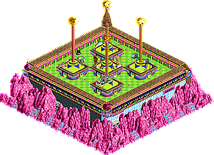
Radical Pattern
 2 votes [9.09%]
Percentage of vote: 9.09%
-
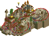
The Church of Bellend
0 votes [0.00%]
Percentage of vote: 0.00%
-
Porto di Pittura
0 votes [0.00%]
Percentage of vote: 0.00%
-
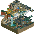
Frank's 2000 Inch TV
 5 votes [22.73%]
Percentage of vote: 22.73%
-
Acid Buttons Birthday Cake
0 votes [0.00%]
Percentage of vote: 0.00%
-
Crowded Park
0 votes [0.00%]
Percentage of vote: 0.00%
-
The Blizzard
 12 votes [54.55%]
Percentage of vote: 54.55%
-
Deep Into Uranus
0 votes [0.00%]
Percentage of vote: 0.00%
-
Goodsprings
0 votes [0.00%]
Percentage of vote: 0.00%
-
Diorama
0 votes [0.00%]
Percentage of vote: 0.00%
-
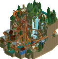
Mountain of Traa
 2 votes [9.09%]
Percentage of vote: 9.09%
-
Cream Soda
0 votes [0.00%]
Percentage of vote: 0.00%
-
RIP harambe cringe comp. 2018!!
 1 vote [4.55%]
Percentage of vote: 4.55%
 25-June 19
 No fans of this park
 Full-Size Map
 Download Park
483
 Objects
62
 Tags
Tags

Welcome to the MM3 Bonus Event! Th ultimate clash of leftover, outcast and experimental micros. Absolutely no rules applied to this round, other than the micros having to be in the spirit of the contest - so no full sized maps. Despite this informal, fun-oriented nature of the round so far, we request that you vote fairly, as always.
__________________________________________________________________
mamarillas - Radical Pattern
Liampie - The Church of Bellend
Gustav Goblin - Porto di Pittura
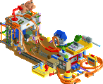
KaiBueno - Frank's 2000 Inch TV
KaiBeuno - Acid Buttons Birthday Cake
L3mmy - Crowded Park
Jaguar - The Blizzard
Faas - Deep Into Uranus
Version1 - Goodsprings
Cocoa - Diorama
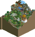
WouterVL - Mountain of Traa
Scoop - Cream Soda
Jaguar - RIP harambe cringe comp. 2018!!
__________________________________________________________________
How to vote?
First of all, check out all the entries in this match. If you can't view one or more entries, then please, do NOT vote. Once you've viewed all entries, select your favourite and second favourite in the polls above. After 3 days, we will close the poll, the results of the two polls will be added together, with the votes from the second poll weighing only half as much as votes from the first poll. The highest scoring entry will win absolutely nothing.
Votes are public and so any cheating of the system, betrayal of honesty or mistrust will be picked up on and will be dealt with.
Some impressions and reviews:
WouterVL - Mountain of Traa - A very strong park... it's a shame we didn't see more NCSO during the actual contest. Perhaps the barrel supports weren't the best choice and the coaster should've had the turns at the end banked but this is great. The blacktiling that left islands also wasn't something I liked but otherwise, brilliant composition with an impressively limited scenery selection.
Cocoa - Diorama - Cocoa does Julow? Despite its unfinishedness, I'm really glad you submitted this entry. The good angle is very beautiful and high quality in terms of composition... the other angles? Not so much but it still has this cool illusory effect with the terrain. Definitely very impressive for a 2 hour piece of concept art
Version1 - Goodsprings - I'm glad you're creating fallout themed stuff... what's here is good quality but it is quite sparse. More variation in terrain such as rocks and hills would have brought this to the next level. But for a quick post-apocalyptic entry, it's nice.
KaiBueno - Frank's 2000 Inch TV - Speaking of rctspace... glad to see another weird al themed micro (the one over there was the night santa went crazy). Overall I thought this entry was stronger than your previous... goofy theme but actually quite impressive. The Bart Nirvana mural must have taken a lot of time and I can appreciate that. The protesters were funny as well.
Feel bad not commenting an all of them, but The Blizzard really reminded me of Dr. Zhivago, especially with the music. Felt right out of the cottage scenes or the earlier part of the film with the grand events in Moscow. Really cool stuff.
Wouter's was also really nice too, felt fresh and the layout was quite solid for a Micro. Good work.
Gonna review all of these because why not.
mamarillas- I love the aesthetic of this one! Really gives me some borderline-vaporwave 90's CGI vibes. The lack of supports really brings out the theme.
Liampie- Great submission! I love the subtle tones in the scenery, and the indigo of the coaster track matches surprisingly well. The coaster design is wonderful as well, especially the sections right above water. On that topic, however, I feel like you could've used some waterfall objects to really round out the river. The ice edges work, but they lack movement and action.
Me- Look familiar? This park was my first ever NE post, except as a screenshot instead of a full-fledged park. I built it in a 9x9 plot in Deurklink's multiplayer server, and it was inspired by some paintings in my house, hence the name. Submitting this micro completely slipped my mind until after submissions ended, but Liampie was able to help me get it submitted after the due date. (Thanks a bunch!) Since I had to completely level the entire server map anyway, I made a few little changes like swapping out the awnings and adding fences around the trees.
KaiBueno:- I was not expecting to see a Weird Al park today! You did a wonderful job bringing Frank's 2000" TV to life, from the overall atmosphere of a crowd forming in Frank's backyard to the nitty gritty details and the mechanism behind the TV. The lyrics on the back of the park and the other Weird Al references in the stall names were great touches as well. Now we can all watch the Simpsons from 30 blocks away!
Acid Buttons Birthday Cake is an interesting one. You wanted to make a weird park and you sure succeeded at it. It's neat, but I prefer Frank's 2000" TV.
L3mmy- This park definitely shows potential, but there's way too many supports blocking the ground. I couldn't even see the bottom section with the flat rides, which you obviously put the most effort into, until I turned on the cutaway view! Different paths would have definitely made this park a lot easier to look at. I do like that twister coaster, though.
Faas- Deep Into Uranus. Ha. Hahaha. Hahahaha.
Obvious jokes aside, this is a very nice park! I remember seeing this one before MM3 started. It almost has a dreamlike feel, with little fragments with unique themes scattered all over. I love the coaster too; it really reminds me of one I'd make. I wish the rides had names, but that's more of a personal thing. Great micro!
Version1- What I really like about this one is how sparse it is. I normally wouldn't say that about a micro, but the lack of dense scenery really brings out the barren, almost post-apocalyptic feel. I like to think it's built on the end of an old road and the station is an abandoned house.
Cocoa- The champ is here! Just like Faas', I remember seeing this one in a Reddit post before MM3. I had the idea of Sub-Rosa Subway at that time, and this was the screenshot which made me think my idea would get absolutely clobbered. I would've never guessed it only worked from one angle, though. (Julow, where you at?) The scenery is nice, although I'm not exactly sure what the twist is there for. The bonus bonus definitely caught me off guard. Not much to say about it except it's a nice layout.
wvl- I'm getting RCT1 vibes from this one! I'm particularly surprised to see you only used 9 NCSO objects besides the default trees and walls and only support blockers and black tiles for CSO. It really puts the focus on your trackitecture, which you used very well. I'll be honest, I never thought to stack two doors on top of each other to get a taller door! I really like this park, but I sure don't like the water that turns the frogs gay!
Scoop- ...Orange? I really like the spiral coaster layout, and the theming sure is interesting. I can imagine the stack of virginia reels in the center being a geyser of orange soda.
Jaguar- The Blizzard is beautiful! I love the usage of both roof and land pieces to show differing amounts of snow of the roof. The UCES backdrop pieces really round it out. Your use of scenery in general makes this piece feel very authentic. Despite the name, I get a warm, cozy vibe from this one.
And what a way to end this bonus round. Harambeworld is a masterpiece. The Rump Tower, the Shrek statue, everything is perfect. Pour one out for Harambe.
Behold my sleeper picks. My favorite park of this bunch is Frank's 2000" TV. There's so much charm behind it, with the story and the references really making it shine. 2nd place for me would be The Church of Bellend. The synergy between ride and location is strong in this one. MM3 was a great contest, and there's no better way to end it than us having fun with the game we love so much. Great work, everyone!
The links for Frank's 2000" TV and Harambeworld don't work right now. They should be https://www.nedesign...ch-tv/download/ (edit removed from URL) and https://www.nedesign.../4604/download/ respectively.
I like how a lot of parks here have a different backstory and approach.
Jag's, Faas's and Cocoa's were MM practice micros. V1, Scoop and me submitted the micros from our one hour micro challenge. Kai is just churning out work at a rapid pace to reconnect with the game. Wouter's micro was a disqualified R2 submission. Gustav's is from a Deurklink contest. L3mmy abused the 'anything goes' rule and mode something offensively simple. Mamarillas used this contest as an opportunity to build something (however simple) that would never make it to a released park on the site otherwise. And then there's the other Jaguar entry - possibly the only really good, especially made for the Bonus Event micro? Did you build this just for the Bonus Event, Jag?
Clear winner to me was The Blizzard.
My other favorites were:
Half of Cocoa's diorama
Franks 2000" inch tv (funny concept, worked well)
Mountain of Traa
Cream soda (this esthetic has some cool potential)
I worked late and will do a full write up this evening, but I have looked at all of them and enjoyed the mix of styles and levels of seriousness. From the not (Crowded, and my "cake") to The Blizzard and everything in between.
First impression is Cocoa is consistent as ever, Wouter's was really good and was what, too big? Mostly though, The Blizzard would have won in some rounds - it is excellent and I enjoyed it from many angles - very clever. I'm still debating my votes, but I liked quite a few of these really much, and in general enjoyed visiting all of them!
As for mine, to clarify - only Frank's 2000" TV was the serious entry. Cake was built in a "Dad's Hour", which adds up to an hour but probably over 3 sessions. Liam was looking for weird so there you go - I dropped acid.
Frank's was a serious attempt in that I wanted to do more traditional archy (than Reel's boxy bldg or Panic's space color saturation). So I started with a house and the idea of "Weird Al's" song. I dabbled with interior items, the reel dancing and protest peep hack rides, tried to give adequate custom support to whatever the hell a 2000" TV would need. It was fun, and if I ever want to do a more "realistic" park in the modern era, this was my practice session.
Thanks for any comments, I'm having fun being back and look forward to using more real estate now that we're out of micro-mode.
its so fucking weird kai, because i thought of that song the other day for literally no reason. i have reason to believe that we now live in a simulation.
Matrix, anyone?
Nice bonus entries Jag, Kai and others. I didn't have the time to do something, but... since we had one Weird Al entry and Jag actually remembered that I did one for an RCT2.com Christmas micro contest, yet it was never added to my page, here's a kinda bonus micro...
downloads: 366
fucking love me some weird al
Jag, wonderful. Very immersive. Love the snow object. Just so good to see where you're taking your game.
Cocoa, as beautiful as the screen you first showed. A bit Julow-ed, but still very good and enjoyable.
KaiBueno, kind of hypnotic. One day you'll make me like green and pink together. Also a good job on the Nirvana cover.
Liam, please do more projects in this style. The colour scheme is gorgeous. Earthy, saturated and dark - how I like it.
V1, I said to Liam how I was happy you submitted something, to then learn he lured it out of you. It's not much, but it's nice. Subtle and tasteful. Much harder than people appreciate. A fun hack, too.
Wouter, very impressive. Shame this didn't make it into the main round, but it's obviously too large for the rules. That immediately allows better composition though which is very good here. I suppose this is NCSO, and you've found nice combinations. Yet some are a bit forced. For example I never think stacked barrels make for anything good. I find them very odd looking.
Scoop, not bad, but Bueno does it better than you.
@ G Force
I can see that, thanks, kinda reminds me of the ice palace from the movie. My main inspiration for the structure was the kolomna palace
@ Gustav
Thank you, the UCES pieces are kinda underused but granted they only look good for night palettes. And glad you liked the harambe park lol, was a quick entry to make fun of Youtube cringe culture.
@ Liam
Thank you and yes, this was built for the bonus event. Saw it as an opportunity to create a setting I always wanted to do that would've been a bigger pain on a full-sized park lol.
@ Posix
Thanks, I appreciate it, that snow object is honestly brilliant for setting an atmosphere
My goal was to make a micro that gave the vibe of almost being a painting if that makes sense, sorta impressionist while still resembling some kitsch kinkade-style cottage in the snow.
Radical is really radical, I like it
Liampie and your parks cool, always with good details
Porto I call it a little charm
Franks became animal, I loved it
Crowded Park was crowded with roller coasters
Uranus, I like this name
Goods, simple but cool
Mountain simply loved it, nice mountain
Cream soda, omg I love soda (Orange - Fanta)
RIP harambe cringe, I love dancing, this is good
The Blizzard, cool cool I remembered URT times (Urban Terror Map Blizzard)
Congratulations to all, I had a great time enjoying
rip harambe- the beautiful music really underscores the deep aesthetics here
cream soda- neat layout with some interesting new color vibes
mountain of traa- interesting to see some ncso, although i'm not sure i quite get the theme. neat layout
diorama- dab
deep into uranus- cant wait to. i like the green glass vibe
goodsprings- want to see more like this, layout ends a bit abruptly tho
blizzard- wow this is awesome- love the atmosphere and the ballroom interiors. the one way walls with forest and dark sky are a great effeect, you could probably even go farther with that idea
crowded park- is what it says
acid- feels like a mrtycooncoaster park but i do like the surreal weirdness to that pool (?) area. export as pdf for readmes plz tho (or a .txt is fine)
franks big tv- wow this was really well pulled off and a great vibe. we dont often see parks themed to songs, let alone a weird al one. good shit
port of silly putty- quaint and simple
church of bel end- its not a competition without an 'anatomy' inspired entry from liam. good shit on the layout and a lovely atmosphere for how simple it is
radical dude- solid layout actually, it would be awesome if a flyer had an airtime hill like that
fun stuff!
Comments!
Radical - rad indeed. Straight out of the late 80s, and very reminiscent of the stylings of that SBTB image on discord, and my 1993 year book. Excellent abstract piece, with the checkerboard and lack of supports being the key. Love it.
Church - nice and simple, solid work for an hour if this is from that session. it's not a head turner, but it is a solid simple layout in a confined space. Good job, especially for an hr, though do you always like 13-14mph (slow) inversions?
Porto - simple yet fun to view. Love the row houses (and the colors) best of this. Do you build larger also?
Frank's - Thanks for the comments guys. I've loved "Weird Al" since Radical's design aesthetic was in vogue. I did my best to create the modern equivalent of a 2000" TV, considering Frank by now (since 1993) would need a new one. Apparently the neighbors still aren't happy and are trying to burn it down.
Acid - Always wanted to find a use for this awful water option from RCT2. The contrasts are horrible but here you go. Not sure how this is Mr.TC ish, I like his playful creations but all of these things are from my crazy head, except the bench. One of you created that hot mess of a bench.
Crowded - apparently this is where all of the supports from Radical went! Not sure what to make of it but thanks for contributing!
Blizzard - This is my favorite here, and near the top overall of all rounds that don't have a proper coaster. Funny we both did a 'reel dance' in this round - no one had that in Bingo to my knowledge. This is certainly a lovely presentation, gives the feeling of a living painting... I like how the carriage arrives at the front, and yet we rotate and peeps are celebrating inside. The snow outside is excellent. Great great job, I could go on about this for longer...
Deep - I kinda like this, and I know there's no rules for a bonus round...but you didn't name anything. Maybe I am overly conscious of that...anyway, it feels like isolated rockets and random shuttles. I do like the aqua/steel/blue combo and curved glass, and the fire under the looper track.
Goodsprings - Never played Fallout, but the hack is nice - same one as VooDuel? The scenery is sparse but feels right. Nice to see a solid execution of the less is more for certain vibes. Nice job.
Diorama - Cocoa strikes again, consistent as always.Simple and straight forward like Liam's, but with better pacing. They feel like blue/purple cousins. A bit lazy on the blackout tiles, but at least you apologized. LOL.
Traa - wow, this was a fun layout - would love to ride this. From the start spiraling around the slide, to the launch up the following hill. Pure speed, some airtime, lovely helixes. The theming is kinda neutral but the ride dominates nicely. Too bad it was too large - how big is it roughly? 400?
Soda - Is this from the hour test run also? Interesting color mix and theme, though a lot of ppl here seem to hate orange. My biggest issue is the white pool, but I love the orange water. In general I am still getting used to colorable trees, so the orange/grey trees are odd for me, but then again I go for colorful walls instead and very little foliage at times. We all have our different styles, but I do like the layout of the ride. Would be a fun run, especially if you snuck in a 2nd train.
RIP - Loved the Shrek screens, happy to see it for real. Thanks for posting this, even if I don't know the history of it.
Santa - Glad I inspired you to post this up - I enjoyed this as new even though it isn't. Loved the named explosions...all those bits of reindeer...twisted and funny.
Thanks again to anyone that's looked at these or my other two (Reel and Panic). MM3 I feel was a great success for the community, and I've enjoyed this time coming back from retirement.
Now on to bigger and better...maps!
The Results
Jaguar - The Blizzard (13 points)
KaiBueno - Frank's 2000 Inch TV (7.5 points)
WouterVL - The Mountain of Traa (3 points)
mamarillas - Radical Pattern (2.5 points)
Liampie - The Church of Bellend (2 points)
Jaguar - RIP harambe cringe comp. 2018!! (2 points)
Version1 - Goodsprings (1.5 point)
Cocoa - Diorama (1 point)
Scoop - Cream Soda (0.5 point)
KaiBeuno - Acid Buttons Birthday Cake (0 points)
Faas - Deep Into Uranus (0 points)
Gustav Goblin - Porto di Pittura (0 points)
L3mmy - Crowded Park (0 points)
Thank you for participating in and attending the Micro Madness 3 Bonus Event!
How strange we forgot to close this. Congrats Jaguar for a well deserved win here. Well done.