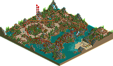
If anyone wants to host these on mirrors, that'd be awesome. I'll update the first post if someone can do that. Brent's host is still down, I think, right?
Hooray for nearly-identical rct2 parks that I can't look at!
Good job both teams, I guess. Although they look kinda generic (please don't take offense at this, it just means that from the tiny overviews they don't seem that inspiring - this is quite possible completely wrong).
Tigers for the win, because the atmosphere is much better, the architecture is worse but more varied, and the inversion coming out of the rocks in Isla Magica could really use some more support.
There were a lot of flaws on the tiger's side which really disappointed me. The first thing I didn't like were the coaster lay-outs.. The mouse coaster didn't have any theming and quite boringly slides through its course. Sure, in real life there are few themed wild mouse coasters, but you really would've scored points by theming it.. The floorless lay-out disappointed me too. It was a 'trying to be a Slob coaster' but didn't reached that level, by far.. It was going too slow through the cobra roll, then suddenly after it comes out of the hill the speed is totally cut out because of the brakes.. Then it ends with going too fast through the corkscrew..
What annoyed me the most was that hideous custom statue object. Nothing against you hobbes, but that has to be the most hideous custom scenery I've seen in the game
The landscaping was the best part, good job on that.. The path lay-out was inconsistent though, with those 1 wide between them which made it not really appealing to me..
The demigods park was pretty cool, nice realistic touches here and there and a great coaster; It kept it's pacing, going through the inversions with the proper speed, the brakes didn't cut off the speed too much, so that it got the right pacing for the 2nd part of the lay-out.. Too bad the lifthill was that high above the paths and it could've used more theming with a nice Spanish building here and there. Speaking of architecture, it was lovely in this park. I really loved the Spanish atmosphere that was created..
The demigods coaster was awesome, I loved the twisted part over the rocks. Unfortunately the rest of the map was quite flat and not much substance.
The tiger's coaster was also pretty good, and they landscaped their park better.
Overall I feel like the tiger's was more finished, but the demigod's was higher quality. I liked the demigod's simple yet attractive architecture and the coaster was very good.
It's hilarious how similar these two parks are. Total coincidence. The H2H gods have been having a ball so far this year. I don't like the idea of team mebers posting in topics (with obvious bias) to boost their own parks so I'm not going to comment on them other than that.
Both parks have a lot of good things going on, but they also have some not so good.
Isla Magica - Really nice park. The thing I liked the most about it was the architecture. Although it was simple, it really matched the theme and it was very solid. The coaster was enjoyable to watch as it was very well paced and I liked how quaint and calming parts of the park were. It did seem a little bit bare in some places though. A couple more buildings or another flat ride could of helped with that. A really nice, solid entry though.
Rapa Nui - I feel the landscaping is the strongest feature in this park. I thought the coaster had a unique layout, and was very fun to watch as well, probably my favorite part of the park. More towards the front of the park, I feel the quality goes down a bit, but thats just me. I really like some bits of the architecture, but other parts weren't that interesting, but as I looked at it as a whole with its surroundings, it really seemed to work, and turned out great. Oh, and those statues are probably one of the most ugly scenery pieces I've ever seen.
But still, a really great entry.
This is going to be a tough choice, I can't decide just yet.
Hmm. I think one might be closer than IC / KR last week.
Isla Magic - Definitely a well-thought-out park right down to each last detail. A convincing realistic approach, although almost too realistic for its own good. The coaster flowed nicely and I enjoyed watching it all the way through its circuit. The only problem I had with it were some un-supported sections, such as the top hat and cobra roll. Both seemed to be magically floating. The landscaping was ok at best. It didn't really stand out as great though. Some of the rock formations in the corners could have been done better as they sort of just jutted out looking quite unnatural. The other aspects of the park were good too though. The architecture, while slightly repetitive and uninspiring, did hold the Spanish/Mexican theme together for the most part. Some buildings I liked more than others, such as adorable entrance building and little restroom building right next to the entrance. The remaining architecture was too minimalistic for me to thoroughly enjoy though. A bunch of 1x1 buildings strewn about the flat landscape didn't really garner much attention from me. Some of the even smaller details were great though, like the observation deck overlooking the water with the boats. I liked that. I also loved the wood pole with mesh fencing used much throughout much of the park. That really tied in well. Overall, this is a great piece of work that demonstrated one parkmaking important skill - consistancy. The problem, however (and no offense to the builders) was that it's too consistant for my liking. The same building textures, flower color and foliage patterns used throughout the entire park didn't leave any room for transition and I sort of felt trapped in one very narrowed theme. Anyway, still a great park. By far the best park the Demigods have shown thus far.
8.5/10
Rapa Nui - Eruption is probably my favorite coaster of the competition thus far. I loved almost everything about it. The section from top of the first loop to the end of the cobra roll were just liquid smooth (I watched that section probably 4 or 5 times ). The second half after the MCBR was just ok. It too was slightly under-supported in spots. The architecture, foliage and landscaping were much more varied than IM, which was good to see. Although more varied, I didn't find the architecture quite as stylish as the IM. I also liked the fact that there was a supporting tracked ride, Typhoon, although absent theming, it was still nice. Same with Short Ear Track. A cool adventure-type ride that meandered around the park and made for a nice transition from Eruption. Another nifty detail was how Shipwreck was built to replicate the mast of some huge sunken ship. That was a detail I didn't catch at first, but was happy to see when I did. I think you guys could have done without the Moai statues and the volcano. The Moai statues (no offense hobbes) look very non-RCTish to me and they didn't really add anything to the park. The volcano was ok, and I know it was the basis for Eruption, but it didn't seem to fit well into the park. I did sort of catch the whole "tropical island lost civilzation" thing I think you guys were going for, but RCT2 volcanos are a thing of the past imo. Regardless, a tremendous park with a top-notch coaster that I loved.
9/10
I'm going to hold off on voting though. As is, the Tigers have the edge but that could change by the time I decide.
Went with Ferocious Tigers because it at least looked like it was trying to be something (Easter Island) and did a decent job resembling it. I thought more coherency would have helped the Demigods' park achieve the supposed Spanish theme it was going for, because all it looks like to me is an essay in the Geoff/Steve "nice cute" style of architecture, a style which I'm not sure is possible to make work due to the fact that buildings that small don't seem enough like part of a whole (no offense to those two good parkmakers). Too much dirt also in the Demigods' park. Plus the Tigers' park had a really nice looking log flume.
Ok I guess I'll jump on the ratings bandwagon,
Isla Magica: 5.5
Rapa Nui: 7.5
Tigers- An OK park. The first half of the coaster was excellent, but from the MCBR, which slowed down the cars waaaaaaaay too much, to the entire post-mcbr part, the ride really was lacking. This one did have better landscaping than Isla Magica, but that was all.
Demigods- The coaster was great. Granted its supports were lacking in parts, it still had a fun to watch layout from start to finish. I also liked the various lines for the coaster, they added to the park's believability. The archy was charming, but too repetitive IMO. However I loved the casa del Mar.
Demigods got my vote, the coaster was slightly better and what was lacking in landscaping was more than made up for in details and the archy, as well as the general atmosphere.
Argh, this is tough. And I wish both parks were great. But no, they're merely "good," which in H2H-scale means they're actually sort of underwhelming.
ISLA MAGICA: Awesome coaster. Clearly superior to the Tigers' coasters combined. Theming is quaint and nice where it occurs, but it's too bare for my liking. It looks unfinished, and while I understand why, it doesn't excuse it, unfortunately. Actually, if this park had been more complete, it would have been an easy, solid win for me. As it is, the lack of completion hurts it enough to put me in a quandry. A couple of unnamed stalls also dropped this a bit.
RAPA NUI: Okay coasters. The wild mouse was definitely disappointing. I would have almost preferred the traditional back and forth layout. Landscaing is very good, and the atmosphere is definitely richer. There's more here, which helps the park a lot. But it's not quite amazing, so that puts a dent in this park's chances.
I've decided to go find my old Corkscrewed's Reviews ratings and assign a rating to each category, add it up, and then choose the park that got the higher score. It's the only way I'm going to be able to make a decision. LOL. Will edit this post shortly.
Wow, yeah, that was about on par with what I was thinking, in terms of how close the two parks would be. Although I might have revised my ratings to get a total closer to 7.5 for both parks.
Well, Isla Magica it is. And to those of you who've never read a Corkscrewed's Review and think this rating system is funny... screw you.
btw, I didn't like the Demigods' coaster that much. Number one, it borrowed too much from Helios. Number two, the pacing was awkward in spots, and launchers were required for the coaster to keep enough speed. Number three, I thought it was long winded but for the wrong reasons (because the shape of the coaster wasn't too adventurous).
The pacing was mediocre enough on the Ferocious Tigers' coaster for me to not like it that much better, but it was the other stuff in the park which made the difference, which in Rapa Nui's case was a good log flume, some nice landscaping, and some other decent stuff, and in Isla Magica's case was basically nothing.
I didn't like the coaster in Isla. Some parts were okay, but for some reason it wasn't doing it for me like Eruption did. Both coasters, however, suffered from some seeeeerious supports problems, here. You're supposed to delete the default supports, Tigers! Also, it looks like Magnus made some nice custom chain return objects; why not use them? I also think the lift supports for the Demigod's coaster was the best part of the park. Nice architecture too, though Napa's architecture held it back from being awesome. I think I'll vote for the Tigers.
I can't decide. Neither park did everything great and, as Cork said, both are underwhelming. I'll say, though, that the statues don't bother me that much. They're no worse than a lot of the lego-block statues I've seen in many parks. I also don't mind the unthemed mouse coaster. Not every tracked ride needs to go in, around, and through archy. It was a fun coaster to watch and they're not done that often.
What I found interesting is that the g-force stats for both main coasters were nearly identical. It hurt the twisty more than the floorless for some reason. I didn't like the 2.8 lateral Gs on both. That's a bit much, IMO.
Since it appears the voting will be open for a few days I think I'll think about it some more and vote a little later.
165 Comments
iris Offline
Isla Magica
DIRECT DOWNLOAD
MIRROR
VS
FEROCIOUS TIGERS
Rapa Nui
DIRECT DOWNLOAD
You can view the Week 4 page here
MIRROR
Thanks to geewhzz for the mirrors.
Corkscrewed Offline
geewhzz Offline
http://mic-averich.c...-IslaMagica.zip
http://mic-averich.c...ers-RapaNui.zip
=)
mantis Offline
Good job both teams, I guess. Although they look kinda generic (please don't take offense at this, it just means that from the tiny overviews they don't seem that inspiring - this is quite possible completely wrong).
ekimmel Offline
geewhzz Offline
I will comment on them later after I get a chance to look at them for a bit longer.
Ge-Ride Offline
Six Frags Offline
There were a lot of flaws on the tiger's side which really disappointed me. The first thing I didn't like were the coaster lay-outs.. The mouse coaster didn't have any theming and quite boringly slides through its course. Sure, in real life there are few themed wild mouse coasters, but you really would've scored points by theming it.. The floorless lay-out disappointed me too. It was a 'trying to be a Slob coaster' but didn't reached that level, by far.. It was going too slow through the cobra roll, then suddenly after it comes out of the hill the speed is totally cut out because of the brakes.. Then it ends with going too fast through the corkscrew..
What annoyed me the most was that hideous custom statue object. Nothing against you hobbes, but that has to be the most hideous custom scenery I've seen in the game
The landscaping was the best part, good job on that.. The path lay-out was inconsistent though, with those 1 wide between them which made it not really appealing to me..
The demigods park was pretty cool, nice realistic touches here and there and a great coaster; It kept it's pacing, going through the inversions with the proper speed, the brakes didn't cut off the speed too much, so that it got the right pacing for the 2nd part of the lay-out.. Too bad the lifthill was that high above the paths and it could've used more theming with a nice Spanish building here and there. Speaking of architecture, it was lovely in this park. I really loved the Spanish atmosphere that was created..
So defenitely Demigods!
SF
Edited by Six Frags, 30 July 2006 - 04:03 PM.
gymkid dude Offline
The tiger's coaster was also pretty good, and they landscaped their park better.
Overall I feel like the tiger's was more finished, but the demigod's was higher quality. I liked the demigod's simple yet attractive architecture and the coaster was very good.
vote-demigods
X250 Offline
I'll look at the parks later, they look okay.
-X-
Coaster Ed Offline
Kevin Offline
Both parks have a lot of good things going on, but they also have some not so good.
Isla Magica - Really nice park. The thing I liked the most about it was the architecture. Although it was simple, it really matched the theme and it was very solid. The coaster was enjoyable to watch as it was very well paced and I liked how quaint and calming parts of the park were. It did seem a little bit bare in some places though. A couple more buildings or another flat ride could of helped with that. A really nice, solid entry though.
Rapa Nui - I feel the landscaping is the strongest feature in this park. I thought the coaster had a unique layout, and was very fun to watch as well, probably my favorite part of the park. More towards the front of the park, I feel the quality goes down a bit, but thats just me. I really like some bits of the architecture, but other parts weren't that interesting, but as I looked at it as a whole with its surroundings, it really seemed to work, and turned out great. Oh, and those statues are probably one of the most ugly scenery pieces I've ever seen.
But still, a really great entry.
This is going to be a tough choice, I can't decide just yet.
JKay Offline
Isla Magic - Definitely a well-thought-out park right down to each last detail. A convincing realistic approach, although almost too realistic for its own good. The coaster flowed nicely and I enjoyed watching it all the way through its circuit. The only problem I had with it were some un-supported sections, such as the top hat and cobra roll. Both seemed to be magically floating. The landscaping was ok at best. It didn't really stand out as great though. Some of the rock formations in the corners could have been done better as they sort of just jutted out looking quite unnatural. The other aspects of the park were good too though. The architecture, while slightly repetitive and uninspiring, did hold the Spanish/Mexican theme together for the most part. Some buildings I liked more than others, such as adorable entrance building and little restroom building right next to the entrance. The remaining architecture was too minimalistic for me to thoroughly enjoy though. A bunch of 1x1 buildings strewn about the flat landscape didn't really garner much attention from me. Some of the even smaller details were great though, like the observation deck overlooking the water with the boats. I liked that. I also loved the wood pole with mesh fencing used much throughout much of the park. That really tied in well. Overall, this is a great piece of work that demonstrated one parkmaking important skill - consistancy. The problem, however (and no offense to the builders) was that it's too consistant for my liking. The same building textures, flower color and foliage patterns used throughout the entire park didn't leave any room for transition and I sort of felt trapped in one very narrowed theme. Anyway, still a great park. By far the best park the Demigods have shown thus far.
8.5/10
Rapa Nui - Eruption is probably my favorite coaster of the competition thus far. I loved almost everything about it. The section from top of the first loop to the end of the cobra roll were just liquid smooth (I watched that section probably 4 or 5 times ). The second half after the MCBR was just ok. It too was slightly under-supported in spots. The architecture, foliage and landscaping were much more varied than IM, which was good to see. Although more varied, I didn't find the architecture quite as stylish as the IM. I also liked the fact that there was a supporting tracked ride, Typhoon, although absent theming, it was still nice. Same with Short Ear Track. A cool adventure-type ride that meandered around the park and made for a nice transition from Eruption. Another nifty detail was how Shipwreck was built to replicate the mast of some huge sunken ship. That was a detail I didn't catch at first, but was happy to see when I did. I think you guys could have done without the Moai statues and the volcano. The Moai statues (no offense hobbes) look very non-RCTish to me and they didn't really add anything to the park. The volcano was ok, and I know it was the basis for Eruption, but it didn't seem to fit well into the park. I did sort of catch the whole "tropical island lost civilzation" thing I think you guys were going for, but RCT2 volcanos are a thing of the past imo. Regardless, a tremendous park with a top-notch coaster that I loved.
9/10
I'm going to hold off on voting though. As is, the Tigers have the edge but that could change by the time I decide.
Corkscrewed Offline
Panic Offline
Ok I guess I'll jump on the ratings bandwagon,
Isla Magica: 5.5
Rapa Nui: 7.5
Edited by Panic, 30 July 2006 - 04:27 PM.
eman Offline
Demigods- The coaster was great. Granted its supports were lacking in parts, it still had a fun to watch layout from start to finish. I also liked the various lines for the coaster, they added to the park's believability. The archy was charming, but too repetitive IMO. However I loved the casa del Mar.
Demigods got my vote, the coaster was slightly better and what was lacking in landscaping was more than made up for in details and the archy, as well as the general atmosphere.
Corkscrewed Offline
ISLA MAGICA:
Awesome coaster. Clearly superior to the Tigers' coasters combined. Theming is quaint and nice where it occurs, but it's too bare for my liking. It looks unfinished, and while I understand why, it doesn't excuse it, unfortunately. Actually, if this park had been more complete, it would have been an easy, solid win for me. As it is, the lack of completion hurts it enough to put me in a quandry. A couple of unnamed stalls also dropped this a bit.
RAPA NUI:
Okay coasters. The wild mouse was definitely disappointing. I would have almost preferred the traditional back and forth layout. Landscaing is very good, and the atmosphere is definitely richer. There's more here, which helps the park a lot. But it's not quite amazing, so that puts a dent in this park's chances.
I've decided to go find my old Corkscrewed's Reviews ratings and assign a rating to each category, add it up, and then choose the park that got the higher score. It's the only way I'm going to be able to make a decision. LOL. Will edit this post shortly.
:: RATINGS formula: Theming = 35%, Coasters = 28%, Architecture = 17%, Naming = 10%, Atmosphere= 10%, Overall = 100% ::
ISLA MAGICA:
Theming - 7.8
Coasters - 9.0
Architecture - 8.2
Naming - 6.8
Atmosphere - 6.5
Total - 7.974
RAPA NUI -
Theming - 7.8
Coasters - 7.9
Architecture - 7.5
Naming - 8.0
Atmosphere - 7.9
Total - 7.807
Wow, yeah, that was about on par with what I was thinking, in terms of how close the two parks would be. Although I might have revised my ratings to get a total closer to 7.5 for both parks.
Well, Isla Magica it is. And to those of you who've never read a Corkscrewed's Review and think this rating system is funny... screw you.
Panic Offline
The pacing was mediocre enough on the Ferocious Tigers' coaster for me to not like it that much better, but it was the other stuff in the park which made the difference, which in Rapa Nui's case was a good log flume, some nice landscaping, and some other decent stuff, and in Isla Magica's case was basically nothing.
Steve Offline
ekimmel Offline
What I found interesting is that the g-force stats for both main coasters were nearly identical. It hurt the twisty more than the floorless for some reason. I didn't like the 2.8 lateral Gs on both. That's a bit much, IMO.
Since it appears the voting will be open for a few days I think I'll think about it some more and vote a little later.