Park / Six Flags Mountain Retreat
-
 23-June 19
- Views 1,881
- Downloads 449
- Fans 0
- Comments 7
-
 Description
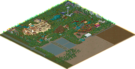
I had a go at making my own Six Flags park a while back. Most of the park is in the style of a Six Flags park but I added some personal touches to make it my own too.
-
 No fans of this park
-
 Download Park
449
-
 Objects
271
-
 Tags
Tags
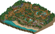
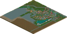
This does quite successfully capture the feeling of many of the pre-built SF scenarios. I do think the park map is waaaay bigger than it needs to be though. The coaster designs are a little unrefined. I didn't like how Lab(y?)rinth's lift is broken up into three pieces, or how it had a big long section of sloped track underneath, which made it all floating. The desert area sticks out a bit, the objects don't quite mesh with everything else. I do like that you tried to have a maintenance area, but centering the park a little more might have given you more space to have other realistic touches around the park rather than just on one side. I also felt like the park entrance was a little too understated. The area should be big, wide, and inviting with lots of shops and restaurants - all there really is here is just a train station and a carousel.
+ I appreciate the scenario feel the park has. Nothing mindblowing, but it's always pleasant and easy to explore
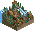
+ Labrinth isn't exactly flawless but it looks incredible. Such a unique layout, I would love to see it improved upon and getting a top tier theming treatment. Maybe by you in the future?
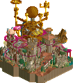
+ Pharaohs Tomb, layout and colours were very nice
+ Even though the main building looks like a weird brown stump, I really like the look of the entrance plaza somehow. Atmospheric.
- Multi-looper overkill. B&M sitdown, stand-up and floorless is already overkill, but you also have a B&M invert and an arrow.
- I didn't like how all the coasters were facing away from the path. I recommend 'flipping' your coasters, and have your paths meander through the coasters in interesting ways. At least make them visible!
- Scenery from expansion packs
I think this deserved a release because it was charming and felt quite a bit like some of the early SF scenarios. The coaster layouts were probably the weakest, but the hyper and arrow were solid. Some more patience and experience will have you producing accolade level parks for sure.
Are you Chris Sawyer? Because this looks just like one of the Six Flags scenarios, minus the expansion objects. If that's the look you were going for, you nailed it. However I did feel like the foliage outside the park, mainly the scattered palm trees, could've been improved upon. I also agree with Liam that there's a few too many of the same rides. Labrinth's layout, although perhaps not very realistic, looked very unique.
As everyone else has been saying, I completely agree that this looks very six flags scenario-like. This was definitely enjoyable to look at and it was also extremely nostalgic... this is how people used to play the game lol.
It's probably just the color scheme, but velocity gave me raging bull vibes. The layouts are odd but aren't bad. Some parts of the park were stronger than others, such as the surroundings and barren patches of sand.
Regardless this was nice and refreshing to look at.
Thanks for your comments all, I should have posted more background to this park. I was aiming for the original Six Flags scenario style but I wanted it to also be my park. I've never actually visited a real Six Flags so I was going wholly on the RCT2 scenarios!
I also built most of the park in 2011, I added the B&M sit down and floorless in 2015, so I've improved a lot since then. Some of the coaster layouts are intentionally basic; I find it interesting that the arrow and Labrinth (should be Labyrinth) were praised, I thought the arrow especially was the weakest, though looking at it now; The B&M invert would be horrible IRL.
I also think the sandy area stands out but I quite like how much texture it gives the overall park and I know that such an area wouldn't probably exist in a real Six Flags park, that bit was definitely one of my fingerprints.
this reminds me a lot of the sort of park you make right when you first decide "hey lets try some of this themeing business". In that sense, its a nice hit of nostalgia- I was quite proud of the work I made then, even though its now lost to time and i'm sure objectively not very good at all. So your park was successful in giving me those feelings again!