Park / Beacon Cliffs
-
 11-June 19
- Views 2,178
- Downloads 595
- Fans 0
- Comments 8
-
-
 59.00%(required: 65%)
 Design Submission

geewhzz 70% Jaguar 65% Scoop 65% bigshootergill 60% CoasterCreator9 60% Cocoa 60% saxman1089 60% G Force 55% Liampie 55% posix 55% RWE 55% Camcorder22 50% 59.00% -
 Description
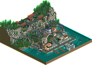
A nice little naval town.
DKMP duelling ride building contest entry -
 No fans of this park
-
 Download Park
595
-
 Objects
191
-
 Tags
Tags
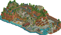
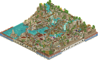
now this I really back. The layout is unconventional for sure but theres some sick moments, especially that immelman/ dive loop combo- thats a great idea that maybe I'll steal one day... The moving light in the lighthouse is also sick. There's some maybe questionable ww/tt object usage that maybe makes the architecture a bit blocky and unrefined but overall I sorta like the vibe and atmosphere. the cliffs are wacky but novel and I think you used those rusted objects well. there's also a lot of life, with the jumping jetskis and boats etc. great job
The plane gliding gave the scene a touch, steel supportes combined with roller coaster.
The wall of stones/ruins on the mountain was 10, was in good harmony with the foliage
Loved the park entrance
Otsdarva Offline
That lighthouse is ingenious.
Very cool! The coasters while not very realistic have flow IMO and look great. The concept and ideas are fantastic and I love the setting on the coastline. Only two things IMO is that perhaps the peach coaster should've had a more daring colour to make it stand out more. Also the WW/TT rocks don't work that well. Interesting experiment, but normal landscaping woul've looked better.
Just need a couple more votes to go to voting guys! Deserves some attention I think.
Lots of creativity and unique objects used here, sorta that ttww mix that we've started to see more of now from outside members. Really works well here and adds some freshness to the map.
+ I liked the layout overall! Unconventional as some have mentioned, but not in a bad way I think
+ Liked some of the details, such as:
The cogwheels for the launch
The small balcony right under the launch
The fact that peeps enter the park from a boat
That you made the waterfront lively by putting the boat ride and the plane tour there
The small freefall ride - adorable!
The fact that you tried to use marshmallows as rocks/boulders. Doesn't look quite right but love that you tried
- Coaster colors. I felt purple and tan just didn't fit well here, and they are not the best combo to begin with. And the black for the coaster rails didn't improve it IMO - I changed the color to the same as the main color of each coaster and thought that looked better.
- Not a fan of those harbour wall pieces. Even if you were going for that grimy look, they look a bit odd.
- Even if you might have made those rock objects look as good as they possibly can, I think I would have preferred the vanilla landscaping look.
Neutral: support work. It was pretty cool in places, but just felt unnecessarily inconsistent - for example, why didn't the helix have giga track for supports?
Overall, nice work!
The immelmann + Dive loop combo is sick
This was a cool little park. Very fun. Great job.