Park / VooDuel
-
 09-June 19
- Views 3,546
- Downloads 692
- Fans 2
- Comments 14
-
 70.50%(required: 65%)
 Design

CedarPoint6 85% Kumba 80% csw 75% posix 75% robbie92 75% CoasterCreator9 70% geewhzz 70% Scoop 70% Ling 65% Sulakke 65% Cocoa 60% RWE 60% 70.50% -
 Description
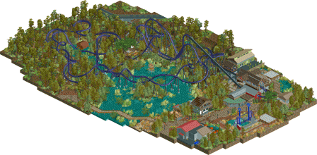
A dueling Möbius roller coaster based on RMC's T-Rex concept model. Enjoy and thanks for looking!
-
2 fans
 Fans of this park
-
 Full-Size Map
-
 Download Park
692
-
 Objects
285
-
 Tags
Tags
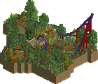
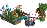
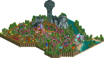
I have always enjoyed your stuff. This is easily one of your best.
The layout is spectacular and the dueling aspect is highlighted very well here, without feeling like you had to totally force it. The hack is what gets me though. We've never had a forwards/backwards duel like this before (as far as I know). It's kind of mindblowing, honestly. I love hacks like this that are used in realistic ways to make it about the ride itself rather than the hack. The block made mid course disguised into the show scene is a great way to hide that.
I like the atmosphere created with the foliage and swamps. It's done really well and the colors of the landscape really bring that out. Architecturally it's fine. Strong from a park standpoint and not necessarily detailed, but I don't think that's a bad thing-- the real focus here is the coaster. I could watch it all day.
Amazing work. Hope to see more.
Good to see you're still playing darva, this was really nice. The coaster was especially refreshing and really one of the better ones we've seen in a while. The terrain and surroundings were great too, overall just a classic design. Perhaps a little rough around the edges with the peeps and pathing, but that didn't really bother me much considering how well done the coaster is.
the layout is definitely the main feature here, and pretty cool. I loved the duel but I wish it could have been timed to go continually. The treehouse next to the launch was my favorite bit, very nice themeing and vibe. Landscaping was pretty good too, although the forest itself was a bit bare- underbrush, flowers, mushrooms, etc help a lot, as does getting trees of varying heights (ie really tall ones) to break up the monotony. The archy near the station sits a bit less well for me- it seems a bit "washed out" maybe? I think its the colors and the general lack of direction in theme that makes it seem a bit blocky and atmosphere-less. But you did a fine job on the paths/infrastructure stuff. I think overall it maybe needed a bit more love all around but I still enjoyed it.
Damn.. what a cool layout. Could've used some more flair and detail with your architecture.. but I love the swamp vibes here. Upon opening the park I was confused at what I was watching.. but once the dueling got moving I was amazed at the hack. But as CP6 said, the hack was realistic in a show scene. Would've been next level to see more show scenes and/or a stronger theme to the ride. But that's a minor gripe. Great stuff.
Otsdarva Offline
@CedarPoint6 Thank you for the compliments. I'm glad you like the backwards/forwards part. Getting the trains to duel afterwards was a lengthy trial-and-error process. I wanted each tracks of the layout to feature their own unique elements without making it too repetitive or mirror-y and I think that resulted in the ride not dueling with itself more than I had wanted. Again thanks for being a fan of my stuff! I'll try to finish more rct projects
@G Force Thanks for the warm welcome; I'm glad to be part of this community. Your statement that this is one of better ones in a while is greatly appreciated. Regarding the guest pathfinding, I think the one-unit step up for the queue is messing up their pathfinding abilities. I only allowed guests after I was done building and am only aware of the problem now.'
@Cocoa Thanks for your comment. Nice to hear you like the treehouse. It replaced a boring hut and the treehouse was one of the last things built. I thought something tall overhead is more exciting for the riders to view and much engaging than a hut. Storytelling wise, it is supposed to be where the riders get "cursed" by being chased by their own spirits hence the dueling of the other train. I agree that the forest part was a bit barren and could use more details. For the archy, that's something I still need more practice haha. Glad you enjoy it as an overall experience
@ottersalad Thanks for the compliments. The general gimmick of the ride is based on RMC's T-Rex model promotional video which only featured one backwards section. I agree that more show scenes would make the ride more interesting and I think that sort of ride experience is something only Disney would do and I don't have the architectural skills to emulate a Disney ride haha. Glad you are able to enjoy it, though!
I really enjoyed this, good job! The coaster layout was great and the foliage was quite inspirational. I also thought the archy was quite good, although it also felt a little bit bland to me, but you're starting to develop a really nice realism style over there. Also the flat ride was very decent!
As improvable i want to also mention your composition. I'm fine with coasters being seperated from the park a bit, even in designs, but this one is a really tough example for me, since there is nearly no viewing point for the visitors of the coaster. It's a bit sad cause i think you missed a lot of potential here, since the dueling scene would have been a great show off.
Overall a great release though and i definitely hope to see more from you in the future!
THE TOP SPIN!! Genius!
You are hands-down the best hacked ride creator on this site. And you're not half bad at theming either. Absolutely great work.
I do love the theming. The swamp/voodoo vibe is perfect. I'm not super into triple launch following a mid-course launch, and I'm really not into the train chilling at the start for a full minute after sitting in the station for just as long. Could probably have done with one or two fewer trains? I don't really have anything else to complain about, mostly just pretty damn solid.
Otsdarva Offline
@posix Thanks for the comment. I agree that the composition to the ride's entrance is not that great. The park building aspect is still something I struggle with. Do you have any suggestions on how the entrance design could be improved? I'm just curious so that I can have some guidance on how to improve.
@RWE Thanks for the comment. The ride being secluded is by design to create an ominous feeling for the riders when going into the swamp. But I agree that some viewing point for guests would enhance the park-side experience.
@csw Thanks for the compliment! Glad you like the Top Spin. The rotating seats are from one of Roomie's park.
@Ling Thanks for the comment. It's more a delayed launch than a triple launch. The first pass does not gain a speed boost; only the second pass. Regarding the train sitting before the lift hill: I needed a train ready to leave at a precise time in order to join the other train in order to have them duel every circuit. I made the wait in a hut as if there's a pre-show before the ride in order to justified the wait. Perhaps I could've made the building larger in order to convey that there's something going on in there.Glad that you like it for the most part, though.
Congratulations on the design! Bit of a low score considering how strong the ride design was here, but oh well.
Regarding composition, I would start with positioning ride entrances so that they have an almost 180° arc of access around them.
Beautiful work.
What an amazing couple of hacks, the forward backward duel was awesome, and the top spin was incredible too. As Posix said, reminds me of seeing new custom rides back in the day.
Very nicely done, no idea how in the hell you did it.
From screens, the coaster seemed weird to me. When viewing it ingame, it proves to be just genius! Wow, that launch near the first drop gimmick amazed me... Great concept, you nailed it dude.
Foliage could've been improved, I agree with everything Cocoa said about that. Archy is good, bit too bland overall but still fine. With some extra details there and some more path interaction with the coaster, this submission could've scored higher I think.
I'm curious for your next projects.