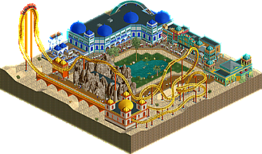
Park / 1001 Nights
-
 09-June 19
- Views 1,465
- Downloads 442
- Fans 0
- Comments 4
-
 Description
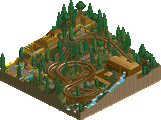
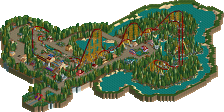
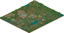
Fox Nation's R1 entry for RCTgo Rush!
-
 No fans of this park
-
 Download Park
442
-
 Objects
156
-
 Tags
Tags
Cool stuff, I'm glad you brought it over here. I sorta wish the greater rct community would use NE's database as a true database for rct work, regardless of whether it was for another competition/server/etc. But politics will be politics
anyway, nice stuff. I like the building with the log flume. I wish the landscape was a bit more cared-for, with some lusher foliage around the trees/oasis and a bit of shrubbery, rocks etc in the desert. custom supports would have helped a lot. looking forward to more stuff tho!
Cool coaster and flume. Just wished the big ugly rock wasn't there. Seems out of place. Maybe if the Thieve's Den was on the edge of the map in a cliff dwelling or cave? Archy was great here.. just didn't seem super cohesive to me.
Tip: use the strip of empty tiles behind the buildings to create a backdrop. Could be some palms, some rocks, or both. Rocks that could morph into a cave when the buildings end?
Good vibes and good competition here. Highlight is the blue bazaar building for me. I think some custom supports would have done alot here. Overall great atmosphere and a fun entry, GG guys.