Park / Ghostrider
-
 31-May 19
- Views 4,244
- Downloads 715
- Fans 2
- Comments 17
-

-
 74.50%(required: 65%)
 Design

Steve 85% Sulakke 85% robbie92 80% SSSammy 80% pierrot 75% ][ntamin22 75% Cocoa 70% G Force 70% posix 70% saxman1089 70% Scoop 70% Faas 65% 74.50% -
2 fans
 Fans of this park
-
 Full-Size Map
-
 Download Park
715
-
 Objects
245
-
 Tags
Tags

Damn i thought i was finally in the loop here lol
This one is hard to vote on.
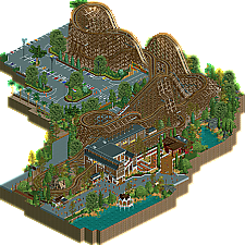
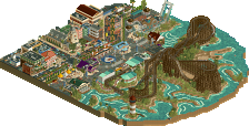
I think the layout and the direct environment around the coaster are great and definitely design-worthy.
But I dislike the front of the park, where the station and the queue line etc. is. It somehow feels way more noobish than the rest.
nice parking lot
I'm confused as to what this is. An old project you finished Liam? It's nice, quite enjoyable. Perhaps a bit small and featureless other than the layout itself which was a bit too realistic and too little fun to me. No matter, it's so good to see any RCT from you geewhzz.
The station was great
Lovely stuff. Feels like I've seen this layout before.. or at least screenshots of it? Regardless, I really enjoyed it. Happy to see more geewhzz stuff. I agree with Faas that the queue seems less detailed than the rest of the park. But loved the support details and the overall layout. And of course the parking lot is good too.
i wanted to vote higher because so much of it is dripping geewhzz but the station/ actual theme park side of it was so boring. its strengths were very strong though.
I'm excited to see this wrapped up and out there in some capacity. The layout and station is A+ work, typical classy and timeless realism work with a real level of warmth to it. As always, #datroadflow is impeccable and really adds a great context to this.
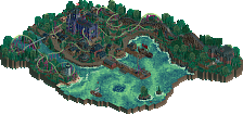
It's unfortunate that the map gets cut off to make the wider context feel more like a placid lake/forest map, though. Part of the magic of the real and this fictional Ghostrider layout is that it was built in an area it didn't fit, jumping over roads and parking lots and weaving in and out of itself because it was literally built into a corner. Having the park outside be a peaceful-looking lake and forest kinda provides a disconnect, though I'm sure part of this comes from my own experience with this when it was a part of a park and my own history with the real Knotts. Still, the layout and station is way too strong to be hindered by anything.
Also, as a side note, I built that little t-shirt stand in the corner around 8/9 years ago, so I don't know if that precludes or nulls my panelist vote on this, but if any admin wants to remove it, feel free.
So you're the reason why all peeps are wearing an orange shirt? It's probably my only complaint.
It's great to see this finished and submitted. I really love this (soon to be) design. The layout, pacing and supports are fantastic and I love the setting around the parking lot. The coaster station is a highlight as well. The way the queue is integrated with the station is really cool.
Good but boring. The attention to detail is great and it's got a very scale-model diorama feel to things with the recreated signage, traffic cones, the little bit of a grate for drainage on the water. I think the layout has sacrificed some in-game flow to match the real-life Ghostrider but doesn't have the underlying interesting layout considerations - this one is obviously not as sandwiched-in as the source material. I also wish it had the killer end helix too.
My recognition for the route design. Design is great. ).
).
Other objects like stores and other drives are quite sparing. That's okay. I think that the parking lot went very "fabulous", certainly very intimate.
I like the brakes of the track over the roof of the station building.
Fastening ropes - though I would add more (!
Everything in a very "meek" atmosphere. I think so.
74.50! That's a score I can agree with. It's probably not a surprise to anyone, but this is a coaster Geewhzz did in a park a few years ago, and he asked me to turn it into a design. I simply cut it out of its surroundings, and filled the gaps. I did a similar thing with RRP's hybrid coaster back in the day, but RRP left much more for me to do than here. That also exposed my inferior skills/vision. Voyager was a 50/50 RRP/me effort, but Ghostrider really is a gee release. He'd done enough for me to fill in the gaps in his spirit, allowing me to stay in the background. If it didn't have my name (and no Dutch flag), would anyone have guessed it was me? I'm happy with how I blended in here, as well as how quickly I did this. I did the majority of the work in a few days. I could've taken longer to add more touches of my own, and more spectacular and meaningful surroundings, but I think this map has all it needs. A great layout and surroundings to put it into a context. The complaints regarding the station being outdated are something I partially agree with. The design definitely shows its age in the object selection there, for example. On the other hand, the whole queue and station setup is so unique and elaborate... That's a timeless quality. Classic gee shit.
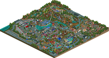
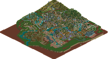
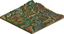
This is the state of the coaster I started with, btw. You can see what gee built (and rob, in the bottom left corner), what I sacrificed, and what I added.
I love it, you did a fantastic job Liam.
Congrats you guys, and I love seeing where it was vs. outcome. From a ride standpoint, I don't use/like trim brakes, but that's all personal preference I suppose-I'm sure they are in here cos they are on the real deal. Otherwise it looks like a lovely wooden ride that I'd try if I ever went there.
Good job guys...love seeing old projects finished one way or another.
onetwothree of NE's best!Takes me back to a great day at Knotts Berry Farm where the real Ghostrider proved to be a real good woodie... Lay-out here is great too, love that turn-around. Station is well designed. Lovely design.