Park / Red Rock Reach
-
 31-May 19
- Views 1,414
- Downloads 461
- Fans 0
- Comments 6
-
 Description
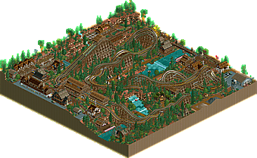
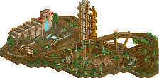
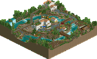
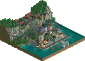
In 1839 a small community of angry Irishmen up and left the big cities to build their own Colorado frontier town - Red Rock Reach.
Red Rock Reach was a lawless trapper town at war with the neighboring Arapaho tribes for three years before Paddy O'Reilly ended hostilities with a bottle of moonshine.
The town was rebuilt on a bigger hill and O'Reilly crafted the perfect whiskey with the help of Chief Kohana to commemorate the occasion.
In 1996, O'Reilly's grandson, Connor O'Reilly, commissioned the Dinn Corporation to build dueling coasters Tomahawk and Flintlock outside of town to increase tourism and whiskey sales.
(created for DKMP Dueling Coasters Challenge; NCSO with TT scenery elements) -
 No fans of this park
-
 Full-Size Map
-
 Download Park
461
-
 Objects
227
-
 Tags
Tags
Great work. The coasters are unconventional but also very easy to follow around and therefore fun to look at. Same for the rapids. Good decision to have two stations up and down the river. The TT scenery is butt ugly in places but you also made it look very nice in places, like the central rock arch (great moment) and even dare I say the Robin Hood camp object which looks absolutely abysmal by itself. I do wonder why you used TT teepee's instead of the easily better looking RCT2 ones. The weakest aspect of the park was the architecture. The best aspect was the stellar map layout and how you gave every little area meaning. I think that if you refrained from using ugly objects and ugly solutions (wooden coaster roofs...) you could do GREAT things. You're halfway there.
Really looking forward to your next parks!
This was an almost single-wide park and I loved that. Nice colours, too. Good architecture. Nice theme commitment. Composition smells like it's developing fast. Still a bit intermingled here, but it's hard to fit duelers into a map this size.
I wasn't bothered by the object choices. It's good to see so much contrast sometimes.
Hoping to see more work by you.
Definitely some of the best use of expansion scenery we've seen here in a while. The coaster layout was nice too even though it was unconventional. Good work.
Really enjoyed the layout. The mix of trackitecture and WWTT objects is interesting. I liked the red rocks here. Only negative for me is the Robin Hood's Camp objects.. just doesn't fit rct2 aesthetics.
I actually really liked this. I think you used the ww/tt scenery in a way that I hadn't seen done so well before (but maybe I'm just a sucker for bad/weird objects!). Most of the archy was pretty vibey and the red rocks were especially well integrated. I particularly liked the "potion" building and the waterwheel one. The layout itself wasn't the most flowing layout possible but it served the job well. It did actually remind me of a (much better) version of a park I made like 15 years ago when I was starting out in rct and that really hit me in the nostalgia. So yeah, I actually really liked this and think you did a great job with the atmosphere.
Great scenery use .. mostly. Some of the rock texture and the HDR-style roofing and log walls still clash a little too much with the lower-contrast scenery elements.
I think you nailed the surroundings, lots to look at and plenty of places to discover a little moment. I wish the coasters were a little more dynamic instead of running side-by-side the whole way around the layout.