Park / Steam Edge Engineering Ltd.
-
 21-May 19
- Views 7,522
- Downloads 453
- Fans 1
- Comments 16
-
1 fan
 Fans of this park
-
 Full-Size Map
-
 Download Park
453
-
 Objects
264
-
 Tags
Tags
Round 3 - Semi-Final 3
__________________________________________________________________
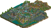
Tolsimir - The Orrery
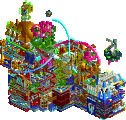
hoobaroo - Dreamcatcher
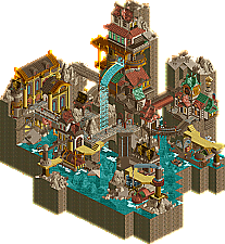
bigshootergill - Steam Edge Engineering Ltd.
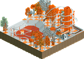
Camcorder22 - Ride of Steel
__________________________________________________________________
How to vote?
First of all, check out all the entries in this match. If you can't view one or more entries, for example if you don't own LL, then please, do NOT vote. Once you've viewed all 4, select your favourite and second favourite in the polls above. After 3 days, we will close the poll, the results of the two polls will be added together, with the votes from the second poll weighing only half as much as votes from the first poll, and the 2 highest scoring entries will proceed to the next round. The third placed park will place its creator on the reserves list for the next round of the contest.
Votes are public and so any cheating of the system, betrayal of honesty or mistrust will be picked up on and will be dealt with.
(in preference order)
Tolsimir - Oh Tols this is absolutely gorgeous! I love everything about it, such an incredible atmosphere you've set. It really does feel right out of a fantasy novel or JRPG. Easily one of my favourite things on the site and I would absolutely love to see this submitted as a design.
Hoobaroo - Damn dude you're so fucking talented, this is incredible. The setting is really cool, the architecture is stunning and the colours are so beautiful. I have a few qualms about some of the layout/coaster stuff but it's also one of my favs now. I am so so excited to see what you make after MM.
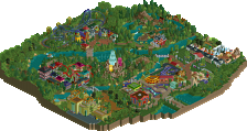
BSG - Steampunk! And it's done right! omg. The archy was amazing, the submarines so cool and I'm just really damn happy you pulled off the theme this well. It feels like you took Markarth and removed all the Bethesda from it. I think with a bit more foliage and movement/life this could have been 2nd, but this is by no means bad. I really do love this too.
Cam - @faas gg nerd [I'm actually really surprised by how good everything here looks other than the supports, you managed to use the steel roofs really creatively and u made me chuckle :3)
It was a fun ride, but I'm clearly outgunned in this R3 match, well done guys!
#1 Tols: What a great entry, a what an amazing chain lift... holy crap!!! So good! Trying to soak in everything on the map, it's awesome. I surrender!
#2 Hoobaroo: You're the best surprise of the contest man, 3 stellar entries! This one is right up there with some of the best micros of the contest! The archy is fantastic, the colors are playful and the theme with the sleeping peep is spot on!
#3 Me: Really happy with how this turned out, no regrets from R3 from me.
#4 Cam: Wish you had more time to build. Solid start, would have been great to see this theme fully flushed out.
#3 Cam
1. Tolsimir: Holy crap. The lift on the ride caught me off guard.. I'd love to see how you did the transfer to the ferris wheel and then the vertical lift with a twist. The use of trackitecture was great. Loved the telescope.
2. Bigshootergill: Great steampunk vibe here. Always a sucker for steam punk. Would've been cool to see the waterfall used in the ride, but that's minor.
3. Hoobaroo: This was great too! Each round of yours is better than the last. The bedroom when you rotate the screen was a cute detail.
4. Camcorder: This was hilarious. The layout was pretty nice and aesthetically it was quite pleasing.
This is the hardest for me to vote on. Lots of good stuff. Love the forced abstraction Cam.
2. Hoobs: damn you get wrecked by being in tols' group. This is fukn awesome too. I especially like the bedroom with massive black wall. So spooky and childlike. The story was weird and coop and the whole micro leaves me with more questions, which you know means the story is working well. Just high quality shit.
3. Bsg: so close to working. I think it felt a bit ketchup and mustardy to me- possibly some foliage to add needed green and smooth those cliff faces would have gone a long way. Still, the details you did include are pretty solid and interesting- especially those boats
4: cam: this is a ridiculous silly idea and I love it. Man of steel indeed lol
This was exactly the fantasy steampunk fuckfest I hoped this match would be. Sorry I couldn't get something serious done and that mine sticks out like a sore thumb lol.
1. hoobaroo - Really close for me but I would've voted this one first. You've improved so much even since this beginning of the contest and I can't wait to see what you do next. Love the concept starting with the bedroom scene with the mini dreamcatcher. You use a wide variety of colors and textures here but it all works together very atmospherically. I'm especially in love with the colorful foliage above the green building. I thought the layout complemented the map well and the very beautiful dreamcatcher with the coaster going through it at the end was framed so well. Definitely a highlight of the competition.
2. Tolsimir - Just a small level below hoobaroo's imo. I was a little less impressed with the overall macro but there was still some very good classic Tolsimir details throughout. You have such a way of creating seemingly functional RCT machines. The telescope was probably my favorite bit with the planets at the top another highlight. The coaster didn't perfectly mesh with the surrounding, but I loved the use of the mechanical conveyor belt lift and the moving transfer track.
3. BSG - Very nice coherent entry that broke from the cartoony, saturated feel of your first two with something a little more refined. The archy is the highlight here, besides that it did feel like it was missing something compared to the other too, whether that be foliage or a central ride. Still great and I love how well this one complimented the two entries.
4. my dumb ass - As said in discord, I've been spending most of my free time mixing/producing an album, with the deadline being last Saturday so I had a couple hours Sunday and Monday to throw something together. Its a joke entry but I'm actually kind of happy with how it came together haha. Building with like two objects is weirdly relaxing compared to stressing over which object to use and good practice too. I built a lot of this with an impressionistic feel, and wanted to make it look like an actual realistic park if you zoom out and squint your eyes, which I think I somewhat succeeded in doing. So basically, I'm Monet and this is the best park on this site.
I loved it, it was amazing, it reminded me of the movie Tomb Raider
I do not need to comment I liked everything.
hoobaroo - Dreamcatcher
Excellent details, loved the back (bed and mosquito haha very cool).
I loved the green building and the panel where the moon is.
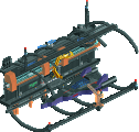
bigshootergill - Steam Edge Engineering Ltd.
I loved the design, the gears makes all the charm.
Beautiful colors in harmony.
Well, nice work.
Camcorder22 - Ride of Steel
What patience, I fell in love with the supportes in blue, I liked the trees, I confess it was very different from what we are accustomed to see, that is good.
Dreamcatcher - I am shocked by the quality of this entry. I really thought I would have voted for The Orrery (sooooo close) at first, but I think what tipped it over the edge was atmosphere and the entire concept. Loved the massive black half-circle, compositionally it's so unique. I personally want to do more designs like this. The ride itself is great in how it disappears with the sole peep on the water, going through the really well executed dream catcher, and the backside of the wall with the bedroom is just perfect. The colorful trees and the music adds so much charm to the whole entry. I think architecture is one area where you have some room for improvement, with cohesion and detailing. I think technically Tolsimir's entry is above yours overall in quality and construction, but I enjoyed your concept and atmosphere so much more. I am so excited to see what you will bring to the finals if you make it!
The Orrery - SO CLOSE to getting my vote, I really loved this! That lift is incredible, you constantly amaze me with your ingenuity and hacking. The architect is great and the atmosphere is well done, the planets are awesome and overall the whole thing was just so well done and well packaged. The foliage is beautifully done, and the rockwork will be a case study for me. The ride is also really interesting, but the layout is a bit messy and lacks some macro consideration.
Steam Edge - Nice step out of your typical style, and a pretty charming take on steampunk, but there's a familiar air of having seen this kind of idea before and there wasn't anything particular that stood out amongst the buildings. I think a focal centerpiece of some sort would've helped, as would've a nice coaster with a steampunk-concept behind it. Still, the colors and roofs especially were fantastic and worked really well overall.
Camcorder22 - I love you.
The Orrery - Very cool application of the conveyor belt. The mechanical focus of this really sold it for me. The rockwork is a little random but overall the atmosphere is instantly captivating.
Dreamcatcher - I wasn't so sold on this until I looked at the other side of the domed piece. Such a simple and obvious addition went such a long way to solidifying the idea. It's clear fantasy, but a kind of fantasy that we only ever seem to see when people are forced to build in these tiny spaces where big ideas alone can save you. I hope we get to see a proper bigger project from you soon. Something like this on that scale would be truly magical.
Steam Edge Engineering Ltd. - It's so tough for me, between this and The Orrery. I think the details here are better but the atmosphere is less complete. I think a well-integrated coaster could have pushed this over the edge for me.
Ride of Steel - I fear there is a Discord joke I must have missed. The layout is serviceable but too fast. The S insignia is clever, given the objects.
Hoob: I didn't think I was going to vote for this until I rotated the map. The little bedroom diorama totally sold this one for me. Some more cohesion in the architecture could have made it stand out even further.
Tolsimir: I liked the atmosphere here and how it told a bit of a story. The track-based walls and roof didn't really work for me though.
BSG: very sold on the steampunk style, but there just didn't seem to be enough going on. it felt like a very compelling slice out of a whole, but without a strong justification for this particular slice.
Ride of Steel: Table With Umbrella 2: pissing on Faas edition. Clearly a joke entry, but I'd have liked thinner support structures instead of those bulky towers, and I think using track roofs for the actual station roof would have been a nice extra touch of irony.
Another great matchup, well done all.
My first vote to Hoob, this was ace. Beyond the gorgeous execution and atmosphere, there were SO many amazing details and real surreal, artistic moments. Even just the person standing on the water with the coaster crashing through behind was SO theatrical and dramatic. One of the coolest things i've seen this MM and in rct for awhile now. Well done, really excited to see more work for you.
Second vote to Tolsimir. this was top notch execution and so many fun details, I love the nerdy-ness of it all. The coaster has some really cool hacks and tricks, and a fun bunch of little details. Well done on a great park.
BSG, This had some amazing atmosphere and really cool pieces, but it felt a bit disjointed and like it was missing some clear through line. I think Tolsimir's just edged you out because of the little details and bits in his that made it feel more real and detailed. Great work though.
Cam, this was a great joke and surprisingly well done for the challenge you set for yourself, but with the others being so amazing, just couldn't live up to the joke, heh.
hoobaroo: flawless. You've outdone yourself again. Ideas, execution, good looks, it's all there. Even some surprises, like the little bedroom scene behind the wall. That little scene has more detail and story in it than most large scale parks. Well done hoob.
bsg: loving the canyon-like feel here. The architecture is beautiful, and the colours are great, contriburing to the aforementioned canyon look. Some nice details like the boats and the interiors - I especially liked the one that looks like a brewery. For the rest this didn't offer that much, but I would love to see this theme expanded on a bigger map. I can picture it and it's great.
Cam: 1K corrugated roof
Before looking at them more in depth now, I was under the impression that I would end up voting for Tolsimir. It's going to be hoob though. What a match, damn.
__________________________________________________________
Winner
hoobaroo: 24 + 14/2 = 31 points
Eliminated
Tolsimir: 15 + 22/2 = 26 points
bigshootergill: 2 + 3/2 = 3.5 points
Camcorder22: 0 + 2/2 = 1 point
__________________________________________________________
hoobaroo proceeds to the Grand Final. Tolsimir is eligible as a replacement.
Congratulations to the winners!
Orrery: So much detail...carts up and down the hill. Telescope. Conveyor vertical lift on a sweet spinner coaster. All the moving gears. Barely got my vote over...
Dream: Wow...I think the difference is the coaster? I love the archy, the night sky wall, and how the coaster dives into a sea of dreams...the bedroom on the back is the best tho...lovely secret there! Both of you should be in the final from these two...
Steam: Crazy thing is I think this wins most brackets in the prior rounds...at least 2/3, and yet feels normal here? It isn't normal, there are tons of details...love the engine on the bottom left, the building above it and the falls. Maybe it's the right side is a touch plain and compared to the other two, this is normal in that it is understandably mountain backside? Tough draw but nice park.
Steel: Sucks you ran out of time, but the roof supports are pretty cool anyway....and it does feel like a ROS layout of sorts. In spirit anyway, and partially in theme...the roof tiles on the ground give it that shard feel from some of the films.
hoobaroo, never heard of you before this contest. Amazing to see you making it to the final. Good luck!