Park / Mystery Park
-
 28-May 19
- Views 2,480
- Downloads 513
- Fans 0
- Comments 13
-
 54.00%(required: 50%)
 Bronze

Cocoa 60% Sulakke 60% bigshootergill 55% chorkiel 55% G Force 55% Jaguar 55% Liampie 55% saxman1089 55% CoasterCreator9 50% Faas 50% Scoop 50% RWE 40% 54.00% -
 Description
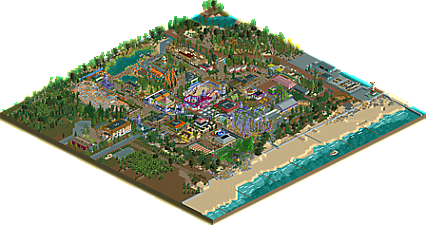
Welcome to "Mystery Park".
Tourists do not look at the costs.
For random coincidence with ideas
owners of other playgrounds, the management of the park kindly apologizes.
Greetings to viewers. -
 No fans of this park
-
 Full-Size Map
-
 Download Park
513
-
 Objects
457
-
 Tags
Tags
![park_4075 [H2H8 R1] Durham, Knaresborough and Staithes](https://www.nedesigns.com/uploads/parks/4075/aerialt3813.png)
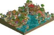
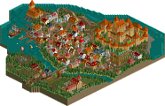
coaster grotto called, they want their aesthetic back
Oh dear.
Anyway, lovely spaghetti bowl!
The lake where the swan stood was the best, the foliagen stayed perfect atmosphere very cool.
TAJFUN got good with the supportes in white/orange, but I can not do that, so I admire it.
WTF the use of the awnings in all the buildings I saw, loved it.
The ride though small was a charm.
The building with awning and balloons was top.
The Farol tower gave a touch combined with the surrounding environment.
Well, I love Flinstones that was a good idea.
the building of the AUTODROM was excellent, with the speakers, haha, I loved it.
I liked the RUIN object that you used to make the path.
Overall it looks great, it really does look good, there is a sense of happiness the details are well elaborated.
Nice work
Great job, battle boy. This is easily your best work yet. Also the most realistic. It's probably not something you always strive for (you've done some crazy, not so realistic stuff in the past), and I hope to see more fantastical stuff from you in the future, but in this case I love it because you've done it well.
I think this park should get you your first NE accolade, at last! Whether it's going to be bronze or silver, or maybe still something below 50%, I'd like to congratulate you, battle man. I really enjoyed it.
Since there is so much to see in the park, I'm going to comment on it using a few screenshots. The good and the bad!
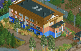
This building is great. The colour scheme is complicated but totally works. The white ornamention on the side of the building pushed it over the top. Lovely!
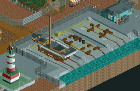
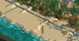
The surroundings were quite good in general. This little harbour area was great.
Beach landscaping: very convincing! The foliage mix here was great. It doesn't have to be complex to be effective. In the future, please rotate your trees so they're not all facing the same way. I also wouldn't use those WW/TT trees, or any WW/TT scenery in general. That way more people can enjoy your park!
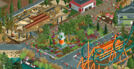
One of the problems I had with the park was how some stuff was very 'undercooked'. The car ride here looks like it came from a random scenario park your 10-year old nephew built. It just doesn't seem to have the same thought and care put into it. There was also a lack of cohesion in the park, like it goes from bright orange Vekoma boomerang to random flower patch to sandy car ride. Every building and every ride was different. Even the paths change for no reason, at times! I think your parks could be a lot better if you were more consistent with the way your park looked. On a more positive note, I do love the flower patch itself. Great foliage, even though it's an awkward square shape, circled by concrete paths. Would've loved to see more similar foliage in the surrounding areas. That would tie everything together! I know I'm being very critical right now, but that's because you're now battle man.
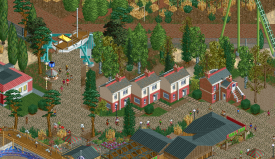
I wish people would stop using this boat object . Love how you used it as a gate here. Very original. I'm also not sure what the suburban houses are doing here, but they're implemented very nicely.
Another example of what I described earlier: so much different stuff going on, that it becomes a bit of a mess. It's hard to concentrate. When I took this screenshot and cropped it, making the screen smaller, I could already notice more of the good things. Those bumper cars are actually great! I also really like that ticket booth for the flat ride.
Very excited to see your next park.
Thank you Liampie for a constructive recenzy. Greetings.
Good to see another submission from you battle boy, you've certainly improved tremendously and this is the best example of that. I still think you can refine or improve your object selection at times, it will help make the park more neat. Looking forward to what you do next!
hey this is pretty dang good. Some really decent architecture and realistic parkmaking here. I particularly liked the shipbuilding docks, and "jokers jinks" made me laugh out loud. All in all, it has a good carnival feeling and atmosphere. Maybe its a bit "dark" in some sense- I'm not sure if thats intentional, or if its because you use so much bare dirt and grass/mud. But I still quite enjoyed the park!
There were flashes of really quality material in this park... the usage of nautical wall pieces actually works quite well. Some of the ride names (e.g. 'boo sound generate,' >slide>go ride!<<) are downright hilarious but overall I can appreciate the layouts, although they are kinda generic.
The quality of this park frankly varies a lot. In some areas, the foliage and architecture are really good (the entrance area and pond) and in others, they seem to be carelessly placed (the yew trees). Despite that, this park is very well-designed even with its playful atmosphere and because of that, it is definitely deserving of an accolade.
Nooooo! You were so close to winning an accolade, but it looks like you picked the wrong category! This is a park, not a design! It should've been bronze!

Fixed.
Sadly can't get the "Bronze" caption under the map to appear on his profile page.
Fixed! It just needed a 'bronze' tag. It's officialy now, congrats on your first accolade after all battle man!