Park / Tierra Aventura
-
 14-August 06
- Views 22,731
- Downloads 1,058
- Fans 4
- Comments 84
-
 77.00%(required: 70%)
 Gold
Gold

Cocoa 85% G Force 85% Scoop 85% Sulakke 85% Liampie 80% Ling 75% RWE 75% Xeccah 75% bigshootergill 70% Jaguar 70% Poke 70% posix 70% 77.00% -
4 fans
 Fans of this park
-
 Full-Size Map
-
 Download Park
1,058
-
 Objects
313
-
 Tags
Tags
Corkscrewed Offline
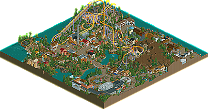
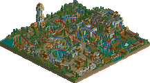
TIERRA AVENTURA
DOWNLOAD
MIRROR (coming soon)
Ferocious Tigers
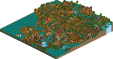
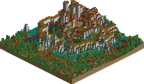
CHEROKEE CANYONS
DOWNLOAD
MIRROR (coming soon)
Week 5 page here
Dayam, possibly the biggest blowout ever. lol
Hurricanes, I really like the park. So many things to look at, good job. Our park... not so good...
I'll post more when I'm actually awake...
Both coasters were equally impressive. Which is too say, good but not great. Second major drop on the wooden looked fucking painful. As for the invert - what ever happened to, you know, REAL zero-g rolls? Up, twist, down. Besides, it was much too slow.
In terms of theming, Hurricanes have it in the bag. I might have taken the Tigers park if it were finished, but as it is, it doesn't give me an inviting feel.
So, vote goes to the 'Canes. Good job, guys (I think I know at least one...).
-ACE
Fatha' Offline
Just forfeit.
EDIT: Actually, the park is much better than I initially gave it credit for. It's a different style than I'm used to, but it isn't just window dressing. A lot of those details have a clear sense of purpose behind them. And I do like the snakes and the piranhas, even if the adventure ride itself is fairly flat and boring. You've themed it well. And the landscaping is all very impressive and the precise placement of bushes and trees too. And a lot of the buildings are very nicely crafted. And you clearly put a lot of thought into the correct placement of benches and queue lines and dining areas and signs and walls and pretty much every amusement park detail imaginable. It's a very well-done realistic RCT2 amusement park recreation. I'm bored to death of amusement park recreations with one major coaster in them. Especially when there's also a mine-cart themed adventure ride, a "water sphere" and a big empty cliffside -- but I suppose that's no reason to take it out on you. I could be accused of building the same sorts of things myself back in the day. For what it is, it's very well done. Superbly well done in fact. I'm still disappointed your two rides are a realistic B&M inverter with custom supports and a somewhat generic adventure ride (see my similarly critical response to The Seige of Castle Grijs) but I shouldn't let that cloud my view of the whole park. Which is, I admit, quite impressive. You definately know how to get the most from RCT2. And I still maintain that this park is far better for taking screenshots of than actually looking at in the game.
I was actually referring to the Hurricanes park there.
Okay obviously i voted for them simply becuase it was finished and is a credit to the parkmakers for gettting done on time. I like it, it's got a very good atmosphere and the architecture was very quirky in some places. However the ride layout was pretty poor, aside from Horus that is. The search for Ra looked like it had some thought put into it but it just didn't work and was a waste just to 'fill' a blank. The flat's were nothing special and Horus was good but not great.
The layout For Horus at was pretty darn good, the pacing was good around the elements except for the poorly placed zero-g, unless of course it was an actual in-line twist. I think the dive loop was beutiful and the station was great.
However
As for Relaism, as far as the frontpage description goes, it didn't meet 'my' expectations of a realistic park, Kayte Ridge for example. I can see where you tried to add in realism but for me if you don't build the park with realism in mind then all these details are pointless. For instance the catwalk for Horus was too low for guests to use if they needed to be evacuated, the transfer track, whilst in the right proportions, was fenced off on both sides with no space allowed for the switching of the tracks. . . . so how were they supposed to use it? Some supporting was a bit off and the custom Op Cabin on the freefall was too high.
However the saving grace for the park was the architecture and teh atmosphere it created. For the the eypt area was very immersive and some other buildings gave the same effect.
Tigers:
Really not much to say here. The first drop on the woody was great but the rest was just OTT on the twists. Architecture was different although i can't see how it fitted the theme 'Cherokee Canyon.
All i can say really.
RFan
P.s well done to a certain RCTF memeber
too obvious that certain knowledge was missing here and there to do things right.
still, it was nice to look at it.
i didn't care much for the adventure ride and that weird hill in the map but the theatre with the marketplace to it were very good.
inVersed Offline
Everytime I have asked, iris ok'd blanking out portions of the map to make the useable land within the 70x70 requirement.
But heck, why am I arguing for the other team?!
Move on, nothing to see here...
SF
Corkscrewed Offline
#1: his 90x90 wasn't even close to the limit
#2: it didn't have blacked out land to reduce actual map size to 70x70
So yeah. Iris can back me up on this.
Tierra Aventura: dripping with atmosphere, and screams _____. The inverted was pretty good, although I wish you'd time the trains leaving better.
A zero G Roll that's too slow? Didn't it zip through that at like 30something MPH? How much faster do you want it? That's what the speed it is in real life!
Cherokee Canyons? Well, about the only things I can say about this park are: "nice woodie" and "at least Iris' team has life again now."
Okay, one more thing: "ride6's two heartbreaks suddenly aren't disastrous now.