Park / Karlkurla Canyon
-
 17-May 19
- Views 2,384
- Downloads 622
- Fans 1
- Comments 15
-
 58.50%(required: 50%)
 Bronze

bigshootergill 65% Cocoa 65% G Force 60% robbie92 60% RWE 60% saxman1089 60% SSSammy 60% csw 55% Jaguar 55% pierrot 55% Scoop 55% Liampie 50% 58.50% -
 Description
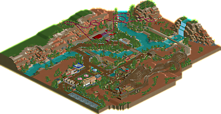
Entry for the NCSO Challenge on RC&F.
Park required there to be 2 coasters, 1 transport ride, and 3 supporting rides.
Theme/setting based loosely on the Australian Outback.
Enjoy!
original download here: https://drive.google.com/file/d/1Tz-m5-1FzzlNO0bF586cW5xGZ86eDK3f/view -
1 fan
 Fans of this park
-
 Full-Size Map
-
 Download Park
622
-
 Objects
191
-
 Tags
Tags
![park_4229 [H2H8/8] Valle Del Amanecer](https://www.nedesigns.com/uploads/parks/4229/aerialt3993.png)
![park_4713 [NEDC5 - 03/10] Nøkken](https://www.nedesigns.com/uploads/parks/4713/aerialt4585.png)
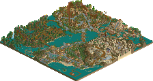
fuck yeah, I like this a lot. The big patches of red sand are a risky choice but I think they go a long way in setting the mood and atmosphere of the whole park- I would have probably just put a more little shrubs dotted across it, instead of just fully blank space. the park infrastructure was very well done in my opinion- nice planters, buildings, etc. Just really pretty and well-themed. I'm not huge on the gumdrop rocks but I guess thats just part of the ncso scene these days. One unrealistic thing about it is that the park is too good! After living in australia for a while, I've come to realize that one needs to lower their expectations from tourist attractions here. One time, we went to an observatory in dubbo and it was just a projector in some dude's garage and some impressive but amateur telescopes out back. this park is way too big and high quality! Although the ride lineup is a bit strange- only two flat rides? I mean I prefer coasters any day but it makes sense for parks to invest in some cheap flats.
anyway, cool stuff. I think its a silver from me, we'll see what other people feel like. I sort of wish you'd chucked a tiny bit of cso in here actually- some whitewater objects to finish up the waterfall, and some taller trees to really feel like wirey eucalpyts.
yeah but cocoa mate, you went to Dubbo. Dubbo! what were you expecting?
Anyway otter I have to agree with cocoa here, I have qualms about some parkmaking stuff (layouts are meh, park needed 1 or 2 more flats, some building quality was a little low in areas. Waterfall was way too simple) you've carried the theme really well, honestly more than any other release on the site. I could easily see this being in NT or SA. It really does feel like Australia. The entrance area especially really captures the country town vibe well <3
Honestly though my biggest criticism is that u didn't make the woody a Bush Beast clone. Press F to pay respects ;_;7
I'd give this a silver too ^_^
it could have done with a few supporting rides!
i really enjoyed this otter. its super fun. the ride design needs hammering out a little (would people be interested in a livestream where i review peoples ride design and give improvements??)
what is there is strong, but theres not much there. 60% from me, looking forward to more!
I want to point out that there was a limit on the number of rides allowed for the contest on RC&F.. two coasters, a transport ride, and three supporting rides. I would’ve wanted another coaster. A small B&M layout or a Schwarzkopf were ideas I thought about. Figured I’d try something new with a suspended swinging coaster.
@cocoa: sounds like a should visit Dubbo lol
@shnupz: glad you liked the entrance.. spent a lot of time on it!
hey the zoo in dubbo is good
I like this as well. It's a bit light in places on the rock/debris (particularly near the wooden coaster), but the fruit drops as rocks on that side are fun. The barren look is done well otherwise, and I understand if this was for a contest that you had limitations on what you could fill in with regarding flats and other rides. Considering that, this is well done and accomplishes the challenge I think.
In the future, a thing to consider for submitting to NE here after a contest later is it possibly fill in the gaps with other rides, etc and call it a special edition...that way it'd be more full, but still capture in this case, the barren look.
Thanks for letting us see this.
Good point Kai. I guess I wasn't sure if I should post the park from the RC&F contest, or add more to it. Definitely agree that there was some gaps to be filled with more rides/content.
You're welcome. Nothing wrong with having two editions, and being judged on the final. It doesn't discredit the original, just means the constraints of the contest might limit it vs. a full park concept. If the layout can handle additional features, go for it and make it the best it can be! If anything, that proves the design had potential and you fulfilled it.
That said, congrats on the park and you have enough votes for an accolade vote it seems.
I wasn't too impressed by the landscaping, it looks like the cliffs were made by raising square pieces of land and you didn't care to properly smoothen them out. The gum drops and ruins and stuff did not blend in well, their placement also didn't make much sense. The large open areas were a bit too raw for me. On the other hand: I liked the general feel of the red sand everywhere and the lush green foliage. Made it feel unique. A much more memorable take on Australia than the average attempt, which tends to come across a bit too generic western.
Landscaping aside, there's some really good content in the park. The entrance gates, the custom flat, the railroad bridge, and the area around the woodie in general. I think I already commented on a screen of the latter, but I'll repeat it here: this area is beautifully laid out. Nicely layered, right amount of colour, blablabla. It just works for me. Due to how empty of some of the surroundings are, it comes across better on a small screen/reduced window than full screen.
Karlkurla Canyon looks like a bronze to me. It's not your best, but that's excusable since it was for a contest. Actually I love that you made your contest entry this big, even though it resulted in some emptiness. Good job!
Congrats on a bronze!
Congrats on the Bronze! This park is sweet. I love how much energy it has, and the use of open space is perfect. This would have been a solid Silver to me.
Really enjoyed the layout of the Wooden coaster as well.
Nice work man!
Thanks guys!
@Liampie: I guess I'll need to work on rock work!!
One of my hidden gem parks for 2019 Otter. I really appreciate the archy, the landscape, and the development on the theme.
2019 was a big year for otter. can definitely see the learning curve in progress, especially in his new 2020 screens... exciting
Thanks guys, looking forward to building some new stuff.