Park / Dry Dock 14J
-
 01-May 19
- Views 5,370
- Downloads 474
- Fans 1
- Comments 19
-
1 fan
 Fans of this park
-
 Full-Size Map
-
 Download Park
474
-
 Objects
131
-
 Tags
Tags

![park_2089 [NEDC] Shock 2 - #4/9](https://www.nedesigns.com/uploads/parks/2089/aerialt1883.png)

![park_3230 [MM2014 Final] The Time Traveler](https://www.nedesigns.com/uploads/parks/3230/aerialt2951.png)


Round 2 - Quarter-Final 3
__________________________________________________________________
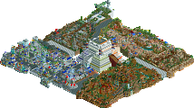
Scoop - Borderlands - Caustic Caverns
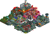
AvanineCommuter - All the King's Jewels
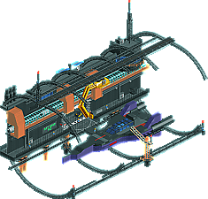
ottersalad - Dry Dock 14J
WouterVL - Forfeit
(No replacement)
__________________________________________________________________
How to vote?
First of all, check out all the entries in this match. If you can't view one or more entries, for example if you don't own LL, then please, do NOT vote. Once you've viewed all 3, select your favourite and second favourite in the polls above. After 3 days, we will close the poll, the results of the two polls will be added together, with the votes from the second poll weighing only half as much as votes from the first poll, and the 2 highest scoring entries will proceed to the next round. The third placed park will place its creator on the reserves list for the next round of the contest.
Votes are public and so any cheating of the system, betrayal of honesty or mistrust will be picked up on and will be dealt with.
Yeah really "All the King's Jewels" hehe excellent work no doubt.
String of Pearls looked amazing, I do not know how it did it.
I understand it's a treasure box, right?
When I dialed F4 and saw a lot of flying saucers haha I loved it, so I got the idea.
The colors purple, blue, green, pink, red, white symbolizing jewelry, diamonds, very well thought out.
The back of the box lid stayed 10 and you made up the lock.
The station is a big ring right? Fantastic.
In other words he got very crazy. (Is this a praise)
02) Scoop - Borderlands - Caustic Caverns
Are the horses running? It was cool.
I enjoyed the truck, and the ferris wheel nice idea.
The pipes pouring toxic water is perfect. I think I understood that.
The building was nice and I liked the dry tree in it.
The green, and the green in the train wagon reminded me of the power plant of the Simpsons, and I love Simpsons.
The overall details looked good, nice atmosphere.
03) ottersalad - Dry Dock 14J
Futuristic vision love this, platform hovering in the air is cool.
Transport Tube was a great idea, and I liked the space plane where it is under the angar.
Robotic Arm nice idea, I like the yellow one.
The forklift coming and going hehe i liked it.
The details are great, dashboard, gears, red warning light, the bulbs.
Looking generally I felt in a space station.
Caustic Caverns - Neat. Bold color scheme choice. The theme is a little unclear. The ferris wheel looks like it's supposed to be... a digger? But it's on something stationary, so maybe some kind of conveyor system? I looked up the level in Borderlands and it looks like you've done a good job of capturing the atmosphere.
All the King's Jewels - Love the loud color scheme and the way you've made things look like faceted gems.
Dry Dock 14J - Can we make space ships in RCT a thing? Because I'd love to see more of this. Love the forklifts. Tough group, I think this one takes 2nd for me.
1. ottersalad: While AVC's entry is probably the best one this round, I couldn't help but vote for this anyway. It just sat with me in the right way. Such a great spacey vibe, really made me think of mass effect in all the right ways. (ugh I wanna play now... rct park maybe?) The ship was a tad underdetailed but I loved all the dry dock stuff- the way you use banked track to sell the curves, the crane, the forklifts, etc. I just get such a strong, mysterious image in my head of the world this could live in, and that's all you could ever ask for.
2. AVC: so fukn cool though. My favorite detail is probably the little gold charms, and I'm glad I remembered to look inside the box too. The pearl necklace is great, as are all of the little jewel ideas. So original and creative and very "you". I would never have thought of this
3. scoop: you did a really good job nailing the borderlands vibe, especially with that music, even if I haven't played in ages. The map itself even looks like real level design. Cool details all around, just maybe a tad brown (yeah yeah I know its the theme). You could definitely have fit a cool coaster or ride into that space though and it wouldn't have felt off.
So many matches, wanna get through, so just some quick reviews for now:
Ottersalad: Wow, just as good as the overview. Love the concept and it was so well executed. The overall composition and shape of the structure is just fantastic, and the multitude of staff throughout really help keep the attention lingering around the structure. The spaceship was really well crafted, some great details throughout and just a whole level above your R1 entry. Great job, I'm excited to see you keep up this level of creativity and execution into the next round!
Scoop: Not familiar with Borderlands, but I enjoyed the ideas at play here. Highlights are the giant ferris wheel grinder, the toxic waste, the round shape of the map. Wished there was music or a ride to really elevate the atmosphere. Not sure how many easter eggs / references you had included since I'm not familiar with the source material, but if you had more time, some more of those would also bring this up a notch.
AVC - Your newfound love for the myan object makes me really proud to have forced that shit so hard with shogo because hnnng QUEEN you fucking did it again you extra bitch. I love this, I prefer your R1 entry, but this is still incredibly charming
The theme was so creative and was executed without fault, it did feel rushed though, which seems to be the trend this matchup.
Otter - What's there was really good but it was completely lifeless. It really needed some movement from the staff and some peeps would have been cool. Also you really missed an opportunity to use the star and space objects that Jag used in his galaxy thing
Scoop - This was so rushed, so so rushed. At least, it feels that way. I've mobbed through the caustic caverns a lot and this honestly felt like a really underwhelming recreation and lacked polish. The grinder was cool, but the scale of this whole map was really really off and you didn't include the roof area of the main building where you go for the dahl treasure quest, or the rail track over the crystalisks by the entrance. It isn't awful or anything, but it doesn't do the map justice imo and I did expect more from you. I imagine you were pressed for time. Also, you forgot Krieg and Gaige!
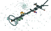
Wasn't planning to forfeit but in my attempt to rush a micro in 8 hours, i forgot that the size limit was 15x15 instead of 20x20 so i made my micro too big. :S
Highlights
Borderlands - Caustic Caverns: tripod thingies
All the King's Jewels: the charms <3
Dry Dock 14J: support structures
Thanks for the reviews so far guys/gals.
AVC: Absolutely lovely. As I mentioned to you already, I thought you'd be tough competition! The jewelry box is such an interesting idea, and having things like different gemstones and the charm bracelets really add to the theme. Even the back/lid of the box was textured. There is no detail left out here and it all came together quite nicely.
Scoop: Haven't played Borderlands, but I can definitely get the vibe here. Agree with Cocoa that a ride could've enhanced it. The atmosphere here was dark and grimey, which I enjoyed. I'd love to see a H2H park set to this game.. or really any looter shooter game like Destiny or the Division.. hell even Elder Scrolls. There's so much lore that our community hasn't tapped in to!
1st - AVC - Jewelry Box
gaaaaay
2nd - otter - Spaceship
Had to vote AVC over you, because his just had so many cool details and a roller coaster of course. BUT you are definitely a close second. This is the most exciting thing I've seen from you, and I want more of it! Love the little details and the frozen staff. The ship was a little underdetailed compared to other parts, but it's still incredible. Love it!
3rd - Scoop - Borderlands
While your cityscape from R1 completely blew me away, this one felt a little underwhelming now that I know what you're capable of. Not to be negative towards you in any way! I personally love the Borderlands series, and the Caustic Caverns level was definitely a memorable one. Unfortunately the aesthetic didn't translate as well into this game. HOWEVER - if you ever decide to do a full map with Borderlands or other video game stuff, I'd be really excited to see it!
4th - Wouter - Forfeit
Now this is just disrespectful. You submitted the EXACT same map as RCTFAN - even down to the park title. Plagiarism is a big deal. Reporting you to iris.
So hard to vote on. All good entries. One of the rare times I enjoyed cut-away view AVC, for stupid flying saucer rides. But conceptually they work so nicely here.
Loved the atmosphere in yours Otter. Very convincingly done.
Scoop, interesting design choices architecturally, and I loved the green water. Perhaps slightly falling behind against the other two in conceptual clarity.
1) Dry Dock 14J - It was a hard decision between this and All The King's Jewels, but I ended up going in this direction. I thought it had the coolness factor AND the composition of something well thought out and built with an artistic vision. The gestures made with the Intamin track arches show some great promise - like you've clearly made these choices yourself and aren't afraid to make some big statements in the work. The ship was actually the weakest part for me, it was good but looked blocky compared to the rest. The actual dock buildings/levels were what kept my attention. Really cool stuff all around, with some moving parts, and I can believe it to be a functioning space dock. I like the tube cars as part of it, but they were kind of teleporting about like crazy which was kind of distracting.
2) All The King's Jewels - Close to grabbing my #1 vote. One of the better and more believable 'blown-up scale' entries, but they certainly are not my favorite. I liked the artistry included here, and it was clearly built with some strong visuals in mind, I just felt many of these visuals were separate and then placed together in the jewelry box. Normally, as in your R1, I think your macro composition is what is the highlight of your concepts, but here it felt abnormally compartmentalized in the vision. The colors aren't my absolute favorite but it's not a negative for me. My favorite bits were the gemstones built in glass at the bottom of the jewelry box.
Borderlands - Caustic Caverns - Good, but felt a little bit rushed and undercooked when compared to the other two. I do like Borderlands so it's a theme I'm a fan of that you've tackled here, and I think you've done it well. I liked the choice of including the ferris wheel, probably my favorite bit along with some of the layering of the mine tracks with the arches. I do think it's a theme that would be most suited for a larger scale, however, and the biggest weakness compared to the other two is simply how it exists as a micro - the other two forgo the land edges to make the micro feel standalone, where here a good portion becomes that land base which doesn't really have anything going on.
AvanineCommuter:
Can't believe how you came up with this idea. It's so awesome and you executed it to perfection. It's the rare occasion where repetitive patters are needed 100% to sell the product. Very well crafted. As others said already even the backside looks great. My favourite jewelry is the ring/bracelet with the looping ride. That diamond looks damn sexy. Those charms on the coaster were a little silly but I forgive you about it for the connection to RCT. Only minor complaint was that it's a little hard to make out the height difference of the different layers. Can't wait for your coming micros!
Ottersalad:
Well crafted dock, the round structure sells perfectly the space feeling. Those cranes/arms on the railing systems are totally convincingly done. Good use of that new tube trains, however I really dislike the teleporting hack as it is not a real teleport and you can still the train in between what makes it really disturbing. The spaceship looks fun aswell structure wise, but I'm missing a little more features on it and in the cockpit. That counts for the rest of the dock, too. Atm for me it is a little too clean to be a working place where something is built from metal. Some more tools, cables, robots (?), materials would have underlined the construction feeling more. On the backside you have it a little more, great use of that otherwise rather useless forklift ride. The upper control rooms were empty, too, unfortunately. Nonetheless, from the overall structure it makes a great micro. Good work!
Scoop:
I'm not familiar with the game, but I quite liked the overall atmosphere in your micro. Color choice worked well, especially the green water. My favourite bit was the overhanging wheel even though I didn't get what is was for. The building itself had a nice structure. The horses caused some otherwise missed motion in your micro. The area around the bog trees was cool, too. I liked those three legged droids. The trucks are a little blocky and scalewise off. The least likeable part of the micro is the red gate. From the outside it's okay, but from the inside you just have empty walls. All in all I felt the piece was a little too barren compared to the other two entries and couldn't hold my interest for too long, maybe because of the theme.
Hands down winner from AVC here, loved it. The dry dock was well done too, great detail, only Pierrot did it better in LL. Scoop's entry seemed a bit empty, but the atmosphere was really good.
AVC- Those Mayan pieces have certainly taken you far on a number of maps now. But despite that and the colors being largely similar, you're making it work from a variety standpoint. This is fantastic. Loving the charms hanging off of the coaster. Gives the appearance of supports without pulling away from your theme. The super loop is perfect for the ring, and the string of pearls works rather well. My eye keeps getting drawn to the crown moulding geometry along the walls, which is absolutely stunning with the glass and the movement behind it. Really nice work. Excited to see how you change things up for R3.
Otter- Cool map. I like that you made use of that pneumatic tube ride in a way that makes a lot of sens and looks good. The various levels of catwalks and gangways are cool structurally. You've achieved repetition without it being a negative thing. The ship does look nice, but I do wish it would stand out a little more or have some more detail to it. The staff naming definitely increased my view time and enjoyment of the map. I really do like those sorts of details. I think you're going to have to bring more in R3, but I did really enjoy what you've done here. Nice work!
Scoop- I haven't played Borderlands so I think I'm starting off in the hole here a bit. I like what you've done architecturally and have to assume it's true to the game. I felt like the map was missing some sort of large main attraction, whether that be a coaster thing or an adventure ride or what. The green water certainly gives the map some contrast, but you were fighting the brown the whole time. You did a decent job keeping it from becoming too repetitive, but again I was really just looking for that centerpiece 'something'. Hope to see more from you soon.
Wouter-- I'd still like to see your map even it was too big. Some of the entries here have been huge...
__________________________________________________________
Winners
AvanineCommuter: 32 + 5/2 = 34.5 points
ottersalad: 8 + 27/2 = 21.5 points
Eliminated
Scoop: 0 + 8/2 = 4 points
__________________________________________________________
AvanineCommuter and ottersalad proceed to Round 3.
Scoop is eligible as a replacement for Round 3.
Congratulations to the winners!
Jewel - One of my favorites in Rd2! A jewelry box in all its glittery glory, pearls I don't understand how to make and gemstones galore. Turn it around and it's you really do realize it's a box and lid! Fantastic details abound. Conceptual pieces like this are often easier in your head than in RCT2.
Dock - Space! DS9? ME? Else? Either way, it definitely feels like a view inside a dock in space. My favorite parts are the DS9-ish docking arms, the color scheme of the ship itself and the hanger doors. Maybe the inside was a bit of an afterthought?
Border - Maybe I appreciate it less cos I don't know the series, but it doesn't do as much for me as the other two. I love the shape of the fortress, and there's definitely chaos going on outside, but not as eye popping for me. I admittedly love colorful works, but on that note I do like the green water. I think both shades of green are still something I need to use someday.
1) AVC - This is really incredible and a unique concept too. Its grown on me a lot but at first I couldn't help feeling like it was a bit close to AVC by the numbers? Even though its a new concept the color scheme and object use, particularly the glass objects, felt very familiar for you. Despite that I still really loved this. I'm a sucker for bold colors done well so the bottom level with all the saucer rides, with the colors along the outside of the box too, was mezmerizing to me. Coaster (with the beads hanging down) and the station is well done too, and even the box lid is good too. I keep noticing other cool things too like all the different charms hanging from the beads. Also i love the use of the stupid sphere ride for the pearl necklace, glad that things made such a comeback in the last year in so many different contexts. Overall this is great, you're one of my favorite builders, I appreciate that you stick to your style, but think you could take your game to the next level if you branch out just a tiny bit in your object and color choices.
2) otter - While this isn't my favorite type of entry, it was really well done and some of the best execution I've seen from you. For some reason the transport line was really fun to watch. The black track on black background blended a bit, but maybe that was still the best choice aesthetically. Seems like you're having a breakthrough and I look forward to seeing what you do in the semis!
3) Scoop - Not familiar with the game and although some people liked it that acid green water pallete really ruins things for me. The contrast is just way too low and that green color is way too bright and it looks out of place in the game. The "brown is a theme" building was fairly well done and everything else did have the feel of a shooter map (i think that's what type of game it is?). Not your best work but not terrible either, but you came up short in this match.