Park / Blue Thunder
-
 23-April 06
- Views 9,774
- Downloads 2,796
- Fans 0
- Comments 25
-

-
 62.50%(required: none)
 Design

Cocoa 75% inthemanual 75% geewhzz 65% Liampie 65% MCI 65% Poke 65% alex 60% 5dave 55% posix 50% Xeccah 40% 62.50% -
 No fans of this park
-
 Download Park
2,796
-
 Objects
202
-
 Tags
Tags
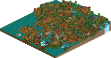
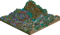
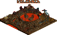
Corkscrewed Offline
BLUE THUNDER
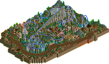
JKay make realistic coaster?! JKay not cause seizures? JKay show off more good coaster skills, continuing PT2 trend? Wow! Check it out!
Oh, and something about new realistic coaster supports from Toon that will revolutionize RCT coaster making as long as you can fit the object data files onto a map....
I thought it was okay. The dive loop right after that cobra roll would probably kill someone. Though, the coaster looked excellent with the custom supports. Great job on those.
And I thought the landscaping was done really well. It made up for the coaster which I didn't care much for. The archy was good too.
Though, I'm just excited to have the new custom supports. I can't wait to put them to use in the future.
Good job JKay (and Toon!)...
Edited by chapelz, 23 April 2006 - 11:12 PM.
Being realistic there were a lot of things wrong. and i will list a few:
1. The lift hill was just wrong IMO. The lift should have been hacked to be wooden rather then layerying the 2 together, or perhaps make your own catwalk (which you have done both). The catwalk supports (brown) were not needed.
2. The Supporting was kinda average for me. Most of it was not ''real'' but i can see you had fun with them.
3. The blocking was a bit crap lol, it stopped on the lift hill.
4. The spare train is facing the wrong way.
However....
there were some really great things, which i always expect from you.
1. Great colour choices (including coaster)
2. Landscaping fitted perfectly with foliage to compliment.
3. The pre lift drop was really nicely done.
4.Station had some great forms and i loved the queue line.
Basically what i'm saying is it was good but you have done a lot better, and i think that this was just to show off toon's supports.
..::RCTFan::..
The Supports are supposed to make rct coasters look more realistic, but in this case they didn't work out.
1. The Layout:
I'm still a bit dizy of it. You have like 20 left turns and two turns to the right. This has nothing to do with a realistic coaster and especially on a floorless coaster it would be great to see fast changes of left and right turns. What you have been thinking while doing the first drop is still a big mystery to me. At least you added a predrop, which gave it some realistic feel, but what's coming next shocked me a bit. You should have had two or three pieces of straight track then a turn to the right facing down and going over into a steep drop. This would be the most interesting for the rider and the most realistic in my opinion.
The Cobra-Roll after directly after the first drop is not very B&M-ish either. All the Floorless Coasters (apart from Hydra the Revenge) start off with a big Loop. So when you are trying a realistic Coaster Layout if would be best to stick to that. It's really difficult to get creative on a Floorless Coaster and make it look B&M-ish.
The Dive Loop-like think next was ok I thought, apart from that fact that 45mph at the top are much too fast. The left turn afterwards looked a bit crimped and the long tunnel part with the left turn was nothing for me either.
The left turn leading the track under the first drop was really good. That's something I want to see on a floorless coaster and I think it would be a lot of fun to ride that. (A one piece tunnel afterwards would add a lot to the experience though.)
On the next hill you built a break. I really wonder what that one is for. I mean it can't be a midcourse break as the Coaster comes in much too fast and would have to stop on a much too short piece of track, but you themed it to a midcourse break. Apart from that the Coaster wouldn't be able to get back to the station in case of a security shutdown which would be pretty expensive for the park.
The small loop afterwards shows what is really missing in rct. A medium sized loop, bigger than this one but a bit smaller than the big loop.
The left turn and diagonal airtime hill, was really good in my opinion. A right turn might have been better though.
The Interlocking Corkscrews are an element you will find on most Floorless Coaster aswell, so it was good to see it here, but I didn't like the turnaround track after the first of them. Again it is a way too long and boring left turn.
The turn to the right getting back to the station looks a bit like you didn't know how to really come back to the station. Some sort of helix might have helped there, but the track out of the station was in the way (which also looks a bit strange).
The breakrun was ok. I don't get why the last but one break on the straight piece is set to 13mph and the one after is at 18mph.
So all in all the layout didn't really look B&M-ish and in places very unsmooth. I have the feeling you rushed it way too much because of wanting to be the first using the new supports. This brings me to the next category:
The Supports:
First of all major thanks to Toon again for making those. They are a huge steep forward in rct parkmaking.
This is the first Coaster using them and I know that is really difficult and the supports aren't easy to handle at all, still I think yours look a bit cluttered.
Look at other B&M Coasters and you will see that they have approx. 5 supports for the whole lifthill. You have 10 or something like that and the supports for the catwalk.
I think less would have been more here.
The Catwalk:
Using the wooden Coaster track was ok I think, but as already mentioned above, people would have to jump down approx. 6 feet in order to get on it. Means this one doesn't really work the way it should. (Also have a look at this picture: http://www.rcdb.com/....htm?picture=13 )Then you have a second catwalk next to it, which doesn't make any sense to me. The wooden Coaster would be enough. Or if you wanted to use the wooden Coaster as sort of a safety net inbetween the catwalk and the track you would have to put those wooden parts on boths sides of the lifthill.
The theming was JKay style I thought. Nothing special though as it didn't give any special atmosphere or anything. The brown path looked way too bare and I didn't like the fact that the queue line was starting at the one end of the park and the exit paths ended at the other end. This is especially bad for families when children want to ride the coaster and parents are waiting. Queue line and exit paths should start/end at one small plaza.
Apart from that there were some positve things like the photospot and the queue line which was looking really good. You could have added some water there though.
I think it's not one of the best designs, but as it includes the new supports it's still a must-download.
(Sorry for all the bad things I pointed out. I know you can do better, but if you are going for something more realistic you have to strick to certain "rules" in my opinion. I hoped to see another try at a more realistic theme from you though.)
Edited by Magnus, 24 April 2006 - 05:16 AM.
And that left turn/right turn ratio is one of my least favourite things. I think it's what hurt Bacillus in Fatha's BGSS, too.
It's nice to see something different from you, JKay, and I think without considering its realism, this is a nice design. I probably have more issue with Croky's description of it than I do the design itself.
Congrats.
I BUILT THIS MERELY TO TEST OUT TOON'S NEW SUPPORTS, NOTHING MORE, NOTHING LESS. I DID NOT SET OUT TO BUILD THE ULTIMATE REALISTIC B&M ROLLERCOASTER.
I look at parkmakers like Phatage, posix and RCTFAN (and others) with envy wishing I had the wealth of knowledge they do to follow these so-called "rules" of realism in RCT. I guess I have a different outlook on the game. I see it more as a fun creative outlet rather than an excuse to demonstrate how much I know about rollercoasters or themeparks. I have nothing wrong with realism, its just not my main goal for playing the game.[end rant]
Anyway, some responses:
Drew - you're correct about the dive loop. thanks for the comment!
chapelz - thanks!
RCTFAN - You're absolutely right, refer to EXCUSE above. Thanks for the comments!
Magnus - Refer to EXCUSE above, but thanks for the deep insights. Good point about the left vs. right turn ratios, that never dawned on me till now. Hopefully I can take some of your advice to use in my next design. Big thanks!
mantis - good explanation of why this is not realistic. whats wrong with corky's description?
I guess Fantasy will probably always suit me better. I'll also agree that this is not the best track ever and maybe downright "unrealistic", but then again, I did have fun building it. Isn't that what matters?
Lastly:
CORK - Thanks for making this a design and another big apology for being so pushy earlier.
Toon - Huge thanks for the opportunity. I'm still in awe of how robust these supports are. I'm so honored that you let me release them. THANKS!
There is a second group of limited supports that included large tile versions of whichever pieces I was able to convert and a cut back version of the other supports. It is a little more managable in terms of fitting them into a full scale bench.
Complete Support Release
I can't imagine how much effort and time it must've taken to create this scenery set, Toon, although you've proven to be the master of custom scenery over and over again.. I've created a few custom sets myself, but those were just altered editions of already in-game items.. Even that cost me a lot of effort and time to just get the lining up and pixeling right (with the help of many trial & errors) so props to you..
Oh, and awesome logo there!
SF
All-in-all, I think you showed what could be done with the supports and for your real first attempt at a "Design", you done good!
James
Corkscrewed Offline
Hey man, I gotta sell the design. I'm not going to write "Here's JKay's Design. We're really using it to promote Toon, so go ahead and totally don't care about Jeremey." aren't I?
Good work JKay... and Toon, this should be counted as JKay's second joint design
While it's obvious you had fun with it, the ride just didn't impress me at all (not because it's unrealistic, but it didn't look good, flow well, etc.)
-ACE
Overall I thought it was good, nice design.
Also, JK, can you e-mail me the workbench you used. I'll P.M. you my e-mail if you can.
Edited by BchillerR, 24 April 2006 - 04:31 PM.
/RCTCA\
But yeah, PM'me or hit me up on AIM (i'm on right now) to get the bench.
You're a real master at composing the supports. Kudos, cause they're not the easiest to get right.... at least for me. lol.
Umm, I enjoyed the design. It was definitely different to what you do. The coaster layout wasn't my thing. I usually don't like cobra rolls as the first type of inversion. Also, the turn around after the first corkscrew to interlock into the second corkscrew was awful. I am sorry. It was just so weird and too contrived.
I enjoyed it though. There were some nice touches, like the the station. Great architecture.
Nice job overall, though.
Corkscrewed Offline
Anyway, for those of you who want something more, I'm sure Titan will come out with something everyone in the world loves within the next two years, only to be overshadowed by posix when he releases a zero-custom support RCT 2 design a week later that gets twice as many replies.