Park / Ever Upward
-
 30-April 19
- Views 10,231
- Downloads 500
- Fans 2
- Comments 23
-
2 fans
 Fans of this park
-
 Full-Size Map
-
 Download Park
500
-
 Objects
303
-
 Tags
Tags



How to vote?Round 2 - Quarter-Final 7
__________________________________________________________________
disneylandian192 forfeits
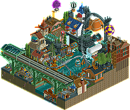
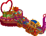
Xtreme97 - Ever Upwards
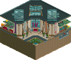
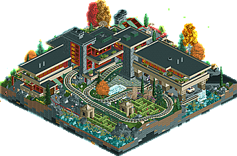
Jaguar - Woodland House of Tomorrow
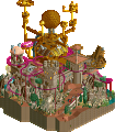
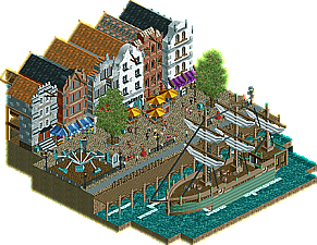
RWE - Drunken Sailor
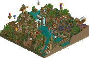
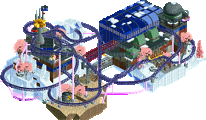
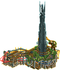
phann - Tower of Orthanc*
*Due to exceeding the maximum map size, Tower of Orthanc will receive a point deduction
__________________________________________________________________
First of all, check out all the entries in this match. If you can't view one or more entries, for example if you don't own LL, then please, do NOT vote. Once you've viewed all 4, select your favourite and second favourite in the polls above. After 3 days, we will close the poll, the results of the two polls will be added together, with the votes from the second poll weighing only half as much as votes from the first poll, and the 2 highest scoring entries will proceed to the next round. The third placed park will place its creator on the reserves list for the next round of the contest.
Votes are public and so any cheating of the system, betrayal of honesty or mistrust will be picked up on and will be dealt with.
So, Drunken Sailor missing objects? I can't tell if it's 3 or 8 cos it goes back and forth every time I try to load.
Same with me Kai... don't think it was exported
1. xtreme97: wow another awesome entry from you- congrats on entering the ranks of hyped parkmakers for the next few years. I feel like we've seen steampunk a lot of times (of which I've contributed many) but this still feels refreshing and original- maybe its the optimism and brightness this time? The coaster is a bit forgettable layout-wise but the colors work really well and the supports are sick. I like all the glass and movement and details everywhere which compliments the pretty good (if a bit all-over-the-place) architecture. anyway- really sick stuff.
2. phann: yeah yeah the tall one gets the votes, sorry steve . But the tower is so good! and the layout is really fun. Its maybe a bit 'unrefined' but still lots going on and a lot to love anyway. Is every entry going to be LOTR themed? Because I'm down with that. But, I think you might need to reel in your object choice just a tiny bit- those barad dur rocks are just awful. I know people saying that about objects usually bites them in the ass 3 years later but those are just bad.
3. rwe: respectable archy and boat. You definitely have what it takes to detail and make good archy in this game.I just want to see some more interesting park composure from you! Give me some rides and weird stuff, I feel like I've seen this before. Despite that, it is of course still quite good.
4. jaguar: I think I remember you being a bit rushed this round? Still quite a good entry. the building itself is great, I can't remember seeing that in rct before. The train and maze are a bit weird IMO- the train track is quite clunky and off-putting and the maze just sits there a bit awkwardly. I think a micro based on really inspired real life design and architecture definitely could be great but sacrificing some of that intelligent design and composure in favor of shoehorning in some rides doesn't quite sit with me. I'd have loved it if the map broke out of the square and really explored the landscaping and stuff in a more frank lloyd wright way, somehow. No clue what that means but that's the joy of creating!
RWE's file is fixed now.
Thanks,will look this evening.
1. Xtreme97: wow. This is some amazing work again. Steampunk is pulled off nicely here. Like the moving bits. The bridge reminds me a bit of Robbie's World's Fair.. but thats a solid park to use as inspiration. Is R2 the round of balloons?
2. RWE: Lovely archy. Nice call back to your R1 entry.. that was neat. The boat was done well too. Would like to see you do something every more detailed/wacky next round if you make it.
3. Phann: Tough 3rd for me. Really liked it.. just the object usage turned me off a bit. Going with LOTR again was cool.. definitely a stronger entry than your last one.
4. Jaguar: Amazing work with the archy.. just kinda torn because the train going through everything was distracting. I think RWE having interiors elevated his entry over yours.
This was a tough vote for me. Just figured I'd explain why I picked 1 and 2 the way I did.
1. Xtreme97: awesome, man. I was charmed the moment I opened it. the underwater seatube path, so sick. I'm not sure what it was about the coaster but I loved it; i dig the quirky layout and the way the colors work off of it's surroundings. despite all the different elements in play here, there's still good readability and not much is lost to the eye. really nothing bad to say here, just another awesome micro from you and i'm really excited to see what you'll come up with next.
2. Jaguar: a really slick map. the architecture feels refined and well polished. the train and maze I think could have been integrated better with the map, but it's not enough to disturb the vibe and atmosphere that you set up here.
3. phann: the tower was well done and clearly took a lot of skill to execute as well as you did. the coaster flows well with the map and don't feel forced. the ent holding up part of the coaster was a nice touch. I think the map could've used a bit more of polish to immerse the viewer in the atmosphere, but overall, this was a well executed entry.
4. RWE: lots of good archy on display here; it just didn't have me as engaged as the other three entries did.
1. Xtreme: While you're still one of my most hyped parkmakers after your first two entries, I think I liked your first a little bit more. I found this one a bit chaotic in comparison to the elegant composition of your R1, but still enjoyed this a lot. It actually reminded me of The Apprenticeship quite a bit in terms of theme and the layered buildings, ships, and bridges. Even though it was a bit overwhelming there was a lot to dive into detail wise with the markets, underwater path, and airship trolley being some of my favorites. Very excited to see what else you bring to this contest and afterwards.
2. Jaguar: Thought this felt unique and like you're gradually refining a distinct RCT2 style. Always enjoy seeing RCT that explores one particular architect or artists style, even though is rare and difficult to pull off. The ponds, gardens, and waterfalls are all great touches. Also can appreciate you sneaking in a tiny bit of WW scenery with the car and the pond object, which actually works fairly well, and also feels distinctly you. The train was a bit shoehorned in and left everything feeling unfortunately cramped. I think you would've been better off using the space to integrate the maze more seamlessly with the rest of the landscape. Overall another impressive entry though.
3. phann: Obviously a well done and skilled entry, but something about it, like your R1, still wasn't quite clicking with me. The coaster was col and the support work was well done, but it was also a bit hard to follow. The rockwork and foliage could use a bit more refinement throughout. Overall still a solid entry, hope to see more from you soon!
4. RWE: Another well-done and technically competent entry that didn't have enough special elements to it to stand out against the competition. The facades were mostly nice, but felt a little to homogenous in height and width even if the textures and offsets are slightly different. Nice work with the fronts and interiors though. The ship was nice, but at this point we've hit such peak ship saturation that it unfortunately doesn't stand out as remarkable. I did enjoy the frozen staff scene with the puke though.
So many matches, wanna get through, so just some quick reviews for now:
Phann - solid modern take on a theme first visited in MM1. Clearly yours and clearly unique however, and very well executed.
Jag - Loved this one. It's a lot more refined than your typical style and brings in a lot of unique charm, exploratory details, and is just a fun entry.
Xtreme - A bit glitchy for me, but so technically dense it had to take the top spot. Probably the best true steampunk take we've seen yet.
RWE - a solid, detailed, strong slice of park. Maybe a bit static, but a strong contender nonetheless.
1. Xtreme: How is it that you always seem to do an idea I'm going to do, before I do it? You know I love myself some steampunk and this was fantastic. Dense, beautiful colors, detailed, and overall fun and enjoyable. Love the underwater tunnels and the use of the curved glass throughout. The piston is great, and that airship is spot on. The coaster wasn't anything particularly interesting though, and I'm not a fan of buildings that end at the edge of a map. I think the composition overall could've been improved. Still easily the #1 spot here. Here's to your Semi's entry, very very excited to see what you'll give us next.
2. Phann: Wow, that tower is really really cool! I like the monochromatic detailing here, The also love the layout, it's creative and fresh, yet still aesthetically flowing and beautiful to watch. The double layer works great here to since they're so closely connected, but the grassy area could've used more detail / landscaping. The support work throughout was wonderful, I enjoyed the stick-thin scaffold aesthetic used here. Since this is LOTR based, some narrative through the use of frozen staff / scenes could've added additional detail to sell the concept. Overall I really really liked this, and am hoping you'll make it through to the next round so we can see more of what you can bring to the table. If you continue with LOTR, I would love to see your take on Minas Tirith or Rivendell.
3. Jaguar: Great to see a take on FLW's architecture! Always love seeing different styles of architecture outside of the typical found on NE, and this fits the bill really well. I think I would've liked to see more landscaping and natural foliage around the building instead of the train though, as it's pretty distracting running through the building like that. Not quite clear on the "interdimensional" aspect of this, maybe I missed something?
4. RWE: Simple and nice throughout. The facades and the boat are highlights, but overall there isn't much content to keep interest. I did like how you created the sails with crown molding pieces, a nice touch.
Xtreme97 - Solid stuff. Feels like Miyazaki tried to remake grand central. Well executed theme, good atmosphere, good archy, only downfall? I really hate the layout. This still gets my top vote though, it is overall a great micro. You've improved so much lately!
Phann - Had you not used the disgusting rock object (why? ;w;) and gone over the tile limit, I would have voted you as #1. This is some damn good LOTR, the tower is excellently pulled off, the coaster is cool and I love it. Support work is great and overall a some damn fine RCT. I agree with AVC's feedback about the staff or just doing a bit more to make it feel more set in middle earth and not a park themed to it.
You should submit this for design, imo
Jaguar - I love the theme, I love the house, I love the Frank Loyd Wright style in general, but dude, the train adds nothing to it at all, and the maze isn't inherently a bad idea, but it shouldn't have had an entrance an exit and looked like a theme park ride. They really brought down what I could have voted for 1st or 2nd place, I'm sorry to say.
RWE - It feels like 2017 TP but Liam and Leon came in and gave everybody lessons on how to build in Dutch Style. I love it, but it is less lively and engaging than the others for me. I think it would have been a really good section of a larger park, but felt flat (not in the vertical sense) to me
I was in love, by the buildings that Jaguar created in this micro work, intelligent architecture, it seems real.
Also in the same way very rich in detail, and I love train.
RWE made a very cool ship, I'm not a fan, but I quite enjoyed it and its beautiful buildings with interesting details.
Phann your tower became animal (that is praise), high this is cool, I loved the structure and colors, along with the details.
The roller coaster is very good and I like underground, The paths you used were 10.
Your tower reminded me of THE LORD OF RINGS
Ever Upwards - Lots to like here. Huge number of details. Feels dense and complete in a way that few other micros do. It doesn't quite have the combination of perfect everything that Ascension did, but pretty much the only nitpick I can think of is I wish the clock theme had been more prevalent, maybe put on a more central or larger structure than on a small house behind the bridge. Still one of the best of the round.
Woodland House of Tomorrow - As a study of architecture in RCT, this is masterful. The RCT-ness of it almost takes away rather than adds. The train seems out of place.
Drunken Sailor - Really succeeds on atmosphere and believability. It's not as active or flashy as other entries, but there's nothing wrong with it. Lots of little details to love, and the ship is great (although the dramatic up-tick in number of ships has not gone unnoticed...). Maybe a water ride of some kind along the docks would help tie it together more than a flat ride?
Tower of Orthanc - Super ballsy theme, probably a little overambitious for the space. Neither area really gets enough space to breathe, but the tower does feel appropriately tall. The tree ent also looks pretty good.
Highlights
Ever Upwards: steam sounds
Woodland House of Tomorrow: architecture
Drunken Sailor: little scenes representing song text
Tower of Orthanc: tower
1st - Xtreme - Steampunk thing
Another high quality micro from you. This theme has been done quite a bit, but I really like how colorful yours is. As is the nature with micro parks, it's a little too crowded but thats to be expected. I love the underwater parts, and the coaster layout is fun. I'd love to go on it! Looking forward to what you do next.
2nd - Phann - Fly You Fools
Where did this come from? So much better than your first submission! I love The Lord of the Rings, and I think you captured it perfectly. The coaster is fantastic, and the colors you chose were perfect. Very nice job!
3rd - jaguarMan - EPCOT House of Tomorrow, presented by Frank Lloyd Wright
Shame that I couldn't vote for this one as well because it's executed very well. I just think it's a tough theme to execute in such a small space. The train and the maze end up cluttering it up as opposed to improving the map. I'd love to see this in a larger map with a lot more space around it. The architecture was perfect.
4th - big Wacked - Boat by Buildings
Your execution is good, but the concept unfortunately doesn't lend itself well to the competition in my opinion. The details are great, and I like the frozen staff singing the song from the readme. Hoping to see more new projects from you soon!
Xtreme:
Awesome micro! Very nice color scheme through out! Great new complementary objects. I'm digging all the sky ships, each having their own twist and nothing repetetive (of course also because some of them are their own object). All those glass tunnels worked really well, as does the train bridge. What disturbed me was the glitchyness of the entry. For example why did you take the objects for the arches on the bridges and no track? Should glitch less! All in all just good work, maybe on the outside facades a little featureless.
Jaguar:
Cool archy, it's like the small brother of E.V.I.L.! The trainride through the garden is forgettable. Moreover, I felt you overdid it with the butterfly object. What I liked was the different types of rock on the outside of the land blocks. Nice idea and added to the realism. In the beginning I was not convinced of your entry but the more I looked at it the more I liked it. Close 2nd place for me before Phann.
Phann:
The tower is really badass, as is the Ent creature (I believe it is one, never seen LOTR..). I did also like a lot the coaster, the doubled inversion looked cool. I did not like those rock objects, especially the black ones, also the edge to the background on the lowest level does not work for me like this. Being ignorant to the theme and having only seem some pics and the typical meme stuff I may get lost on some stuff. Also, even though there will be some point deduction the (obvious) oversize I'll count as a negative point which is the reason in the end why I went with jaguar for second place. Nonetheless, good entry. Especially that the tower is nothing repetive and nice to look at is a great achievement.
RWE:
While this entry is okay it doesn't stand up against the other three. If you concentrate half of the map on the ship you should be sure to make it also visually the centerpiece of the creation. Unfortunately, the ship lacked a bit in execution and didn't feel very well thought out. The streetscene was nice to look at although I don't know what to think of that flatride. All those little singing guys all around were a nice touch. The street facades of the buildings were nicely done and each building has his little own character. Especially thanks for using the RCT default colored pirate roof object, loved to see it in original once again! The interiors on the other side were lacking though and felt uninspired. 5/6 of the rooms were just spammed with barrel objects. The reference to your R1 micro to me feels a little forced. Sorry for the harsh words, I think you can do better!
1) Ever Upwards - Impressively packed in here and pretty readable. I think I liked Ascension a little bit more, just for the fact that it had fewer, stronger statements which made it a little more direct and confident. I do like the theme with the steampunk and whimsy strewn together. The composition was really nice and the only thing I didn't care for was the balloon ship cut in half. It's a little bit like Steampunk Corsair which is perfectly fine with me. You're one of the top performers so far, so ITM can have to deal with you now.
2) Tower of Orthanc - This one does feel really huge, not in terms of verticality, but in the actual tiles used. I don't know how much you went over, but it at least appears to be a lot. I think it would've taken my vote if there was just a little refinement given to it. The blockiness of the underground layers and landscaping were the weak points for me, but also provided it with its strongest aspect - the adventurousness. Throw in some natural arches in the columns, some diagonals in the landscaping, and cut a little bit of the repetitiveness in the fiery area and this is a homerun. Close to taking my #1 vote, as it has some of the strongest parts, but I'm glad to see you back and hopefully you can iron out the last little bits of technical work moving forward.
Woodland House of Tomorrow - It may just be me, but it feels like you went restrained compared to your usual work here? I like the Falling Waters look, even if I think Frank Lloyd Wright is overrated as hell, it does look pretty cool. I'll admit I didn't quite get lost into the theme, so maybe that's one of the main areas that held me back from giving it a vote. I liked the edges with the rock layers, which was probably my favorite little detail, but I wish it didn't have to be done with the repetitive blocks. It also feels like it really wants to bust out into something more wild, like a huge underground hidden area.
Drunken Sailor - Nice, no complaints from an execution standpoint on this one, but there's really no scope here. It's a nice ship with a line of buildings I feel like I've seen a billion times now. Thankfully you've done some underwater work, which I alway appreciate. But after that and the ship, there wasn't much for me to get into or lost in. I think it's your best work yet from a technical standpoint, but probably your least interesting thing from a conceptual point of view. Has the same feeling as MK's R2 entry which is going to make it tough to vote for in a competition such as this, but easy to appreciate on a large scale level.