Park / Doc's Haywire Adventure
-
 29-April 19
- Views 11,422
- Downloads 477
- Fans 0
- Comments 24
-
 No fans of this park
-
 Full-Size Map
-
 Download Park
477
-
 Objects
131
-
 Tags
Tags

Looking forward to seeing the next two entries from you two!
Congrats for making it this far MrTycoonCoaster - I really enjoyed your park. Hope you submit a reserve entry!
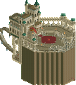
1) 1K Museum - A funny idea and was really enjoyable to view. Really, it was the clear winner for this match for me, but it might've had a little tougher time in some of the other matches. There was enough interest thrown in here for such a tiny but fun concept that it held my attention for quite a bit. And the fact that it's built out of 1K objects itself is pretty cool too. Looking forward to what's next from you.
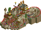
2) Writer's Block - Here's an interesting situation where I run into a round where I don't want to vote for second place, and I didn't because I forgot to place my vote. Honestly it was fine, but I'm mad that this is what you're going through on. The layout was pretty good and it was classy, but it didn't feel like a Liam park or accomplish anything in particular. I'd be much more interested to see you build like this in a large park, but for a micro, I couldn't keep my attention on it. But I understand it was done probably in a couple hours so it's pretty good work considering that.
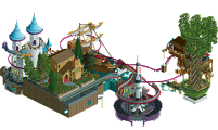
The Tower - I liked this one better than Ghost Park. It has some hints of some of the old builders of this genre like Beejer and ja227 himself, but is held back by its own blockiness and symmetry. You've got to break up some of the large forms you're putting in with some variation or things interrupting it. It will add a huge dimension to your work as it's finally starting to come along.
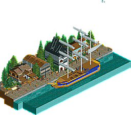
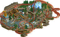
Doc's Haywire Adventure - Sort of ended up being like Drunken Sailor and was a sort of awkward pseudo-NCSO. I think your R1 showed way more promise even if this one was constructed fairly well. Just not much scope to this one and it felt incredibly tiny, or it was just that empty water and path was a big portion of the map.
This is weird, I am not in the contest and made an entry for it... kinda, lol. Loved the museum and all the details. Sadly, I honestly didn't notice any spelling errors... Liam's entry is such a joke. A theme to not having a theme. He just went into default Liam mode and got a win, likely having only built for half a day at most. This is not a one-hour challenge, you'll need to turn it up in R3! The tower was pretty fun, loved the timing on the coasters/effects. Wacked with a nice dockside theme, just the ride seemed the fly into stuff.
Liam- I can tell you pushed the easy button here and phoned it in. It's pleasant, but you can certainly do better. Nice enough layout though loses points for no brake run and a 9 car train. The pacing isn't fantastic in places, but it's still fun to watch. Architecture is passable, though it doesn't really speak to the theme whatsoever. I guess on the whole it's mostly the fact that I know you can do better that I find disappointing. I'm sure you went in strategically here, but I do hope you put something nice together for R3.
Tolsimir- Super fun and creative. There's enough established members here to get all the references and you certainly packed a bunch of them in. The details like the poker tables definitely made it 'Kumba' and the more subtle stuff like the catwalk colors next to that are pretty clever. The frozen staff meet and greet was probably my favorite part. I do wish you had some more spelling mistakes and it would have been near if you could work in a crazy coaster like that one in Virginia Key. But the clear winner here-- hope your R3 park is equally clever.
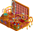
Mr. Tycoon- This is cool. I'm not quire sure what I'm looking at, but it's cool. The synchronized coasters are fun to watch and I like the sound of everything. The air launched coasters make for a nice wall structure at the entrance. It's a great use of trackitecture as a whole though I think I'd like to see more of a purpose to your next map. You're improving so rapidly-- it's been very fun to watch.
Wacked- Unfortunately you got out-detailed this round. It's pleasant enough, but I'm left looking for more. Ship, path, row of buildings has become something of a trope for micro parks this competition-- we've seen more than a few. The ship is nicely built and the seawall using a couple kinds of materials is nice less visible detail. I also like the sunken wagon looking like more supplies off to the side. More scope, detail, and things to look it will really help you next time around.
1K - I missed MM1 and MM2 (and a whole lot more), but this is classic! A joke, but a well executed one. For something that focused on interior detailed rooms, this does what it needs to. Dunno how to make objects, but I love how there's a whole room for the aerial as an object. Sweet.
Tower - As much as I like fantasy, I'd never try something like this and respect those that try. There's so much going on from a sheer coaster count to look mechanical. I really like the yellow/grey/black look for most things, well balanced here.
Block - I like this a lot, but it feels like Wacked's Round 1 Wyvern entry which I really enjoyed. It's a great layout, and scheme, but not as original since I can't shake the similarities, especially since they both lean downhill. I do like the station house quite a bit though, fits the surroundings well. Good luck in Rd 3 tho, looks like you're onward!
Doc - Speaking of Wacked... I like the classic sailing vessel, the rest is a bit less? Not as detailed as the first round entry, where I loved the coaster that just rolled out and went on its way. With this, I'm not sure what the carriages are supposed to be doing honestly. Sorry if you ran out of time, but glad you didn't forfeit.