Park / Kukuana
-
 17-September 06
- Views 14,787
- Downloads 1,158
- Fans 9
- Comments 89
-
 81.88%(required: 70%)
 Gold
Gold

Liampie 90% no Xeccah 90% no G Force 85% no Steve 85% no trav 85% no Coasterbill 80% no SSSammy 80% no Kumba 75% no posix 75% no ][ntamin22 75% no 81.88% 0.00% -
9 fans
 Fans of this park
-
 Full-Size Map
-
 Download Park
1,158
-
 Objects
353
-
 Tags
Tags
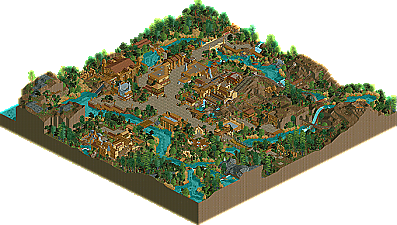
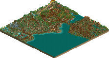
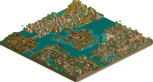
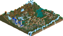
LoL^, many builders and captains could and would have said the same of their parks...."if" it was finished,
but it seems a bit of a strange thing to say when the park (even after getting many days extra) was indeed so far from being finished that what was there could not even be put up for a fair competition ??
I agree with you though that the atmosphere of KuKuana is excellent. never seen such a skillfull and tastefully use of what the game has to offer as here. I've never been in the midst of Africa either, but I guess if they would have a small spot there that would have a kind of a modest "amusement area", -without just having imported loads of "western" things - it could very well be this one.....
Edited by Emergo, 19 September 2006 - 08:34 AM.
It looks like the two parkmakers of the no-sent park don't want to have an unfinnished parkmaker reputation...
I really like the park, quite innovative I think (those statues with argonath objects)... I also liked the way you made the landscape... But it looks too similar to Mamba Kilima to my eyes...
Edited by RCTFAN, 28 November 2006 - 11:09 AM.
I don't really want to defend this, as I honestly don't think it needs it, but there seems to be two camps of people from the feedback. The first camp are saying "it's a beautiful park, the atmosphere is good", and the second camp are saying "ugh, it's just another park that looks nice". Honestly, this park is neither, and the one thing that was key to this park's construction (for me, at least) was the idea of practicality over aesthetics. I think this is the most practical park i've ever been a part of, the sheer number of details we put into this should give people enough to look at/for for a good few hours, but it seems no one can be bothered any more. Little things like every ride having disabled access, one even has a lift for wheelchair users as there's no room for a ramp. Things like custom made queue lines that take the person on a journey, not just to the ride. Things like the mine train station having a yellow "do not cross" line on it. Things like ruins scattered around, with restoration work clearly started, but not finished, and the ominous volcano sitting above everything bubbling away... I really think that this park is the pinnacle of my personal achievements in RCT, I don't know where I can go from here. Every single piece of scenery was put there to create a feeling, a sense of place. I don't have the time or inclination to answer everyone's comments, but there are a few I feel I need to answer. Mostly those whose opinion I value.
X250 - Interesting that you say this reminds you of Katanga, and has a Tussauds atmosphere. This park was built as a replacement for Katanga Canyon, and is meant to be a small area of a larger park. Maybe one day we'll make that larger park? Who knows...
Artist - I personally think that the custom scenery that was in this park allowed us to go into much greater detail, something that was required in order for the theme to really be hit home. I like most of the scenery here, i'll definitely use it again if I make anything. The boats, we liked. Yes, they're not THAT different from the original boats, but it's just another little touch that we felt added to the experience.
Ed - Here goes nothing. I'll try to address some of your points, at least. Firstly, I personally think that the park relates to the story very well - there's the volcano, for starters, and the obvious ruins of a time forgotten, all mysteriously abandoned. We wanted the park to feel very wild and ever so slightly abandoned - hence the lack of signs on buildings. This meant that guests would have to actually "explore" the area to discover things about it - which would immerse them in the story even more. I'm sorry you feel that way about the custom scenery in this park, but again i'll say that I feel a lot of it was needed in order to go that little bit further into the theme than others have before. And as to what you say about RCT being an exercise in assembling bits of scenery, you may be party right. However, a little arrogantly maybe, I challenge anyone else at this site to put those scenery bits together in such a way. No one's done that theme before, really (apart from Mamba Kilima in week 6, damn you X and chapelz!), and in my eyes it hasn't been done better, or even as well. You don't think that this park has good rides? I respect your opinion, and I certainly haven't ever built a ride that's anywhere near as good as most of yours, but I think that the mine train is very good. Please imagine being on the river ride, I know i'd love it. I'm sorry that the river ride doesn't work for you, it worked for me when I tested the saved game for a good 30 minutes after I saved it. You don't think that this park has good ideas? Take some time and look for all the little details here. In a few days time, i'll make a post with screenshots showing just some of them. I know details =/= ideas, but I hope you get my drift. Also, one other thing - in response to this quote - "all you need to do is stack enough shit on top of itself until it looks good." I don't agree. If you stack shit on top of itself, it won't look good. If you stack stuff on stuff without thought as to what will work and what won't, it'll never come out looking good. That takes skill and a certain eye for what scenery works with other scenery, and also a vision as to what you want to achieve by making the thing in the first place. I'm rambling now, so i'll stop, but I hope some people at least read that and try to make sense of it.
trav - One sentence annoyed me - "making it more like how the game is meant to be played". We've been through this, we all play for different reasons, so to attack a park because it doesn't fit into your favored category is slightly closed-minded.
Panic - It would have been interesting to have faced off against your park, to be honest. It sounds awesome. I hope it gets finished so I can see it sometime.
I'll stop here, but I really like this park. Best thing i've ever done, for sure.
Edited by chapelz, 20 September 2006 - 12:59 PM.
Basically the whole idea came from my A2 graphics project where i designed a replacement area for Alton Towers which ended up being Katanga canyon. From that i started thinking about transfering it to RCT and i have tried once or twice but never got that far becuase it didn't feel right.
Then H2H4 came along and i thought it would be a perfect opportunity to try this again becuase it would fit perfectly in a 60 x 60 bench. Jem agreed and started it since i was having some computer problems and posted some of his first screen shots which i fell in love with.
From there it has taken it's own rollercoaster ride to how you see it now. The emphasis on the park, as Jem said, was mainly practicality. I designed it so that it could be an area in a theme park all the while carrying on the feeling of being in Africa, themeing that only Disney and Universal can pull off.
You will notice a lot of details in the park but you will have to delete things, move things to get to some of them. Try looking at the park from the guests point of view and see how different it looks. Try going round in a wheelchair... .
As for what Jem and i made, we both made a station each, a main facade each, entrance area, etc but the main thing that linked our styles together is that we finished each other's buildings. We added our own details to the other's buildings to help the styles blend. I hate duo parks where it's simply 1 parkmaker on oneside and another on the opposite side. That's not a park in my opinion.
Custom scenery-wise i think helped the park reach a different level of atmosphere. As i said before i tried this on my own a few times but never liked it. I'd still go as far to say i don't like it now but it's the best we can do with the time and objects available.
I don't know how to end this rant but i'm quite angry at the people who have expressed a dissapointed view towards our parkmaking abilities. Custom-scenery is a matter of taste but why then don't you ignore them and look at the forms of the building, the space it uses and they way it interacts withit's surroundings. How does this add to the atmosphere? How would it look if i was standing inside? When was it built? You have to start asking yourself questions when you look at parks instead of dividing your opinions into good and bad.
As for the way the game is supposed to be played (Trav i think) is being very ignorant. Everyone plays it for different reasons as Jem said. I don't go around the forum flaming parks that are not realistic, therefore i don't expect you to flame ours simply becuase you don't like it.
Laslty then i'd just like to publicly thank Jem who has helped to bring this idea of mine to fruition and inspired me for life.
And after all that ranting i'm gunna end on a sentence that goes against everything i have just said.
Remember, it's just a game.
RFan
I demand to see your coursework!
-X-
(moved it to "favourite park of week 7" where it was intended for)
Edited by Emergo, 21 September 2006 - 09:35 AM.
I liked the map very much, but it wasn't really a park but rather a section of one, even the entrances to the area signify that. I'm not saying this is a bad thing, its just an interesting and different take on what h2h parks are, and it was very fresh and delightful.
Well, for one thing, I didn't really dislike the park if my post made it seem like I did. I have two typical negative responses. One is if I really don't like something. I'm usually fairly generous there. Even if I hate something I point out a few things I don't like and leave it at that. And the other times that I respond negatively are because I see something that a lot of people are going to like and there's a particular reason why I don't agree, and in those cases I try to point out why it is I have a difference of opinion. And that was the case here. I think the park is well done for the most part, and particularly in how well you use the scenery. The buildings were very nicely detailed -- and a lot of that is because you picked good scenery items that go well together and used them appropriately. But that's also the source of the problem for me. It isn't even that you chose bad custom scenery. This is all pretty good. It's just that the whole look of the map is determined by the custom scenery.
Let me try to explain that better. Take the trees for one. On an aesthetic level they do create a distinct look. It might not obviously be Congo rainforest, but if you tell me that's what it is, I'll believe you. When you create a new look, it's fair to let you define what it is. But then looking deeper, basically its a few trees repeated over and over again in big clusters. So maybe it does look good, but is it more because of your tree placement or because you simply picked good looking scenery? I guess that's why I don't consider the trees to be a very important part of making a park because that's all trees have ever been, proper scenery selection. And that's the same type of problem I have with all of the scenery, and it isn't limited just to this park. I'm old school. To me parkmaking is all about manipulating familiar elements in an unfamiliar way. You create a unique look by using things in innovative ways, not by selecting an appropriate collection of scenery and walkways and putting them all together in a logical way. And you can still use things in an innovative way in RCT2, some people do, but the overwhelming majority of parks don't simply because there's no reason to. Why challenge yourself to create something completely outlandish like the stuff cBass does when you can just place scenery and make it look great? But the cBass stuff, that's what jumps out at me as just really good ideas. And my big thing is that I much prefer a good idea with decent execution to a decent idea with flawless execution. I used to love realistic parks, I used to make them too, but I guess I've changed in this regard. I'd much rather see something interesting than something beautiful. In fact, ugly is usually more interesting than beautiful.
And your rides aren't bad at all, just the sum of them isn't that impressive to me. A river ride that travels around in a circle is a nice kind of atmospheric supporting ride, but not really a main attraction. I do really like how the water circles the city, but that doesn't make the actual ride any more interesting. I guess it's broken down because of the RCT2 hacking issue, but if that indeed is the case, could someone please explain to me why I have to keep installing this RCT2 reliable patch when I've already done it a half dozen times. Do I have to use it every time I download a new park? That's not your fault, it's just something that doesn't make sense to me -- and it's preventing me from seeing people's parks the way they intended them to be seen which is annoying. The mine train is definitely a nice main attraction and it fits the theme well. I guess the thing I didn't like about it is that it's off in it's own little section of the park and the only interaction it has with, well anything, is the little pass by the waterfall, the station pass-through, and the little buildings near the end. It's a nice little ride, but it doesn't help bring the park to life. And when pretty much the whole rest of the park is static scenery, that becomes a bit of a problem. And I've never been a fan of custom flatrides that sit there and do nothing. Even when people were making them in RCT1. It's a nice little exercise in sculpture I guess, but I like rides that move. Certainly not a negative, if you can do it great, but not as much of a positive for me as it is for some other people. So when I look at the park with my "ride" glasses on, I see a lot of empty space and a river ride that goes in a circle and a mine train which is pretty good, but not really anything special to me, and that's it.
But I guess the best answer I can give you is that you're right. It is a very good park filled with lots of very nice buildings and even some particularly cool details like all the station buildings and queue lines and the custom flat-ride and especially all the little details on the buildings that you must have spent so much time on. And I saw all of that, and was impressed by it, but at the same time I had very little desire to explore it all because to me (old timer that I am) it's so completely contrary to everything I'm used to about RCT. And I think this is the same problem I've been having with LL lately. When you make the scenery disappear, everything disappears. How am I to distinguish the buildings from the scenery anymore? And that's what scares me about making an RCT2 park. It so overemphasizes that one aspect of parkmaking, the scenery part, that it would be easy to focus on that at the expense of everything else. I don't really want to spend hours piecing together little bits of scenery. That's like building a model. I spend hours hacking rides and coming up with little ideas I haven't seen before. That's what engages my creativity. This whole RCT2 business just kills all the fun for me.
And bascially I'm finding out that everything I always liked about parkmaking doesn't even apply anymore. What people call great landscaping looks overdone and tacky to me with little 1/4 tile arches everywhere and little 1/4 tile waterfalls too and rapids that all look the same. What people call great use of trees is not much more advanced than picking the right combination and slapping them down until there's no more blank space. And a completely generic coaster somehow becomes "amazingly realistic" when you tack on a catwalk and custom supports and a mid-course brake and so on. And whatever happened to rides that aren't basic coasters? The splitting coasters and the luge machine coasters and the shoestring coasters and so on? If I see one more RCT2 park with a B&M super-looping coaster with custom supports I think I'm going to puke. And buildings used to be about form. You had no textures and one type of window so to make a variety of buildings you really had to pay attention to the basic shapes and the rooflines and the angles. Now it's a lot of stacking blocks and walls and then stacking window scenery and then stacking little custom-made arch and overhang scenery pieces. You've got a custom made piece for every occasion. You can basically make a big giant block but if you put enough little windows and custom beams on it, it looks good enough to qualify as "great architecture". That's my problem in a nutshell. I've been evaluating parks for years on the basis of certain criteria, and now the rules have been completely re-written. I don't think it's even fair to call people who use RCT2 and people who use LL both parkmakers. They're two completely different ways of thinking--two completely different skills.
I guess the real litmus test is the 'Favorite Park of Week 7' topic. If you liked Kipper Amusement Park more, than you're like me. If you liked Kukuana more, than you're not. And I'm not trying to say that my taste is any better than anyone else's. I think a lot of it is just plain stubbornness. I see a park like Kipper Amusement park and I go "ooh RCT-goodness, I must explore" and then I see a park like Kukuana and it looks great and I respect all the work that goes into it, but I don't really want to explore it either. I want to frame it and hang it on my wall maybe, but otherwise that type of detail is really lost on me. I respect, I appreciate, but for whatever reason I do not enjoy it. I felt the same way about Tierra Aventura. And pretty much all of the RCT2 spotlight parks too, except RoB -- which I think is a good park but not a great one.
I'm trying to explain why I feel the way I do, and I don't think I'm doing a very good job. It's a nice park, I see the details, I'm sure you both put a lot into it, but this kindof thing just doesn't interest me anymore. You could build the fanciest most kingly throne imaginable -- it's got this beautiful carved relief of the royal seal with diamonds and rubies embedded in it, and velvet lining and gold trim -- but it's still just a chair right? If I build a rocking chair out of plain wood I've already got you beat. That's what I'm getting at. People are looking at the gold and the velvet and the diamonds, and I'm simply asking "but what does it do?"
I'm glad that you took the time to post that, because I now understand why you feel the way you do. And I understand, I really do.
In fact, you've made me want to take up LL again, just to see whether I can do it at all. It would definitely challenge me more, that's for sure. Less tools, as you've said.
I didn't really want you to feel bad about what you've accomplished, I just wanted to express a different kind of sensibility.
It was a little annoying in this case because I felt that because this wasn't in a match up, people didn't look at the park as much as they would if it were against another. And to be honest, the positive comments annoyed me as much as the negative ones, as apart from a few cases, there weren't any people who seemed to look at the park for more than a few minutes. And I do think of RCT now as a little bit of art. I've created something, and of course i'm very happy with it, but I want to share that with everyone else. It was if i'd spent years adding little bits to a painting, and finally this painting was ready for the world to see. But when I unveiled it, people just went, "yeah, it looks nice" and walked on to something else. I'd prefer someone to analyse it a bit deeper and spend more time looking at it, regardless of whether they actually like it or not. That's why I really value it when people like yourself take the time to really go into depth with your feedback, and get a little philosophical with your posts. I find that much more interesting than "it looks nice".
when you make aqcaintance with the codex-trainer for LL, you go wild about it.
Nothing wrong with that as such.
But....ehh...it is a thing that opens special and easier ways to get what you want to get things realized in LL. (just like scenery is in RCT2)
And at the same time you are constantly hammering down on things in RCT2 (which also opens special ways and "easier" ways to get what you want to get realized)
I don't see that much of a difference......at least not the "big" difference that you try to advocate......
Both type of games have their own limitations/development/credits and expectations, don't they......?
Why not trying to "judge" and enjoy them on their own merits instead of focussing on "difference/"more" skill or whatever...?
I made this comparison before somewhere, but why trying to discuss whether a horse-cart-race is so much more better than a Formulae-1 race or v.v.? they both have many things in common, as well as many things that separates them.....just try and see them in their own light, while their goals (winning that race in the best kind of fashion and most beautiful/skillful way for their type) might be the same but with other means....
(and as I explained in the other thread, I still cannot take my eyes off of Kukuana)
Edited by Emergo, 21 September 2006 - 06:56 PM.