Park / Where the Sidewalk Ends
-
 29-April 19
- Views 10,743
- Downloads 593
- Fans 0
- Comments 28
-
 No fans of this park
-
 Full-Size Map
-
 Download Park
593
-
 Objects
288
-
 Tags
Tags
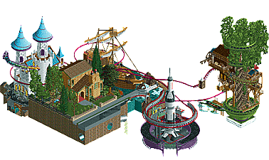
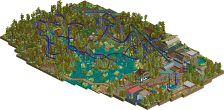
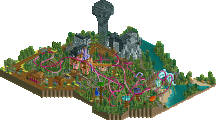
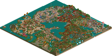
Great matchup! I had trouble picking a clear favorite as I liked them all.
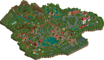
Dirt: I really have no idea what's going on here, but the aesthetic is lovely. It's like a painting. The coaster isn't my favorite, but I do like the supports. The area development around everything is what wins for me. The landscape in between the buildings and the softened edges to the black tile is great. The foliage is pretty non traditional, but the greens, tans, and red of the landscape work super well together. Architecturally there's a lot of detail in the buildings despite being a lot of 2 by 2s or 3s. The moon set among the stylistic clouds really makes the whole thing. So while I didn't understand it, the park got my vote.
Mav: For 5 tiles across, this is a shockingly good coaster. Very much in the spirit of Steel Curtain and with a full 9 inversions as well! I thought you might go for the airtime hill and roll underneath combo, but what you do have is great. Top notch support work that looks as complicated and painful to build as the real thing. The way the cobra roll wraps the station is quite nice. The architecture itself is kind of simplistic, but still have some fun details like the fountain of tears on the side of the station. While I'm not a Cleveland sports fan by any means, I know enough to find the jokes amusing and appreciate the detail. Nice work!
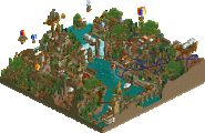
ITM: This is super detailed and very cool though like Dirt's I'm a little lost on what's going on. The various vignettes work well on their own though I'm not quite sure the transition between them really exists. It's cool to see the single rail flying coaster since we really don't see that much anymore in game, though I'd love to be able to watch it more than once without having to do anything. The creative reason behind the 1 rider are sort of lost on me, so I guess I'd much pretty to just see the coaster operate. I think my favorite bit on this might be how cool the water looks with this palette. On the whole a good entry as well, making this a tough round to vote on.
Dr Dirt - So I think you ended up rushing this but in your attempt to build a quick micro you actually managed to present a really cool art style and theme. I love it! It may be more simple than your usual entry, but it is very well done. Is that ride type a Vekoma Stingray? I'm blanking on the name a bit but this comes to mind. We really don't see enough of these in rct, but I think there's been a bit of a resurgence and I love it. The layout was really great and it integrated into the map excellently.
Ok Ling I really don't know what you're on about here, I just did a quick count and I couldn't get the exact number down but it doesn't seem to be going over the limit at all and if it does it is maybe 1 or 2 tiles? When I raised a 15x15 square in the middle there was enough tiles outside of the micro on the corners of the square to make up for the remaining tiles not covered in the 15x15. I hope somebody does an exact count here because it would be a shame if this broke the rules, but I can't seem to see how it does based on my rough estimate.
ITM - This is one of those park ideas I think everybody has had before but not enough have tried to execute. I just have to ask, is this a reference to The NeverEnding Story? I've never seen the film myself, but when I noticed the dragon flying around all the the fantasy elements it just felt like what I've seen of the trailer and heard about it. Kinda cool if so.
The actual RCT here was good, but I wasn't a fan of the way the four islands were composed and connected macro-wise. I think some sort of flowing, singular landmass would have been more immersive, but these chunks of the map are all great in their own right (the rocket feels stolen though lmao) and the story being told is heartwarming. The micro was good, and I did like the coaster. Lots of great stuff in here, just not as cohesive as Dirt's entry for me.
Maverix - I don't quite get the theme, I think it's an American football thing? Is it Cleveland Browns? That's all I can think of off the top of my head, iirc they are like, kinda a shitty but well loved team I guess? We have a few like that here in AFL. Anyway, S U P P O R T S. They were cool as fuck. The layout was too! I don't really know if this is supposed to be realism, because the coaster seems a lot more RMC or Premier than S&S, but it's really unique, interesting and aesthetically pleasing (although I'm not sure how I feel about there being no merges in some areas to make things smoother. It certainly looks a bit more clean this way at least), in terms of layout. I think the way you went for a really long and skinny map shape like this is refreshing.
Here's the thing that made this fall flat for me: The colours fucking sucked dude. I get the theme, kinda, but honestly I feel like you should have handled it differently or picked a different theme for the same coaster because it just did not work at all. So much clashing, it was garish. The Coaster station was cool, but the restaurant felt really bland and I didn't like the texture work. Honestly the archy would have been so much better if it was in a different context. It really brought down what would have otherwise been a much more well loved release for me even with all the things in it I don't understand.
There's references and jokes here I clearly don't get, so I'm going to try and not judge this based on any of them, but overall this really didn't mesh for me and was a bit of a letdown. It has a lot of potential though, and I think a lot of the concepts you used here would be incredibly effective and much more engaging if they were used in a different release.
Highlights
Where the Sidewalk Ends: black water
Blood Moon: fringy black tiles
The Dawg Pound: supports
ITM:
Really liking the idea, especially the opening with the guy actually floating off the sidewalk. All the little scenes by themselves are really cool, I think the connection by the band/track worked quite well. On the detail level these scene were ace, I think my favourite is the rocket site. The only downpart was the actual sidewalk/house and this took even a big part of the micro. It's clear you need it to give the rest the right scope but I felt it was a little life and loveless compared to the rest.
dr dirt:
On your micro I am quite torn. I think the atmosphere is actually very convincing and the theme translates well. Also the blacktile edges are a super nice idea. What I didn't like a lot were the new objects. They do not really fit in and disturb the visuals. Also the texture work in the archy is quite blurry making it hard for me to appreciate it 100%. The supportwork on the coaster is ace, also the color makes a nice contrast. What I didn't get is why you take the effort to do these cool supports but then have the coaster in the same time clip through walls and ground. The drop tower next to the moon was a cool idea.
Maverix:
Impressive how you squeezed in the coaster. The downside of it is that your micro 90% consists of only coaster and supportwork of which the color scheme is quite a torture. So most of the other stuff is hidden behind supports, and when there is a viewing window you put there a bunch of trees as on the station or theres an interior. With these I have the problem that you (again ) have paper thick buildings with supports ending on the rooves. The underground stuff made no clear sense to me, however I liked the footballfield by itself. Sorry, but with this micro you couldn't convince me.
__________________________________________________________
Winners
inthemanual: 22 + 13/2 = 28.5 points
dr dirt: 19 + 17/2 = 27.5 points
Eliminated
Maverix: 9 + 20/2 = 19 points
__________________________________________________________
inthemanual and dr dirt proceed to Round 3.
Maverix is eligible as a replacement for Round 3.
Congratulations to the winners!
I wasn't really expecting a win here, and I had to do this micro essentially in an afternoon. I understand why I wouldn't take this round, and honestly thought I'd lose to Mav too, so I'm really happy with what you guys thought of the park. Yes, there's some rushed errors like the coaster going through the wall, and the points brought up you guys are pretty much right on. I've been ousted to what's looking to be a tough-ass semis, but I've been preparing my micro that is lightyears beyond my first two rounds for then, so it's on.
Where the Sidewalk Ends - I figured this one would win this round as soon as I saw the overview, but I'll be honest I wasn't the biggest fan. I thought A Petty Squabble was a much stronger park and fully realized concept, where this one sort of felt like it was built catering to what might gather votes. The composition of it was the weakest part for me, where the potted plant and launch station were floating in black and the others were built on big land masses. Land edges/masses are a really important part of these micros and this one felt a little awkward in the multiple approaches to them without any blending. It was certainly fun and well built though, and was probably destined to be the winner here.
The Dawg Pound - I thought this one would be #2 and I'd be out. Probably one of the wildest coasters we've seen in MM and it looks actually really good. It's a fun as hell theme and features some of your best work, imo, even if it is sort of cheeky. I hate the Browns and especially their hideous colors, but okay, you've used them. The couple underground vignettes were cool too. It was definitely an interesting composition, not necessarily the friendliest, but hey that wasn't really the point.
I certainly agree that composition was the biggest issue I faced. I'd realized it was an issue while I was building, but I was too far invested into the idea to facilitate much of a rework, so I'd just hoped the content would carry it regardless of the poor composition.
The biggest focus here was on the narrative, which was very loosely inspired by the ideas and works of Shel Silverstein without making any direct references to anything specific, beyond the name of the park. His works always emphasized the power of imagination, which was the idea here: a child walks to the "end of the sidewalk" and goes on a journey through his imagination and the worlds therein. As I'm approaching fatherhood I find it an important ideal to emphasize with my child(ren) and wanted to make something that captured my expression of imagination.
Heck of a 3-way battle here. ITM's entry was pretty awesome with all the sections, just the ride was so weird and a miss for me. I went with Blood Moon, loved that little coaster and the spoke and wheel style supports. I did feel you kinda made up the theme as you went along, but it worked. The Dawg Pound... a great horrible idea for MM. Most people will not get the theme or even the odd choice of coaster colors. I did love it tho. Hats off to Mav for doing what he wanted and making a really fun entry that I am sure he enjoyed.
All you have to do is place a 15x15 square roughly centered. Subtract tiles that aren't used, add them in places they are. My exact count came to 242. Remember the rules state if you use diagonal tiles you have to count them. It was enough over that it stood out to me, which is why I went and counted. Still glad it made it through.