Park / Taloria
-
 25-April 19
- Views 2,733
- Downloads 654
- Fans 1
- Comments 17
-
-
 60.50%(required: 60%)
 Silver

Kumba 75% bigshootergill 65% G Force 65% RWE 65% Faas 60% posix 60% robbie92 60% Scoop 60% Sulakke 60% Cocoa 55% csw 55% Liampie 55% 60.50% -
 Description
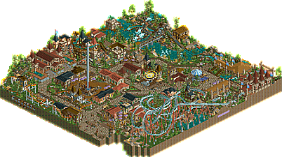
Welcome to Taloria. A fantasy themed park.
My main goal with Taloria was to just generally work on my park making skills and improve in areas in which I was lacking. I think i succeeded in doing this.
With that being said I know there is still a lot of room to improve! Hopefully I can bring some bigger and better things to the table over the summer
Note: I fiddled around for quite a while trying different color schemes on the station for the steel twister coaster which was suggested in my screenshot but i couldn't get anything to feel like it fit quite right -
1 fan
 Fans of this park
-
 Download Park
654
-
 Objects
286
-
 Tags
Tags

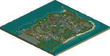
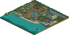
What a fantastic first outing for NE. This was a really cool little piece of rct. The ride layouts are definitely something that you could work on but I was able to look past them because of how atmospheric the park is. There were also some really nice composition moments, ie. the area of the final drop for the splash boats ride. it's a solid 60% in my mind. Can't wait to see more from you.
Thanks for the comment! I was feeling a bit iffy about the track layout as well, definitely something ill have to put more time into in the future
I think the architecture here is unique and captivating. You have some little details here and there that keep me looking and searching. Layouts are a bit wonky though. The junior coaster layout was odd with the lift into a short drop then another lift. Rocky River was the highlight for me. Scenic and also some cool elements. Just a little confused about the park though.. is it a park? Where's the entrance? How come there's no shop names? Otherwise, its a very cool submission.. welcome to NE.. and look forward to seeing more from you!!
great stuff- i'm really excited for you guys (ie, MM newcomers) to be releasing work here.
Its a pretty good park, with some nice rides and atmosphere. I particularly liked the splash boats with the wooden coaster track dips into the water. The archy was pretty decent throughout, if a bit hard to pin the theme down- "fantasy" isn't so much a thematic style as a parkmaking direction and otherwise it felt a bit more like a european realistic park. I've got a couple bits of advice to improve your next park, if you'll let me. One is the park layout- its essentially a figure eight, with two filled centers of rides/buildings and then stuff on the outside. To get a more dynamic park layout (I think Liampie has a picture of this somewhere...) you should consider "blending" or crossing over bits into each other to break up this island-in-path feeling. So have the coasters go back and forth between bits. Have landscaping- rivers, hills, cliffs, etc inform and shape the space. This level of quality of work in a really well-layed out and dynamic space would improve it at least 15% in my vote, if not more. For example, in this park- you could have the river cut through one of the inner circles, and the water ride go through there. Meanwhile, the beemer would dive through both holes, with the path following the gaps in the layout You could then raise one of the two circles as a hill so the path needs to wind up it a bit, and have some interesting terrain dynamics. Obviously there's a million ways to do it, but thats where the creativity of parkmaking is!
Thats my main advice. The other is that it all feels a bit textureless/creamy/washed out. But I think thats the palette's fault- I don't think I'm a huge roman palette fan. It just makes all the rooves and stuff blend into a gelato-ey goop in my eyes
Anyway, its still a really enjoyable park and definitely a great step in the learning experience of rct! Looking forward to what you keep playing around with.
When I was making it I kind of though of it as a fantasy town or city not really a park. As I am looking at it now though it seems like I found a weird blend between that and a realism park. I probably should have included as entrance rather then just a walk in looking back to make it more realistic.
Thank you for the advice, I will definitely work on this in the future
I see a lot of potential in your style! It's a small, but atmospheric park. Nice composition and a good use of colors.
I highly agree with the park layout. That's really keeping the score low.
The paths and fence in general was very good.
The buildings where the flags are are good, and the triple flags that I liked.
DUNE RUNNER: This roller coaster's scenery is well balanced, and the supports got very cool.
ROCKY RIVER: haaaa this is 10, I liked it a lot I'm a water fan, all the details you created around this ride is very nice.
Your park is wonderful, I can not see any fault.
Looking quickly it looks like a happy village
Thank you! for my next project the layout will be given much more attention early on
Thank you for the kind words:) much appreciated!
Nice park. Like the compactness.
Park Layout: Would've liked to have seen more path interaction. I think you missed a big opportunity with Dune Runner especially. Also what's the point of having a train if 2/3 of it is underground?
Ride design: You were probably constrained on map size, but the end of Dune Runner is not great.
Colors: I think some of the palette choices hurt here. I liked the custom red shades, but the tans and darker browns would've been better with default colors.
Landscaping: rockwork looks good, foliage is average. Some of the foliage clumps looked great but I think your placement of flowers and grass objects in particular needs work.
Architecture: good enough for my standards.
Good first release, it's a hell of a lot better than my first. Bronze from me
Thanks for the review!
in regards to dune runner, I agree. the dune runner section was one of the last areas I built and by that time I was a bit worn out. Building in that style got tiring very fast and I ended up relatively rushing through the dune runner area. In hindsight I wish I gave it some more attention.
The underground part of the train was just a planning mistake on my part. I didn't realize I had run out of room for the train to exit the wooden building by the splash boats until I had built far to much to be able to rework it.
I really enjoyed the landscaping, foliage and overall atmosphere here. The splash boats ride was great.
I didn't like the coaster layouts at all though. A bigger park in this style, with coasters that aren't terrible would be awesome!
Damn I wasn't expecting to get an accolade from this park! It feels great though! Hopefully I can get some bigger and better stuff out soon!
Congrats. Much looking forward to your future projects.
Congrats on the accolade! This was really fresh and inspirational and i'm really hoping to see more from you in the future!