Park / Ol'Cliff Island

Park_4464 Ol'Cliff Island

4 Comments

  • FredD%s's Photo
    On the site RCT Miracles is running a contest called RCT Miracles Chamions Trophy.
    In one week you've got to make a park.
    Every week, the admin chose a new challenger.
    If he wins, he's the champion.
    At the end of august, there will be counted who had the most champions titles and that man win the trophy.
    There's also a silver and a bronzen trophy.

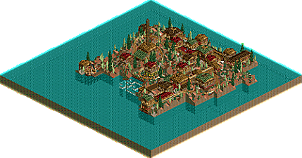
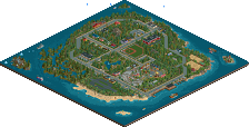
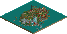
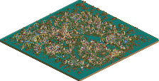
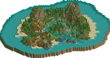
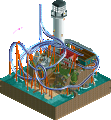
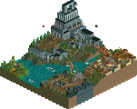
    I was chosen for challenger aiganst the first champion Double J, and this was my entry !

    Posted Image
    Posted Image
    Posted Image
    Posted Image
    Posted Image
    Posted Image

    I've won Battle II and now Tom_DJ is the new challenger...
    But I think I'm gonna make it....I've made the best I can. (but I dont may show screens of that).
  • iGNiTED%s's Photo
    looks pretty good...i like your style, even though it is a bit blocky....

    but watch out ....tom-dj is pretty good...


    keep it up though...looks nice...
  • Xcoaster%s's Photo
    Looks pretty fun. That land color doesn't get used often enough. Anyways, the first of the two main things that catch my eye as needing improvement are that the landscaping doesn't have enough flow, as in it looks like you just lifted up lots of land tiles one by one, but not really in any pattern, so they don't form a connected landscape. It's too jagged looking. It might work occasionally if you used the rock texture, but over the whole map it's too much. The other thing is the window placement. On the second screen I see one window halfway under a waterfall, and another stuck behind a a rock. In the fourth screen you have a few more doing this. The easiest way to fix this would be to just pay more attention to your landscaping, as mentioned earlier. But it's understandable that if you're running low on time in a competition, you may have to rush through a few things. Anyways, good luck.
  • Atlus%s's Photo
    Nice basis for a park. I like the colours, but I feel they are overused. Also, the archy is a little blocky, you should try tidying this up a bit.
  • inVersed%s's Photo
    The archy here is kind of blocky and rushed, as does the foliage, however. congrats on beating Double J... do luck against DJ.. he's a good uprising parkmaker