<eah the download works
but the zip file is damaged
--
downloading now
if it works i'll post something
--
nope doesn't work
have icq/aim/msn?
maybe you could send it to me?
Edited by MasterOfDisaster, 18 January 2006 - 01:20 PM.
I'm just going by the screens but it looks like you guys know what you're doing when it comes to everything except folidge, which looks horrid. Well and architecture can always be improved, but that's quite good already...
OK, the download works fine, the zip file isn't damaged, so if you're still having problems MoD than it might be your winzip... Do you have the newest version?
Don't shoot, I just looked at it. I had finals though, so I guess that's an excuse for such a late response.
Firstly, I'm so glad that we got something done. It's been around 6 or so months since we released Crumbas Point. We are still alive, and we are going stronger than ever. And I'd like to thank Michael for going ahead and finishing this up. This was originally a duo between Michael and Tom dj, but then Tom moved to RCTX, so we kind of didn't know what to do. Michael decided that he wanted to finish it up, rather than rot on the shelf, and I have to thank him for the initiative. Michael decided he would finish it as a solo, but then Elby asked if he would be able to make a contribution and Michael was more than happy to let Elby have a go at it. So FYI, this is basically a Michael solo with 2 large guest spots, and I can't thank Michael enough for his hard work on this.
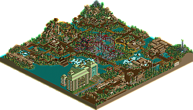
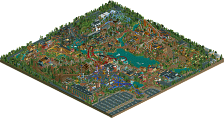
On to the park. I thought it was lovely. I was amazed that you were able to fit so many coasters in one park. I loved Elby's great chase, I have always liked The Bat, and I liked Tom's mine kart. I'm going to say it now and get it out of the way. As ride6 said, the foliage was pretty poor. I think it was due to overloading and littering the park with the jungle scenery and pretty much solely that. There were a couple of spots, for example in Tom's and Elby's contributions, where the foliage, did in fact hit the target. I think you probably wanted to finish it all up quickly, as the foliage does look rushed throughout. I understand the logic of choosing the "jungle trees" because it is a jungle theme, but all of the game's jungle stuff together simply looks cartooney and a bit over the top. Had you used some of the normal shrubbery in addition to the jungle bushes, and mixed and matched, it most certainly would have been better. I do think that the foliage did kind of hold this park down. And yes, you use too many flower combos, and I'm sure I've told you that before. Now that I'm done with that, I can go on to praising you again. I have always loved The Bat; for some reason those two colors overdone provide quite an effect. The only things I didn't like about the ride were that the path around it was quite distracting, I wish I would have caught that when it was in construction. A normal dark dirt path would have worked nicely. In fact, the ride would have been more dramatic, in its surroundings. I also didn't like how the majority of the queue was a bit close to the path, but that's not a big issue. Elby's section was magnificent. Adventure, thrill ride all in one. Beautiful structure, really captured an Indiana Jones kind of theme. Lovely. You really have gotten good lately and I'm really glad you are in the club. The mine train didn't do anything for me, and I know it was like one of the first things you built, so it shows how far you've come. The Boomerang was nice enough, the kiddie coaster was fine as well. The hotel was a little off to me. I think it was the green color of the roofs and stuff. I think it was a good structure, you were just a little off. If you touched it up with some more deco kind of stuff, it would have been great. I found the architecture in general, to be very suitable. I do realize some of it was very 2x2 ish and I think you're starting to get away from doing that too much, which is a good thing. I'm not saying 2x2 doesn't work, it is fine, as long as it is used in the proper quantities. There is one instance I remember, I think it was along the "main street" of the park. Opposite it is a couple of food buildings, and the Boomerang coaster. There were like 3 buildings right next to each other, each 2x2 from top to bottom. It didn't look good at all here. A few simple structural changes, and you would have been fine. Just try to avoid relying on it too much. Finally, there were some nice touches here. I liked the placement of waterfalls a couple of times, and some of the bridges really hit, while some didn't. I think that in the future, spending more time touching stuff up would really be beneficial to you. For example, there is a sign by the boat hire that says something like "caution. dangerous waters ahead!" or something. I thought, that's cool, but then I thought you could have added a sort of gate or railing that wouldn't allow boats to go over into the rapids. That would have been nice. I thought about things like this a couple of times during my viewing. Your work is great, but it lacks that sparkly look. It's not perfect, but a few details here and there, and foliage improvement, and you can really elevate yourself as a parkmaker.
Great job. Thanks again, and I look forward to working on some of those parks with you.
13 Comments
SenZ Offline
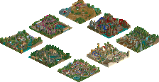
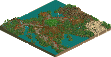
A 90x90 park by RCT Fury. Builders: Michael, Tom_DJ & elby.
RCTMiracles, thanks for hosting!
DOWNLOAD
(More screens at the download link)
MasterOfDisaster Offline
SenZ Offline
Well, the download works fine for me... Maybe try downloading it again?
MasterOfDisaster Offline
but the zip file is damaged
--
downloading now
if it works i'll post something
--
nope doesn't work
have icq/aim/msn?
maybe you could send it to me?
Edited by MasterOfDisaster, 18 January 2006 - 01:20 PM.
Ride6 Offline
Anyway...
ride6
sixflagsfreak56 Offline
I'll take a look at it tommorrow.
Jay_Ho Offline
Hast du nicht die Icq von Andrej?
Wenn nicht kann ich sie dir ja irgendwann geben...
Jay
MasterOfDisaster Offline
SenZ Offline
Ich habe kein ICQ. Ich habe das AIM von Andrej, das ist also unser Kontakt-mittel.
^Don't mind my bad German, please. I'm dutch
SenZ Offline
Anyway: Everybody who has downloaded; thanks!
elby Offline
Edited by elby, 20 January 2006 - 03:07 PM.
SenZ Offline
Great Thanks Andrej. And everybody, thanks for the comments.
postit Offline
Firstly, I'm so glad that we got something done. It's been around 6 or so months since we released Crumbas Point. We are still alive, and we are going stronger than ever. And I'd like to thank Michael for going ahead and finishing this up. This was originally a duo between Michael and Tom dj, but then Tom moved to RCTX, so we kind of didn't know what to do. Michael decided that he wanted to finish it up, rather than rot on the shelf, and I have to thank him for the initiative. Michael decided he would finish it as a solo, but then Elby asked if he would be able to make a contribution and Michael was more than happy to let Elby have a go at it. So FYI, this is basically a Michael solo with 2 large guest spots, and I can't thank Michael enough for his hard work on this.
On to the park. I thought it was lovely. I was amazed that you were able to fit so many coasters in one park. I loved Elby's great chase, I have always liked The Bat, and I liked Tom's mine kart. I'm going to say it now and get it out of the way. As ride6 said, the foliage was pretty poor. I think it was due to overloading and littering the park with the jungle scenery and pretty much solely that. There were a couple of spots, for example in Tom's and Elby's contributions, where the foliage, did in fact hit the target. I think you probably wanted to finish it all up quickly, as the foliage does look rushed throughout. I understand the logic of choosing the "jungle trees" because it is a jungle theme, but all of the game's jungle stuff together simply looks cartooney and a bit over the top. Had you used some of the normal shrubbery in addition to the jungle bushes, and mixed and matched, it most certainly would have been better. I do think that the foliage did kind of hold this park down. And yes, you use too many flower combos, and I'm sure I've told you that before. Now that I'm done with that, I can go on to praising you again. I have always loved The Bat; for some reason those two colors overdone provide quite an effect. The only things I didn't like about the ride were that the path around it was quite distracting, I wish I would have caught that when it was in construction. A normal dark dirt path would have worked nicely. In fact, the ride would have been more dramatic, in its surroundings. I also didn't like how the majority of the queue was a bit close to the path, but that's not a big issue. Elby's section was magnificent. Adventure, thrill ride all in one. Beautiful structure, really captured an Indiana Jones kind of theme. Lovely. You really have gotten good lately and I'm really glad you are in the club. The mine train didn't do anything for me, and I know it was like one of the first things you built, so it shows how far you've come. The Boomerang was nice enough, the kiddie coaster was fine as well. The hotel was a little off to me. I think it was the green color of the roofs and stuff. I think it was a good structure, you were just a little off. If you touched it up with some more deco kind of stuff, it would have been great. I found the architecture in general, to be very suitable. I do realize some of it was very 2x2 ish and I think you're starting to get away from doing that too much, which is a good thing. I'm not saying 2x2 doesn't work, it is fine, as long as it is used in the proper quantities. There is one instance I remember, I think it was along the "main street" of the park. Opposite it is a couple of food buildings, and the Boomerang coaster. There were like 3 buildings right next to each other, each 2x2 from top to bottom. It didn't look good at all here. A few simple structural changes, and you would have been fine. Just try to avoid relying on it too much. Finally, there were some nice touches here. I liked the placement of waterfalls a couple of times, and some of the bridges really hit, while some didn't. I think that in the future, spending more time touching stuff up would really be beneficial to you. For example, there is a sign by the boat hire that says something like "caution. dangerous waters ahead!" or something. I thought, that's cool, but then I thought you could have added a sort of gate or railing that wouldn't allow boats to go over into the rapids. That would have been nice. I thought about things like this a couple of times during my viewing. Your work is great, but it lacks that sparkly look. It's not perfect, but a few details here and there, and foliage improvement, and you can really elevate yourself as a parkmaker.
Great job. Thanks again, and I look forward to working on some of those parks with you.
Steve Offline