Park / New Providence
-
 18-April 19
- Views 1,954
- Downloads 582
- Fans 0
- Comments 7
-
 51.50%(required: 50%)
 Bronze

Liampie 60% saxman1089 60% chorkiel 55% Cocoa 55% CoasterCreator9 50% G Force 50% Jaguar 50% Ling 50% RWE 50% Scoop 50% posix 45% Sulakke 45% 51.50% -
 Description
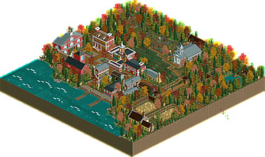
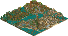
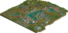
Built for the defunct finals on rct&f. Goal was to build a town, I took first place with this entry before dropping out.
-
 No fans of this park
-
 Full-Size Map
-
 Download Park
582
-
 Objects
220
-
 Tags
Tags
![park_2810 [PT4 R1] Los Sueños Gardens](https://www.nedesigns.com/uploads/parks/2810/aerialt2474.png)
Very cool town. Could've used a boat in there! I'm guessing Chuck is a nod to Ralph Waldo Emerson? Enjoyed that little detail. The church was really done well too.
Nice bits of architecture here, I especially appreciate what you did with the church windows, coloring them to appear like stained glass.
I like the fall colors.
Sad you dropped, I really liked this.
My commentary from the RC&F scoring sheet:
definitely a nice little town. my favorite building on the map was actually the tan house just outside the gates- I think the town was a bit overwhelmingly red brick and this was needed. The chimneys frame it nicely, and the lawn is cute. pretty solid foliage.
Architecture of the buildings are very good, colors balanced, good details.
In general the spaces well used, nothing remained in the empty.
Good lawn, really nice.
Nice Work.
Good atmosphere and a pretty well executed fall look. I understand this was for a specific contest to make a town, so I can't fault you for that. But, as a stand alone piece, I think the lack of more traditional park elements means that the town components have to be perfect. In this case, they were good but didn't have enough detail to keep my attention too long, and the archy itself was a bit blocky. Overall, I like this as an exercise in targeted parkmaking, but it knock my socks off.