Park / Altar
-
 11-April 19
- Views 6,895
- Downloads 453
- Fans 0
- Comments 12
-
 No fans of this park
-
 Full-Size Map
-
 Download Park
453
-
 Objects
160
-
 Tags
Tags

Round 1 - Group D
__________________________________________________________________
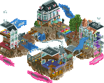
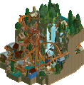
alex - Verchaix
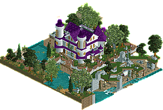
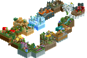
roygbiv - Altar
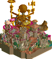
MK98 - Jack and the Beanstalk
Maddkattunge - Whistle Stop
__________________________________________________________________
How to vote?
First of all, check out all the entries in this match. If you can't view one or more entries, for example if you don't own LL, then please, do NOT vote. Once you've viewed all 4, select your favourite and second favourite in the polls above. After 3 days, we will close the poll, the results of the two polls will be added together, with the votes from the second poll weighing only half as much as votes from the first poll, and the 2 highest scoring entries will proceed to the next round. The third placed park will place its creator on the reserves list for the next round of the contest.
Votes are public and so any cheating of the system, betrayal of honesty or mistrust will be picked up on and will be dealt with.
Verchaix - Neat little trick with the waterfall. Overall really solid sense of space, great terrain and foliage. It reminds me of Louis's and my round 1 entries to the last MM. I would really love to see LL hold its own into round 3.
Altar - Cute little haunted house entry. The use of the black walls did confuse me a little bit, there's nothing wrong with leaving the land sides exposed on a micro. The little witch's hut out back was really charming. The guests clipping through the wall... not so much.
Jack and the Beanstalk - This is a good, reasonably ambitious round 1 concept. The castle is nice, I liked the little village structures too but wish there were more of them. The bean stalk could have done with a little more asymmetry, and I don't really understand the point of having coaster trains on it. The awkward invisible queues do stick out a bit.
Whistle Stop - I really liked the scale here. The station is so concise. I do think on a map like this you have to use your space a bit more cleverly though - find a way to wrap the path above or below the coaster track to claw some space back. Having a single closed, cloned t-shirt stall for an "eatery" strikes me as really odd. The abandoned car also looks like a hack for hack's sake. This is still a nice little study in NCSO, though.
Alex: It's cute, I loved the composition and the waterfall. The ride layout was meh and I don't know, I enjoyed it, but it didn't really wow me or stand out. It felt so much like Emerald Heights to me and I just got into a sort of comfy nostalgic mood for it. This is good LL, and a good micro, it isn't really amazing though. I think Ascension might have raised the bar for me lmao. This gets second place for me, but if it wins first I think it would deserve that too.

Roygbiv: Cute, definitely cute. I did like it, but it felt very... flat (emotionally). I think the colours really hurt it, the purple roof was really intense and idk, didn't really mesh well. Same with some of the textures. The composition of it all is nice though. iirc you're colorblind, right? I think MK98 is too
MK98: This takes first place for me. The beanstalk was cool, but also kinda annoying? The coasters going up and down was somewhat idk, loud and repetitive in a negative way. It was all cool though, nice concept, good castle, good rct in general. I did however feel that it needed a little more stuff at ground level, it felt like it was missing something, and the colours were very flat and meh for me, in the same way as Roy's entry. I do think it makes up for these flaws, but it is nonetheless flawed.
Maddkattunge: I did like this, it was clearly the weakest entry here but... that's ok! I smiled while viewing it, it reminded me of my rct a few years ago. I agree with Ling's advice, I think a more complex use of space would have been cool. The layout was bad but I think the ncso stuff you did was rather nice, I think the biggest thing I suggest you focus on is composition, you seem to have a decent sense of aesthetics and building stuff well. The way all of the elements on the map are layed out is such a big part of the game, and it really can make a huge difference to any park.
Interaction is key here, focusing on points, moments and areas where path, rides and sight lines interact to create a space that is dynamic and keeps the guests engaged in the world around them, and by extension the viewer engaged too. I'm excited to see more fro you in the future
1. roygbiv: I think you got lucky with this group being more low key! But still, a really nice micro. Just simple and classy and with a solid atmosphere. Just great composure all around, and I really enjoyed the cutaways to the ride under the graveyard. I want to see more of this shit, but with more coasters and cool shit
2. alex: you also got so fucking lucky getting these second place votes! Its classy, chilled, and simple, which is a bold move in this funny meta. But, the layout is cool and no alex park would be complete without some new innovation: here, the waterfall thing. I'm not sure how you keep pumping out new ideas in LL...
3. mk98: definitely good stuff. I really enjoyed the ride that twisted up the beanstalk. the stuff up top is a bit lifeless and boxy but I think you handled the clouds quite well. I enjoyed the vibe of the bottom a bit more, but I wish there was a bit more going on and a bit more "fun" considering its a fairy tale park. Maybe shrek spoiled that for all of us... . I couldn't really figure out what the cutaway sign was referring to?
4. mattkatunge: very similar to what we managed to sleuth up of your previous work. sort of naive old school rct2, which is still great. It doesn't really compete here but thats not to say its bad, I still like it.
I honestly really enjoyed MADD's park. Its simplicity yet nice details here and there.
My first vote went to MK for bringing the drama! Great entry MK, loved the hack, brought a fun element to the beanstalk and some essential movement to the park. We've definitely seen Jack and the Beanstalk before, but this is one of the better versions I can think of. The castle was really well done, everything beneath was fun and atmospheric. Some parts felt a little path heavy, particularly given that there weren't a ton of peeps, but overall a great micro, well done.
Second vote went to Alex, was close for second though. Gotta appreciate some LL, and this was atmosphere to the max. Simple, but without a second 'high drama' entry in this round, this won out for me and had some well thought out bits that were really beautiful.
roygbiv, I nearly chose this for second. Between you and Alex it was all about atmosphere and execution since neither was overly dramatic, and Alex just won out for me. But, this was a really nice 'slice-of-life'-ish park, had some great little details, and I liked the bold purple. Well done on a great micro.
mattkatunge, a fun little entry with a lot of default rct goodness. Execution was a little off in places, and the composition was very packed, but I enjoyed the peeps and the movement. Well done.
MK- The beanstalk ride is just mesmerizing to watch. Like I've been sitting here for a while just watching it cycle. Here's a 2 level park that actually made complete sense for the 2 levels as well, which is appreciated. Reasonably nice architecture, though I'm not sure I got much out of the cutaway. With the call-out for it on the side, I think I was expecting more. I like the scenery that makes of the cloud. It's sort of non standard, but actually works surprisingly well for me. You easily have the flashiest park of the group and it works well in this instance.
Roy- A sort of unassuming map, but I did really like it. It's a pretty cheerful map too despite the sort of darker theme. The library start for the ride was a nice lead-in to the rest of it. There was a solid balance of removed scenery to see what was going on, but not too much that you couldn't understand it. Would have maybe been nice to have a little more height underneath, but it is a comfortable scale. I've mentioned it a few times in my reviews, but I'd love to see more frozen staff or little details to help develop out your story. But for an unassuming map, I enjoyed this more than I thought I would.
Alex- So close! This had a very classic charm, with some cool details (like the waterfall dive). You fit a lot of coaster in here and I love the way the reverse spike wraps the lift. Really nice detail. It's a relaxing map, but I think in the end it was just lacking some additional 'something' whether that be movement, little details, or just some architecture. Not to say I didn't enjoy it, however. I've watched the coaster run several times now!
Madd- The combo of wild mouse track with the mine train supports is really nice. It's a pretty simple layout, but I like it a lot. The whole map is really clean, with some nice little details and a pleasant NCSO atmosphere. I enjoyed watching the ride run. Hope to see more of your stuff.
__________________________________________________________
Winners
MK98: 23 + 12/2 = 29 points
roygbiv: 11 + 16/2 = 19 points
Eliminated
alex: 6 + 12/2 = 12 points
maddkattune: 1 + 1/2 = 1.5 point
__________________________________________________________
MK98 and roygbiv proceed to Round 2.
alex is eligible as a replacement for Round 2.
Congratulations to the winners!
congratulations on the (well deserved) wins MK and roy! my own expectations were low but it was fun to make an entry
Highlights
Verchaix: coaster
Altar: purple-roofed building
Jack and the Beanstalk: beanstalk ride
Whistle Stop: mine carts
This is great. Before the match I felt like the underdog and I didn't expect to get further. I had great competition from good players. Thanks for everyone who voted.
Fun entry MK98, very whimsical. I liked the coaster trains.
I guess Alex's entry was a region in France or something. I liked the coaster train color and the waterfall hack was neat. Still somewhat close for second.
Maddkattunge, good layout pretty solid ncso attempt!