How to vote? First of all, check out all the entries in this match. If you can't view one or more entries, for example if you don't own LL, then please, do NOT vote. Once you've viewed all 4, select your favourite and second favourite in the polls above.
After 3 days, we will close the poll, the results of the two polls will be added together, with the votes from the second poll weighing only half as much as votes from the first poll, and the 2 highest scoring entries will proceed to the next round. The third placed park will place its creator on the reserves list for the next round of the contest.
Votes are public and so any cheating of the system, betrayal of honesty or mistrust will be picked up on and will be dealt with.
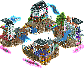
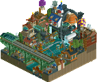
#1. Wvl. This is my favorite of the group. Stunning architecture here, the micro detail work that went into this is exceptional. Those interiors are very well done too, all of them look like real interiors which is not easy too pull off in rct. Its an overused floating islands approach, but I like how you've textured the bottoms of them with rocks. Really gives some life and something interesting to an otherwise boring area. Lots of details here to explore, love the snowman statue, and the train tracks were well done. The monorail is cool through the center, helps fill the gap with something interesting. The whole thing is a bit colourful for my taste lol, but that's okay I can see that's the intended theme. The story told through floating banners doesn't really add to the micro for me, but it doesn't hurt it in any way either. Art is a about expression, in many cases self expression, and I'm glad you were able to include a message that must hit somewhere close to home. Lots of talent on display here, This micro held my attention for a long while. A deserving first place in the group.
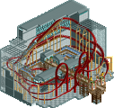
#4.Impulse. There is just a certain charm that a wooden roller coaster posses. The iconic "cickity-clack" of the chain, the shudder and rumble as she roars through her layout. In my coaster count of over 100, I have 2-3 woodies in my top 20 favorites that most overlook. What I'm getting at, I have a soft spot for wooden roller coasters. This is a good layout it flows nicely, and the station fly through is cool. The heart line roll is in a great spot, a menacing centerpiece that would make you question why your in line for this nonsense. I love it, but unfortunately other then the layout there isn't much here. The foliage is just okay nothing too special, and the station is pretty forgettable. I can see you added some nice details with the lift hill tunnel and rapids in the river, but it's just not enough to elevate this to the level of detail that your competition has provided. I really enjoyed it, I just can't vote for it.
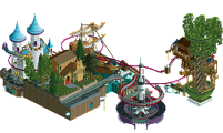
#2. Cocoa. Ah the long awaited heavyweight Micro builder. After your "practice" micro I was very hyped to see what you'd dream up for the real thing. And I was definitely not disappointed. The coaster has a strong layout, personal favorite part is the huge slopped S-bend after the first half loop. Id imagine that spot would be particularly awesome to ride on a flyer. The cavern's in the back of the hill really add some complexity to the micro, i'm glad there is something to look at back there. Nice foliage and archy help this along, no wasted space anywhere. I especially love the logs going down the waterfall, what a creative idea that adds alot of charm and character. Those water wheels at the top are cool too. Overall I really enjoyed it, definitively good enough to move on, just not quite enough to pass Wouter's architectural Masterpiece.
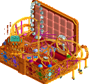
#3. Rct2Day. And that leaves the unfortunate third place. I liked this idea, very creative and lots of fun. I like the ride selection, very funny stuff like the demon drop, lava slides etc. I loved the coffin place, got a laugh out of me, and it's a pretty nice piece of archy too. I did make the volcano erupt, that was a fun gimmick. Overall there's lots of stuff to like here, its just lacks some refinement and micro detail work that the other two in this group has. I wasn't crazy about the land texture though, I think its pretty ugly and hard on the eyes. I enjoyed it, glad to see you in the contest. Fun fact Indian Point Ballpark was the first NE release I looked at, had just joined as a new member when it was released.
Cocoa- Amazing! I love how much there is to see and follow in this park, like Woodchip and the logs going down the river. The attention to detail is unbelievable, and there's so much to discover. The throwback names show just how far this game has come over 17 years. My only gripe is that it looks a bit cluttered at times. There's so much life in this park, and it's definitely one of the strongest submissions for this contest.
RCT2day- The name got a good laugh out of me, so I knew it was going to be great from the start. I had the descent to Hell idea for a micro a long time ago, but you cranked it up to 11. I'm a sucker for cheesy puns, so every name was hilarious to me. I feel like there's a reference in the M&M's sponsor that I'm not getting though. Funniest park of the contest for sure.
Wouter VL- Wow. I could focus on the architecture or the cutaways or the detailed interiors, but it just wouldn't feel right. It would feel like I'm focusing on unnecessary details when the story is what truly matters here. Gender dysphoria is a very real issue I did not expect to see tackled in this contest, and you brought it into our favorite theme park simulator beautifully. My only issue is I'm not 100% sure which way I'm supposed to follow the monologues. Do I start from the skate park, read top to bottom, and rotate counterclockwise ending with the train station? Do I read all the top monologues and then the bottom ones? Either way, it gives you so much to look at, even with only one functional ride. Amazing work.
Impulse- I love me some NCSO! A compact GG woodie is perfect for a contest like this, and the support work is amazing. It has to be tedious placing and angling all those fences. While it gets washed out by the coaster, the landscape is gorgeously detailed. It's a shame you got placed in such a hard group, as this is a wonderful submission.
This is the hardest group I've reviewed so far. It's clear that Forest Frontiers and Assigned Male At Birth are the top two for me, but having to make a final decision is unbelievably tough. There's so much to see and follow in both parks, and they're jam-packed with little details. The big difference is Forest Frontiers is a micro park and Assigned Male At Birth is a micro story. It took me a while, but Assigned Male At Birth just barely edges out Forest Frontiers for me. The story adds just enough to push it over the top. Amazing work to everyone in this group!
Holy shit, incredible competition. I hope you guys don't mind me doing a quick review of your parks if I'm only gonna say good things?
wouter: You've been doing a lot of trash talking and this whole time I've been scared of you, which was right, because thats an amazing micro. I loved the way the story is told through scenes in either interiors or facades as you rotate around- it really feels well thought-out and meaningful. A very sincere park. Of course the buildings and surroundings are all very high quality to add to it, and the rainbow monorail which transfers between the stories is a cool layer of complexity to it all. Love it a lot!
rct2day: wtf this is also an amazing and hilarious idea. Entering through a shed in SFOT junkyard is brilliant, and the underworld is just so funny. I loved the "sponsored by m&ms" and all the usual six flags marketing bullshit everywhere. of course the rides and archy are really high quality ncso, especially that coffin rental building. I love that you gave instructions for us to start the show whenever we want, I'd never seen that before and might steal that...
impulse: a really solid coaster you fit into the micro. Really crisp ncso work and a pleasure of a layout.
Forest Frontiers - God this is so good. The water wheel transfer cable system? What the hell? The lift/first drop on the coaster is awesome too. The falling logs are hilarious and also super well executed. Really glad I'm not up against this one.
Six Flags Under Texas - Hard to pull of what's trying to be basically an entire park on this tiny plot. I like that the upper level is related but isn't the focus at all so it doesn't feel over-crowded, just there for flavor. The landscaping is super atmospheric and the water park stuff sort of takes away from that - I think if you used the water to go a little darker with it and make it a theme park built into the forbidding landscape of hell it could have been more striking. As it stands this is some of the most incredible application of landscaping I've ever seen in NCSO, I think there it's just better suited to a style that takes itself more seriously than all of the bright colors and semi-ridiculous premise do.
Assigned Male At Birth - I also sort of wish I knew where to "start" here. I looked at it for a while and eventually figured out how the vignettes lined up together. But damn if it's not one of the most visually compelling micros we've had in a round absolutely fucking STACKED with amazing micros. What a build.
Gunslinger - We've seen a few attempts at basically fitting an entire "normal" layout on a map, and I'm not entirely sure they work. You have to give up the entire shape of your map to be what the coaster needs it to be, it feels like there isn't much leftover to really do stuff with the concept. I would have liked to see this go up against something like Cotton Candy Cloud or Fantasyland. What's here is great - the coaster is good, the station is a little bare-bones. The problem is the coaster is all there is. It's hard to even get a sense of what the surrounds would be with the tiny fractions of hill and stream we do get.
1. Cocoa: Damn dude. Loved it.. the sawmill using the gears and belts powered by a waterfall? Sold. So many neat and innovated details that go unnoticed at first glance. The coaster layout too was solid.. much like Luketh's and Impulse's layouts. The waterfall was expected, but positive nonetheless. The palette was pleasant.. really gave a rustic feel. Other than that, everything else has been said. Congrats!
2. RCT2day: This was quite fun... and interactive, I enjoyed that. The NCSO was solid.. barely could tell the difference. Your style worked well here in the small setting. The layers here worked well too.
3. Wouter: Solid archy.. and very serious topic. But, this seemed like Subdued Thought 2.0 and thus I picked RCT2day over you. I'm always impressed by your skill.. the main station in Grand Central still amazes me.. but all of this seems recycled.
4. Impulse: Solid layout as I already said. Just handed a tough draw. Also, doing NCSO was a bold choice, but I loved what you did in the little space you had.
1. Cocoa: Nothing groundbreaking, but almost flawlessly executed. Great interaction, composition and atmosphere. The use of custom color schemes nowadays helps to make the classic Cocoa look feel fresh again. I love the falling logs.
2. RCT2Day: Funny idea and pretty good execution. The ground level feels a bit flimsy but is a good introduction to the map's main layer. I really appreciate how you made a dark theme feel colorful. Brilliant use of color. The rockwork was great and I liked the building as well. The volcano eruption was a bit disappointing.
3. Wouter: Well crafted, but the theme didn't do much for me, sorry. Like others above already stated, it was a bit hard to follow and to recognize the starting point, if there was one. The architecture was good, if slightly too busy. I really like the way you made the undersides of these floating islands and I love the rainbow bridge.
4. Impulse: I didn't really like this entry, sorry. Micro's filled to the gills with one coaster layout don't work well, if you ask me. It felt like the coaster layout was the only thing on the map. See Ling's comment.
I waffled between cocoa and wvl for a while before settling on one.
I don't think Cocoa's needs commentary or explanation. It's classic, strong, atmospheric cocoa.
Wvl: this was super interesting, a nice look into you. There was lots of clever hidden messages beyond just the obvious, such as the masculine, presentable, clean, side being out in the open and above ground with the colorful, creative, feminine things below the surface or kept inside. I really appreciated the honesty portrayed in the work. It was a bit unfortunate that every building on the map was sliced open, and all the most interesting details were facing inwards rather than out towards the viewer, which while it makes sense as part of the self expression, doesn't make it well-composed rct.
Rct2day: humerous, fun, but it felt almost like a collection of gimmicks rather than a cohesive whole. It was a refreshing theme and a fun twist on the classic six flags realism.
Impulse: I liked this, but it was difficult to read a lot of it because of how dense the coaster was. I'd like much of the same but with a bit more breathing room.
Cocoa: gud shit gud shit. Classic and great atmosphere as always. This gets my first place vote. The coaster was adorable and well composed, I loved the logs and just, like, everything. It was comfy as hell.
wvl: Really emotional and expressive and I really really appreciate that you are using rct in such an artistic way. Powerful impact with all of the subtle detailing that ITM mentioned and it really gave me the feels yknow? The archy and the actual rct component of this was beautiful and I love the vibrant, energetic vibe your style has. It did feel very much like Grand Central but that might just be to do with the setting? Either way I loved it on multiple levels, I'm voting you as second place although it's really a tough choice here since your micro is competetive against cocoa's tbh.
RCT2day: I absolutely love the concept here, it's so fun and cute. It was cool to see somebody use the maze/dirt texture like that, I'd been thinking about it for a while. There's some really great ncso in here and I loved it all... except for the water park. It was good don't get me wrong, well made, just ruined the atmosphere imo and didn't need to be there. I think it overall weakened the composition. Something like a log flume or water slide or rapids etc would have fit with the landscape better imo. Third place for me, but it comes down to a really tough matchup for you, I think this would have been a first place or second place vote in most other matches.
Impulse: I really love the GG. Comfy layout, nice support work, station, tunnel etc. The NCSO here is on point and really well done, and the landscaping was really nice too. I think it ultimately just suffered by being in the micro format, this would be a really great ride for a small design or in a park and you are definitely a talented builder. It needed more space around it and maybe a supporting flat and unfortunately the 225 tile limit just didn't work with it. Overall a really great bit of NCSO though.
Cocoa: Absolutely gorgeous. You have an eye for the aesthetic that few have. The coaster is unique and fun to watch. I like the on your back head first drop. It's a nice flowy layout too, which is hard with the big coasters. Excellent architecture, foliage, and general atmosphere. The themed conveyor up the side of the waterfall is super clever as well. One of the most pleasant parks in the match thus far. Amazing work.
WVL: Super expressive park... definitely a bold thematic approach as opposed to the light and fun that we've been seeing elsewhere. But it's a real issue and I can tell you put a lot of thought into this. That more than anything is why this gets my #2 vote. There's a lot of great detail here but it's presented very cleanly. I'm sure there's more to this than I fully understand, but I look forward to seeing some explanations. Looking forward to seeing more from you. I like your build style.
RCT2day: You were so close on this one. Super clever, fun park. The maze ground texture is a clever idea for the upper area. There's ton of humor here, which I appreciated. I do think you could have done with some kind of coaster below, though I know it's already tight (fireball doesn't count!!). It was nice to see a classic like the Intamin 1st gen drop, though. A lot of fun on the whole. Would like to see more.
Impulse: Fun layout here. Looks really nice and reasonably realistic. The station is solid NCSO and I like the little details such as the queue line with the single rail track. On the whole I think it's just a matter of quantity compared to the other submissions. You've used all your space on a very nice coaster, but there's no room for anything else. Still, I like what you put together. Nice work.
COCOA) I always admire the roller coasters with personalized supports, because I find it difficult to do that. The roofs/colors was a charm, combined with the environment. The little bridge got cool and I love rock wall, it helps a lot in contrast, and the waterfall is very cool, I love waterfalls. The foliage gave a special touch to the theme, is well distributed. The details showing the underground were nice and the idea of the gears / circle together was very good. Overall everything is great.
RCT2DAY) Creative idea no doubt, I liked the area where the red grub is, the shed in the junkyard is good, and the underworld was cool. I liked the layers.
WOUTER VL) Ahcei park well expressive and good thematic approach with many details presented very clearly. I liked the objects/details blue and pink, and even though the buildings are cut, I found it cool.
INPULSE) I like roller coasters wood and its layout got good along with the season. The foliage is simple and cool details with the elevator's hill tunnel and rapids on the river.
1. WVL: I don't think I've had such intense feelings from a park since Metropolis. I thought the scenes did a great job portraying what was actually on the signs. It feels like a combination of the best parts of the personal concepts of Subdued Thoughts combined with the skilled and detailed archy from Grand Central. Beautiful job and I'm excited to see what you do in R2.
2. Cocoa: I'm simultaneously impressed and a bit overwhelmed by this. The layout is one of the best I've seen in a micro and the interaction is incredible as well. It clearly took a lot of skilled planning to make the layout fit so cleanly. At the same time, the whole bottom half feels a bit chaotic for the theme. In general you did a good job not blocking the buildings with the coaster, but maybe there's one too many layers of track over the stream? Overall though that didn't hurt it much and would've been 1st for me in most of the matches, still probably a top 10 for me in R1. Kept my attention for a long time and again proves you're one of the most skilled builders on the site.
3. RCT2Day: Loved the concept and all of the humor in it. Great archy on the coffin rental and the volcano with the freefall ride built into it was impressive as well. I don't think the waterpark quite meshed with everything else. Overall, an above average micro in a difficult bracket.
4. Impulse: Layout was pretty nice. I assume it was supposed to be an RMC because of the barrel roll but it had a GCI train? Either way no big deal because it looked cool and interaction was good. In general purely layout micros don't really do it for me but good job nontheless.
I gave my first vote to Cocoa, cause dat atmosphere. You managed to pack a lot of content in a way that didn't feel crammed, it was super atmospheric and had some amazing touches, like the mine carts and the logs falling down the waterfall. The flyer was a great layout for such a small space, and overall this just felt amazingly well execute and pulled together. Well done, incredible.
Second vote went to Wouter, and wow, this came out of nowhere in the best way. The concept is fascinating and so bold for an RCT park, and I can't help but love the bold move. I think what really holds it up those is the execution, your traditional rct elements are so well executed, some amazing archy and I love the way you built the islands. The interiors are great as well. Ultimately, I found myself feeling like regardless of the conceptual element I'd probably vote for it just based on the atmosphere and execution. Add on top of that a great and interesting concept that resulted in some fun artistic moments, and I loved this. Only thing that held it back from a very close first vote was feeling that it needed a bit more landscaping/foliage to round it out, while cocoa's landscaping was excellent and felt like a finishing atmosphere element. That being said, this is near the top of my list for creativity and artistic ingenuity. Amazing work.
RCT2day, this likely would have gotten my vote in another group, really well done and creative. The eruption was great, the flip of traditional six flags park elements into a 'hell' theme is just so much fun. Ultimately, I felt this just lost out to the execution and artistic elements of cocoa and wouter's work. But really well done!
Impule, this was great and well done, I liked the layout despite some of the limitations of the mirco. That being said, it just missed on the drama/creativity that was part of the other parks that made them more captivating.
Congrats to cocoa and wouter! You guys both deserved it and put together two killer entries. Best of luck in the next round.
Thanks everyone for the nice reviews and votes. Though I ran out of time and had more ideas (enough for a full park with this concept), I was happy with the end result. Best of all, it got me out of a designers block that I was stuck in for some weeks. Dont expect a replacement entry from me, but Im not ruling out the possibility that Ill do something.
19 Comments
posix Offline
Round 1 - Group A
__________________________________________________________________
Cocoa - Forest Frontiers
RCT2day - Six Flags under Texas and Inhumane Harbor Waterpark
Wouter VL - Assigned Male At Birth
Impulse - Gunslinger
__________________________________________________________________
How to vote?
First of all, check out all the entries in this match. If you can't view one or more entries, for example if you don't own LL, then please, do NOT vote. Once you've viewed all 4, select your favourite and second favourite in the polls above.
After 3 days, we will close the poll, the results of the two polls will be added together, with the votes from the second poll weighing only half as much as votes from the first poll, and the 2 highest scoring entries will proceed to the next round. The third placed park will place its creator on the reserves list for the next round of the contest.
Votes are public and so any cheating of the system, betrayal of honesty or mistrust will be picked up on and will be dealt with.
Xeccah Offline
scrambled eggs 1 is broken and needs to be fixed.
ida Offline
This egg from Food Stall 1 is really good value
Mattk48 Offline
#1. Wvl. This is my favorite of the group. Stunning architecture here, the micro detail work that went into this is exceptional. Those interiors are very well done too, all of them look like real interiors which is not easy too pull off in rct. Its an overused floating islands approach, but I like how you've textured the bottoms of them with rocks. Really gives some life and something interesting to an otherwise boring area. Lots of details here to explore, love the snowman statue, and the train tracks were well done. The monorail is cool through the center, helps fill the gap with something interesting. The whole thing is a bit colourful for my taste lol, but that's okay I can see that's the intended theme. The story told through floating banners doesn't really add to the micro for me, but it doesn't hurt it in any way either. Art is a about expression, in many cases self expression, and I'm glad you were able to include a message that must hit somewhere close to home. Lots of talent on display here, This micro held my attention for a long while. A deserving first place in the group.
#4.Impulse. There is just a certain charm that a wooden roller coaster posses. The iconic "cickity-clack" of the chain, the shudder and rumble as she roars through her layout. In my coaster count of over 100, I have 2-3 woodies in my top 20 favorites that most overlook. What I'm getting at, I have a soft spot for wooden roller coasters. This is a good layout it flows nicely, and the station fly through is cool. The heart line roll is in a great spot, a menacing centerpiece that would make you question why your in line for this nonsense. I love it, but unfortunately other then the layout there isn't much here. The foliage is just okay nothing too special, and the station is pretty forgettable. I can see you added some nice details with the lift hill tunnel and rapids in the river, but it's just not enough to elevate this to the level of detail that your competition has provided. I really enjoyed it, I just can't vote for it.
#2. Cocoa. Ah the long awaited heavyweight Micro builder. After your "practice" micro I was very hyped to see what you'd dream up for the real thing. And I was definitely not disappointed. The coaster has a strong layout, personal favorite part is the huge slopped S-bend after the first half loop. Id imagine that spot would be particularly awesome to ride on a flyer. The cavern's in the back of the hill really add some complexity to the micro, i'm glad there is something to look at back there. Nice foliage and archy help this along, no wasted space anywhere. I especially love the logs going down the waterfall, what a creative idea that adds alot of charm and character. Those water wheels at the top are cool too. Overall I really enjoyed it, definitively good enough to move on, just not quite enough to pass Wouter's architectural Masterpiece.
#3. Rct2Day. And that leaves the unfortunate third place. I liked this idea, very creative and lots of fun. I like the ride selection, very funny stuff like the demon drop, lava slides etc. I loved the coffin place, got a laugh out of me, and it's a pretty nice piece of archy too. I did make the volcano erupt, that was a fun gimmick. Overall there's lots of stuff to like here, its just lacks some refinement and micro detail work that the other two in this group has. I wasn't crazy about the land texture though, I think its pretty ugly and hard on the eyes. I enjoyed it, glad to see you in the contest. Fun fact Indian Point Ballpark was the first NE release I looked at, had just joined as a new member when it was released.
Gustav Goblin Offline
Cocoa Offline
Holy shit, incredible competition. I hope you guys don't mind me doing a quick review of your parks if I'm only gonna say good things?
wouter: You've been doing a lot of trash talking and this whole time I've been scared of you, which was right, because thats an amazing micro. I loved the way the story is told through scenes in either interiors or facades as you rotate around- it really feels well thought-out and meaningful. A very sincere park. Of course the buildings and surroundings are all very high quality to add to it, and the rainbow monorail which transfers between the stories is a cool layer of complexity to it all. Love it a lot!
rct2day: wtf this is also an amazing and hilarious idea. Entering through a shed in SFOT junkyard is brilliant, and the underworld is just so funny. I loved the "sponsored by m&ms" and all the usual six flags marketing bullshit everywhere. of course the rides and archy are really high quality ncso, especially that coffin rental building. I love that you gave instructions for us to start the show whenever we want, I'd never seen that before and might steal that...
impulse: a really solid coaster you fit into the micro. Really crisp ncso work and a pleasure of a layout.
Ling Offline
Forest Frontiers - God this is so good. The water wheel transfer cable system? What the hell? The lift/first drop on the coaster is awesome too. The falling logs are hilarious and also super well executed. Really glad I'm not up against this one.
Six Flags Under Texas - Hard to pull of what's trying to be basically an entire park on this tiny plot. I like that the upper level is related but isn't the focus at all so it doesn't feel over-crowded, just there for flavor. The landscaping is super atmospheric and the water park stuff sort of takes away from that - I think if you used the water to go a little darker with it and make it a theme park built into the forbidding landscape of hell it could have been more striking. As it stands this is some of the most incredible application of landscaping I've ever seen in NCSO, I think there it's just better suited to a style that takes itself more seriously than all of the bright colors and semi-ridiculous premise do.
Assigned Male At Birth - I also sort of wish I knew where to "start" here. I looked at it for a while and eventually figured out how the vignettes lined up together. But damn if it's not one of the most visually compelling micros we've had in a round absolutely fucking STACKED with amazing micros. What a build.
Gunslinger - We've seen a few attempts at basically fitting an entire "normal" layout on a map, and I'm not entirely sure they work. You have to give up the entire shape of your map to be what the coaster needs it to be, it feels like there isn't much leftover to really do stuff with the concept. I would have liked to see this go up against something like Cotton Candy Cloud or Fantasyland. What's here is great - the coaster is good, the station is a little bare-bones. The problem is the coaster is all there is. It's hard to even get a sense of what the surrounds would be with the tiny fractions of hill and stream we do get.
ottersalad Offline
1. Cocoa: Damn dude. Loved it.. the sawmill using the gears and belts powered by a waterfall? Sold. So many neat and innovated details that go unnoticed at first glance. The coaster layout too was solid.. much like Luketh's and Impulse's layouts. The waterfall was expected, but positive nonetheless. The palette was pleasant.. really gave a rustic feel. Other than that, everything else has been said. Congrats!
2. RCT2day: This was quite fun... and interactive, I enjoyed that. The NCSO was solid.. barely could tell the difference. Your style worked well here in the small setting. The layers here worked well too.
3. Wouter: Solid archy.. and very serious topic. But, this seemed like Subdued Thought 2.0 and thus I picked RCT2day over you. I'm always impressed by your skill.. the main station in Grand Central still amazes me.. but all of this seems recycled.
4. Impulse: Solid layout as I already said. Just handed a tough draw. Also, doing NCSO was a bold choice, but I loved what you did in the little space you had.
Sulakke Offline
1. Cocoa: Nothing groundbreaking, but almost flawlessly executed. Great interaction, composition and atmosphere. The use of custom color schemes nowadays helps to make the classic Cocoa look feel fresh again. I love the falling logs.
2. RCT2Day: Funny idea and pretty good execution. The ground level feels a bit flimsy but is a good introduction to the map's main layer. I really appreciate how you made a dark theme feel colorful. Brilliant use of color. The rockwork was great and I liked the building as well. The volcano eruption was a bit disappointing.
3. Wouter: Well crafted, but the theme didn't do much for me, sorry. Like others above already stated, it was a bit hard to follow and to recognize the starting point, if there was one. The architecture was good, if slightly too busy. I really like the way you made the undersides of these floating islands and I love the rainbow bridge.
4. Impulse: I didn't really like this entry, sorry. Micro's filled to the gills with one coaster layout don't work well, if you ask me. It felt like the coaster layout was the only thing on the map. See Ling's comment.
inthemanual Offline
I don't think Cocoa's needs commentary or explanation. It's classic, strong, atmospheric cocoa.
Wvl: this was super interesting, a nice look into you. There was lots of clever hidden messages beyond just the obvious, such as the masculine, presentable, clean, side being out in the open and above ground with the colorful, creative, feminine things below the surface or kept inside. I really appreciated the honesty portrayed in the work. It was a bit unfortunate that every building on the map was sliced open, and all the most interesting details were facing inwards rather than out towards the viewer, which while it makes sense as part of the self expression, doesn't make it well-composed rct.
Rct2day: humerous, fun, but it felt almost like a collection of gimmicks rather than a cohesive whole. It was a refreshing theme and a fun twist on the classic six flags realism.
Impulse: I liked this, but it was difficult to read a lot of it because of how dense the coaster was. I'd like much of the same but with a bit more breathing room.
shnupz Offline
Cocoa: gud shit gud shit. Classic and great atmosphere as always. This gets my first place vote. The coaster was adorable and well composed, I loved the logs and just, like, everything. It was comfy as hell.
wvl: Really emotional and expressive and I really really appreciate that you are using rct in such an artistic way. Powerful impact with all of the subtle detailing that ITM mentioned and it really gave me the feels yknow? The archy and the actual rct component of this was beautiful and I love the vibrant, energetic vibe your style has. It did feel very much like Grand Central but that might just be to do with the setting? Either way I loved it on multiple levels, I'm voting you as second place although it's really a tough choice here since your micro is competetive against cocoa's tbh.
RCT2day: I absolutely love the concept here, it's so fun and cute. It was cool to see somebody use the maze/dirt texture like that, I'd been thinking about it for a while. There's some really great ncso in here and I loved it all... except for the water park. It was good don't get me wrong, well made, just ruined the atmosphere imo and didn't need to be there. I think it overall weakened the composition. Something like a log flume or water slide or rapids etc would have fit with the landscape better imo. Third place for me, but it comes down to a really tough matchup for you, I think this would have been a first place or second place vote in most other matches.
Impulse: I really love the GG. Comfy layout, nice support work, station, tunnel etc. The NCSO here is on point and really well done, and the landscaping was really nice too. I think it ultimately just suffered by being in the micro format, this would be a really great ride for a small design or in a park and you are definitely a talented builder. It needed more space around it and maybe a supporting flat and unfortunately the 225 tile limit just didn't work with it. Overall a really great bit of NCSO though.
CedarPoint6 Offline
Cocoa: Absolutely gorgeous. You have an eye for the aesthetic that few have. The coaster is unique and fun to watch. I like the on your back head first drop. It's a nice flowy layout too, which is hard with the big coasters. Excellent architecture, foliage, and general atmosphere. The themed conveyor up the side of the waterfall is super clever as well. One of the most pleasant parks in the match thus far. Amazing work.
WVL: Super expressive park... definitely a bold thematic approach as opposed to the light and fun that we've been seeing elsewhere. But it's a real issue and I can tell you put a lot of thought into this. That more than anything is why this gets my #2 vote. There's a lot of great detail here but it's presented very cleanly. I'm sure there's more to this than I fully understand, but I look forward to seeing some explanations. Looking forward to seeing more from you. I like your build style.
RCT2day: You were so close on this one. Super clever, fun park. The maze ground texture is a clever idea for the upper area. There's ton of humor here, which I appreciated. I do think you could have done with some kind of coaster below, though I know it's already tight (fireball doesn't count!!). It was nice to see a classic like the Intamin 1st gen drop, though. A lot of fun on the whole. Would like to see more.
Impulse: Fun layout here. Looks really nice and reasonably realistic. The station is solid NCSO and I like the little details such as the queue line with the single rail track. On the whole I think it's just a matter of quantity compared to the other submissions. You've used all your space on a very nice coaster, but there's no room for anything else. Still, I like what you put together. Nice work.
MrTycoonCoaster Offline
The roofs/colors was a charm, combined with the environment.
The little bridge got cool and I love rock wall, it helps a lot in contrast, and the waterfall is very cool, I love waterfalls.
The foliage gave a special touch to the theme, is well distributed.
The details showing the underground were nice and the idea of the gears / circle together was very good.
Overall everything is great.
RCT2DAY) Creative idea no doubt, I liked the area where the red grub is, the shed in the junkyard is good, and the underworld was cool.
I liked the layers.
WOUTER VL) Ahcei park well expressive and good thematic approach with many details presented very clearly.
I liked the objects/details blue and pink, and even though the buildings are cut, I found it cool.
INPULSE) I like roller coasters wood and its layout got good along with the season. The foliage is simple and cool details with the elevator's hill tunnel and rapids on the river.
Camcorder22 Offline
1. WVL: I don't think I've had such intense feelings from a park since Metropolis. I thought the scenes did a great job portraying what was actually on the signs. It feels like a combination of the best parts of the personal concepts of Subdued Thoughts combined with the skilled and detailed archy from Grand Central. Beautiful job and I'm excited to see what you do in R2.
2. Cocoa: I'm simultaneously impressed and a bit overwhelmed by this. The layout is one of the best I've seen in a micro and the interaction is incredible as well. It clearly took a lot of skilled planning to make the layout fit so cleanly. At the same time, the whole bottom half feels a bit chaotic for the theme. In general you did a good job not blocking the buildings with the coaster, but maybe there's one too many layers of track over the stream? Overall though that didn't hurt it much and would've been 1st for me in most of the matches, still probably a top 10 for me in R1. Kept my attention for a long time and again proves you're one of the most skilled builders on the site.
3. RCT2Day: Loved the concept and all of the humor in it. Great archy on the coffin rental and the volcano with the freefall ride built into it was impressive as well. I don't think the waterpark quite meshed with everything else. Overall, an above average micro in a difficult bracket.
4. Impulse: Layout was pretty nice. I assume it was supposed to be an RMC because of the barrel roll but it had a GCI train? Either way no big deal because it looked cool and interaction was good. In general purely layout micros don't really do it for me but good job nontheless.
FK+Coastermind Offline
This was an interesting group in so many ways...
I gave my first vote to Cocoa, cause dat atmosphere. You managed to pack a lot of content in a way that didn't feel crammed, it was super atmospheric and had some amazing touches, like the mine carts and the logs falling down the waterfall. The flyer was a great layout for such a small space, and overall this just felt amazingly well execute and pulled together. Well done, incredible.
Second vote went to Wouter, and wow, this came out of nowhere in the best way. The concept is fascinating and so bold for an RCT park, and I can't help but love the bold move. I think what really holds it up those is the execution, your traditional rct elements are so well executed, some amazing archy and I love the way you built the islands. The interiors are great as well. Ultimately, I found myself feeling like regardless of the conceptual element I'd probably vote for it just based on the atmosphere and execution. Add on top of that a great and interesting concept that resulted in some fun artistic moments, and I loved this. Only thing that held it back from a very close first vote was feeling that it needed a bit more landscaping/foliage to round it out, while cocoa's landscaping was excellent and felt like a finishing atmosphere element. That being said, this is near the top of my list for creativity and artistic ingenuity. Amazing work.
RCT2day, this likely would have gotten my vote in another group, really well done and creative. The eruption was great, the flip of traditional six flags park elements into a 'hell' theme is just so much fun. Ultimately, I felt this just lost out to the execution and artistic elements of cocoa and wouter's work. But really well done!
Impule, this was great and well done, I liked the layout despite some of the limitations of the mirco. That being said, it just missed on the drama/creativity that was part of the other parks that made them more captivating.
posix Offline
Group A - Results
__________________________________________________________
Winners
cocoa: 37 + 14/2 = 44 points
Wouter VL: 16 + 18/2 = 25 points
Eliminated
RCT2day: 1 + 15/2 = 9 points
Impulse: 1 + 8/2 = 5 point
__________________________________________________________
cocoa and Wouter VL proceed to Round 2.
RCT2day is eligible as a replacement for Round 2.
Congratulations to the winners!
MrTycoonCoaster Offline
In:Cities Offline
Shame - I thought rct2day's entry was fantastic.
Nice work strangelove boys!
RCT2day Offline
Thanks everyone for the nice reviews and votes. Though I ran out of time and had more ideas (enough for a full park with this concept), I was happy with the end result. Best of all, it got me out of a designers block that I was stuck in for some weeks. Dont expect a replacement entry from me, but Im not ruling out the possibility that Ill do something.
CHE Offline
Highlights
Forest Frontiers: falling logs
Six Flags under Texas and Inhumane Harbor Waterpark: volcano eruption in hell
Assigned Male at Birth: floating thoughts
Gunslinger: #datflow