Park / Itsukushima-Jinja
-
 10-April 19
- Views 11,649
- Downloads 904
- Fans 0
- Comments 21
-
 No fans of this park
-
 Full-Size Map
-
 Download Park
904
-
 Objects
126
-
 Tags
Tags


Round 1 - Group B
__________________________________________________________________
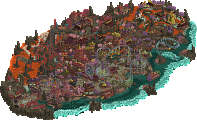
bigshootergill - Pinball Carnival
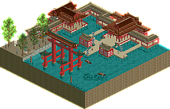
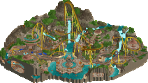
CoasterCreator9 - Itsukushima-jinja
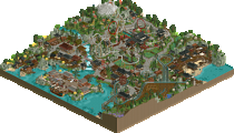
ottersalad - The Treehouse
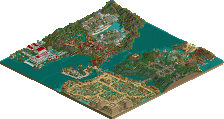
Narc - SkyScream
__________________________________________________________________
How to vote?
First of all, check out all the entries in this match. If you can't view one or more entries, for example if you don't own LL, then please, do NOT vote. Once you've viewed all 4, select your favourite and second favourite in the polls above. After 3 days, we will close the poll, the results of the two polls will be added together, with the votes from the second poll weighing only half as much as votes from the first poll, and the 2 highest scoring entries will proceed to the next round. The third placed park will place its creator on the reserves list for the next round of the contest.
Votes are public and so any cheating of the system, betrayal of honesty or mistrust will be picked up on and will be dealt with.
Pinball Carnival - I'm actually short of things to say for this one. It's the most perfect version of itself I can imagine. The dioramas are great, everything is wonderfully to scale.
Itsukushima-jinja - While I do really like the structures here, this strikes me as using a color palette for the sake of it. I don't like that the station for the only ride on the map is off the edge, that strikes me a bit as cheating.
The Treehouse - The basic concept of a giant tree is a solid one, but I'm a bit lost on the details here. Why is there a monster? The upper levels of the tree look really built up so there's this suggestion that there's a civilization living way up off the ground level but it's just not quite enough, somehow. Maybe a more connected structure at the upper level would have established the story of the world a little better and given you more opportunity to showcase some more details.
SkyScream - Neat interaction, good little study in (mostly) NCSO. The structures seem a little flat and the colors are a little drab.
1) Pinball Carnival - I'll admit it from the start, I'm just not a huge fan of the exploded-scale, bedroom park type RCT. This is probably my favorite one that's been done, just because it looked good as a map, had good and not forced movement, and got to use regular rides in a way that makes sense. I used to love pinball as a kid, blowing quarters on the games at dive bars, the whole bit; so this one did put a smile on my face. I think it was the best balance of the round that both had a concept that I resonated with and got into, and also executed from an RCT standpoint well. If it could have legs, that'd be crazy cool, but I'm not going to view that as a negative. Looking forward to what you come up with next.
2) Itsukushima-jinja - From a "was this built well?" perspective, this one takes the cake this round. While it wasn't as adventurous as the others, it was really created beautifully. The colors looked so fitting that I had to check to see if it was its own Japanese-specific palette. I liked the big Torii, and how it was built over water was simple, yet effective. I thought it was great object-economy here. Thank god you did underwater work, if you hadn't, this very well might have fallen flat. It was close for me however, and I think it'll be a tight race, mostly because this would look so great if you did it on a large scale. Still, it was done to the execution I was expecting here.
The Treehouse - Well, I had a distant idea to do Codename: Kids Next Door, and there goes that. I was so wanting to give this my vote, but I think you'll be competitive in getting through anyways. It had a cool concept, and good artistic choices were made here I think. Nice use of curves, the second perch was great for the overall look, and I loved that there's a monorail up there. What was lacking for me was the base land was very flat and really needed some complexity and interest down there. There was just some minor technical execution type stuff that I felt could be pushed further. You've gotten exceptionally good now, I think once you've ironed out the last bit of technical work, you'll be huge.
SkyScream - I felt this was probably a risky entry. Taking a cutout of a larger park is hard to pull off, and I'll be damned if I didn't want to vote for this one as well. The turnaround itself was a great way to do such a large element, good work. The train felt extremely long if you're going for pure realism, but I'm also not the expert on that stuff around here. The use of the flower gardens was probably my favorite part, and the little bridge over the track was understated and beautiful. I think in general, large park cutouts are going to be a hard sell as the concept itself isn't finished on the map. There's some refinement left in the work and don't be afraid to make some bolder statements going forward (look at how someone like RRP handles realism in that regard). Very pleased with this entry, however, so don't be discouraged - drop something like this here and you'll be looking at pretty good accolade wins.
1. bsg: really awesome work. the dioramas on the side and back are brilliantly executed and such a clever idea. the pinball table itself is functional and fun but maybe slightly less impressive- my only comparison though is roomie's incredible LL design. still, a really fantastic micro and so creative. the dioramas really work as an rct-esque backdrop.
2. treehouse: I like whatever story is underlying this entry with the monster down below- I'm intrigued and I like that you didn't tell it to us but left it for us to figure out or think on. The actual tree is pretty decent- top layer could be slightly more organic and less like a fat paintbrush though. I really liked the lived-in parts and would loved to have seen more of the transport system etc. Maybe a less square layout could have given you more space to play around with that, add some movement, maybe a coaster even.
3. cc9: a really close third for me! I loved the shrine in real life and you did a very good job translating it to rct- i sort of wish that I'd thought to do so because I was just there. solid work all up, some crispy detailing work and good restraint on the overall composure.
4. narc: a nice section of park for sure. Would definitely fit in well to a large ncso project, but feels slightly lackluster in this incredible group. but its still nice for sure and I'd love to see more in a larger project!
BSG -- Such a clever micro. Hi score for this tourney, for sure.
CC9 -- I appreciate the real-life inspiration for your entry, and the execution is good. Lovely roofs and red lines, good palette choice. In a competition full of wild, fantastical concepts, I only wish you strayed from reality and stacked this micro about 200 feet high.
Otter -- I like the concept of a massive tree, but the foliage here is lackluster to me, and I wish there was more of a visible lore to your map. Who's operating the Treetop Transit Authority? What's up with the monster? I'm left wanting more context.
Also, nice use of the custom palette, and I like the use of trackitecture for the tree roots & trunk. The outpost on the corner reminds me of Yavin IV from the OG Starwars trilogy.
Narc -- I don't think I'm sold by the 'section of a larger park' take on a micro. The larger coaster element takes away from the SkyScream to me, I found myself waiting for the coaster to pass thru again, rather than focusing on the ride you titled the map after.
I do like the 'crazy path' station of SkyScream, and the flowered roofs are pleasant af. I'd like to see you expand the park to show the entire finished the coaster.
I've been checkin back for more brackets multiple times a day at work -- don't tell my boss!!!
BSG: This whole map is fantastic, but the little dioramas on the side and up with the main screen really made it. Just beautiful work. And fun too. I enjoyed watching the spinner roll around the machine. This is one of the best uses of these neon lights. Lots of great little details too like the guests entering through the coin slot area. It's an easy first place entry for me this round.
Otter: I would like to know more about the story here. There's some well crafted stuff here and it was clearly thought it pretty deeply. The tree is not bad, though it's really the details all around it that I like more. The little platform, the outpost tower, and all the various ruins on the bottom. Would've been nice to have some movement up top-- maybe some staff or birds flying around perhaps. Regardless, it's a really nice entry!
CC9: This was super pleasant. It's a rather faithful recreation. I'm sad I never did get to visit this while I was over in Japan. The English palette works well here for the coloring-- helps with those several shades of red. I think what holds it back from a contest perspective is there just isn't enough there. It's peaceful and relaxing, however, which I really appreciate. Good work!
Narc: A pleasant enough section of a larger park though unfortunately I'm not sure that works super well as a micro. Would have been great if you could get a full coaster on the map itself. What's there is nice enough though!
There's an extremely high chance that this will happen. The DKS palette fits it so well and I had so much fun building a snippet that I don't think I can leave it at just this if I tried.
I'm really happy with what I put out there, and I'm really impressed by the other entries in this bracket. If I don't move on, these guys are absolutely worthy of it.
Pinball was great. The little murals were a great use of space, refreshingly full of life, and great at holding my interest. I only wanted a little more on the back!
Treehouse was a tale of mixed results. The treehouse and outpost content was great, but the tree itself needed some improvement. The details were there and it kept me invested nonetheless.
CC9 - A serene little scene, but there didn't seem to be enough there for a winning entry. What is there is phenomenally executed and interesting in its own right, it just left me wanting a lot more.
narc - I really like the macro composition of this. A big helix around a tower is a real nice setpiece. I think it was a little rough around the edges, but overall a solid entry.
1.) bigshootergrill - very, very cool. Love this, super well done with the lights and colors and everything. I don't really get the sides of the machine, but whatever. 8/10
2.) ottersalad - love the grand scale of all this, very cool foliage, and that tower added a lot the park for me, don't know why. Anyway, excellent job, looking forward to more from you. 6/10
3.) Narc - looks like a snippet from a bigger park, which I learned the hard way isn't the way to win. But you've got good NCSO style, so keep it up. 4/10
4.) CoasterCreator9 - wow that place is beautiful in real life, thanks for sharing that! But it doesn't translate very well into the game. 3.5/10
My first vote went to BSG, this was awesome, a clever idea to utilize rct stuff in a very authentic-feeling small world application. This is the right way to do giant stuff, it still has some weird-ness to it, but overall it looks detailed and clean enough. Loved some of the small details like the popcorn. Well done.
Maybe odd for me, but i went with CC9 for my second vote. Idk, this just really captured me, had amazing atmosphere and felt very specific and thought out. Probably will be the flattest thing I vote for all tournament, heh. But, overall, it just felt executed well enough to overcome it's lack of intense drama. That being said, if this had been, like, the entryway into a bigger more dramatic concept, may have captivated more people then me.
ottersalad, really close for me between this and CC9, but overall this just seemed to be missing some component. I loved what was there, the tree was very well done, but it was hard to read the actual treehouse itself and it seemed like it needed more context to emphasize what was there. Since it seems you'll go through, I hope you'll keep this drama and scale in the next rounds. Well done.
Narc, what was there was nice but i've learned the hard way that snippets of parks have a real struggle in MM. It was cool to see the coaster functioning, but overall this just doesn't embrace the mindset that MM has found itself in with the drama and the tall ideas and the weird concepts.
BSG - Pinball - Easily the coolest thing I've seen in game in a while. Just perfectly executed and the right amount of detail.
CC9 - Japanese thing - I know you've been wanting to do Japan stuff for a while. I love this; despite the lack of a major ride or anything. The colors work perfectly and the scene itself is just so nice. Would love to work together with you on a park again - specifically with this in it!
Otter - Big Tree - Dude I feel bad for not voting for you, because I really like this. So great to see some fantasy stuff coming from you. I think this missed another ride, or some movement at the top of the tree. Regardless, it's a great park.
Narc - You have a nice style and this would be a great section in a bigger map, but on it's own it just doesn't hold up in this kind of composition.
bigshootergill- Absolutely incredible. I have never seen anyone even attempt a pinball machine in RCT2 until today. The way you not only made a pinball machine, but gave it a unique theme and making it come to life is nothing short of amazing. The guests entering through the coin slot is the cherry on top. Honestly, with the inventive techniques you brought to the table in your Mario Kart park, I shouldn't be surprised. Best of the group without a doubt.
CC9- Nice work! Modeling a place close to your heart is a surefire way to get a great result. I loved learning about the real Itsukushima-jinja in the PDF you attached too. Chibi-Itsukushima is definitely the best way to desribe your park.
ottersalad- Love it! I especially like the man-made part of the treehouse, such as the outpost and the monorail. The rest of the landscape is great too. Second best of the group by a close margin.
Narc- Solid! I like how you got the section of the hypercoaster to run. It brings a lot more life to your micro than if you had just placed the track. All the fantasy in this contest is great, but it's nice to have a touch of realism in there too.
bigshootergill - Carnival Pinball) How crazy! How did you think of that? I loved it, wonderful idea, it reminded me of my old and good times in Fliperama, it's perfect for me.
Itsukushima-jinja) Very well built, the colors are great, in perfect harmony with the environment
I loved the sanctuary and you did a very good job.
The Treehouse) The concept of a giant tree was very good, the objects I believe helped, it was fine.
As ling said, "So there is this suggestion that there is a civilization living at ground level?"
I really liked the top.
SkyScream) The use of the flower gardens was also my favorite part, and the small bridge over the discreet and beautiful lane.
The roller coaster supports are good, simple and cool, without exaggeration, in the right measure.
1. Pinball
2. Treehouse
Pinball - Nailed every part, each attraction on the sides and back is well implemented and nicely detailed. The main board colors are fantastic and everything that involves the peeps is super clever and fun.
Treehouse - At first glance I wasn't that excited, but then using cutaway starting from the top revealed great details in the upper levels and quality construction throughout the tree. The tower to the side and other ground features are nice, too.
Itsukushima-jinja - so pretty and contemplative but I just wish there was more here
Skyscream - I really like all that's featured here but I don't love getting just a chunk of a ride and the perimeter foliage could use more detail in my opinion
#1. BSG. I mean far and away the best of the group, probably my favorite of the tourny so far. Awesome idea, awesome execution. Usually big structures/sculptures are blocky boxy but you nailed this. The scale is perfect in relation to the rides. Love that the people enter though the coin slot. I have nothing bad to say, perfect entry. One of those micro's that you knew was going to be first in the moment you submitted. This voting is just a formality.
#4. Narc. A nice cutout of a park but didn't hold my attention for too long. Nice atmosphere, I could picture this in a park somewhere. Archy is pretty non existent. Foliage is okay I guess, I'm not a fan of the flower roofs. Peeps are nice to see. Nice micro, 4th place.
This is now a hard decision that I went back and forth on for a while. Fantasy tree vs recreation. Neither thrilled me to be honest.
#2. CC9. Going with the recreation. I think I would have preferred you take some liberty's and make something inspired by this location, instead of recreating it. There isn't and impressive centerpiece that draws the eye here its all pretty flat and one dimensional. I don't think it translates too well into a micro. I don't like how the boats, boat off the map, that should have been hidden in my opinion. The map overall is pretty empty too. On to the positives, peeps help atmosphere. And what's there is nice. The thing in the water is recreated nicely, overall palette is nice. I disliked this one less then the tree. 2nd
#3. Ottersalad. And that leaves the tree Ive been hatin on. The roots do not look like roots to me at all. It looks like a brown pyramid. The canopy off the tree looks way off to me too, it should be at least 2x but probably 3x the size based on the height of the tree. Most of the actual tree house is boring to me too. The entire lower layer is a monorail track, effectively a tan wall. The top layer has some nice detail, that's a much better layer and my favorite part of the entire micro. Nice store in there. I like the monkey's too That monorail station looks unsupported, and the wooden platform with the monkey hanging on it is not supported, that thing just straight falls down. Its a tree house and I don't like the tree or the house. Art is really subjective, just because I don't like it doesn't mean its bad. Hopefully others enjoy this more then me, it doesn't have my vote.
#1 BSG: I think the facades and murals here were the best part and executed perfectly, awesome they're peepable too. The board was fun to watch and the macro with all the tiling looked amazing, couldn't help but feel like you could make it crazier and more chaotic like a real pinball board though. Still overall my #1!
#2 CC9: Honestly when I opened this at first I said "that's it?" and probably looked for just a minute. For some reason I decided to come back to it and it grew on me a lot. I love the elegance and simplicity of the composition and feel like because of that I was able to take in every detail. Very beautiful and serene. The only thing I would've liked to see more is some more foliage, whether that be planters on the buildings or water lilys or something of that sort. Hyped to see a fuller version of this.
#3 Ottsersalad: Nice and cute entry that was executed fairly well. Didn't really win any originality points from me since it was similar to my MM1 entry and big trees have been done a lot at this point, but I liked the platforms in the trees. Could've used another major ride as well possibly.
#4 Narc: I think a full release of this level would have been accolade-worthy but in a micro it doesn't really do anything for me. The ride snapshots are hard to pull off and if they're going to be done well I think it needs to be a really picturesque section of the ride, but it was just a big turn. I liked the roof gardens though.
BSG, your creativity is such a blessing to this site.
__________________________________________________________
Winners
bigshootergill: 50 + 2/2 = 51 points
ottersalad: 3 + 30/2 = 18 points
Eliminated
CoasterCreator9: 1 + 19/2 = 10.5 points
Narc: 1 + 5/2 = 3.5 points
__________________________________________________________
bigshootergill and ottersalad proceed to Round 2.
CoasterCreator9 is eligible as a replacement for Round 2.
Congratulations to the winners!