Park / Thunderrock Mesa
-
 10-April 19
- Views 7,533
- Downloads 470
- Fans 0
- Comments 20
-
 No fans of this park
-
 Full-Size Map
-
 Download Park
470
-
 Objects
79
-
 Tags
Tags
![park_4715 [NEDC5 - 01/10] Ririku](https://www.nedesigns.com/uploads/parks/4715/aerialt4584.png)





How to vote?Round 1 - Group M
__________________________________________________________________
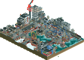
FredD - Falcon Heavy
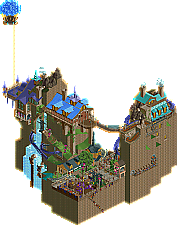
disneylandian192 - Baron Von Beets Summit Chateau
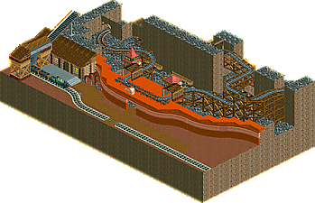
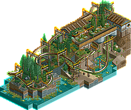
Wonterra - Thunderrock Mesa
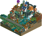
Wacked - Wyvern Experience
__________________________________________________________________
First of all, check out all the entries in this match. If you can't view one or more entries, for example if you don't own LL, then please, do NOT vote. Once you've viewed all 4, select your favourite and second favourite in the polls above. After 3 days, we will close the poll, the results of the two polls will be added together, with the votes from the second poll weighing only half as much as votes from the first poll, and the 2 highest scoring entries will proceed to the next round. The third placed park will place its creator on the reserves list for the next round of the contest.
Votes are public and so any cheating of the system, betrayal of honesty or mistrust will be picked up on and will be dealt with.
1) Baron Von Beets Summit Chateau - Great entry dude! I thought this was the clear frontrunner for this round. Good balance of the extravagant and keeping it readable. I thought it was a fun idea that didn't take itself too seriously. There's some moments of greatness - the balloons, the path ledge hung from the cliff, the long suspension bridge, the zaniness in the architecture. If there's anything I disliked, it's only that it felt a bit rushed on making a nice looking map edge and adding some interest to break up the part-rectangular, part - organic shaped map. Can't wait for your next round.
2) Wyvern Experience - I was torn between this and Falcon Heavy, and I went with this because it felt like there was more to jump in and appreciate. It felt like a complete package and, while not mindblowing, was strong enough to get my vote. I loved the canes used on the supports, and the moment where Wyvern Rider dives under the station shows some good senses with interaction and vertical spacing. Good clean work that I have little to critique besides suggesting you continue to push the theming and immersion.
Falcon Heavy - Damn, I wanted to vote for this. It's the most unique and has the greatest sense of grandeur of the group. I liked the tracks that you've put in that transport the whole launch. Also great touch with the rockets falling off. It took me back to when I saw a rocket launch on vacation to Florida when I was younger. The sky element made sense to me, and was a great setting. What drew me away from it was the fact that it felt like there wasn't much there and was more of an image/screen type thing than something to view in game. You're getting very good, and I think this will compete well and I'd like to see what you could do in round 2.
Thunderrock Messa - Unfortunately it was unfinished so there's not a lot I can say about it. The start of the rock layers looked cool and I think you would've had something that probably could've been very very competitive if you had more time. I like that you weren't afraid to use a big path there, and I like how the train is in relation to it.
Falcon Heavy - Clever use of the different views, although I do wish more had been done with them. The obvious choice would have been to show different stages of the launch, and I don't think it would have actually been that much more work.
Baron Von Beets Summit Chateau - I love this. The waterfall is well-done, the architecture stands out and is unique but feels like it belongs. The coaster layout is the weakest link I think, something about the pacing is just off.
Thunderrock Mesa - Not much to say here.
Wyvern Experience - Pretty minimal but I like the station. Foliage and landscaping were well executed. I do think the rapids should have been exposed. I just don't think NCSO stands much of a chance in this contest.
1. disneylandian: really nice work. full of whimsy and fun, and just pretty high quality work. I loved the ropey bridges and baloons and everything.
2. fredD: I didn't understand the 4 separate versions at first until I realized it was for the sky to look right. Nice job on the rocket and pad! A bit simple overall but you got a good bracket for it sneak into second place with.
3. wacked: a pretty solid entry. the layout doesn't do a lot for me but I like the dense atmosphere and it does all feel a little mysterious. cool stuff. not sure how a dragon fits in though!
4. wonterra: disappointed to see an unfinished entry, but also I'm impressed that this is our first. hope you stick around NE anyway!
Disney- Wow! This was a fun map. I like the two separate landmasses and how you spanned between them. The rope bridge is super cool. I like how you incorporated the landscape into the various buildings and also the queue for the cable cars hanging off the side. As mentioned above, the coaster layout is maybe not the best, but there are some nice sections where it frames the waterfalls nicely. With this kind of initial attempt, I'm excited with what you'll come up with next.
Fredd- Having been anxiously awaiting the launch tonight, this was a good substitute once I found that was postponed again. The 4 corners was a nice solution, though as Ling mentioned, it would have been super cool to see each angle be a different stage of the launch. It would have also been neat to show those boosters doing their re-entry sequence since the Falcon Heavy does land those. But still, I enjoyed that once quite a bit so it definitely gets my vote.
Wacked- Some pretty nice NCSO here. I like the candy stick being used for the columns. That's a clever application. On the whole though I think your coaster layout lets you down a bit and a majority of the map is just pretty homogeneous landscape. I think some variety will help you the next time around.
Wonterra-- Would like to see this finished.
1. Disneylandian192: Whimsical and fun. For whatever reason I enjoyed the chairlift station at the top. Also, opening the park with the balloon was a nice touch. Allowed the viewer to filter down the map. Well done.
2. FredD: I thought the amount of work needed to make the rotation views align was impressive. I'm not an expert, and I saw on discord others saying the illusion could be done easier, but I respect the work. Also, same as Disneylandian.. scrolling up to see the rocket was a neat touch.
3. Wacked: So close to being #2.. really nice effort. I think the same-y archy and foliage hurt. The commitment to custom supports was impressive.. really paid off. Just fell short with the layout.
4. Wonterra: Shame it was unfinished. I love your stuff over at RC&F.
Falcon Heavy - I love the concept and theme, I do wish you had gone a bit larger scale with the launch pad. Surely there's a way to get the same sky effect without limiting yourself on tiles? Maybe not.
Thunderrock Mesa - I think this came across to me as a little unfinished. I'm not sure if that's true or not. I did love the canyon wall motif with monorail track, though.
Wyvern Experience - This is NCSO, isn't it? It's impressive and a bold move. The layout is perhaps a little lackluster and "theme" may be a stretch, but I enjoyed this one quite a bit. I think the interaction got me.
Baron Von Beets - Strong. Very strong. It's got a lot of verticality without sacrificing readability which I really appreciate. As dirt mentioned, it's fun and has a lot of wonderful little details.
Baron von Beets sounds like one of the eccentric family members of the kids of the Unfortunate Events series. This was a pretty well done micro, but I found the coaster really hard to follow. Lots of fun details and a really clean execution.
Falcon Heavy was well done and a cool thing to make a micro of, but wasn't great at keeping my attention. Would have liked to have some variation between the panels, or some other interactive or moving element
Wyvern was pretty nice. The layout was sufficient for the space, and the way the supports looked really pleased me.
Thunderrock looked unfinished. Wanted more.
I clearly voted way different on this then everyone else, lol.
I went with Falcon for 1, I liked the idea and the execution, thought it showed the best skill. I like the idea that the best way to counter the need for TONS of movement and content is a single, snapshot moment with no movement at all.
It was super close for me on second but I went with Wyvern, I loved the style and it just felt super original. Coaster wasn't amazing, but it was unique. Could have use more peeps to bring it to life, but overall a submission I enjoyed enjoy to edge out Baron.
I was super close to voting Baron second (apparently it's okay though cause everyone else gave it first). This had the drama and fun we expect from MM, but it didn't feel fresh, and it seemed to be missing the final polish of some of the better submissions. A few places had so much blank rock face with no texture or deviation, it felt a bit empty and jagged. But, regardless, love the creativity and excited to see more (likely) in the next rounds.
Thunderrock, unfinished, thus not able to really compete. It has some great bones, but nothing but bones. Wouldn't mind seeing it finished though!
1.) disneylandian - nice landscaping, cute theming, no complaints. 6/10
2.) FredD - I love the creativity and you nailed the rocket and launchpad, but you'll have to add more and rely on more than just one trick in the next round. 5/10
3.) Wacked - love a good NCSO park, but the layout (the crux of the park) wasn't great and the colors didn't help much either. But I'd love to see more from you! 4.5/10
4.) Wonterra - I take it this is based on Imagineering's original plans for the first Magic Kingdom expansion (for those who don't know, worth watching a documentary about it). Could've been a great submission 1/10
1. Beet
2. Falcon
disneylandian: despite some flaws, this is the clear winner to me. Coaster was way too fast but I liked the interactions. Questionable roof choice, but at least it was consistent. Ugly LOTR rocks, but well made waterfalls. Lots of rides, and stuff to see from every angle. I wish you spent more time on foliage, having just two trees is not enough to establish a style and it cannot lift the barrenness.
Wonterra: unfinished, too bad! I'm glad you submitted though, for that perfect number of 64 entries.
Wacked: I'm not sure what exactly the theme is, and I think you could've chosen better colours than this, but overall it's a nice arrangement. Decorating the edges of the micro with fences and walls was a good move.
1. disneylandian192
2. Wacked
3. Wonterra
4. FredD
#1. Disney. I don't think I like this as much as others seem to, but good enough for first in the group. I really don't like the tall dirt walls, nothing too interesting there. That kinda kills the atmosphere for me. I like the waterfall in the back, that really helps to break up the monotony of the dirt walls.I wish there was more of stuff like that in this micro. I can see you tried the same thing with a few windows, but they don't work for me and seem out of place. I'm not too crazy about coaster the layout either, although a few elements are really nicely placed like the heart line roll over the waterfall. For as much as I don't like about this micro there is also lots to like. The purple building is the best of the archy in my opinion, I really like that chairlift station. The peepable overhanging mini golf course path is awesome, I love that idea. Mine train suspension bridge is cool too. Balloon is a nice touch. Overall, not to exciting for me, but there are enough small fun fantasy details to take the number one spot in the group.
#4. Wonterra. Well perhaps the easiest choice of the tournament so far. Too bad this is unfinished, I think you could have done something cool here. The little that is there is nice, I like the train being loaded with rock or whatever, I'm definitely going to rip that off at some point. Shame, 4th place.
#2. Wacked. Beautiful piece of NCSO. No peeps which is unfortunate. The layout is funky, I'm not sure how I feel about it too be honest. Those supports are awesome, and archy is simple, but fits the theme and isn't done without skill. Some extra details are what gets this in to second for me, the river rapids in the water, mine train track in the tunnel. Good enough to move on.
#3 FredD. It's a nice rocket. Its a nice gimmick. First time I rotated the screen it took me a minute to understand what was happening. Rocket is nice, it looks like a rocket. Launch pad is nice, it looks like a launch pad. It just didn't hold my attention, and the gimmick isn't enough for my vote. I think you took a risk here, and its either going to be hit or miss. Its a miss for me, hopefully it capture someone else's affection.
Baron Von Beets: Fun little thing! Love how it opens on the balloon and the viewer has to descend. Nice archy, fun little story, but landscape ccoul'dve been better.
Wyvern Experience: Some great NCSO! Nice atmosphere, of a little busy. This gets my vote for second place.
Falcon Heavy: Great idea and well executed! But it could have been more. Sorry my friend, third place.
Thunderrock Mesa: So this actually is unfinished? A shame, could've been nice as it shows promise.
Baron Von Beets: I love the layout and arrangement of everything, the bridge across is a nice touch and the balloon is a fun touch. The tall dirt walls are bland in places, but areas where you spiced it up with rock work and waterfalls are great.
Wyvern Experience: I am all about NCSO, great supports and I love the water and plants framing the front edge of the map. I wish the coaster had a little more height or speed but it's very pretty.
Falcon Heavy: Feels too clever for its own good! An ingenious solution to get the effect, but the end result is just not a ton to look at or hold my attention
Thunderrock Mesa: Could have been great, wish it was finished
Thunderock Mesa:
What was here was a nice start. Something that I think would have hurt the layout even if it was finished was the symmetry of the stacked monorails. Sandstone formations like this are hardly ever symmetrical and going with a more random, organic shape may help the believability. The train station was well done, I liked what I assume was a coal chute. What was built showed good promise, I'd encourage you to hold onto this and finish it!
Falcon Heavy:
A nice use of this illusion. The rocket was very well made, as was the launch pad. Not enough details at the ground level to suffice for a competition like this I believe, I would have loved to see frozen staff with names, stories, or jobs. I wonder if you could have used each angle to tell a piece of a story, with the rocket at different stages of the launch in each view. A missed opportunity I think to take the map further and hold attention longer. Remember the thing that gave "A Year" that edge using this same effect was how well the backstory was portrayed in the content, giving the viewer an eagerness to rotate the map and discover something new. I rotated, but didn't find anything new. I'm sorry to see you potentially on the alternate list for R2.
Wyvern Experience:
Love me some well done NCSO, and to go in that direction in any competition is brave, especially in this where nearly every tile counts tenfold. The supports were exceptionally done, I loved the use of the candy canes. A woefully undervalued scenery piece- i'm inspired now to use this more! Great pacing on the coaster, and I commend you for your choice of a swinging coaster. Something I didn't care for was the color choices. Too much brown and yellow. I would have loved to see a bit more color integrated into the map. Even the flowers on the lily pads were yellow! Other than that small qualm, I enjoyed the map!
---
Thank you all for the comments and constructive feedback on my map. I ended up gone for a majority of the building period for work, and ended up rushing to "finish" the map the last few days leading up to the deadline. Simple things like adding music could have gone a long way, something I remembered an hour after submission as I had spent most of the build time on this map with RCT muted.
The foliage and tall edges of the map were the last to get done, and subsequently suffered the most because of it, lending to the overall unfinished feel of the map, something I can't stand. I'm looking forward to R2. It's exciting to see so many underdogs, some I've hardly seen work from before, come through on top in R1!
Very original, I liked the tracks that you put that carry the whole launch, and like parts of the rocket falling (it was good). I loved the rocket and the idea went through the clouds.
Simple but honestly great work.
**disneylandian192 - Baron Von Beets Summit Chateau
Great job, fun, loved the edges and the layout I used got 10, feel amazing, I was a good time enjoying.
**Wonterra - Thunderrock Table
I loved your idea and the objects you used, but do not be offended, it seems that you have finished finishing, a little lifeless.
**Wacked - Wyvern Experience
I liked the format of the terrain, good ride, ok station, water in parks always helps on the scene, foliage ok, just think the colors did not help, the barrels do not know, if it was good choice.
Sorry, I was confused by the theme.
But I liked the supports in yellow.
__________________________________________________________
Winners
disneylandian192: 42 + 9/2 = 47 points
Wacked: 4 + 28/2 = 18 points
Eliminated
FredD: 8 + 16/2 = 16 points
Wonterra: 0 + 1/2 = 1 point
__________________________________________________________
disneylandian192 and Wacked proceed to Round 2.
FredD is eligible as a replacement for Round 2.
Congratulations to the winners!
Brief comments from KaiBueno! (Disclaimer - I'm renewing myself to the community and know very little of you, your parks, styles, etc. My views are framed from what I see as I open it, with a twisted 2005 perspective of wazzup.)
Wyvern - Oh, this is near perfect without being overly daring. It wasn't gimiky, and I feared it wouldn't move on. This is what I see as a modern version of where I left off in 05...straightforward coaster, modest theme, excellent execution. Top 5 possibly in Rd.1, easily T10.
Baron - whoa, great job with the split cliffs, coaster track connection path and lovely structures, especially the decking. The coaster and waterfalls interact fantastically.
Falcon - I wanted to root for this, really. Maybe it is a common trick for the rest here, but I learned a lot with the 4 panel replication to make this work, so I want to thank you for that. Clever idea, executed well, but still just a rocket still life. Gives me ideas going forward.
Thunderrock - This one is well done as if carved out of a full blown park, so it kinda suffers like mine does. Too big for the task at hand. It reminds me of the climate of Gila, but is lacking the shrubbery...needs a few more (and yea, I know mine only had 1 tree).