Park / Seperated Worlds
-
 09-April 19
- Views 10,551
- Downloads 534
- Fans 0
- Comments 30
-
 No fans of this park
-
 Full-Size Map
-
 Download Park
534
-
 Objects
253
-
 Tags
Tags
![park_3211 [MM2014 R3] Heart of Darkness](https://www.nedesigns.com/uploads/parks/3211/aerialt2825.png)

![park_3226 [MM2014 Final] Ode to the Ood - MMFinale by Stoksy](https://www.nedesigns.com/uploads/parks/3226/aerialt2837.png)

How to vote?Round 1 - Group K
__________________________________________________________________
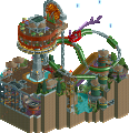
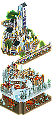
Recurious - Sky Castle
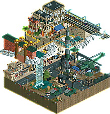
Bubbsy41 - Seperated Worlds
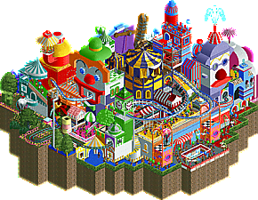
Chocotopian - Clown Town
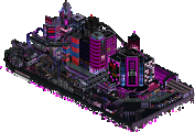
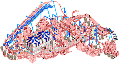
Luketh - Cotton Candy Cloud in the vast emptiness of space
__________________________________________________________________
First of all, check out all the entries in this match. If you can't view one or more entries, for example if you don't own LL, then please, do NOT vote. Once you've viewed all 4, select your favourite and second favourite in the polls above. After 3 days, we will close the poll, the results of the two polls will be added together, with the votes from the second poll weighing only half as much as votes from the first poll, and the 2 highest scoring entries will proceed to the next round. The third placed park will place its creator on the reserves list for the next round of the contest.
Votes are public and so any cheating of the system, betrayal of honesty or mistrust will be picked up on and will be dealt with.
1.recurious: really cool work. I thought the plot was well done and pretty original, and properly justified the use of floating islands- which can get a bit tedious otherwise. The upper level is really impressive archy and I'm sure was a nightmare to build! The ground level had a great video-game feeling to it with the frozen steampunk stuff on top of the lava mines. The hole in the ground made a really great viewing piece. I actually might have covered up the sides so that you couldn't see in except via the hole except when using cutaway view- would make the surprise more interesting. I'm a sucker for creating a bit of drama/suspense from the audience's perspective.
2. chocotopian: I loved this way more than I expected to. So full of life and vibrancy, and the clown sculptures are awesome and weird and slightly nightmarish. This place would be fucked in real life, I want to go. Its so crazy but also so cool and I think you handle the sort of tight tent awnings pretty well, especially near the balloon flat.
3. luketh: a really solid layout you got into the micro! its a bit bare all around but still likeable. I wish there was a bit more to see but I do enjoy the fluffy landscaping.
4. bubbsy: i know your rct parkmaking is built on copying other people, but you shouldn't take that so literally. Its a bit over the line for me personally. I don't think it necessitates a DQ or anything drastic, and no hard feelings, just I won't be voting for you, sorry. You seem to have copied some of my work essentially piece for piece with a bit of recoloring (and making it worse.) The micro also seems to have ripped off pierrot's arabian micro/helicopter, EVIL's rockets, and probably more I can't find but I have my suspicions on some of the archy above- I have to say seeing my work in the park was a jarring and funny experience.
Regardless, I'm not so hot on it. I don't really get the story of it, it just seems like stacking levels to get more space out of the micro. I get that its meant to be some sort of contrasting middle-eastern thing, but theres not really a ride or shops or staff to guide me through it. some of the archy up top is cool though.
Anyway- I don't want to derail this thread with some sort of semi-argument about copying/cheating/where that line lies. I said my bit and would love comments following this one to just focus on the micros otherwise, no need to reply to me here
Haha Nice bit of fantasy here, with the three layers creating a convincing setting. The castle is well made, love the garden bits, though not the biggest fan of the color scheme. the bottom layer was a bit sparse but I enjoyed the mining coaster diving into the underground. It was weird to see peeps start coming in though; the whole thing was peepable, but it was opened without peeps, but then when peeps showed up, they only went to the rides and didn't inhabit the landscape / castle as I thought they would've. I think the narrative could've used more details / explanation with staff and track pieces named to create more immersion in the concept, and the overall look does stray a little close to generic fantasy cliches for my liking, but overall a strong showing and well made micro that deserves to move on to R2 in my book.
2. Chocotopian - what a lovely surprise! This reminds me full on of Circus Circus hotel + casino in Vegas: gaudy tacky fun but a little creepy and stanky clown lovin' involved. Loved cutting through the dense park seeing all the rides, there were so many to find! The cat shuttle was wonderful, as were all the balloons. Loved the coaster snaking through the park, and just seeing all the little ins-and-outs was a joy! The colors were great and I think overall the park just put a smile on my face. Well done, it looks like the micro format is perfect for this style of parkmaking and I'm loving it.
3. Bubbsy - Overall really well crafted, the architecture and rocket / helicopter were great. I didn't quite get the theme, it seemed like a realistic US war zone in a middle-eastern city, but with a fantasy floating city? Strange combination and I didn't quite understand the idea behind it, some more narrative clues by ride names + staff names could've helped add to the concept. The clouds were a bit blocky for my taste, I think I would've rather liked to see the upper level more floating mechanically with tension cables / support structures, ala Alita / steampunk style, instead of mystically with clouds, given that you've quite a nice train track structure there. Also wished to see more of a split between the two layers, and some music / sound would've helped set the mood better. Overall the skill and craft is there, but the lapses in the concept and idea meant I wasn't fully drawn into the setting.
4. Luketh - Fun and pretty to look at because I love all the pink! First reaction was how large your micro looked, so great job on having that impressive size within the limit. The idea is cute and I enjoyed the concept, and the park was simple and well done. Definitely could have used more detail in both architecture, setting, and concept, but it was a cute submission that had a nice impact in the overall look.
1. Recurious - For me the clear winner of this group because your micro combined originality and execution the best. I like the different layers and the story it tells. The castle is awesome! Archy in general is really good. I also really like the coaster, love that special corkscrew element The track layering also really works here. Great job!
2. Chocotopian - This micro screams fun all over it! I really like the clown faces (come on, how can anyone find that scary ). It's maybe just a bit too busy which makes it sometimes hard to read. Fine submission and I vote you second because it kept my attention longer than the other micros in this group. I'd like to see what more you can do!
3. Luketh - You had a clear concept and kept it simple. I don't want to say that in a negative way, I say it because it paid off. It's clear what it is and it looks fun to look at. The coaster is really good for being on such a small surface. Almost no micro coaster looks like I'd want to ride it IRL, this one does so kudos.
4. Bubbsy - Technical this is from a very high level! Everything looks really good, the archy is awesome. But this micro looks vague. The lower lot looks like a Middle Eastern war zone, but then there's that weird upper world?! I don't get the connection between those two and I think you'd better off without that upper zone. You are a good builder, I'm afraid the others in this group managed to make micros that appealed to me more and kept my attention longer.
1. Sky Castle
Amazing stuff. This really shows why you were a top seed, the architecture in this is one of the best i've seen lately. The coaster is also very good.
2. Bubbsy
This was a great entry with a good theme and good execution. Would have loved to see some more stuff from your own tho.
3. Cotton Candy etc.
Nice stuff. We not often see design-like micros, and also the concept is quite original and well executed. Would have loved some more details tho, maybe some different candys or so. The coaster was cool tho.
4. Clown Town
This is fun. You definitely executed the theme right. It was hard to read though and a bit too busy and messy for my taste. Colors were great.
Another day another dollar, and in this case another set of Micro reviews. Its been a hell of a week for RCT.
#1.Recurious. Beautiful. I loved the story to go along with it. The castle is really the standout centerpiece here that pushes this far beyond the competition for me. That is well laid out, and colours are spot on. Special mention to the floating gems from the story, I think they look pretty magical and powerful. Cool way to get an accent colour in there too. I liked the lower village as well, that's nicely detailed. I like that the buildings in the village are a smaller scale, it really makes the castle look more grand and magnificent in comparison. I liked the lift hill and track layering for the mine train, but I'm not sure about the red colour it switches too in the caves. In fact I'M not sure i like the caves at all here, its the low point of the entry no pun intended. The ground of the village is too low and greatly restricts the view, i can barely see the mine train down there.
Considering I just spent 30 minutes on dicscord explaining why I generally don't enjoy overly tall micros, I feel like I should address the height here. The castle probably could have been like 2-5 units lower without obstructing the lower village, but that is super nitpicky and entirely forgivable. I feel like the height has a purpose in this one, its written into the story which helps, but more importantly you don't waste space with the height. It's not an atmosphere killer, the height actually adds to the lore here. Anyways in summary Beautiful castle, nice village, bad mine, good enough for first in the group.
#4. Choco. Now this is a fun entry. Lots of details to find and love, my personal favorite is the clown face in the back with the star eyes. Backwards coaster is nice. You did a good job of selling the theme of a clown town, bright colours fun nonsense. This in my opinion is built in more of a macro style which sufferers against its micro detailed competition. A strong entry, just not quite on the same caliber as the other three in my opinion.
#2 Bubbsy. I don't want to get into the whole whats copying and whats inspiration debate, those photos look pretty incriminating. But its possible you were both taking inspiration from the same real world wall. Rocket ships are all similar. It looks bad, but its impossible to prove intent with this stuff, so I'll give you the benefit of the doubt and judge this as an original work with no copyright issue.
That being said I'm actually not overly fond of this micro. For me this piece as a whole doesn't come together to paint a beautiful picture. Its almost like you made two separate micros, one on top of the other. Its .... Disconnected lol. Despite that, I think the micro detail work on your structures is enough of a crutch to get this into the second spot. They really are beautiful buildings. Barely enough, and goes against my heart to vote for this. If cotton candy didn't have its own problems you would be in third.
#3 Luketh. Now this is an entry that is the opposite of Bubbsy's, I think its a fantastic overall composition, greater then the sum of its parts. The coaster is a fantastic layout #datflow and the support work is spot on. Nicely laid out landscape with a fun theme, creative use of stalls. I didn't enjoy the station too much, Interesting idea using the tents, just didn't turn out in my mind. My biggest issue with this micro is the colour. Its too pink, the coaster blends into the landscape way too much. There really isn't too much complexity to this micro, and because of that colour becomes crucially important. With a minimalist entry everything has to be just perfect to take down a bigger micro detailed competition, that's why your in third for me. I screwed around with the colours for 30 seconds and I think something like this might have been better. But I have to judge it as it was submitted so its a mute point
I would like to formally request that we abandon the trope of tenuously connecting a floating section to a grounded section with nothing but a waterfall.
it hurts me
Cotton Candy: Nice layout, fun idea, flat composition. Doesn't really hold me beyond watching the train roll through once.
Clown Town: Chaotic, fun and exciting much like Liam's entry. This misses a bit of the refinement and composition that elevates that to the next level, but still an enjoyable entry. I was really happy when opening this.
Bubbsy: Well-executed except for that gate, and the top and bottom sections do seem strongly connected, even if the relationship is ambiguous. I wish the upper section were higher so I could more easily read the facades on the lower level. The idea is interesting, but it's ambiguous: is this one section profiting from another, is it where the US has and hasn't gone to war in the middle east, is it oil middle east vs religious middle east?
Rec: This is two beautiful micros stacked on top of each other that could each easily do well on their own. Nothing on the map itself really explains their connection to me, however. Technically and creatively strong though, this will take my vote.
Just want to post a quick response to the deserved criticism above. I will admit I have a boner for that entrance and that park in general. However unlike what you guys might like to hear I built the remainder of the map without looking at anyone's work. DQ me if you must, but I don't see any reason to keep this conversation going.
As for the others in group K, you guys killed it. Some awesome work. Hopefully I'll be able to get you guys some reviews in a bit.
Edit: The idea behind the micro is basically America screwed up the middle east and the bottom is reality, while the top is what the middle east would be without involvement.
Bubbsy, your fine. Being inspired and using bits of stuff is a progression of good ideas and imo healthy for the game. It's not copying in any way.
Nice work everyone, sorry I won't be voting or giving much feedback on the 200+ entries in R1. I am retired and (more) lazy now
1. Sky Castle: Thought the top layer was really well done.. loved the details on the castle. The second level was okay.. liked the gritty factory sort of vibe to the architecture. Not a fan of the bottom level.. Also, I agree that waterfalls connecting levels is overdone.. and hell, even I did it crappily years ago!
2. Cotton Candy: Thought the layout was solid. The theme was very simple and to the point.
3. Clown Town: Toss up for me. Really enjoyed it.. just thought the coaster was a bit lackluster. Everything else was nutty but in a good way.
4. Separated Worlds: Not gonna lie. I'm with Cocoa on this.. Sorry.
1) Separated Worlds - This got my vote because I thought it was executed well. I liked both the top and the bottom parts of the map. The use of the big train bridge with the arches was great. I also liked the grunginess of the bottom part of the map with the fires, tires, smoke, imperfections, etc. I'm not all that familiar with the copying bit, but to a degree I can get over it if it's there. I thought it had the best architecture. Very strong.
2) Orbis: Sky Castle - Close to getting my vote for number one in this group. i thought the bottom section with the ice/lava dichotomy was the best part and the blitz-type coaster was really cool and I liked the Drachen Fire inversion. The top half with the castle was equally well done, but felt like it was missing the magic of something going on up there. I probably would've enjoyed if the castle was just included in the ice section and the bottom area was just expanded on more in that regard. Good stuff, I enjoyed viewing it.
Clown Town - Some flashes of brilliance were present in this one. There was great awning work with interesting shapes, that funky building spire, the one clown face, etc. I love the fact that you included Catbus - it's my favorite CTR and I've been including it somehow into everything. I liked that it essentially went on a janky course too. Overall, I just felt this one wasn't constructed to a level as high as the other two, but probably had the coolest feel to it.
Cotton Candy, etc - Impressive to fit a full (and pretty good) invert layout into the 15x15 size limit and I think it looked really natural. The accents with blue were a great choice as well. I do wish there was something else to draw my attention on the map, but it had a pretty cool 'pink-out' motif going on that I actually enjoyed. The cotton candy clouds were convincing and I'm glad you didn't just spam cotton candy stalls. I look forward to new releases from you.
Recurious- Amazing! Choosing between your park and Bubbsy's as my favorite was hard, but what pushed yours over the top was your story. Orbis is a wonderful park on its own, but learning the local folklore and understanding how it ties into the park adds an extra level of depth to it. Favorite park of the group!
Bubbsy41- Great entry! I was going to say your park felt a bit incoherent and some context would be nice, but now that you've talked about it in the comments, I love your basis. Didn't expect to see any political messages in this contest! The comments about the potential scenery theft concern me, but I'm willing to look past it. Second favorite park of the group.
Chocotopian- Nice work! It's wacky and chaotic, perfect for a clown-themed park. The scenery gives me an old UCES vibe for some reason.
Luketh- I absolutely love your coaster layout! For being compressed into a micro, it looks and feels very natural. Making a micro coaster can be tough, and it's easy to make an awkward layout. However, the rest of the park feels very monotone to me, and I wish there were a little more besides the coaster. Good job!
A solid set of entries for this round!
Recurious: Nice work! The architecture is very strong and I appreciate the three fully distinct areas. The coaster has a nice little layout, though I wish the underground portion was taller so you could see more of it. Your land seems a little thin. I did still use cutaway to watch the ride, just because the layout was nice. There is a bit of a disconnect between the above and the below with just the waterfalls connecting. You have 3 very flat layers and I think you can probably vary it up more in the future. Still, this one is great and it should get you through easily.
Bubbsy: I get the theme and all, but I think it's still maybe a little disconnected. Most things look good in the English palette, but your architecture is especially nice. The details on the military compound are also very strong. The copying or highly inspired stuff doesn't bother me too much. Really I wish you gave a bit more room between bottom and top so I could fully appreciate the architecture on the bottom more. It's quite nice.
Choco: Super fun map. There's so much movement, which I appreciate. The middle of the map kind of gets lost in the chaos and color. It's a little hard to read perhaps. But it's super clever and I love stuff like this that feels a little more old school than a lot of more technically polished maps. It's refreshing.
Luketh- You got my 2nd vote because the coaster is great. I really enjoyed it. It's kind of funny how 'realistic' the coaster is in layout and supports and everything sat on a bed of cotton candy floating in space. I like that you used the stalls heavily but not overly so which doesn't make it as overwhelming. I would love to see some more architecture, but I'm not entirely sure what you'd do here. But either way, this is one of the better coasters on a micro that I can recall.
1.) Recurious - multilevel thing was cool, each level on its own could've won some easier groups, but I didn't really get how they were connected. Otherwise, super good, nice job. 8/10
2.) Bubbsy - don't worry about the copying thing. It's just not as impressive seeing something done again (and not quite as good even). But still, this shows tons of skill. Love it, keep it up. 7/10
3.) Luketh - loved the layout, you did an amazing job getting a whole coaster in there. You could've gotten away with colors besides pink and light blue, but I give you credit for an original idea. 6/10
4.) Chocotopian - kinda cool and amazing how you got those faces to come out so well, but the colors and motion were too much for me to handle. 5/10
Sky Castle - This clicked for me. There's enough space between the two layers that each can breathe a bit. Hell, you probably could have split them and had winning R1 and R2 submissions. Make a storyline out of it. The subtle disconnect is probably the only major criticism I have.
CCCitVEoS - Nice name. I was massively impressed with your coaster layout. It's just fun in general and I really liked it as a whole. While perhaps not as detail laden as the other entries, the coaster itself and the theme as a whole was a hit for me.
Seperated Worlds - Where Sky Castle gave enough (nearly too much) room for each level to breathe, I don't think this gave enough. I'm not convinced you made the helicopter without looking at others' work. The narrative fell a little flat to me and I don't think I would have gotten it had you not said something in this thread. I was rather fond of the middle eastern architecture; that's something we don't see often.
Clown Town - There's soooo much going on here, I had a bit of trouble focusing on any one thing. It's nice to see some stuff that's not focused too much on hyper-detail, but it's a little hard to read. Still something to be proud of; the atmosphere and chaos fits the theme well.
This was an interesting group for me. I think that Sky Castle and Separated Worlds had a lot of stacked, layered content that was generally well done, but conceptually didn't seem all together. Sky Castle seemed liked different worlds connected by waterfalls, and while the other seemed a bit more harmonious, it wasn't easy to understand why these world exist (and the clouds weren't great).
By comparison, Clown Town and Cotton Candy were both conceptually really interesting, but a bit more flat and not as well executed. Cotton Candy was RIGHT up my alley, but it didn't have enough to it, it needed to go beyond beyond, and this kinda felt like a single amazing idea replicated without much change. Clown Town was so much fun, with some interesting ideas, but it felt like the wrong side of chaotic.
Ultimately, I went with Separated World and Sky Castle, because I think they show a commitment to creativity combined with better execution. But, I would challenge both of you to think conceptually about your parks in the next rounds. The bar is really high this MM, and I think the most successful parks are combining execution, content, and a clear (or purposefully unclear) concept.
Well done to all builders though, your parks pushed me to a difficult decision in a good way.
Recurious - Sky Castle - The coaster layout was great. The layers were great. The snow theme was done very convincingly. The castle was well constructed and interesting. Overall the most well rounded submission.
Choctopian - Clowns - I spent much more time looking over this map than the others. The architecture and the overall theme aren't my favorite, but the movement, interaction, and cleverness are what won me over.
Bubbs - American Interventionism - I get where you're coming from dude, but it just really didn't hold my attention as much as the others. The architecture is beautiful no doubt, but there isn't enough in the map to captivate and hold my attention unfortunately.
Luketh - Cotton Candy - The layout is pretty cool. I like the overall silhouette of your map. Just not enough to hold my attention for long though. Nice work though.
As AvanineCommuter said it really does remind LAS VEGAS.
The layout was fine, congratulations on the excellent work, in fact it was great.
Luketh - Cotton Candy Cloud in the vast emptiness of space) I'm really not an expert on the subject parks / RCT but the conception of the idea caught my attention.
All pink I liked this, like cotton candy and I love cotton candy, for me it is light, quiet, I liked it.
The roller coaster was well built, well positioned.
I love stones and rocks, so I say it's good.
I just think the path should have been of another color.
Bubbsy41 - Seperated Worlds) I liked the helicopter and the rocket launcher trucks.
Architecture is cool, and as you explained now it got better to understand your theme, had imagined something like it was a war.
Recurious - Sky Castle) I find it hard to build in height and it is not easy to position the pieces, I believe that it took a lot of hard work.
The details are great, loved the structure, the layout, waterfall, foliage, gardens, castle was amazing, at last I liked everything.
The idea of layering was perfect.