Park / Ascension
-
 08-April 19
- Views 13,061
- Downloads 703
- Fans 5
- Comments 38
-
5 fans
 Fans of this park
-
 Full-Size Map
-
 Download Park
703
-
 Objects
206
-
 Tags
Tags
![park_3211 [MM2014 R3] Heart of Darkness](https://www.nedesigns.com/uploads/parks/3211/aerialt2825.png)
![park_3189 [MM2014 R2] Conquest for the forgotten empire](https://www.nedesigns.com/uploads/parks/3189/aerialt2814.png)
Fired up my LL so I could vote, turned out to be a great choice, cause this group was killer.
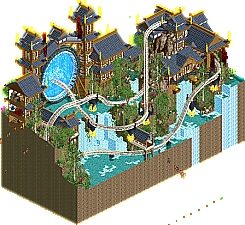
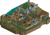
My first vote went to Ascension, as this was pure micro magic. Xtreme97, this was gorgeous, an amazing combo of sci-fi concept with incredible execution and atmosphere. The architecture is brilliant, bold but clean, and perfectly serves the core concept of a port coastal which was so well done. Love some of the other touches like the floating supports, the landscaping was great. Perhaps the only knock is that the park was clearly framed from one direction, rather than a full 360. But, I don't take much offense to that, i've done entire parks like that, heh. Well done overall, very excited to see what you can do in round 2.
Second vote to Tolsimir, this was just drenched in things I would love. Huge, dramatic height, steampunk vibes, very very well done clouds (and i've spent a lot of time trying to perfect clouds, heh). I think perhaps some of the edges could have been better smoothed over or some more textures added to really push the atmosphere of the bottom and top of mountain areas, but loved this overall, well done.
Faas, this would have gotten my vote in another group, but here you just got out-micro madness-ed. Great archy, atmosphere, content, just a fun and funny little park, but it just lacks the drama and intensity of some of the huge parks that we've come to expect in MM. Well done on a great park though.
Merzbow666, I actually loved this, the LL details and concepts and storytelling were excellent (and the source material). But, it felt somewhat unfinished and a bit lacking in certain areas. If more fleshed out, I think it could have given Tolsimir a run for second place. Well done!
Faas, I really wanted to vote for your park here because I very much enjoyed it, but the competition was too fierce.
"fuck" is right.
1. Ascension: Got my #1 vote. Extremely refined. Incredible execution. The teleportation! The rest of the layout is a little fast in it's pacing. Kinda keeps the viewer from feeling any elevation changes. But that's minor. The landscaping, the foliage, the architecture... all flawless. Beautifully done.
2. Spaghetti Harvest: Seems like a solid sense of humor and the detailing both in and outside the buildings was magnificent. The lack of rides and that a few things weren't named were the only real let downs.
3. Suphiro: Amazing concept, and clearly a lot of time and effort put into it. Great use of vertical space. But a lot of it felt kinda sloppy and rushed in spite of all that. In a weaker group this could easily be #1.
4. The Siege of Ba Sing Se: Super cool drill, and nice to see LL with a pulse, but everything else was just... there. And the lack of rides, references or additional detailing failed to draw me in.
1. Xtreme97 - Wow! Was really impressed by this micro, you managed to pack in a lot of stuff without making it feel too cramped. The landscaping is beautiful and the interaction with coasters and building is really great. I love the portal stuff you did, also the archy is really nice. A clear and easy winner of this group for me.
2. Faas - A typical Faas micro as it feels super cute. The idea is hilarious and the execution of it is great. Overall very atmospheric which made it your micro win from Tolsimir's one for me.
3. Tolsimir - Pretty original, it looks kinda cool. There are some neat details in it like the paper press. The huge land block is a bit of an eyesore and the flowers on it are an ugly object. This felt a bit less atmospheric than Faas' one and it didn't appeal to me that much, hence why I went with Faas as #2.
4. Merzbow - Ballsy to go for LL. I liked the drill. It looked awesome. The whole park looks a bit bare compared to the others though.
1. Zuphiro Weather Forecast & Research
Really close call for number one. This was the most inventive of the two, which is what made me decide. Original concept and executed very nicely. The music was very enjoyable.
2. Ascension
Very beautiful. The portal looks outright stunning.
3. Lavertezzo Spaghetti Harvest
Very quaint and relaxing. Could have shined in other matches, which is unfortunate. Wouldn't mind seeing you continue building with this atmosphere/theme.
4. The Siege of Ba Sing Se
Glad to see LL. Glad to see A:TLA. Very good idea for a micro, but I found this one a bit too bare. The cabbage guy was a nice detail. I would have loved to see more details like those. Important thing that should be mentioned here - I think Jappy also said it on Discord: The Siege of Ba Sing Se was a different battle. One that I would love to see you try in LL too. LL seems perfect for the earth kingdom.
All of these entries are amazing. Such a tough round.
1. Tolsimir -This was my favorite. Such a cool concept. I loved the balloon that carrying people up to the lab. I liked that you used the rides as "measuring" tools. I opened it with the music like you suggested and it definitely helped the atmosphere.
2. Xtreme97 - Loved the concept. The portal was done really well. I liked the use of the Wooden Coaster trains. I think the sound actually added to the concept of a portal. The layout, rockwork, and architecture were great as well.
Lavertezzo - This was really cute. I liked that you added the different workers. A lot of nice details here.
Merzbow - Actually a cool concept. i liked the drill and the other details.
Faas) This is a very good micro. Archy is good, the foliage is nice, the atmosphere is good. I love the pasta conveyor belt.
The architecture was cute and had perfect colors.
I loved the Harvests theme.
Tolsimir) Your clouds are great, this entry is very cool, amazing. All the details of the building, like the mail pigeons, the huge land pillar you performed well. Unique, intelligent and creative. The thermometer ride is very cool.
Merzbow666) I love the use of giant wheels for gears/drills, the idea of a drill was very good.
I just thought I missed a ride, but I still say it's a good work.
In order of opening the parks:
Ascension: Absolute perfection. Love the portal, love the coaster layout, love the archy, love the landscaping, love the foliage. I like the way you did the dive loop. The floating supports are great to. Just phenomenal!
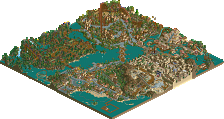
Zuphiro Weather Forecast & Research: I really liked this micro as well. Many clever ideas like the balloon, the thermometer and the printing press, really cool and original. The boat was great too. The landscaping and the archy on top of the rock could have also been a bitter better though imo.
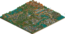
Faas: I like the concept, and overall everything is really well executed. It's cute and also a bit funny so I like that and it feels really Faas. The spaghetti conveyor belt and the tractor were nice although I do wish you had named the tractor ride, feels like an easy thing to do to add quality. The church tower also glitched quite a bit on my screen but that was a small nitpick. I feel that in another round this would have done way better but you had some very strong competition here and got quite unlucky.
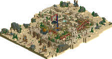
Merz: Bold move going with LL. I really liked this though, especially the buildings on the wall and the drill were pretty cool. However I do feel that because this is LL the detailing is of course wall lower than the level of RCT2 parks which makes it difficult. Overall though this is still a strong entry in an overall very strong round.
So yea, great round overall. Imo probably the best round of the contest so far with Xtreme being a very nice surprise.
Holy shit you guys, this is nearly impossible to rank. This honestly came to splitting hairs for me; each and every one of these is fantastic and you all should be proud of them no matter what.
In no particular order;
Ascension - Amazing. Build a full park in this style, please? I want to see more like this. The teleporting coaster is an awesome touch. Architecture and foliage is very pleasing to the eye, interaction with the coaster is top notch. My only complaint is that the portal is so loud. Seriously; so well done.
Zuphiro - I'm a weather geek, so that scores some points. All the small details in this make it tick; the temperature gauges, thermometer ride, weather balloons, and that unique transport system - very cool. The clouds are probably the best I've seen in RCT. It's extremely tall - whether that's good or bad...eh. The music choice added to the overall experience in the best way. Super cool.
Ba Sing Se - I'm a big avatar fan, so all of this is immediately recognizable and pretty fun from a reference-understanding perspective. You got all the details down, and I think in any other group this would be a top pick for me.
Lavertezzo - This is a simple submission, but it's lovely. All the ideas and details put into this are clever and fun. Like Ba Sing Se, I think the only thing that kills this is the parks it happened to go up against. It's fun, a little quirky, but not overly so. It's not too in your face, and I think that works to the advantage of it - whether you win the group or not - well done.
This group is insane; 4 incredibly high quality micros. Wow.
1) Zuphiro's Weather Forecast & Research - This one was really bold and I thought it was just insanely charming. The barrel carried by the balloons was probably one of the coolest things I've seen in RCT since H2H, and the way the barrel hung there was perfect. The little details were awesome like the thermometer, barometer, weather balloons, press, great stuff. I thought the macro look of it fit in with the whimsical theme. The only thing I can comment on negatively is the landscaping felt kind of blocky where no 1/4 tile work was added, and those bog tree trunks aren't an object I'm a big fan of. Seriously awesome work.
2) Ascension - This felt like it came out of nowhere. Top level work was produced here and the architecture was brilliant. The portal was obviously awesome, but my favorite part was the roof that went over it - beautiful as well as badass. The coaster was exciting and good use of the 'teleportation' with its train. Hell even the landscaping and foliage work was great. One of my favorites so far.
Lavertezzo Spaghetti Harvest - Unfortunate you had to go up against two behemoths of micros. I thought it was cute and charming as hell. Loved the fun and quirky idea, reminded me of Turtle Rescue. Nice, restrained use of details like the spaghetti conveyor. I loved the little hayride and thought it was hilarious that the driver went backwards to return to the barn. Architecture was nice too. I think in almost all the other matches this would get you through to the next round.
The Siege of Ba Sing Se - Happy to see LL enter the picture. The idea behind it was pretty awesome and I think you did the whole thing justice. I think LL is a disadvantage in this competition, however, and you also got stuck in probably the toughest group we've seen. I loved the giant burrowing machine with the ferris wheels, and good work on building the setting and atmosphere. I'd like to see this type of work from you translated into something larger where I think it would be more effective!
4 excellent submissions again. I don't remember previous competitions being so consistently high quality.
#1 Tolsimir - Zuphiro Weather Forecast & Research
I think the balloon ride alone wins this over for me. The interaction between the two components, the way the basket delays and sways on its travels, the way it breaks through the clouds and lands gracefully, all while actually transporting people - fantastic! I love the rides at the top too, each with their own purpose to fit the theme, and essentially acting like large scenery pieces too. Interestingly, I think the coaster comes across as the least noticeable aspect, despite its size (but it's the name of the game so I don't blame you for including one ). Really like the industrial feel of the lower part too, with its steampunk aura that doesn't force itself too heavily. Yeah, I think this submission is excellent all round.
#2 Xtreme97 - Ascension
I certainly like the theming in this one. The sci-fi/Asia mix works really well, with neither detracting from the other. Great layout and pacing of the coaster, and beautiful landscaping. The portal is superbly done and works perfectly, but I do remember seeing a Portal themed submission somewhere before, so while I am rewarding its flawless execution, I don't feel completely amazed by its appearance or ingenuity, I suppose (whether or not you were inspired or came up with this yourself, I cannot know, but I'm afraid this is just my reaction upon seeing it). Still, well made and presented, and very enjoyable to watch.
#3 Faas - Lavertezzo Spaghetti Harvest
Very pleasant, and a clear contrast to the other three submissions which have a sort of heaviness and muscle to them - whereas this is calm and going about its business at a leisurely pace. The theme is certainly you: not taking itself too seriously, but without being silly or trying too hard. The little stream through the centre is perfect for the setting, and I like the mix of old, classic farming equipment mixed with modern machinery and work practices.
#4 Merzbow666 - The Siege of Ba Sing Se
A very commanding design, and I am impressed by your decision to dedicate such a large amount of space to a single (huge) piece of machinery. The little touches of chaos, such as the tilted cabbage stand and the jumble of buildings in the walls, are well done and really set the scene. I have to admit though, I'm not actually familiar with the scene - don't know where it's from at all - so I can't relate to it in that kind of way nor praise it for accuracy. However, I can praise it for its construction in LL, and the amount of detail you've managed to include, all with the in-game objects.
Faas: Great video, I never knew that's how they made spaghetti. I'm digging the innocence of your entry, and it's a load of fun. Simple, but with enough to see from every angle (and cut-away view!) to hold my interest for a while. Good execution too.
Xtreme97: flawless synergy between object choices, palette, movement, ideas and execution. It's a stellar micro. This is not your only great work lately... Are you having a definitive breakthrough?
Merz: I don't understand any of the references, but I get the general idea of it, and I think it's pretty cool. Great idea to make a big drill with ferris wheels. The architecture looks good though, although it's nothing mindblowing. I think this park would've benefited from some more movement.
1. Xtreme
2. Tolsimir
3. Faas
4. Merz
Tolsimir held my attention for the longest, but I can't look past how flawless Ascension is. Wait, I got a flaw. What does the name mean?
Ascension: Amazing archy and a great idea for the portal! Only complaint, some more explanation why there's a friggin' portal there could've been better.
Lavertezzo Spaghetti Harvest: This shows how cutaway view van be used to a great advantage in this contest. Hilarious idea worked out to it's max, great work!
Zuphiro: The giant landspike kinda kept me from voting higher on this... But it's a fantastic micro! Big fan of the machinery on top and the printing press below. What a creative idea!
The Siege of Ba Sing Se: Apart from the fact the drill attack isn't the Siege of Ba Sing Se this was a nice callback to one of the best animated series ever. It's such a recognisable scene and you pulled it off well! But sadly, somebody has to be last and in this case, this had to be it... Also, MY CABBAGES!!!!
__________________________________________________________
Winners
Xtreme97: 40 + 12/2 = 46 points
Tolsimir: 14 + 25/2 = 26,5 points
Eliminated
Faas: 3 + 15/2 = 10,5 points
Merzbow666: 1 + 6/2 = 4 points
__________________________________________________________
Xtreme97 and Tolsimir proceed to Round 2.
Faas is eligible as a replacement for Round 2.
Congratulations to the winners!
i dont know how i feel about commas to denote decimal places... europeans
Tols took my second vote. This micro is insanely tall which I cannot stand but the ideas here were too good to pass up. You are a master when it comes to fun and unique ideas and it’s pretty infuriating, but hey, good stuff man.
Brief comments from KaiBueno! (Disclaimer - I'm renewing myself to the community and know very little of you, your parks, styles, etc. My views are framed from what I see as I open it, with a twisted 2005 perspective of wazzup.)
Ascension - Portal. Pagodas. Kick ass coaster...and waterfalls. I love all of this. Easily one of the better overall in the field of 64.
Spaghetti - For a still life (rideless), I rather liked this, especially all of the machinery. There's a nice sense of peace here, despite the work being done for the sake of pasta!
Zuphiro - I thought I'd like this more, but I think the aerial does it more justice for me than up close. A daring and towering premise, but just slightly off. I think it's that I like the scenery more than the ride in the clouds, which is a hard thing to pull off.
Siege - Nice entry, excellent use of rides to create the mega drill and related turbines...I just think it is hard for LL to compete with Open2 these days. RCT2 on its own has a hard enough time.
Highlights
Zuphiro Weather Forecast & Research: transport basket
Lavertezzo Spaghetti Harvest: mediterrean atmosphere
Ascension: portal
The Siege of Ba Sing Se: drill machine