Park / Reel: Isolated
-
 07-April 19
- Views 11,164
- Downloads 647
- Fans 0
- Comments 41
-
 No fans of this park
-
 Full-Size Map
-
 Download Park
647
-
 Objects
99
-
 Tags
Tags
![park_4392 [MM3 R1] Audubon Society's Field Guide Series I - Black Bear](https://www.nedesigns.com/uploads/parks/4392/aerialt4157.png)


How to vote?Round 1 - Group J
__________________________________________________________________
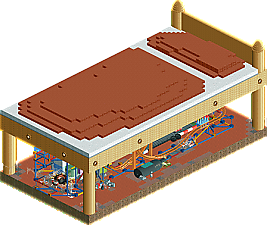
RWE - The Monster Under Tommy's Bed
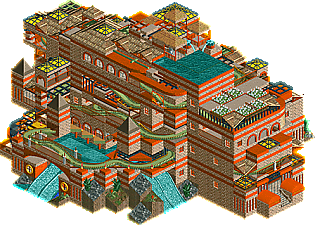
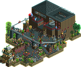
KaiBueno - Reel: Isolated
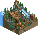
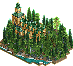
6crazy6king6 - The Church of Bellington
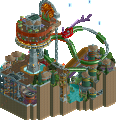
MrTycoonCoaster - Ghost Park
__________________________________________________________________
First of all, check out all the entries in this match. If you can't view one or more entries, for example if you don't own LL, then please, do NOT vote. Once you've viewed all 4, select your favourite and second favourite in the polls above.After 3 days, we will close the poll, the results of the two polls will be added together, with the votes from the second poll weighing only half as much as votes from the first poll, and the 2 highest scoring entries will proceed to the next round. The third placed park will place its creator on the reserves list for the next round of the contest.
Votes are public and so any cheating of the system, betrayal of honesty or mistrust will be picked up on and will be dealt with.
poll closed?
1. tycoon coaster: what a lovely surprise! really great work- definitely your most clear park yet, conceptually and in execution. Solid atmosphere, cool themeing, and a lot of life to it. Even if it wasn't the most technically skilled, it was enough to convince me! I just liked it, what else can you do.
2. RWE: cool little park. the knex coaster and toys were done really well, a lot of nice detailing under there. I though the readme was really funny. I was just disappointed to not find a monster! Am I missing something?? I thought it would be perfect to hide a cutaway evil lair under the bed or something and found myself disappointed in that...
3. 6crazy6king6: It was a really close call putting this in 3rd and not 2nd for me, and 1 wasn't even that far away either. A really close top 3 all up. Its a really cute church- nice archy and nice foliage. It couldn't capture my attention for so long, which is why its here for me- but still great work.
4. kaibueno: Even though I'm so happy to see you back and having fun, I'm gonna put you in last . Its awesome seeing some old school work from you though- just wish the coaster was open when I opened it! The building is a bit monotonous and overwhelming, and I wasn't sure what the theme was, but I still enjoyed the maze-like rides and paths. The names of staff and rides were all cute too. I reckon you probably guessed you wouldn't sneak through with this but I think its still really awesome you entered and put something decent together for your return to NE. More ahead?
4. Mr. Tycoon Coaster: Nice little micro. Enjoyed the concept.. ghost trains/haunted houses are always nice to see. I think your object use was a bit wacky, but that's your style. I think adding more interior to the ghost train building would've elevated this for me. Good work sir!
1. RWE: Neat little coaster. Reminded me of Jonny93's A Day at Coney Island a lot.. but obviously a simple looper would do that. That giant fucking spider is not cool.. I mean, adds to the theme but I don't want a giant spider under my bed! Had some nice little details too with the big fly and the spilled bottle of beer (?).
3. 6crazy6king6: Very atmospheric church. Good foliage and archy. But same as Cocoa, didnt captivate me for long. I think this would be a good set piece in a larger park.
2. Kaibueno: Welcome back! I think your small object selection was interesting.. didn't expect such few objects.. but in terms of the micro, I liked the meandering paths and virginia reel. I think adding a little more detail/colors would've helped. The named staff helped as well... provided a tiny bit of narrative.
RWE - such fun stuff, I enjoyed picking through all the details like Steve the best friend being a Lego man, the buzzing fly, the spilled bottle.
6church6king - so atmospheric, the lone smoking peep and single boat had me storytelling in my head and drew me in. was that a lone underground table I saw?
MrTycoonCoaster - quality theming, a flawless ghost train / haunted mansion type environment. awesome entrance
Kaibueno - a bit jumbled for me, description helped clarify the cool story and your own history but on it's own nothing really popped out of the plot
#1 RWE
Brilliant! Just brilliant. I loved it, every single part of it. It had it all, well, except peeps, of course. But what's there is just mega. The fact that you were able to put those details in and tell a story really helped the entry.
#2 6crazy6king6
You're showing great skill with this and I think the terrain is fantastic. There wasn't that much to it, but you built enough to secure that #2 spot.
#3 MrTycoonCoaster
Where did this come from? It's crazy. It worked out so well for some reason. The micro scale helped it a lot. The atmosphere was also pretty good, I honestly didn't expect that. Great job!
#4 Kai
I'm too new and too young to understand the older RCT2 archy, which I think was just the case here. It looked alright but didn't really compete with any other entry in my opinion. It was pretty neat to look at the cars fly through the turns as they popped out of the building, though. Good stuff. And of course, welcome back to NE.
#1. CrazyKing. This might be controversial to some people, but this is the winner. There is nothing amazing here, but whats there is good. The church is beautiful, which is important because that's all that is there lol. Foliage is perfect, I feel it's just the right density. Shoreline is nice, adds alot of atmosphere. Colours are all vibrant and great, the atmosphere is what shines through in the micro. Good enough for R1, your through.
#4. Kai. This one is a miss for me, just not my thing. Macro style lacks against its micro competition, and Im not a fan of the orange or the puke green colours. High point for me is the lower pool that the Virginia Veel goes around. That's a neat little spot. Good effort and good to see you in the contest.
And that leaves the battle for the last spot RWE vs MrTycoon
#2. MrTycoon. This is the winner of the 1v1 I created in my head for the last spot. Love it. All the colours go nicely together. I like the modified haunted mansion as the entrance. The cutaway to the ghost dinner party inside is awesome, and the prancing ghosts are such a nice touch. Reminds me of the haunted mansion, one of my favorites from the magic kingdom. This is fun, this is creative, and this is through to R2. Great job
#3. RWE. 3rd place sucks, I hate putting someone here. Nobody likes being the first loser. This was close, Fun idea, and whats actually under the bed is well executed. It really does look like something made out of kids toys down there with cob webs and stuff. I don't like the actual bed at all. I think the scale is off, it looks too big and too small at the same time. Its really blocky and takes away from the overall atmosphere. Also it might be a tick too low, its kind of hard to see underneath. I love the write up with the kids diary but for me out of game stuff doesn't make up for whats in game. In summary good idea that misses the execution for me.
GG boys
This whole match feels super close to me. Nearly impossible to pick a favorite or even two.
6crazy6king6 - This feels like it shows the most technical skill, and it's very atmospheric, but it lacks motion, which sets it back somewhat.
MrTycoonCoaster - This is super atmospheric and probably your best work yet. It does have some weirdness to it, however, and I think the ride layout itself could have been more purposeful.
RWE - A really clever overall idea, a real nice story behind it, and lots of smart details. I don't think it was quite executed to your typical standard, however. Pretty charming regardless.
Kai - Charming and nostalgic, but hard to follow and the ride's not even running when I open it. I really like the style, however, and I think it's still super competitive.
Holy shit the Haunted House entrance is genius
Looks like it will be a tough vote, will review later when i get home.
1. The Monster under Tommy's Bed - This entry is so gross and goofy but I still really liked it lol. The giant spider, spilled drink, and lego clutter among bits of dust and spider webs are a nice touch. Something about the knex coaster supports really gets to me.
2. Ghost Park - Creative use of scenery and a fun entry to view by MrTycoonCoaster. The park was very charming and I thought the flying ghosts were neat and kinda funny. The buildings are still kinda blocky but there's definitely a lot of improvement here and it's great having you in this contest.
3. The Church of Bellington - Great landscaping and nice archy but it has the same problem that Burg Bärenfels had in the previous match. There just wasn't much motion or anything to hold my attention for a long time. Still, from an aesthetic standpoint, this is probably the highest quality entry and some movement/rides could have made it the victor.
4. Reel: Isolated - An endearing and nostalgic entry. I hope to see stuff from you after the contest and I think this was an unlucky entry. This style of building is better on a macro scale... it looks ancient. Nevertheless, this is a nice park and it is certainly livelier with peeps.
1. Church
2. Reel
1. Kaj
2. RWE
3. MrTycoonCoaster
Teenager Trinket Trophy: Monster Under Tommy's Bed
Comeback Kid Banner: Reel: Isolated
Serene Churchy Church Award: Church of Bellington
Booyah It's Mr Tycoon Coaster Badge: Ghost Town
My vote goes to: Mr Tycoon & RWE
I found this set much harder to judge than group O, as I liked all of these for different reasons. A lot of reordering, but this is what I went for:
#1 RWE - The Monster Under Tommy's Bed
As a sucker for Lego and K-nex, this brings back some memories. There are some interesting uses of rides to sell the theme, and lots of little bits to explore, which in a way fits in perfectly with the idea of searching under a real bed for stuff. I'm a little underwhelmed by the bed itself, but I understand its presence for the sake of the setting (not sure if just having the legs with some hanging blanket would've worked, but either way, the cutaway view removes it for visibility sake). A lot of fun to look through... and under.
And while I didn't judge the park based on it, the diary is an amusing addition to the piece too. Very clever to tie in the game's date with the diary's.
#2 6crazy6king6 - The Church of Bellington
Very well crafted, and really gives off a regal air. I'm not sure if the smoking peep is meant as an in-joke, but it certainly made me smile, purely for the contrast it has to the rest of the design. The choice (?) to have it load up whilst raining is interesting, but I think it adds to the idea of finding sanctuary in a holy building. Nice, subtle landscape work, but I think a little more content on the currently tree-laden grass would add more to look at and engage with. Even so, this is pleasant to view.
#3 KaiBueno - Reel: Isolated
A somewhat unique theme - I don't think I've seen "isolation" as a key premise before. I very much like the colour combinations, giving a rather tropical vibe, and the parts of the coaster that are revealed are well decorated. The supporting ride and staff names are enjoyable to read too, and the changes in elevation add a lot of interest. There is definitely an old-school feel to this, but so much so that it seems a little outdated. It's almost like a classic macro park (relying on the larger, vanilla scenery) has been compact into a smaller space, and thus it overwhelms with heavy texture and repeated decoration. It's also a minor shame that everything is closed upon loading the park, but I suppose this could be as way of allowing the viewer to appreciate the scenery first, and ride later. Still, a good, throwback style submission.
#4 MrTycoonCoaster - Ghost Park
You seem to have a thing for ghost trains, and that's certainly not a bad thing here. A nice submission which has your signature mix of unusual objects and playful experimentation. Enjoyable to watch, with plenty of movement. I just feel that the large housing structure could use some refinement (although your progress shows that developing quickly) to break up the large walled areas.
2. RWE - love the concept, enjoyed the readme. Missed opportunity in not having a cool monster reveal though, especially after the buildup. The knex coaster is cute but a little lacking in supports and the pacing is off for a knex (usually they shoot through the loop at lightning speed), though I loved tracking the spider / marbles which kept my attention for a while. Would've benefited from peeps to liven the atmosphere, though I can see why you left them out .
3. KaiBueno - nostalgic style, and very dense layers made it fun to unpack with cutaway view. Overall detail / colors were a little dull though, and I didn't quite get the concept. I do like the style however.
4. 6crazy6king6 - It was a nice church building and the landscape was pretty, but I really didn't see much to keep my attention here.
1.) RWE - love the creativity of this, especially the ReadMe that came with it. It's whimsical, playful, cute, and fun. Loved the coaster supports and racer car track. Perhaps the bed could've been higher to show off more? I don't know, I felt the need to remove the bed to see the whole thing. Anyway, loved it. 8/10
2.) 6crazy6king6 - I mean, it is gorgeous. The foliage and architecture is really good, but there's nothing dynamic (although the rain helps that, I must admit). That's not a problem in this round, but it's worth considering later on. Anyway, very cute, very nice, keep it up. 6.5/10
3.) MrTycoonCoaster: Yes, dude, you've improved! What a great entrance into the micro, and you've got a cohesive theme too. The main show building could be less blocky but its passable. I love the ghosts and spider on the roof. Unfortunately, there's not really any wow factor to the park. You're headed in the right direction, keep it up. 4.5/10
4.) Kai - Was this a reference to something? I didn't get much out of this. It was just a huge blocky building that didn't showcase the actual ride. Why were the default supports visible? I think you have good instincts for how to make a ride have a signature moment (see the front of the micro), but there needs to be more eye-catching moments through the ride. Cool to see someone who hasn't played in so long pick the game up again (a living time capsule!). 4/10
Wasn't overly impressed by any of these. Went with RWE first for dedication to a true MM-esque concept, though I don't think this was very well executed. You had lots of ideas but they didn't seem to come together, and overall the bed was kinda ugly. I know it was supposed to make you use cutaway, but it's hard to get past that the overview itself isn't that impressive. But, the concept makes me hopeful for better things in r2
Second I went with 6crazy6kings6. This concept wasn't that strong, but it was executed at a better level that Reel and Ghost Park, enough that it nabbed my vote. Hopefully we'll see more concept in the next round, but It was a nice picturesque little slice.
Kai, I enjoyed this overall, but it just didn't have the right execution to work for nostalgia feelings in my opinion.
MTC, this shows improvement, and had a lot of small ideas that I liked, but the boxy building and some of the thrown in pre-made sculptures took away from it in my opinion.
RWE- I'm in love! The story you've written is what really makes this park shine. I love how the park brings everything in the PDF file together. All in all, it's my favorite park in the group. Tommy's gotta look out for that spider!
6crazy6king6- It's so lovely! I love the landscaping and foliage, and you can never go wrong with a boat. I just wish the church had an interior you could view with the cutaway view. Second favorite of the group.
KaiBueno- Very abstract! Almost feels like I'm looking at a work of modern art. I will say it does feel it does feel a little incoherent, and its story could be elaborated on a bit. I also wish the rides were open from the start and some guests were in the park.
MrTycoonCoaster- This is some of your best work yet! I absolutely love the haunted house as an entrance. Very solid entry!
The Monster Under Tommy's Bed - Ah, our first bedroom park of MM2019. It's perfectly fine for what it is, maybe a little over-built in terms of all the spider webs and miscellaneous stuff. The bottle is a cool touch but I'm not sure what the ooze is supposed to be. I checked the ride menu to make sure I wasn't missing anything and saw the Marbles ride... I sort of see them make that turn but they don't seem to go anywhere or do anything... And the red car from the story explodes, but it's also just sitting under there? Was a little confused by that. The story was a nice accompaniment though.
Reel: Isolated - Man, I thought I was going retro with my workbench choice. I think it's crazy that we get a park like this in 2019. I like how colorful it is, I like that the virginia reel is obnoxiously hard to follow and totally unconventional. I even kind of like that it's empty and you have to open all the stuff yourself. If anything I think all the black accents kill it a bit for me, and you could potentially have gone even more outlandish in your color scheme. It is handicapped somewhat by having a water "theme" and then having that water removed. Probably find a way to build some of that in if you make it through to round 2?
RWE- Nice readme to go along with this. The K-nex coaster was really nice. I like how well the supports match the toy. The detailing of all the various other toys under the bed is great, especially the Lego bricks. It's a bold strategy hiding a lot of your main attraction with the bed, but you offer enough space to view what's underneath. Great work!
Crazy King- Super pleasant entry! The architecture is nice as is the landscape around it. I wish there was a little more to it maybe, like some frozen staff to help give it a story, but it's a solid diorama at the moment, which I think gives you a good chance at going through.
Kai- Really great to see you back. The architecture isn't my cup of tea, but the ride was a lot of fun to watch. I enjoyed the staff and ride names-- something a lot of other entries overlooked. Hope to see you continue to build and get back into the swing of things.
Mr. Tycoon- Wow! This was a great entry. Some of your best work yet. Great theme and color selection, really nice use of objects and the various custom rides and a pretty unique entry overall. It's been great to see you develop and I hope that will continue on. I'm excited to see what you come up with next.