Park / Ghost Park
-
 07-April 19
- Views 11,164
- Downloads 552
- Fans 0
- Comments 41
-
-
 No fans of this park
-
 Full-Size Map
-
 Download Park
552
-
 Objects
130
-
 Tags
Tags
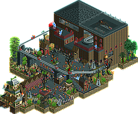
Alright. I might have dropped out and been unable to make my mark on this contest. But I will try and leave as many reviews as possible. This group was pretty close for me, they were all solid, but none of these hit the top level like a bunch of micros have this year.
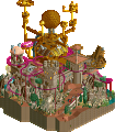
1st. Mr. Tycoon Coaster. By far your best work. I think the micro format helps you, as you've always been super creative but struggle with some park layout aspects. This micro lets you focus on one idea and you do it very well. The weird objects work here, and it's just so full of life. The Haunted House entrance was brilliant.
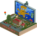
2nd. RWE. Excellent concept, I was really excited to check this out when I read the readme, but the actual reveal when I started using cutaway was a little bit disappointing. Still the concept, and some of the clever little details like the knex and other toys left this in a solid second place.
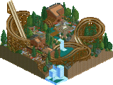
3rd. 6Crazy6King6 Great architecture. Maybe the most polished of these four entries. The concept was not the most engaging though, and it could have used some more movement to hold my attention. Great technical work though.
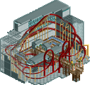
4th. KaiBueno - I do enjoy this throwback style, but this didn't work fully for me. I think the overall compositional was a little unclear. I got the theme, but the actual building's design didn't exactly support it for me.
1. RWE - First of all, super cute read-me! Fun concept, some cool details like the fly and the leaking wine bottle. Nice Knex coaster and the race track looks good to. Wish you didn't include that spider. Clear winner to me.
2. 6crazy6king6 - The church is really well made, it's a good and interesting building. A bit of a shame how you didn't use the entire map, it really could use some more content. The landscape is good, foliage is a working point. It feels a bit randomly placed.
3. Kaibueno - It's good to see oldschool members return. This micro feels also like a throwback to earlier NE parks. Interesting how you weaved the coaster through the building. Not a fan of the building however, the combo of bricks with orange walls are a bit ugly imo.
4. Mrtycooncoaster - This micro wasn't up to par with any other micro I've seen so far. I can see you have definitely some fun ideas but the execution lacks a bit. Also why the spiders, hate those creatures from hell... Keep building, you seem to like have a lot of fun and in the end, that's all what matters.
Exciting match-up. I've had a hard time choosing which entries to vote on. None of these entries was standing out. They were all kind of mediocre IMO.
1. Kaibueno - Nice oldskool vibe and good composition, but a bit monotone. It's also a shame the ride wasn't open and there were no peeps.
2. RWE - This one was the most detailed and shows creativity, but it was also messy and the bed was under detailed.
3. Mrtycooncoaster - It had the best atmosphere and a high fun factor, but the building was blocky and really plain.
4. 6crazy6king6 - Well crafted, but boring. Micro's need life and motion if you want my vote.
Is there a reason why votes are anonymous in this poll?
Hardest match to choose so far for me. Really close for all of them!
RWE: I quite enjoyed this, you pulled off the concept nicely and there's a lot of cool things going on under the bed. The read-me was a fun read too lol. I think the blankets and pillows on the bed itself probably could have been better executed though and maybe included the kid or something, but overall a nice entry.
 ) and you managed to fit a surprising amount in, and I love the classic vibe.
Kai: This was great fun to look at. I do wish the ride was open at first but nevertheless watching it was great. The shop and staff names were also a stand-out (Pho-gotten soups
6crazy6king6: Very nice entry, the scene you created is lovely and peaceful, and the church is great work. I wish there was perhaps a bit more to it though, but what you have is brill.
MrTycoonCoaster: My fave entry of the round. This was really imaginative and fun to explore, and you have a lot of great ideas (like the Haunted House ride as an entrance). I think you just need to refine your building style a bit but you're improving greatly!
Currently a 3-way tie for 2nd place. Wow.
1. RWE - This was very "dark" especially with the diary. I like how this told a story. Having the car explode upon opening was really imaginative.
2. MrTcoonCoaster - I thought this had a really fun atmosphere. Could see this being a piece in a full park. The Haunted House as an entrance was cool. you could've added more detail to the Ghost Train house both inside and out but it was overall fun to look at.
6crazy6kings6 - Loved the atmosphere - the storm really helped sell the story. Just wasn't much to hold my attention.
Kai - Nice colors and I like seeing the lesser used coaster types used. the layout was cool, but I thought the building was a little all-over-the-place for me.
This was a tough one to vote on, although each of the builders did a good job overall, they all had their strengths and weaknesses.
1. Mrtycooncoaster: This was the most lively entry and the atmosphere was pretty convincing. A nice lighthearted take on the haunted theme and I honestly love the logo that goes with it that keeps very much with the feel of the park. The smaller buildings on the map all look great and I love the haunted house ride being used as an entrance. The rock texture outlining around the map was a nice touch too. Your foliage is getting better but could still use some improvement in colors and looking less random. The main building is a bit blocky though not irredeemably so, if anything the facade could use some more detail. Keep up the great work!
2. KaiBueno: The old-schoolness was a plus for me, great to see structures like this again. Overall, great macro, colors, and form. My biggest criticism is I didn't think much of the ride, it was hard to follow parts of the layout and the layout wasn't that interesting. Hope you make it through so we can see some more entries in your style!
3. RWE: This did a good job at capturing the real life gross-ness that a bedroom park would have. Although there were good ideas, some aspects of it felt a little underdeveloped. Although it would be hard to pull off without lots of new objects, the roller coaster didn't really scream Knex to me. Also I think the bed could've been a little higher up to not rely on cutaway view so heavily.
4. 6crazy6king6: Nice structure and landscape. It was really missing some more "features" though. I can see not wanting a ride for this one, but a river, fountain, garden, or something of that sort would've helped it a lot, because otherwise the landscape outside the church was fairly homogenous, if well done.
Commenting on each micro on the three mayor points for me of an RCT piece.
Crazy King:
Visuals: The church looks great. Nice gothic form. Not sure on the colour though if it fits the setting. Foliage is okay, tree placement looks a little random. I think it's a little unfortunate that the trees cover a large portion of the building itself which is the only feature of the map. Especially the one tree covering the view on the main door is an total no go. Quarter landscaping is absolutely not my thing, especially with the grass object and those sharp edges. Detailing/Eyecatchers are to be missed, there are exactly two: the boat and the smoking guy and they are even from the same angle.
Concept+Realization: I think concentrating the micro on just one building is not enough. There is not to much to excite the viewer. The quaint atmosphere is transported nicely but thats all. I like attention to small details like the set money and the year.
Credibility: The micro is okay, I can imagine such a church at some lake. However some things bother me. To me, the trees are too close to the building (not only from a artistic view). Also the nave is super narrow, only one tile (look at the windows). That just doesn't make so much sense.
A nice micro but it's just so little to explore. Strong point: Visuals.
KaiBueno:
Visuals: Super oldschool. Color choice is nice. The path choice is very fitting, like that a lot. Most I like the area around the merry go round, I appreciate that you use the window objects where you can actually look through (most likely because of the oldschool style) not the fake ones like nowadays. In total the structure is just fine with the virginia reel coming through". Those black support structures are a little distracting as is the fact that the building is just sitting on the black tiles "floating in space" (Judging only the MM3 version).
C+P: So from the readme I get the isolation theme. However, aside from the clever staff names I don't find a lot that supports the theme, maybe the "floating in space" gives it a little that odd feeling, although I don't know if you inteded it this way. The lack of movement actually does support the idea of isolation. I'm liking it. The infinity pool is a cool idea and supports that hotel feeling, it's just a little poorly executed. Some more details here would work wonders.
Credibility: Due to the old school style it's hard to judge this point, but I can't make out any super huge flaws that bother me. Maybe there's are a few windows missing.
Welcome back to the site. One can see that you are still a little rusty but I think that solves with time. With the right tools and maybe a more modern object palette you will create cool stuff. Strong point: nothing really sticks out, sorry.
MrTycoonCoaster:
Visuals: It looks a little like you went through the object selection and picked every object that has any connection to a horror/ghost theme and then you threw them at the park. And for some point I am thankful for that because there are some objects that are really cool and that I have never seen before like the scarecrow and the candle holder. The ghost train building is very blocky and simple. I think you could elaborate a little more on the structure. On the inside I wished the dining hall would have been bit more detailed or clearer. For example a change of the ground texture already would have done a lot. Now it looks more like a cave.
C+P: The entrance through the haunted house is brilliant. Simple idea from a execution standpoint but very effective. You focused entirely on the concept of a Ghost Park and it worked out quite well. Still it feels very RCT, which is not a bad thing. Only as mentioned above the spam of objects in the gardens area seemed a little random and without a lot of thought. Some other details were cleverly placed though, like the guy coming out of the grave below the drop of the ride (advice for later: this detail I wished would have been framed better from 3 of 4 angles).
Credibility: The park is nicely laid out, I think the scale of the building is a little huge. The ride is nice, maybe the bridges outside felt a little thin, also the brakes after the drop a way too hard. There are some technical flaws like paths going through walls, nothing serious. I see that you use zero clearances so maybe next time add more stuff to the paths, for example the lights would have been great on there.
Nice little park. Not up to the standard when it comes to technical level, the atmosphere and charm make up for it, though. Strong point: C+P
RWE:
Visuals: First directly after opening there is that racing car. Too bad that I have activated that test rides don't crash, so no nice effect for me. It's rather a never ending self repeating crash IMO, the bed looks bad. The pillow and blancket are just blocky. A bed of a six year old kid would have given so many opportunities!
Below the bed it looks differently, way better. The knex coaster is really cool but I even more like the piece of the carrera track. I like the piles of dust/spider webs. That spider object is any eyesore, though.
C+P: The idea is cool, the storyline of the readme funny. It's a little anticlimatic not to find any monster under the bed, but sure we are grown ups, we see the truth! The map itself is like a micro of the bedroom parks (with a little twist), it's always nice to see this stuff in a different scale than normally. The toy details all are nicely done, lot at LEGO figure Steve being his best friend. Poor guy.
Credibility: The leaking bottle is overdone, have it be there empty and it's fine. Having it leak I don't buy it. Also the largest logical fault is how he got the built up coaster down under there so nicely, seeing that it exactly is as high as the bed low. May sound nitpicky but in this category I'm looking at the logic in the scope of the park. Typically these kind of flaws tend to bother me a lot
Cool concept, but in the end the micro hasn't got so much to offer. Strong point: Concept.
In the end it's a tough choice for voting. I think I'm most convinced by Ghost Park and after that the Church.
Another great round of micros, you guys aren't making choices easy.
In no particular order;
Ghost Park - This might be my favorite of TycoonCoaster's work so far. It's got so much going for it in terms of atmosphere and clever features. The haunted house entrance is probably the highlight for me. It might lack some polish, but I love a good haunted theme, and this is a good haunted theme.
The Monster Under Tommy's Bed - This is a pretty clever micro. All the little details under the bed were cool; particularly the fly and the marbles rolling down the slides. Sure could use a really good cleaning though.
The Church of Bellington - I'm loving the still life parks we've been seeing so far. There isn't much in terms of movement, but I love the atmosphere that this oozes. The architecture is lovely and I think this is a really solid submission.
Reel: Isolated - I really like the old school nature of this. It was fun to explore and look at from all angles, and really brought me back to a simpler time in RCT. I'm glad you made this, even if it doesn't win - it's spectacular.
2) The Church of Bellington - This one was the. It's consistent in my opinion and had the best architecture as the church itself was well done. The setting was cool and the addition of the little rowboat was effective. Where it didn't take the first spot for me was that it didn't have much going on in general and felt like a quick view, not that that's terrible.
The Monster under Tommy's Bed - I debated voting for this one but I just had a hard time justifying it completely. I suspect it may be the winner, however, as it felt the most "Madness". The bottom with the Knex coaster was great and had the best execution of the round. Sadly most of the map was a huge bed that wasn't particularly interesting or well executed, but I get that's the point. Still, well done.
Ghost Park - The highest quality stuff we've seen from you! The haunted house entrance was great. I think it suffers for me in the back half of the park where everything is too boxy and constructed in large rectangles. If you can get out of that and work in some more forms I think this would make for an excellent format for you.
Let me say first this one was very difficult to vote on!
The Monster Under Tommy's Bed: This one got the vote for the creativity behind the idea. I like the idea of a Knex coaster (why not use the Knex coaster trains from SpaceK?!) and the little details under the bed like the bottle and all the rest of it. It's a shame the bed itself is kinda boring though.
Ghost Park: Holy hell, was this a suprise! MTC delivers a micro and it's pretty great as well! The haunted house entrance is an aweomse idea and the park is filled with life. Sadly the mansion in the back is kinda blocky and could've used more work.
Reel: Isolated: I'm not very familiar with KaiBueno's previous work. This micro does show he's from a different era of NE than most of us here. Now that's not a bad thing at all, but it did kinda hurt this micro IMO. I liked the ride and how massive the building is, but I'm not sure what the general theme of this is apart from the ride itself? Glad to see you back in action though.
The Church of Bellington: Very nicely executed entry with some little things to discover. But the lack of movement also hurt this one bit. It seems there is a story to tell here, with the date and money like you said on Discord, I just wish it showed better.
KaiBueno: yes, making your maps feel more lively is the norm nowadays... Open your rides, let in peeps, and have some music play. I forgive you, youve been away for a long time. I really like how this thing really looks like it was built in 2003. You just picked up exactly where you left off!
6crazy6king6: it's a church in the forest in the rain. It's a pretty little scene, I can't find many flaws in it, other than it is generally unexciting.
MrTycoonCoaster: your style seems to thrive on the micro format, this is the best thing you've ever done! The objects you chose are very random, but they actually work together well. The graveyard brick as main texture is great. I like how this park is horror themed, but it's not actually scary. It's scary like a Super Mario 64 horror level is scary. It's just a ton of fun. I'm not sure if your kind of random approach to RCT will work every time, but in this round it resulted in the best park of the bunch. Good job.
1. MrTycoonCoaster
2. KaiBueno
3. RWE
4. 6crazy6king6
__________________________________________________________
Winners
MrTycoonCoaster: 20 + 20/2 = 30 points
RWE: 22 + 15/2 = 29,5 points
Eliminated
6crazy6king6: 15 + 17/2 = 23,5 points
KaiBueno: 10 + 15/2 = 17,5 points
__________________________________________________________
MrTycoonCoaster and RWE proceed to Round 2.6crazy6king6 is eligible as a replacement for Round 2.
Congratulations to the winners!
Ooh, a dark horse winner. Contrats Mr Tycoon Coaster!
congrats to all! especially pumped for tycoon coaster in r2!
Congratulations MrTycoonCoaster! Who would've thought!
True Jappy, I was surprised, I never imagined that it would be classified.
I know there are experts here, I've seen other works/groups and thought "OMG" hehe.
From now on it will be extremely difficult for me, but I've already been happy with this result.
I enjoyed it a lot, I had a lot of fun with the comments and also with all the other amazing groups.
THX all who voted for me, encouraging words and criticisms.
Thanks to Liampie, Cocoa, Posix, G Force, MK98, Saxman1089, Jaguar, Dr Dirt, Shotguns?, and other members, beginning when I registered, had patience with me with questions and doubts.
It was one of the best competitions, which I participated in the international community.
Congrats MTC!
Looking forward to your R2 entry.