Park / Aquaterra
-
 18-April 19
- Views 1,178
- Downloads 393
- Fans 0
- Comments 8
-
 Description
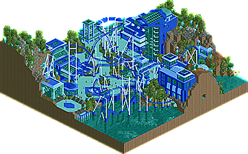
Created for the RC&F Mini-Challenge #5, where players had to choose a small subset of colors to work with for all objects and rides. Natural objects were exempt. I came up with the contest idea from looking through some old QFTB-X entries.
I had only a few days to do this one in between other contest projects - significantly more effort went into the sports multiplayer spot. I tried to pick something unambitious to be sure I'd finish in time, but while the structures all came out very rushed I think the support work ended up pulling together quite nicely. -
 No fans of this park
-
 Download Park
393
-
 Objects
243
-
 Tags
Tags
![park_4381 [MM3 R1] Burg Bärenfels](https://www.nedesigns.com/uploads/parks/4381/aerialt4171.png)
![park_4392 [MM3 R1] Audubon Society's Field Guide Series I - Black Bear](https://www.nedesigns.com/uploads/parks/4392/aerialt4157.png)
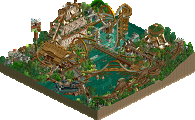
Neat layout. When I saw the contest/challenge I was curious to see what sort of entries would result from it! Definitely see where the structures were rushed, but, it all comes together quite nicely.
The water is glitched to hell for me, but looking beyond that I think you pulled off the monochromatic aesthetic quite well. Cool architecture on the lift hill.
I still love this sort of work from you. Classic, jkay-reminiscent stuff. I like the layout a lot and I don't even mind the overwhelmingly blue environment, because the construction was really solid and interesting. Definitely high quality. My only gripe is that the coaster is fukn impossible to see! Literally any color other than blue worked way better. It really makes a huge difference
Thanks guys.
@Luketh, I think the water glitches for everyone, but it's only obvious here because the distance between the surface and the water is so large. If you replicate it in another park you should see the same thing. I've mentioned it to the devs.
@Cocoa, this one was mostly looking at that era, but more Kumba and Titan than JKay (I keep wanting to do JKay... but I can't get in the right headspace to build that style ). I considered doing monochrome, but looking at the options for the palettes (admittedly, that I created) the only other way to get good contrast was to choose blue. I didn't really have a theme after that, but I threw in some aquatic stuff so the color choice at least seemed like it made sense. It wasn't quite as clever a use of the palette options as the other entries which is why it didn't do so well.
@ling is there a way we can see the rules and the other entries?
You can get around the water glitching by putting invisible path on top!
Really cool, I liked this a lot. Titan influence shows.
I liked the colors.
I tried to do this type of architecture, I can not hehe.
I like name Aquaterra, good work.
@inthemanual
https://drive.google...r41KWB-rJM-cNob