Park / Fossegrimen
-
 16-March 19
- Views 5,536
- Downloads 643
- Fans 3
- Comments 16
-

-
 75.50%(required: 65%)
 Design

saxman1089 85% inthemanual 80% Liampie 80% CedarPoint6 75% Coasterbill 75% CoasterCreator9 75% csw 75% Ling 75% RWE 75% Scoop 75% Cocoa 70% G Force 65% 75.50% -
 Description
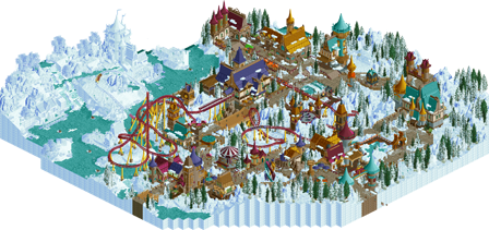
This park started off as a Reddit design for December 2018, but I wasn't even close to completing it for the deadline. So I added in some objects I really wanted to round out the winter theme and took the last few months to complete it. Enjoy!
Thanks to the park testers for their tips and feedback (posix, Ruyatax & ultro) and Ruyatax for the great logo! -
3 fans
 Fans of this park
-
 Full-Size Map
-
 Download Park
643
-
 Objects
356
-
 Tags
Tags

![park_3128 [MM2014 R1] Earl Grey](https://www.nedesigns.com/uploads/parks/3128/aerialt2770.png)
This is some of your best work imo. Really fantastic architecture and the coaster layout isn't to bad either. Not sure what to give this quite yet. might change my vote later but I gave it a 75 for now, but I could see either side of the spectrum as far as voting goes.
But I need to enjoy it more.
I'm working on something tangentially similar and may end up stealing some ideas from this to make it work. Cool project.
A lovely little design. We don't get many winter themes, so this was a pleasant surprise. the coaster is nice, a pretty decent if short-ish layout with some nice interaction and the colors work well for it. the archy is detailed and vibey but maybe a bit too colorful for me, especially on the rooves, to really pull together a cohesive theme. I always find it a shame that winter themes often get sort of 'generic alpine magic' theme instead of some more specific geographical reference. That said, it was still quite nice and I really liked the fully frozen side of the map.
Great architecture.. wow. Super atmospheric. The coaster station was well done, and for whatever reason I really liked the building that had the bathroom stall. I do agree with Cocoa that there's a lot of colors here.
Nice work, archy was quite nice and there were some clever ideas and execution. Not sure if I really liked the layout but the majority of it was effective. Thank you for using the Haystack snow palette.
Overall I'd say it was quite cool.
Damn, I thought I was going to get the first properly frozen forest themed Design
This is just lovely. A lot of the architecture here is absolutely brilliant, though I do think the station is a little big for its own good, and it looks a little awkward in the same architecture style as so many other of these much smaller structures. The frozen stuff could have used a little more color for contrast without giving up the style I think, but it still really works I think. I have to say I think the layout itself is the weakest part of this - I don't think the loop is totally necessary, and maybe finishing in the frozen area makes more sense than starting there? There's also some more interaction to be gotten out of this sprawling village layout. Nevertheless, early congratulations on your third Design.
Wow great atmosphere! I really like the combination of the colorful 'tangled-style' buildings on the snow-covered surroundings. I do agree with Ling that the frozen part could have used some small color accents. But I love the overall style of this. I'm a fan! And thumbs up to Ruyatax for the great logo.
This is phenomenal.
The coaster layout isn't really the star but you've progressed as a player to the point where you're really improving in that department.
As usual, you killed it with the atmosphere and small details. Great, cute architecture everywhere and the ice area is insanely good (and I of all people fucking love RCT ice).
This is lovely. I can't honestly come up with something I don't like about it. Great archy, great colors, and great coaster. Also, so happy to see the Haystack palette becoming the norm for snow themes.
initial impression is that this is what Arendelle and Kingdom of Winter should have been. I love it
Great work here bsg. Things I loved: the "white-out" area, the colors, the path layout, the landscaping, the snow on the paths. Things that could've been better: I thought the layout was somewhat uninspired and you could've done a lot more with the queue.
That being said this was still very enjoyable. 75%. You have become one of my favorite builders.
excellent, this is really freaking cool. The complete side of all Ice/snow color is bold and it works so well. Impressively whimsical.
Appreciate the kind words (happy it was well received) and the Design accolade! It was a fun building project... good break from my full scale park.
Awesome map bsg, i love the atmosphere! Well deserved accolade!
I love how the colorful and lively architecture contrasts against the snowy white backdrop, especially with how good the overall macro is with it. Also like the ice palace area that adds interest and variety.
The coaster interacts well with the surroundings, and has some very nice clean support work. Overall, a very charming map.