Park / Milliville Park
-
 16-March 19
- Views 2,694
- Downloads 629
- Fans 1
- Comments 13
-
 59.50%(required: 50%)
 Bronze

inthemanual 70% bigshootergill 65% RWE 65% CedarPoint6 60% Cocoa 60% csw 60% G Force 60% Liampie 60% Ling 60% Scoop 55% Coasterbill 50% CoasterCreator9 50% 59.50% -
 Description
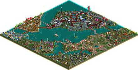
Started in 2014, I've been chipping away at this whenever I got in the mood to build again. I've really enjoyed working on this, and though it doesn't properly fulfil what I intended it to be, I am happy enough to show it on this site. Thank you to everyone who commented on the screens, and offered advice and assistance.
I hope you enjoy exploring Milliville Park! -
1 fan
 Fans of this park
-
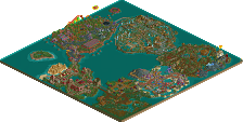
 Full-Size Map
-
 Download Park
629
-
 Objects
442
-
 Tags
Tags
![park_4221 [H2H8/8] Hitchhikers Harbour](https://www.nedesigns.com/uploads/parks/4221/aerialt3979.png)
I have a weak spot for good NCSO and I absolutely love everything this park has to offer!
The snail races were funny, and I'm going to steal how you used the Goliath signs on Pistol Whip. I really enjoyed that entire little western area, among the overall really good themes in this park.
The pirate ship flat ride theming? Why is that so good? idk, but it is.
My favorite building is the orange mess hall in the Cyber City section.
Cool park, definitely one I will come back to. I only wish there were some larger roller coasters! No inversions? Curious to know your reasoning for that.
Initially loved it, the first impression was very good, I need to appreciate more
Are there no hacks in this? Absolutely impressive.
This park has a really charming atmosphere created by it's absolute refusal to follow any sort of convention. It's fun, whimsical, and full of it's own creativity. The lack of convention makes some areas hard to follow, and as a result, weaker, but as a whole it works. There's so much humor and fun here it's hard not to enjoy it.
I think this park is a treat. It has a playfullness and ease which reminds me a bit of LL in a hard-to-describe way. A good refresher from modern ncso work. The pirate and future areas were probably my favorite, with some good atmosphere and layout. Some of the park was too 'square' in composition for my tastes, in particular the wild west area (interesting idea for those goliath signs btw, not 100% sure it worked but could be workshopped for sure). kudos on putting out a full park after so many years with some neat areas.
You're in MM yeah? Can't wait to see what you got!
Totally agree with itm, I liked your non-conventional NCSO. Really enjoyed the pirate area.. kinda funny how theres a giant hill peeps have to hike, and at the top is just a pretzel stand! And probably a nice view of the park too.
Cyber City is such a wacky area and I love it. Astro Blaster is a nice layout.. looks like a ride I'd enjoy riding. Liampie told me a few months ago to focus on making queues better, and I'd say you really nailed it when it came to this area of the park.
Individually I like a lot of pieces of this. Cyber City reminds me a lot of tyandor, and the insect-themed section is something that I think could only work in a park with a style like this - it's exactly as cartoonish as it needs to be given the scenery restrictions and that fits the atmosphere perfectly. The entrance area is also really nice, with warm colors and wide open midways. The pirate area feels suitably claustrophobic with the darker color scheme, and Flower Fields is maybe the most original theme area idea to come along in a good while. I don't know if there's a specific connection with the slightly Asian-skewing architecture but it does make for a really interesting macro look and signature main ride which I love. I have to say, the wild west area is the weak one to me. The architecture is strong and mostly more conventional-looking here, but the wide open spaces and lack of rides just don't make it come together for me. Could have used a bigger coaster and more space to make it feel like it belongs. It and Water Works being so much smaller than the other themed areas in the park makes them feel like afterthoughts, but Water Works' crazy color scheme and building style only really works on that smaller scale so it's easier to buy in to. On the whole I think having just one themed zone house your two flagship coasters isn't a great idea, and some of the other zones could really have used some extra highlighting features. I really enjoyed the style on display here, particularly how not using zero clearance means you worked the entrance and exit huts into the architecture as features. It doesn't always work but sometimes it really does.
I'm probably going to low vote this but I don't want you to think that it's because I don't really like it, it's just very simplistic in nature. Still, I do believe that it's accolade worthy and it's nice to see someone take a break from the crazy hacking and micro detailing and just play the game the old fashioned way. Great atmosphere.
I really enjoyed the water works, marauda bay, and cyber city areas. Great colors, buildings, and ride interactions in those places. Overall, I loved the feel of this park, and it was a lot of fun to look at. I also was hoping there would be one or two more large coasters.
Great stuff!
Thank you very much to everyone who voted and commented, and to the accolade panel! I'm very pleased to have finally submitted a bronze-worthy park, and am even happier to see it comfortably in that bracket too, and not just scraping in. This really was a lot of fun to work on, and I'm glad that enjoyment is present to some of you.
However I would like to clarify that, in terms of "hacking", I did turn clearance checks off while building some areas. The earlier sections, like the entrance plaza and Big Bug Garden, are relatively no-hack built (as these were pre-OpenRCT2), but much of the other stuff features overlapping scenery objects. By the way, massive thanks to whoever came up with the idea of auto train track over path, and the resulting waiting that the guests do. Lovely feature.
@Deurklink: Thank you, glad you liked it.
@Luketh: Thanks Luketh. The Goliath sign thing needs some work in my (and Cocoa's) opinion, but please feel free to improve on this. About the lack of larger coasters, it stemmed from the initial idea of making it a small family owned park, with Astro Blaster being the only coaster present. I chose a wooden one to represent the idea of clumsy planning on behalf of the somewhat naive family owners, in that a wooden coaster doesn't really fit within a space themed area. However, as I worked on the other themes, I added rides as I went, and felt that none of the areas suited a large coaster. The lack of inversions was purely a result of this - in fact, I think there are only two rides in the park that invert the riders... Anyway, thanks for the kind words.
@MrTycoonCoaster: The snail race was inspired by one in Toyland Tours that used to be at Alton Towers (and though not to my knowledge, it's probably been done in RCT before too). Thanks for taking the time to look around the park.
@inthemanual: Glad the humour is to your taste With regards to convention, I tend to build as the mood takes me, sometimes working out better than other times. I think people approach the game in different ways, with some seeing it as a decorative/architectural project (the way some people create building facades before the structure of the actual building is something I'll never be able to do), others as a landscaping project, and I guess I treat it like a bunch of building blocks, maybe resulting in the more whimsical result, as you put it. Thanks!
@Cocoa: Yeah, I agree with you, the wild west did end up very square. I was going for the classic straight rows of buildings that I saw in some pictures, but with just the NCS objects, I found I couldn't vary it off the grid much, and as such it's squareness stuck. Something to definitely consider in future parks. Thanks for the comments.
@ottersalad: Heh, yeah, it was intended as more of a viewing area (I think I ended up making about seven or so of these), but with some snacks to reward those who made it. About the queues, sometimes I laid them out first and themed around them, other times I had to wind them through remaining space or between existing buildings, so I guess this helped create some variation. Cheers for looking at the park.
@Ling: Thanks for taking the time to consider each area, and I'm glad you liked the entrance - I was particularly happy with it as I'm usually not too good at making larger buildings interesting, but I was pleased with the way they turned out here, and I think the openness, as you mentioned, helped them breathe. I guess I never considered the idea of flagship coasters, but now you mention it, I can only confess that I wasn't building with coasters in mind. I have to agree, some areas are lacking a highlight as such, and I suppose I was relying on the theme to sell the areas... but coasters would've been better. Thanks for the tip, and for taking the time to do an in-depth review.
@Coasterbill: No worries at all, I thank you for voting as you saw fit. And yeah, it is simplistic. I didn't really attempt anything new or inventive, so it's lacking on the innovative side of things. But I'm pleased you deemed it accolade worthy nonetheless.
@csw: Yeah, going back to what I said above, the coasters didn't really take precedence for me as I was building. Astro Blaster was built early, and Rat Run was worked into the landscape before the rest of the area, but other than that I didn't plan ahead for large scale coasters, nor did I particularly strive to add them later on. Sorry to disappoint you there. But thanks for the comments, and I'm happy you enjoyed some of the areas and the interactions in them.
Really a solid park man, you're definitely coming into your own style wise and it certainly showed here. Went with a 60% just because of the ambition, creativity and scale. Wish you put a bit more emphasis on the coasters and layouts, I think it would of elevated the park quite a bit. Nice work!
No hacks, right? Very impressive. Really shows how much you can do with just the basic game. The NCSO gives it an old school charm, but there's still a lot of originality to be found, particularily in the space themed area. The western and entrance areas where somewhat predictable but well done. The only part that doesn't really do it for me is the Asian area, but it's more the fault of the stock Asian theming than your imagination. The limited possibilities of that scenery group clearly show here. I dig the landscape, reminiscent of the classic center-lake-four-corners park. Overall, a very well-made park that, despite (or maybe because of?) the very old school technique, manages to look very fresh to my eyes. A solid piece of RCT2 classicism! In my eyes it deserves a silver.