Park / Coors East
-
 10-March 19
- Views 11,687
- Downloads 1,077
- Fans 9
- Comments 22
-

-
 87.50%(required: 80%)
 Spotlight

CedarPoint6 95% yes G Force 95% yes Coasterbill 90% yes Cocoa 90% yes Ling 90% yes CoasterCreator9 85% yes csw 85% no Faas 85% no Kumba 85% no RWE 85% yes SSSammy 85% yes Sulakke 85% yes 87.50% 75.00% -
 Description
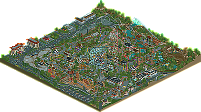
Once upon a time, you couldn't get Coors east of the Mississippi. Now you can, at Coors East!
-
9 fans
 Fans of this park
-
 Full-Size Map
-
 Download Park
1,077
-
 Objects
622
-
 Tags
Tags


The cars at speed seems like the rush hour I loved.
The gas station and hotel got very crazy (this is compliment)
If I talk about all the things and details of your park, fences, roofs, windows, colors, architecture, foliage, water, stones, etc., I'm going to use about 500 lines, so in summary: it was fantastic.
What I like about your parks is that you do not just make amazing buildings, but there are lots of rides, that is what I appreciate.
Your parks are very good
Nice work and also congratulations to the other participants.
I am absolutely enamored with that Waffle House.
I really enjoyed riding these coasters, especially Rebel Yell, the red Schwarzkopf.
The surroundings were awesome, the architecture was really on-point with the McDonald's, Holiday Inn, Chevron and Waffle House -- really cool tricks with the signage for those places.
It was funny to watch the traffic at that intersection at the corner where Corsair -- another favorite -- was. Some mean street driving, cutting u-turns across four lanes.
The dam that widowmaker drops right next to was a really cool detail, I thought. Overall, a really fun park to pick through.
Every time a park like this comes out, I say "this is my favorite realism yet!". Its true again this time- this is my favorite "american" realism park on this website I'd say. Although I love many of them for different reasons, historical and aesthetic, this one really ticks all my boxes in the right way. (awesome use of palette and colors too throughout)
the overall composition is so pretty. Paths and rides flow in really realistic and pretty ways, sandwiched by buildings and planters and open spaces in just the right way to build a great, cozy and dense atmosphere. speaking of, the architecture throughout is amazing- there's a lot of great american archy to really dig into, which is detailed without being glitchy. I'm a big fan of much of the themeing throughout the park.
Layouts are all pretty good, especially the woodies, and notably fit well within the park and don't just sit awkwardly around the borders. Theres a host of fun supporting rides, all with awesome queues, stations, little bits of themeing, etc. Throughout the park I was impressed by all the little things around the paths that bring it to life and add an extra layer of fun and realism to the park.
Anyway, I've said a lot of good things. I love pretty much everything here and I hope this is remembered as one of our best realistic parks yet- really up there with previous greats in my books. Of course, every spotlight is great in some way
I also took a couple snaps throughout of bits I particularly noticed:
your new orleans archy always makes me jealous
the dinghy slide for elevated log flume is a great solution
this is absolutely incredible work.
Going to lump my thoughts together because I don't know how to properly write a review.
The burnout custom flat is sick. A shame it only looks good from one angle. Barnstormer is amazing, especially the station area, only think I don't like are the queue covers. The Oil Striker theming is just cheesy enough to be convincing. A lot of things seem cluttered at first but they make sense after thinking about them.
Overall I'd say this park is like nothing I've ever seen before. You threw a lot of RCT conventions out the window (colors, scaling, textures) and it still works as a great piece of realism. For example, the hotels nearest to Corsair look hideous, but then I realized...that's what every standard hotel in the US looks like. Even the teal carpet in the hallways....
I don't know if I like it as much as Coors West but this shows you're one of the best, if not the best builder on this site.
I think I like the atmosphere of Coors West better, but this one is better technically.
A very solid park; ticks all the boxes when it comes to technical standards and is very impressive.
Unfortunately, in ticking all the boxes in the way it did, I think it lost some magic that made the original just work. I think you know this.
Well deserved Spotlight, combine the technical work done here with the unique originality of Coors Park and you have your 90%.
Good review on the way but congrats on Spotlight!
thanks for my second spotlight.
This was an absolute pleasure to build on. Learned a lot by working with you Shogo, even if I didn't do much, this and SoA will always be dearly remembered by me as the catalysts that helped me grow as a builder and a person.
As for the park itself? Absolutely lovely. The atmosphere is amazing, it's a park that I'd love to experience as a visitor. The realism is unparalleled, the atmosphere is lovely and it's altogether super comfy. I really enjoy the way you used the English palette to set the mood, and the organic, interwoven layout of the park on a macro scale is excellent. You haven't sacrificed the micro quality for this either, which isn't new, but you've definitely set a new bar for me in this regard.
Definitely a well deserved spotlight, I think it sits nicely between a 90 and 95 for me. The Victorian area and Widowmaker's surroundings are my favourite sections.
The only negative criticism I have is that the invert should have been pink bitch what were u thinking smh it was super pretty and gay before u changed it back <3
i told you this already but this is easily one of my favorite parks ever
everything on the map looks so pristine and effortless and the textures and colors set an atmosphere that creates a level of immersion beyond comparison. i feel like ive been there.
Congrats!
Why I voted 85% (which is high):
- The execution was good, great techniques and pretty clean.
- Surroundings were cool and add a lot
- Good ride design with some nice interaction
Why I didn't vote spotlight:
- Although everything was at a high level, I thought everything also kind of looked the same. I couldn't really figure out any cool concepts, themes or creative ideas that stood out. It missed a lot of heart and soul for me. I think the other Coors park did that a lot better.
I worry I might sound like a broken record, but you are so damn talented. How you are able to build these parks, this fast and this good is beyond me.
This, to me, is an obvious Spotlight.
I will do my best to write a review in the near future. Life has been quite busy as of late.
Congrats Shotguns, well played!
Congrats on the spotlight Shotguns, and sorry for the 90% miss. I've told you my thoughts privately, and it's hard to reiterate. But the general jist is also emerging in this topic here. Your talent is so apparent that you build most anything with seeming ease, but as a viewer it's hard to find genuine heart and soul in it. Something you yourself said the park was more or less void of. I hope you'll never do that again, because it's the most important aspect of any "work" you do, and anything else really isn't worth your time.
Congrats with the spotlight Shogo! I know you hoped for a higher score, but if you count your spotlights and the time you got them... you should be proud of that. I can't think of any other builder making such quality work in such quick periods.
This is American realism at it's finest. It's cool to see a park that's not really chained to a real chain. Though I do admit I get huge Hershey Park vibes from this. The coasters are really great, Blackjack my favorite. Reminds me of Fahrenheit which really is a hidden gem. I also keep digging the woodie more and more whenever I view the park!
A well deserved spotlight. Imo the original Coors is slightly better, it has more atmosphere. That's maybe my only nitpicking, since the two parks are from the same "chain" it's not far fetched to make the comparison.
You already know my thoughts but this is clearly your best work.
The blackjack station, main midway and surrounding areas are phenomenal and you really pull of the gritty American realism vibe well.
I know you're always on the brink of retirement and while I feel that you should do whatever makes you happy I do selfishly hope that you never quit this game because the work you put out is excellent.
Just look at that main midway. Look at it. No... look...
Saw this mentioned in the discord yesterday and wanted to add some comments since I haven't already. A spotlight deserves more comments!! Anywho, I figured I'd add a few screens of stuff that I wanted to highlight:
I saw you mention Shogo you don't have a style.. I politely disagree. If this screen was anonymous, I think this cluster of buildings defines what you do very well, and that is realism that still has a lot of color and character.
Tennessee Valley Rapids' station was nuts. First, the queue is super long, but the queue covers were nice, colorful, and added to the experience I think. Liampie has mentioned working on strong queues to me, and the interaction here is something that I'd want to emulate. Also, all the extra boats hidden are a nice touch.
Simple stuff like the cover for the carousel always wow me. The seamless integration of the carousel top with cso is impressive. Looks almost like a completely custom ride. Your cover for the teacups ride was also simple, but well done.