Park / Terra Phantasia
-
 09-February 19
- Views 3,376
- Downloads 591
- Fans 1
- Comments 14
-
-
 60.50%(required: 60%)
 Silver

Cocoa 70% Coasterbill 65% G Force 65% robbie92 65% saxman1089 65% CoasterCreator9 60% Liampie 60% Scoop 60% Ling 55% RWE 55% Sulakke 55% Xeccah 50% 60.50% -
 Description
Dear Relation,
JCD would like to invite you for the official presentation of our newest creation. -
1 fan
 Fans of this park
-
 Full-Size Map
-
 Download Park
591
-
 Objects
437
-
 Tags
Tags
![park_3351 [H2H7 R3] The Hanging Gardens of Babylon](https://www.nedesigns.com/uploads/parks/3351/aerialt3058.png)
![park_3359 [H2H7 R4] #diamondheights](https://www.nedesigns.com/uploads/parks/3359/aerialt2984.png)
Is it fair to call this our first true example of Post-Riverland Realism? A nice little park, all of the themed areas feel fun and work well as a whole despite being very separated from eachother. Fun design and style too. Probably will end up being a 65% for me, nice work.
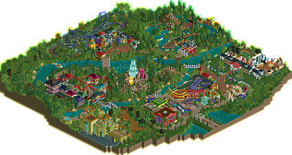
This is so cool. The launched dragon coaster is really slow but such a unique spin on a very old RCT concept. Crystal Mountain also looks really cool - that idea and aesthetic alone could probably carry a whole design. This feels very much like a small-town, small-scale park. Each of the areas is distinct but not overdone. The foliage is a weak point - many of the tree colors are awkward and the park could do with more underbrush in places. Some of the custom trees hurt the palette more than they help it too.
Definitely looks like Riverland offspring, but in a good way because you add a lot of touches of your own. The fountains in the entrance area are awesome. The crystals? Fucking awesome. Drain Drivers? Wacky.
Your use of colour is ballsy in general. Again Fisch-esque, but you turned it up to 11 and you're owning it. I love the use of vomit green on Babylon Falls. Green tarmac? No problem.
The one thing I think you need to work on is ride design. You've got some nice concepts like the dragon coaster, but I think the layout is awful. Occultus is also not working for me, at all. The rapids actually have a nice layout but the theming is bland. The mystery mansions is indeed a mystery, because as soon as you board and you're ready to explore the mansion, the cars instantly take you through three different but all unexciting ecosystems. And then you're back in the mansion. What the hell is this ride about? As I said I think Drain Drivers is awesome but the ride exterior seems to be completely unrelated to the interior. I think Xophe did the sewer theme better. Check out Zippo's Wacky World of Wonders if you haven't already.
All in all a very charming park. I think you're one of the most exciting new players right now!
I liked the colors and the buildings, the themes were cool, the paths are good.
This temple in particular I loved, very nice.
Sorry, I am no expert on subject RCT2, but foliagen is reasonable.
Attached Thumbnails
Two things I love about this park: creativity and unique use of colors. The water slide dark ride, the crystals and the dragon shuttle coaster are all great ideas and set this park really apart for me. The colors are a pallette I would never think of using in the way you did, but it works wonderfully well. I also like how the themed areas are not connected, but feel like seperate pavillions, an approach that won't work for everyone I'm sure but for me it does. The look into the interiors are tastefully done as well!
As been mentioned before the layouts could use some improvement, especially the big vekoma coaster. Layout of the dragon coaster is aesthetically very pleasing, but the speed is too slow. Babylon is along with the crystals one of my favorite parts, only thing I would change is not to have the splash underground. An outdoor splash zone adds so much to the atmosphere of a splash ride and makes it interesting for visitors who are not riding too. Theme of the river rapids isn't very clear to me and could use some more context and detailing.
I enjoyed this very much and I think it's a great step forward from your previous submission.
Wow thanks guys, those are some awesome compliments!
I started playing OpenRCT after I was blown away by Fisch's Riverlands and still regularly look at his parks when I'm stuck in building. I love his use of colours and how he succeeds in really creating immersive, well-themed area's. So being named in the same line as him is really an honour! I also get a lot of inspiration from Liampie's parks, so being named as one of the exciting new players by you is really awesome
I'm really happy with the pointers I got in Wonderland and have tried to work them out in this park. I'm glad Faas and olddtfan51 helped me out with good advice, especially with the foliage. After reading your comments I compared my parks to other parks and I fully agree that the foliage and ridedesign can be better than it is now. I'm going to try to work these aspects out in my next park. Thank you for all the advice I've gotten so far, and I really hope others will give me even more advice
this is fucking awesome. I'm not sure exactly how you set the atmosphere you do but its really great and just up my alley. I can look past the unrefined-ness in architecture and scenery usage because I love the way you put the park together, especially that center structure which is incredible. the layouts are a bit funky but don't bother me too much. the aztec temple is super cool too, and g force is absolutely right to call this a direct inspiration from riverland. I do think you still have to be careful to not rip too much off from other parkmakers- you did it in the last park you made and a bit in this one too. Its good to take inspiration but make sure you're not just recreating the same area but in your park. it still needs to have its own voice.
What a great little park! Time for a review.
I love all the different ideas you have. Quite a lot of them are so simple, yet so effective, like the crystal drop towers. just wonderful. Also the atmosphere you create inside this park feels very whimsical with all the colours and ideas. Your colour choice feels warm and magical, totally fitting for this park. You also listened to our tips about foliage on your last park, which definitely shows as it has much improved.
You've seen to have a grasp of good park making, but some design choices are still a bit weird, like how Occultus is nearly completely shielded off from visitors. It would've been nice to see someinteraction with the path.
Most has alreay been said by the others, so not gonna copy that here. One tip with music use though, don't put it on ALL your rides... It starts to sound god aweful when all of those tunes mix because they're too close together.
This was really nice.
It feels like a collection of ideas rather than anything cohesive but I don't think that's necessarily a bad thing. There's a lot of creativity here and the creativity and bold color choices help create a really fun and enjoyable atmosphere.
Great work!
Big fan of all the colors. I think your choice of colors and textures create a nice atmosphere. My favorite part of the park is the center island. The crystal tower was done really well. I'm no expert on park planning and layouts, but I think you have a firm grasp of that. Just continue to add more detail and interaction between paths and rides in the future.
Congrats on the Silver! Well deserved!
Good job on the silver, it suits this park well. Keep it up.
Thanks guys! I'm very happy that Terra Phantasia reached a Silver Accolade. I put a lot of time and effort in this park and I had a lot of fun building it. It's nice to hear people appreciate it. So on to the next one!