Park / Bob
-
 31-January 19
- Views 4,268
- Downloads 618
- Fans 1
- Comments 16
-

-
 71.00%(required: 65%)
 Design

Steve 80% CedarPoint6 75% Liampie 75% RWE 75% SSSammy 75% bigshootergill 70% Ling 70% Scoop 70% Sulakke 70% robbie92 65% saxman1089 65% Xeccah 60% 71.00% -
 Description
A tribute to one of my favourite rides at Efteling.
RIP -
1 fan
 Fans of this park
-
 Full-Size Map
-
 Download Park
618
-
 Objects
341
-
 Tags
Tags
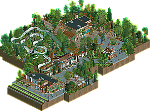
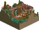
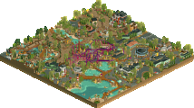
What a great park. I think given the size and quaintness of it all, one really needs to zoom in and focus.
Thats better. All right, yeah so did I say this was a park? I guess its more of a design (of half of one??). Is this finished? I guess the layout is okay but its recreation so I cant fault you. Or is it a tribute? I cant speak to the accuracy since again Ive barely ever left America in my entire life let alone go to Efteling. Im sure its nice, if its like this. Is it this cute in real life? Is this the Tinder of Efteling recreations where it looks great on my screen but then its an absolute dumpster fire when I meet it at the local bistro? Lord give me strength as I clutch my lucky joint.
Anyway, this is well done and all. Make a full park like this and you will have my unending gratitude but still also have my unending hatred of the fact that you cant even make a fucking grilled cheese sandwich. Like, what the fuck, dude. Nothing has ever infuriated me as much as that conversation. I use the toaster, like what the hell. Lucky joints be damned because there is no respite from this God awful situation of botched grilled cheeses in a European country that doesnt even have the right mayonnaise. What a world. Anyway, good job.
Since Steve kicked off the first review I decided to put my thoughts down as well after sleeping on them for a night and watching at the park again.
So first off, I think you really nailed the architecture and the general atmosphere. The whole map just looks very cute which fits the Efteling. The station building is really nice and is my favourite building on the map. I also really like the little details like the planters, the benches, the map sign and the path textures used on the path near the spookslot.
However I feel like this design has two problems:
- Firstly, I feel like the map is so small. The content that is there is great but I wish there was more.
- I'm not a big fan of the layout of the BOB itself. Like the map itself it just feels way too small to me. Sure BOB isn't that big of a ride in real life but I feel like compared to the scale of the station building the ride is very low and small. It's only 5 units taller than the roof of the station building. Partly because of this the trains also crawl through the last break section, while this section is also not that fast in real life, I feel like it definitely is a bit faster.
Also lastly, that Efteling trash can object, while a cool idea, looks horrendous. It has no shading at all and it doesn't fit in with the rest of the game imo.
All this maybe sounds a bit negative, but I thought this was a really good design! I think the score it has currently is even a bit low. Everything around the layout looks really great imo, the architecture, the pathing and also the foliage. 80% from me.
Do I smell Faas' first design accolade?
I thought this was quite sweet. Like I said, feels like you built it with a bit of love, which is always a good thing. I have never been to Efteling, and any aspect as far as "correctness" of a recreation goes is really of zero concern to me. But your landscaping and architectural design choices were nice, and showed a style change for you from the cutesy bright colour RCT Louis would always swoon over, to a more naturalistic and recreationalist look. I hope this will mean a good thing.
The one thing I did not like, and would hope you will consider to change in the future, is to not tree up everything quite like this. The map comes off as if it's 85% trees, and it's a bit too much (for me).
I love this. I've never been to the Efteling, but this really wants me to go there. It is small, but i don't cared about that this much, actually spent more time on the map than on some bigger projects, because of the immersive and good looking atmosphere and architecture you created. I also do respect you very much for trying to include interesting object choices like the snowy houses and the castle tower in this, really helped the viewer's experience. I do agree with Rec though that the trash cans looked a bit off, probably would have tried the paradise pier cans instead. Also some of the supports of the coaster felt a bit too messy to me, but maybe that'sbecause of the recreation i don't know...
Anyway all in all great design and accolade worthy for me, would be a great achievement for you wining it with a bobsled coaster and such a small map! I can already smell some controversy....
this was excellent in what it was. however, it had limited scope, and the ride design was well done but very limited by the fact that a) its not a very interesting coaster type (think giant inverted coasters in contrast) and b) it is a rec.
If this sort of quality was translated to a more adventurous and original work, i can imagine giving very high scores.
my big beef with this is that while it is objectively a show of skill, it also felt like a personal rejection of your own style for a recreationalist soulless approach to parkmaking, that while i can enjoy on the surface level more than i can your actual style, i don't respect as much. youve essentially came off as liam jr. in this park.
my score has absolutely nothing to do with "scale" or "ambition" or whatever. hell, it's not even about the fact that this is in fact a recreation of something and i somehow wouldnt enjoy that or whatever. but it's missing you from the equation. normally when someone does a recreation it's their personal interpretation of a work (building recs is a lot like the art of storytelling in this regard). all i find is a compromised aesthetic that borrows too much from your realism building contemporaries. congrats on making something "good", but i can't really enjoy this.
please dont be offended <3
That's not how your supposed to vote shogo. at least imo. It shouldn't be based on who the builder is or should be.
I think the size and the fact the coaster wasn't anything notable hurt this one a lot for me. Its a design that puts the coaster 2nd to everything else. Definitely some nice parkmaking but I'm not sure it deserves anything higher than a 65.
Congrats Faas on your first Design Accolade! I think this is an excellent recreation of this atmospheric part of the park. You really nailed the Efteling vibe.
Looking at the screens I thought this would be a real 80% contender, but when looking at it in game I couldn't bring myself to vote that high. Not to say that it didn't live up to the expectations though. It's the layout. I don't think it feels super accurate (I know it's hard though, there's a reason why I cut it off on the map edge in Piraña) and as a pure RCT coaster it's not that interesting to look at. I also don't like how you've done the supports, they're not representative.
You surpassed yourself with the surroundings though. The back facade of the castle with De Witte Walvis, Het Seylend Fregat, and the Gijs ornament, De Steenbok, the planters in front of and the round windows on the main building, you nailed all that stuff. I don't like the kitsch of the winter Efteling at all, it's very un-Efteling-like, but you made it look very nice here. I like how you used the ice huts. Accurate layout or not, you succesfully captured the soul of the coaster and it's an RCT piece I will keep around for nostalgia when the real thing has been removed. Excellent work dude.
This is really the perfect balance of that unmistakable Dutch style and that also-unmistakable Faas atmosphere and charm. I'm too late to vote but I feel that the score is on point. Congrats!
its small but awesome. I feel like you replaced your previous habits of doing small buildings with doing regular buildings but in a small park
the archy is great and the surroundings are expert-level. I just wish there was more to see! my favorite thing is the icy huts with the banners between them.
one day can we just see a full efteling?...
This is a release I was looking forward to. Thanks for recreating one of the most fun coasters there is, I'll miss it a lot in my future Efteling visits.
I think it's not an easy coaster to recreate but you did a great job on it. Those mid brakes are a pain in the ass but a needed evil since capacity would be shit otherwise. I hope OpenRCT once enables a feature when we can adjust the braking speed of those damn block brakes
The archy is really lovely and phenomenal. If you would say to me Liam made it, I'd believe it. Everything is so atmospheric, lovely. Really Efteliaans. Great use of those snowed stalls. Foliage use is excellent and elevates the atmospheric feeling a lot!
A shame this is scored so low... The Bob from Efteling is maybe the best example a coaster doesn't have to be big, fast or contain multiple unique inverting elements to be just a really fun coaster. It's a type of coaster that gives you so much joy and pleasure riding it, however never mentioned in a top coasters list. I think the whole setting was well enough for a better score. Maybe it's because I've ridden the Bob and most other haven't?! Dunno...
Wow my first design, cool!
Thanks for the replies everyone. A lot of the critique made sense to me, others not so much, but so it goes.
I think it's a nice tribute to one of my favourite coasters.
This was very charming, Faas. Not as charming as your usual stuff, but still very atmospheric and pleasant. Nice to see something different from you. I'm glad there wasn't any bloated coaster, or anything similar. Just a nice calm ride in an equally calm setting.
Only nitpik I have with this is the paths. I think they would've benefited from more of the "little things". Perhaps some colourful map racks/flowers, a small waterfall or something similar. Just to break up some of the grey.
Good job, and congrats on the design. Well deserved.