Park / Bumbly Beach
-
 15-January 19
-
 Bumbly Beach
- Views 9,863
- Downloads 1,000
- Fans 11
- Comments 27
-
-
 77.00%(required: 70%)
 Gold
Gold

bigshootergill 80% CoasterCreator9 80% Ling 80% saxman1089 80% SSSammy 80% Coasterbill 75% G Force 75% Jaguar 75% robbie92 75% RWE 75% Scoop 75% Faas 70% 77.00% -
 Description
Develop Bumbly Beach's small amusement park into a thriving theme park.
-
11 fans
 Fans of this park
-
 Full-Size Map
-
 Download Park
1,000
-
 Objects
538
-
 Tags
Tags
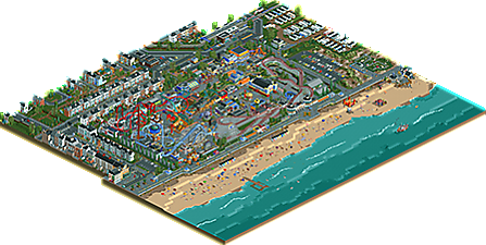
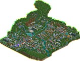
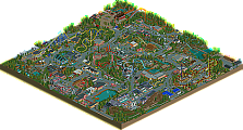
This is a very nice park, dude. Probably one of the most immersive viewing experience i had in a park from you! I really loved the beach and all the city, it's all done very realistic and beautiful in places where it needs to be, but also ugly where it needs to be.
The park was good too, but it was the point that kept me away from voting higher, while kind of liked the overall atmosphere over here i think the way how everything works together didn't appeal to me. Don't get me wrong, the individual rides and the architecture, is nicely done, but i kind of missed the consistency.
All in all a great achievement for you though, and i'm looking forward to your next stuff!
Putting Scoop's link to his review from the Discord here as well:
https://www.youtube....h?v=9Zf2g2iFDPM
glad I finally got a chance to check this out- very enjoyable. I love the dedication to reimagining the original scenario, it fills me with nostalgia (especially all the surroundings are very well done). the park itself is cramped in a good way and takes references liberally from a bunch of real parks (blackpool, grona lund, etc). It still feels very jappy in the way you put together buildings and compose the park. No that thats a bad thing, but I am waiting for you to embrace a bit more curves and natural flow as well as a slightly more mature building style. that said, there are a number of really nice buildings with cool details. overall I like this park a lot. the reimagined scenario is done really well- maybe without quite as much ambition and creative license as diamondheights, but still a really nostalgic effort. congrats and well done!
Bumbly Beach, it's there! Was quite excited for this, sorry I'm so late with the review.
I don't know the original rct1 scenario since I never played that. I do recognize the Blackpool influences and viewing through the park it brings me back to my last Blackpool visit. You want me to remind you never do such outskirts anymore?! Ok, but even I realize that this park is lifted up by its outskirts. You really succeeded to catch the typical ugliness of a British seaside town.
The park is really looking fairground-esque, but in a good way. Some design choices must've been a pain in the ass to do, like the go karts, woodie and steeplechase crossing each other. Respect. The coasters are pretty good, I think you're also making progress at that. Tyran looks like a bit too fast paced but who am I to complain about that
Kudos and extra points for including a wooden wild mouse! Park looks way more believable and better with it. You managed to put in a lot of stuff on a small surface in this park. And make it look good. The beach is awesome, really nice details with the cabins, paraglider and so. Don't know if the sea around the UK is fitted for some swan pedalos though
I know you wanted to get a higher score, but I think you should be a Happy Jappy and be proud of this. It's your best work (yet), you are getting better and better. I'm really looking forward to what you'll build in the near future, and I think a lot of NE'ers are curious to see future work from you.
Little late but, great park Jappy. Not so much a overall improvement from JWAK, but definitely sort of a filling out of your skillset and adding a bit more variety to your parkmaking.
Overall, I hope you pursue a bit more macro ideas in the future, big coasters, large scale attractions etc... Maybe continue your trends here and sort of mix up your areas and allow them to melt together a bit more. Exploring some new textures and styles too, it will really help add more visual depth to your parks.
Went with a 75%, after going with an 80% on JWAK it was hard for me to give the same score here considering the scale and park itself not being quite as interesting. I just love the huge expanses of JWAK and how it felt like a real, zoological park. Not that this doesn't feel like a high density seaside park, but it just doesn't have the same impact I guess.
Very much looking forward to EDK, it will surely be your best yet.
It seems like I never wrote a review for this park. It’s a shame, since I really like it. First of all, congrats on the accolade and the achievement in finishing another park. You’re a very productive player. What I like about you is that you take one step at the time with each release. You gradually improve your work without losing your style. There is a lot of realism circulating right now, but it’s fairly easy to see who built this park. It certainly has Jappy written all over it.
What I love about the map in general is how full of life it is. There is so much going on both on the inside and the outside of the park. I love that. As I’ve mentioned in previous reviews, I like context. In my opinion it adds more depth to the viewing experience. The beach for instance is wonderful with all the activities going on. I really like the fishing boat, the flying seagulls, all the people swimming, and the parachuters! And by the way, the mini golf course is gorgeous.
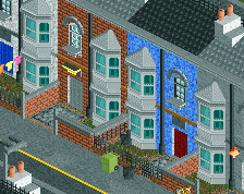
The community is even better. The architecture is a bit repetitive perhaps, but I assume that’s what it looks like in real life. What you did well, is to make every garden of each house different. I can imagine it being somewhat painful to make them all unique. Some of the gardens were really cute and charming. I like that you made the town peepable. You even made some of the stores peepable as well. Big plus in my book! I also adore the unfinished facade right across the street. Also, good job with the traffic.
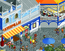
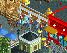
As for the park, it really is chaotic, but not in an annoying way. It’s not even that hard to read. Just like the outskirts it’s full of life, and there are things happening everywhere. Some of my favourite things in the park are the steeplechase coaster, the go carts and the interacting Big Dipper. Very well done! What I absolutely love is the area around the carousel. It’s very charming and atmospheric. The Skyride building is brilliant. What I also really like is all of the tables on top of the roof, above the game stalls. You should’ve made them peepable! Lastly, I want to give you credit for the lovely colours.
I think you did very well with this map, Jappy. Not an easy build, but you did it. Good job. Where I see room for improvement, is mainly in the texture department. The way your work comes across sometimes, is almost like a painting, painted with oil, acrylic, watercolours, pastel colours, and spray paint. It’s still a nice painting but could texturally look messy, incoherent and hard to read. I’m not worried though, I’m sure you’ll continue to improve, and I can’t wait to see your next release.
You asked for a review...
Overall, the look and feel of the map scream Britain, although a bit more colourful and bright, but the setting is fantastic at portraying a British seaside.
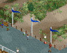
The beach is perfectly done, the windbreaks, beach huts, bouncy castle, the boat shed, all of which can be found in the summer. It isn't quite perfect IMO, there are a few bits that I think are either too american, or just are a bit less common in the UK that ruin the true authenticity. These would be the wooden jetty, all the umbrellas (far too many for a british weather ), the paragliders, the swans in the sea (usually are in a boating lake instead), there's a few too many kiosks directly on the beach. But these are all minor little niggles.
The promenade without a road is an interesting choice, I feel in this setting when there is so much going on down on the seafront there would be a road going along too. The fact that the promenade is on wooden stilts is also interesting, this is a more american approach, I feel it would have been nicer to see something more solid, particularly when you have the more victorian style lamposts. Again, the conflict of victorian british traditional seaside and americanisation holds this back from being perfect.
The mini golf is lovely, as is the caravan park, exceptionally well done on that. In fact, the entire surroundings are probably the best thing about this creation. All the houses are very well built and thought out and all the surroundings (minus the issues with the beach) are quintessentially British. Kudos on this, its really well done and brings the park up in quality massively.
The park itself is themed enough and not themed enough to portray the goal well. My only issue is that it is almost too colourful. There isn't enough drabness, needs more grey industrial boxes around, particularly around the edges, you have it a little bit in the corner by the go karts, but there should be more of this. When you look at blackpool, there is so much old shabby sheds around the edges, and everything is aged and weathered. The british seaside with all the wind and rain, you'd expect it to not look so fresh and bright, even in summer.
The ride selection goes nicely together, but there should be a bit more older stuff I think. Even what is meant to be older looks to be newer, and that's a shame. I think that is what holds the whole park back, there isn't a clear sense on continuation, of the park expanding, it is almost as if the park built everything at once, there is a lot of things on top of each other, which is good, but it seems too planned, as opposed to "where can we build next".
I mean I'm saying all this as if it is a bad creation, its not, far from it, its brilliant, and a great first NE park to look at on my return. A very solid Gold.
You have the surroundings and setting down perfectly, focus on the thought of the park and you'll have a spotlight in no time for sure.
Here's a video review of the park. It's over 80 in my eyes-- what a great park with so much detailing.
https://youtu.be/t1zgnTn6TEU