Park / Bumbly Beach
-
 15-January 19
-
 Bumbly Beach
- Views 9,923
- Downloads 1,002
- Fans 11
- Comments 27
-
-
 77.00%(required: 70%)
 Gold
Gold

bigshootergill 80% CoasterCreator9 80% Ling 80% saxman1089 80% SSSammy 80% Coasterbill 75% G Force 75% Jaguar 75% robbie92 75% RWE 75% Scoop 75% Faas 70% 77.00% -
 Description
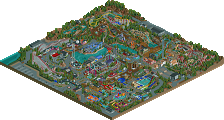
Develop Bumbly Beach's small amusement park into a thriving theme park.
-
11 fans
 Fans of this park
-
 Full-Size Map
-
 Download Park
1,002
-
 Objects
538
-
 Tags
Tags
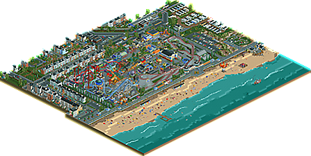
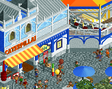
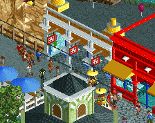
Incredible work Jappy. I'll be back to write a full review soon, but I needed to pop in and tell you that this was everything I expected and so much more.
Very nice release! Everything is so well done here, it's wonderful to look at.
There are many, many things that impressed me with this park, but what impressed me the most was the mixing of chain and no chain with the vehicles to make them slow down for stop signs and the like. Very innovative! It has set the new standard for city realism.
The park is stunning as well. It's hard to form words as to how good it is. The way everything fits together is impressive, the layouts are good, and the scenery is top-notch.
The beach is very good as well, but my absolute favorite part of the park is the mini golf. There used to be a mini golf place by my house with classic and interesting courses much like the ones you have built. Putt-putting through miniature houses, cannons, and over formed hills were a staple of my life. Unfortunately the place closed after its owner died, but I'm glad I can still pretend to be there, here in Bumbly Beach.
There's so much in this park it's hard to cover everything in a post. But I have to say, every tile on the map is top-notch.
First reaction is that I should enjoy this more, given the obvious effort visible everywhere. I just ever struggle with recreationalist/model parks that due to their small artistic merit leave me quite cold.
Love this a lot! It's incredible!
i think that there is a lot of really great execution with bits and pieces. Most if not all of the surroundings are outstanding but then the park feels like it was built by a completely different builder. I like how much fun the park is and i think your passion for the project shows through that. Many of the color choices don't work for me either. There are a lot of spots where it seems that bright colors were chosen just to convey the theme or style of the park rather than using the object usage and composition for this. I think this will still score very high but i don't know if I can get myself to vote this over 80% though. We will see with time.
It is so amazing details I do not know what to say.
I do not know if I'm talking about this or that, it is too beautiful.
Well, but I will appreciate it more and make a summary.
In advance congratulations the team
I love this! Not only does it showcase great skill but it also has moments where it feels like throwback, classic RCT with it's bright colors and stacked rides. I feel like the NE style realism and great technical skill (Harold's Haunted House / Awesome Mini Golf / the surrounding buildings) should clash with this more but it actually blends together really nicely.
Great work!
I honestly think this is so good that it might start a trend of "remaking" these kinds of early scenarios. Parts are awkward, like Chupacabra and the fact that there is I think one too many roller coaster, but parts are just genuinely lovely, like the two entrances and the boardwalk. I'm not super enthralled by the ultra realistic style that's all the rage lately either, but I do think mixing it with such a nostalgic scenario works wonderfully.
This park was great! On the one hand it was a fun, colorful, realistic park but on the other hand it was a big nostalgia-fest. It reminded me a lot of how I used to play this game as a kid. Just filling parks to the brim with any type of ride the game would give me. Including the chairlift. This park resembles Bumbly Beach so much that I'm pretty sure without the name anyone would have guessed it within seconds. Fantastic job! Although you could have bought the land over the sea to build more rides
My first impression OMG this is fantastic. A detail lovers dream. and very nostalgic at the same time.
I lurk a lot here, so apologies that this comment comes generally out of nowhere, but I respectfully disagree with the notion that a recreationist/model type park is inherently devoid of artistic merit! In fact I see it everywhere in this, in the way you've filled in all the "gaps" in the original scenario and given such life to it. Stunning amount of detail and I love the layouts here.
The area has been polished. Strong houses and street, and a tram "at rush hour". I wonder if anyone would dream of building
"Bumbly Beach 2" (?).
Greetings.
Damn this is so good. This level of density really suits your style Jappy. Feels very authentically english too, could easily be Blackpool or (a flattened) Scarborough.
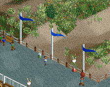
Great to finally see this park ingame! First of all I took a look at the surroundings, and they are really well done. Lots of cool details at the beach - especially enjoyed the lights, in the backyards of the houses and in the streets. I love the minigolf. Inside the park you did a cool reinterpretation of big dipper. Nice to see less used rides like the steeplechase and the wooden wild mouse, they really fit in here. For my taste the park was a bit too cramped and I agree that it could have done with one coaster less, but you definitely succeeded in creating a submission with great atmosphere!
Great park Jappy! Don't really have much to say because I pretty much just liked everything that I saw. There was so much fun stuff going on and one thing that I really liked in particular was the crazy amount of interaction between different attractions, really reminded me of something like black pool pleasure beach. The outskirts and the beach were also very well done, overall just a very complete and nice looking picture.
So yea as I said already, great work!
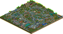
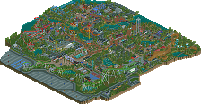
Excellent touch on the surroundings. Especially on the right bottom area(based on the aerial).
77% may not be a significantly higher score than your previous stuff, but when looking at the park itself it looks like you're entering a new phase. This park isn't your crowning achievement, it's Jappy V2's debut park, and the only way from here is up!
I hope I can give you a full review sometime soon, the park deserves it.
Wow, what a response!
Thank you all for the nice comments and the praise, it's very nice to hear. It's always fun when your hard work gets recognised and when it pays off. While I may have expressed a slight disappointment in the NE Discord about this scoring lower than JWAK, don't get me wrong, I'm still very happy with the score it received. I'm pretty impressed actually by how consistent the voting by the panel has been.
I will however be looking forward to reading some more in-depth reviews pointing out what could've been better and what kept this from breaking the 80% barrier that I want to break so badly. After all, it's improvement and striving for the best while still having fun we're all after, right?
Okay, here we go. Finally getting around to reviewing this awesome park.
I think the thing I like the most about this park is how nostalgic it is. Bumbly Beach was one of my personal favorites as a kid, and this looks like what I dreamed about building back then. It says all the right things in all the right ways. The colorful buildings, lots of tarmac, and assortment of rides screams oceanside park. The ride selection is great and makes sense for the park, and the Woodie really looks like an out-and-back you’d see by the sea. The steeplechase coaster is also great, just screams fun like a good boardwalk park would. Glad to see some shoestringed rides in the park too! I love that people are making peepability of custom rides a more prominent thing. The biggest issue I have with the park portion of the map (and actually carries through the outskirts) is the amount of grey. I know, rich coming from me. I wish you had used some different path types throughout the park to break it up a bit.
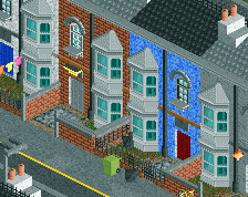
The outskirts are also pretty well done, although the amount of repetition brings it down a bit. I wish you had done more to give the row homes a bit more variety. Slightly different structure from building to building, rather than just texture and color changes, would have been a great improvement. The same is true for the trailer park. I mentioned above the amount of grey in the park, the same is true of the outskirts. Grey roads and grey roofs, plus lots of white and black as well, all adds up to a lot of grey.
Ultimately, the grey is the thing that kept me from voting above 80. However, I think this park will be a source of inspiration for me going forward, as the ride design, ride selection, architecture, layout, interaction, and creativity are top notch. Great job, and looking forward to what comes next!