Park / Castle Of Gold Park
-
 12-January 19
- Views 2,746
- Downloads 595
- Fans 0
- Comments 12
-
-
 46.00%(required: 50%)
 Spotlight Submission

Camcorder22 60% posix 55% RWE 55% Coasterbill 50% G Force 50% csw 45% Sulakke 45% Liampie 40% saxman1089 40% Scoop 40% ][ntamin22 40% CoasterCreator9 35% 46.00% -
 Description
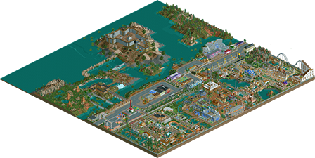
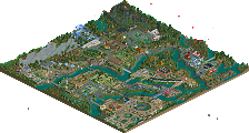
Castle Of Gold is a project inspired by parks that have castles here in "NE".
Although it is not a high level park, I hope I have at least made the theme, approaching of things built which is just castles.
It was not what I wanted, but it was a cool experience, I believe that some things you will enjoy.
Always feel free to make sincere comments in my parks.
The cannonballs in yellow are to symbolize gold. -
 No fans of this park
-
 Download Park
595
-
 Objects
590
-
 Tags
Tags
Very fun park. I enjoyed watching it.
Some things which I think could have been improved: I feel like the castle itself and the surrounding area was a bit empty and could have had some more details. I also think the foliage and landscaping could have been better as it was very bare at many places. I also feel like this park suffers a bit from ``Islanding`´, where you have a building or an attraction completely surrounded by path. This kind of removes the flow from the park and is also not very realistic.
The rest of the park is full of fun ideas albeit a bit unconventional. I liked the river in the park and the how the park works around the road. I liked the GIGA CASTLE OF GOLD ride and the Great White Wail ride. The syncronized loopings on great white wail were pretty cool to see.
Nice work and I see potential, work on the point I mentioned before and I think you could improve rapidly!
Hey. Greetings.
Impressive number of visitors. Is where to play.
I like this park. It is cheerful and colorful. There are cool attractions. The theme of the theme may be hard to see, but it has a character.
An impressive number of diverse architecture. Cottages, castles, palaces. In fact, everyone would probably find something for themselves.
The attraction "Octopus" probably could not be unrivaled.
I like RCT "Giga Castle ..." even though "unusual"
It's cool. You create so many original rides. That's good.
"Super Mouse" - it's a bit too much overload, so if it was about a real rollercoaster (... not only "Super Mouse"),
but everything you do looks better and better.
What would not he write: "a lot of positive energy"
Nice to build new scenarios.
Great White Wail is a prebuilt.
I’ll have more comments soon, just gonna look through the park again.
Well damn
Your work is so dream-like to me. Just weird and perplexing. Sometimes in a good way, sometimes not. Overall though I take something positive from this. It sure is refreshingly different.
ive not had chance to view the park but i just want to say keep up the good work. it genuinely seems like you have a lot of fun while building and that is really great to see
This is super weird but I like it. It's nice to see some variety on NE.
I love the massive Eurofighter.
The interesting thing about all this, even seeing other parks as a model and inspiration, we have our style this is cool.
But it is very good to see the comments.
Please players, rate my park, even if they consider it a weak park I find the comments interesting and instructive.
Honestly liked this a lot, it has a level of fun and disregard for the meta that I haven't been able to build with since my early days in the community.
In terms of rides and architecture, there's definitely still room for improvement, but you're going in the right direction so keep doing what you're doing. A lot of the structures were awkward but there were some nice ones too like the Castle of Gold station and some of the houses outside the park. It seems like you study a lot of other parks though so I'm sure you'll continue to improve.
While the roller coasters certainly weren't realistic I actually enjoyed watching them and liked the out of the box approach. The long sections of straight track kind of gave me an old school vibe too. One pet peeve for me though is I don't really like seeing a mix of custom and non-custom supports. I think you did a pretty good job on the custom ones and it would've added a lot to see it on the others, the way it is now feels unfinished.
I think landscaping is where you could definitely improve a lot and take some time studying other parks really closely and practicing a bit more. Some of the smaller bits like the gardens and fountains were nice but the larger scale rock formations and treeing looks unnatural and repetitive. I think the biggest problem right now is most of your foliage is evenly spaced out and uniform, while this is hardly ever the case in real life. You're more likely to see patches of trees/plants clumped together with some room in between. Definitely study some other parks and maybe even just take note of what you see in real life.
I think continuing with your current style while really focusing on improving your landscaping could get you into silver territory with your next park. I gave it a 60% though because I thought it was fun and memorable.
this seems about the usual weirdness from your parks- lots of stuff I just don't understand. Some cool work thrown in too, like the bustling area near the white castle. I'm pleased you're starting to use your own coaster layouts and forming more cohesive themes (mostly)
Ask me no problem, I will explain