Park / Attractiepark De Korenaar
-
 09-January 19
- Views 3,203
- Downloads 702
- Fans 2
- Comments 13
-
 55.50%(required: 50%)
 Bronze

Jaguar 60% Ling 60% RWE 60% Scoop 60% Faas 55% G Force 55% Liampie 55% posix 55% saxman1089 55% CoasterCreator9 50% robbie92 50% Xeccah 50% 55.50% -
 Description
A small Dutch theme park in the middle of a forest. Works in OpenRCT2. Inspired by many west-european theme parks like Bobbejaanland, Drievliet and Slagharen.
___________________________________
This park is my first completed solo park in years. It was a great opportunity to try new things and explore the hacks of the game. As a challenge to myself I had set a goal to finish the park within 200 years, which also just succeeded (partly because I put the game on nitro speed on several occasions). The park mainly consists of small and simple buildings and I hope to be able to release a full scale park soon. The only big building of the park is the theater / restaurant, which in my eyes is also used by the surrounding municipality. Furthermore, the park also consists of a few custom rides, which I unfortunately did not get peep-able. This is a challenge to get this working in the next project. As is often the case, there are also some easter eggs in this park, I hope you can find them. There are not as many as in my previous project and these are somewhat more difficult to find.
I would also like to thank a few people for the support and help when I needed it. The people know when I mean them. -
2 fans
 Fans of this park
-
 Full-Size Map
-
 Download Park
702
-
 Objects
374
-
 Tags
Tags
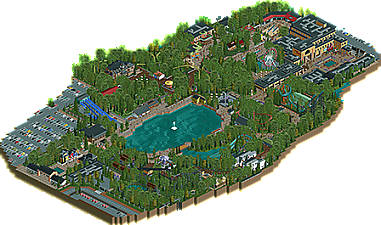
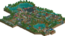
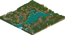
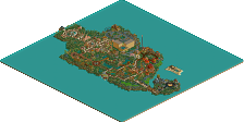
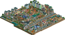
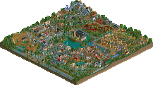
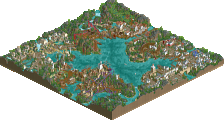
You're the first park to use the spacek cars I think, and you do it well. Great advertising for the objects! The rest of the map is quite nice too. I think you deserve some praise for the dedication to the setting. Just enough surroundings (parking) to place the park in the real world, and the content of the park are fitting for a small park. Mat slides, car rides, a wacky worm-esque ride, a cool powered coaster, playgrounds, a Bobbejaanland-esque Maurer spinning, and the Boomerang being the park's 'big coaster'. It's very fitting and restrainted. I also see some Drievliet-inspiration, is that correct? The only place that is arguably a little out of place is the enormous theatre complex, but it's not a deal breaker.
Overall you're pretty good in every aspect of the game and you crafted a good park that has a more coherent narrative than most NE realism parks I think. You definitely deserve bronze, and I wouldn't even be mad if you got silver. Maybe that's something for your next park though! Great job, definitely looking forward to what you're doing next!
This is something I don't say very often but I think this is a rare park that could actually do with slightly more surroundings. Chopping the park right where the rides and path ends in a few places affects the sense of what you would actually see from those areas.
The entrance midway seems really sparse, although the houses are cute. I think Xpress is the highlight of the park for me. The medium-speed turns and hills coming out of the trees on one side, flying over the path, and disappearing back into the trees on the other is something I can totally imagine from the ground here in a very realistic way. The "museum" haunted house ride was well done also. Lots of cool little custom rides, shame so many of them are not peep-able.
I think the biggest thing that bothers me about this park is that it feels like two completely different parks, where one just kind of exists where the last quarter of the other should be. The giant plaza in the back feels like a city shopping center, which would have been fine as an adjacent entrance to the park but there's no division so you have this huge tan behemoth of a building dominating the park visually and spatially. I think there is a way this could have worked, where that zone is a city block that just happens to be near the park that you've fleshed out for context, but I think incorporated into the park it just overshadows everything else somewhat. The back entrance to the park is also more visually interesting than the front/main entrance and I almost didn't even notice it on my first pass of the park because the map was shaved so close and it's completely hidden in 2/4 views.
nice work, I especially liked the parking and the news cars
No need to comment on the details, they were very good
earned my vote
Okay, here it goes:
+ Overall solid layout (congrats for not going for a square)
+ Decent coaster layouts for the most part
+ Good overall selection of rides, etc.
+/- No custom supports on many of the coasters. Not a huge deal but not exactly a plus either.
+/- The big building in the back is great in terms of its structure, but could have used a bit more details in places. Same goes for most architecture, actually.
- Foliage too thick and too much reliant on big trees. I know that's how it is IRL but it makes for a unpleasant viewing experience in RCT2.
- Boring Log Flume
- Coaster stations weak for the most part.
- The building for the bumper cars really needs a bit more detail on the roof.
This is kind of hard for me. I think you have the ability to build a silver level park, but this park just has a lot of problems. I personally give it a 55% in the community rating. Kinda hope for you that the panel is a bit more positive than I am in this case.
I think going forward this park is a good standard for a modern-era criteria for bronze. It has some great silver and potentially gold-worthy moments, but holistically it feels like an updated version of a lot of people's starter debut bronze parks. Not big enough in scope or ambition or identity to be a silver but is definitely without a doubt accolade worthy.
Call me a hypocrite but I think you went overboard on the trees and thick foliage, would really have liked a bit more open grass so things could breath a bit more. But the park definitely showed promise and if you improve a bit with archy, scaling and just become more comfortable with style you'll improve your scores for sure.
I agree with shogo its a pretty solid bronze.
I agree, solid Bronze in my books. It was a decent park in an odd shape, but ultimately too "standard" and didn't try to do anything different either conceptually or aesthetically.
It seems the panel has unanimously decided that this park is your first accolade win. Congratulations!
Congrats on the bronze!
Congrats! This was a great little park with a lot of charm. I think it could benefit from some more surroundings and maybe a few less trees but overall I have very few complaints.
Looks like an effort to bring old school Dutch park making into the nex decae of OpenRCT2. And it doesn't look bad at all! For a first park, this is a very nice effort with a great and realistic selection of rides. I agree with G Force and Version1 that the foliage is probably a bit too dense and that some of the buildings could've used some more details but I'm sure you'll consider this in your next project.
this was super cool. sure the actual construction of buildings and stuff was a bit simple and blocky but it came together to a nice complete park with charming atmosphere. I really enjoyed the layout and vibe of the park and the ride/building selection, as well as the areas with denser foliage. felt unique and I'd love to see you do more with a bit more skill in architecture and scenery usage!