Park / Burkholder's Electric Fields
-
 06-January 19
- Views 3,741
- Downloads 724
- Fans 0
- Comments 13
-
 51.50%(required: 50%)
 Bronze

CoasterCreator9 60% Jaguar 55% posix 55% robbie92 55% saxman1089 55% Coasterbill 50% Faas 50% Ling 50% RWE 50% Scoop 50% G Force 45% Liampie 45% 51.50% -
 Description
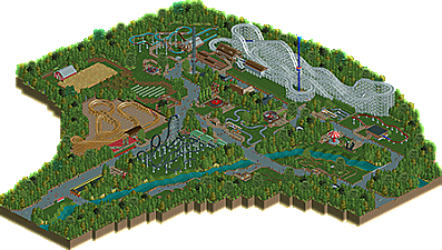
At the turn of the century, Electric Fields Farm was a struggling enterprise. The nearby woods made expansion impossible and the small farmland was not in a position to compete with big farming companies. The farm slowly fell into disrepair until, in the early 50s, Eric Burkholder, a member of the family owning the land, decided to build a theme park. While the land wasn't big enough for a profitable farm, it was almost ideal for a small theme park. The park slowly grow, but one principle always stayed: Everyone could enter the park and you only need to pay the rides you actually go on.
In 2018 big news shook the region: After nearly a decade, Electric Fields Theme Park would get a new roller coaster: The family wooden coaster build by The Gravity Group is the fourth coaster in the park and a highly anticipated addition to the park's line up.
______________________________________
I guess a little end of the year surprise (or start of the year, if this gets released in 2019). I build it in just under a week (22.12.-28.12.) and it was a lot of fun. It obviously doesn't really hold up in terms of quality, but it was a fun distraction from Heckengäu Park (where the pressure to actually build good stuff dampens my motivation). Since this was a good amount of fun I will probably re-visit other scenarios from RCT1 and RCT2 under the Burkholder name, so always be prepared. -
 No fans of this park
-
 Full-Size Map
-
 Download Park
724
-
 Objects
231
-
 Tags
Tags

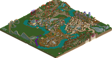
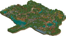
Glad to read you've enjoyed making this. It can help sometimes to change one's relationship with the game a little. In the best case parks like these help you clear up smaller aspects of your game you never give much attention to otherwise.
liked the story.
considering the park in relation to the history, is well explained and we understand why the park was built like this.
Looking around the park is very good, simple and cool, I always say that the simple sometimes gets very good.
The buildings are nice, to the right extent in my opinion.
I loved the part where the plantation and the barn are.
The paths are simple, but charming, details are fine, without much paraphernalia.
The entrances of the rides became cool along with the kind of fence chosen.
The foliage in general for me is well balanced.
For me the park portrays exactly the story, congratulations
I liked the format of the park
This park reminds me a great deal of Silverwood Theme Park in the layout and ride choices. Outside of the midway, things are fairly well spread-out with some lawn in between rides.
Quite a few custom rides featured, which I like because it makes me feel that what I do adds some value to this community.
I quite enjoyed this V1, glad you had a nice little project in you to get out and make yourself enjoy the game. Reminds me of Knoebels to be completely honest, and I'm a sucker for that type of park. Hope to see more projects like this!
A strange application of a custom palette. I tried switching back and forth and couldn't actually notice anything changing except the Open ride flags? I enjoyed the backstory but think the coasters are a bit too big and flashy for the park size, and there are perhaps one too many of them. Patriot's station and the small buildings around it are all great though. I even think the long, mostly empty midway section there works too, where in most parks that would be criticized as unnatural or boring. The little catering huts and picnic area are really nicely sized and spaced out too. The log ride should probably have been closer to the water - as it stands, the only acknowledgement that the stream even exists is the three small bridges.
With a bit more detail, ambition and content this could have been a pretty solid small park. It has nice atmosphere in some areas but overall falls a bit short I think. The rides are probably what falls short the most for me, with just a bit more detail around some of them I think it could have made the mark for me.
Nice little park V1. The style reminds me a bit of G Force's style.
Although I feel like this park is pretty fun to see, I also find it a little bit of a weird park to look at. Mainly because the park is a bit bare and some of the attractions/rollercoaster seem a bit big for a park of this size, namely the woody, tornado and the observation tower seemed a bit out of place. Other than that I think its still an enjoyable little park to look at, I liked the mini golf and the farm for example, so great work on that!
The park is very bare but it's undoubtedly pleasant to look at and it has a really nice atmosphere. I enjoyed it.
Generous scores, I honestly expected some more 40s and 45s. Even though I voted 45, I can't see bronze is undeserved. Very simple park, nothing flashy, nothing especially bad. It's all kind of there and it's kind of okay. The big woodie is the best thing about the park I think.
Congrats on the bronze! I also expected more 40s and 45s from the panel even though for me it was on the edge of bronze (voted 50%). I think its well deserved so congrats V1!
Congrats on the Bronze, V1!
i'm not sure I understand this park. some stuff is cool and american vibey, especially near the gigantic white woodie- very small park feel. but some of it just felt like lazy emptiness and the park lacked some stuff I felt, like an entrance and context for what it was I was looking at. It felt like a cutout section of something else that I needed to explain what it was
This is without a doubt the weirdest rct I've seen from you. You're always talking yourself down but you're not that bad of a builder. Even this has some positive points. The station of Patriot is pretty good. The burger joint across Patriot is also nice. Try to go further from that.
This park is not understandable. Is this is meant as a piece of a park? Or just as a whole park itself?! It looks like you went with option 2 I assume, since you've placed some poles meant as an entrance and a sign with the parks name on it. This is a park entrance is a joke. Even if you go with a pay per ride system, you want a park to have a clear beginning.
I don't know what you're point of this park is. If you wanted to have just fun, it's ok. I get it, it looks like you just wanted to make something that's just fun to make. Not using any standard or rule. But should this belong on NE?! Doubtful. The placement of some rides and it's "theming" just scream laziness. Look at the flume, just thrown around on a piece of grass land. Not very exciting to look at as a rct viewer, not looking interesting to ride as a guest.
Same with the kiddie coaster, just thrown in there. With one of the most uninspired stations I have ever seen. The coaster lay-outs are also not worth to write much about. Guess Patriot is still quite ok. Tornado looks believable at first sight but when looking closer it has nods in it, doesn't flow and not well thought out. Don't let me start on Logger's Revenge. Worst woodie ever. It looks like a coaster someone would make if it was his first time opening rct.
Foliage is horrible. Why did you have to spam every empty tile with a tree?! You also just spammed the underbrush object beneath them. Also the little grass objects placed at random in open grass fields... looks really terrible.
Idk man. You're latest work was getting progressively better. This is taking not one step but a whole walk back! If you have fun making parks like this, I won't judge you. Do what you like. But this isn't bronze quality worthy imo. You recieved some generous scores.