Park / Christmas Valley
-
 02-January 19
- Views 1,527
- Downloads 503
- Fans 0
- Comments 7
-
 42.50%(required: 50%)
 Spotlight Submission

bigshootergill 45% CoasterCreator9 45% csw 45% G Force 45% Liampie 45% RWE 45% Scoop 45% Cocoa 40% Jaguar 40% Ling 40% Camcorder22 35% saxman1089 35% 42.50% -
 No fans of this park
-
 Download Park
503
-
 Objects
204
-
 Tags
Tags
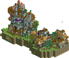
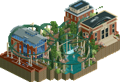
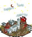
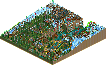
This is pleasant. Fairly remarkable for a first submission. The coasters were the highlight of the park for me, I just wish they had some more room to breathe. Your architecture is simple and could use some refinement, but it is effective. Keep it up!
Good first release, i have definitely seen far worse! Elevation really helps this and the whole viewing experience is dominated a lot by fun and joy. While everything is quite simple and composed a bit lazy, this still manages to get some atmosphere over to me, the dive coaster down the cliff was my favorite, definitely a cool addition.
Other then that i also see some bis i didn't liked that much, some parts of this felt kinda rushed and could have used a bit more dedication, for example the foliage. I also would have loved a bit more small details to explore.
Still a fun submission though! Looking foward to see your next one!
Bullet points:
+ Alway like Alpine Coasters
+In general good layouts. I especially like Krampus.
+bold landscaping choices
+/- Park layout a bit awkward due to the landscaping
+/-Foliage could have been more exciting, but is kinda interesting in a way
-Yeti Hunter sadly was a bit weaker than the other coasters. A bit too forced on the layout
-Very basic architecture
Fazit: all in all a solid first release. I gave it a 50% in the community vote.
I liked the chair lift, I think it is cool
Some cool stuff, lacking in polish I think. The way the park recedes into the cliffs as you go away from the entrance is really interesting but you don't do too much with it. Gryla is sort of... oriented wrong, somehow, and doesn't use the terrain to the fullest, and the only other ride on that gorge is The Grinch which basically ignores it completely. Krampus is definitely the highlight, even if it does look like it runs out of ideas 3/4 of the way through. I think more structures and scenery in general will help tie your ideas and colors together to make everything feel like it belongs a little better.
I don't think this is strong enough for a bronze accolade, and gave it a 45%. Closer to 40 than 50 though. You had some really nice stuff going on. I think the invert layout is great, and the diver makes great use of the landscape. Krampus could've been awesome, but it was too cramped. Pun kind of intended. The map overall is a miss but there's no lack of good ideas. Keep refining, share some screens for feedback, and the same time next year we'll be looking at Christmas Valley version 2 with an accolade win. Or don't do that and just keep doing what you're doing in your own way, which I look forward to seeing more of as well.
some of the layouts in this park are great (the invert, krampus, the mountain coaster) and some are super janky. in general, the landscaping is a bit "unfinished" feeling and bare and doesn't exactly complement the ride placement, so it feels a bit busy and like the rides are just stacked on top of the world and each other. Getting the park to feel organically built is difficult but a good goal! a bit more architecture and park bits other than coasters (as well as some space to breath) would do wonders here.