Park / Raspberry Acres
-
 25-December 18
-
 Raspberry Acres
- Views 8,590
- Downloads 993
- Fans 7
- Comments 23
-
 75.00%(required: 70%)
 Gold
Gold

Kumba 85% CoasterCreator9 80% RWE 80% saxman1089 80% WhosLeon 80% Xeccah 80% posix 75% Scoop 75% csw 70% Liampie 65% SSSammy 65% Faas 60% 75.00% -
 Description
Stay as long as Glenn D. and we'll pay for your admission.
-
7 fans
 Fans of this park
-
 Full-Size Map
-
 Download Park
993
-
 Objects
365
-
 Tags
Tags
![park_3377 [H2H7 R5] Costa Del Maya](https://www.nedesigns.com/uploads/parks/3377/aerialt3048.png)
![park_3340 [H2H7 R2] Indiana Jones and the Temple of the Damned](https://www.nedesigns.com/uploads/parks/3340/aerialt2942.png)

Wow Terry, great park!
Some details that I liked:
- The snakes on the ground near the entrance of kingsnake.
- The climbing wall, great idea and execution!
- The custom flats, like for example Red Baron's Revenge, the sunset swinger, and the Hat Dance, quite impressive especially considering this is ncso.
- The building with the coca cola sign.
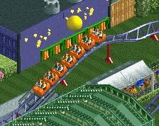
- The station for quickdraw.
- Tbh just the architecture in general .
.
- The restaurants and restrooms near the waterpark (the wooden ones)
Also wondering how you did the hack to get the checkerboard floor in the pink and blue/cyan building to the left of the entrance.
The little midway games section is so well-done. I'll review in more detail later.
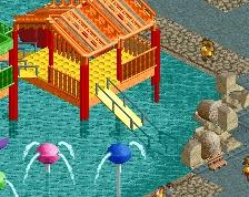
This is really incredible. I'm a huge fan of what you've done here. Great rides, incredible details, and a clever use of objects. Some of the architecture is just spectacular. The whole flume rockwork structure is one of my favorite parts of this whole thing. The water play structure too is a lot of fun. You should be proud of what you accomplished with this.
I loved everything, but the "V" really called my attention, was 10.
I need to enjoy more this park
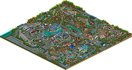
Here we go. Loved this park, and here’s a terribly-written review for it, since I always suck at writing these in any sort of coherent fashion. Some really great macro planning stuff in this park, such as the main entrance opening on the tophat of the coaster with the fountain in front, and the whole area around Steel Diablo, with the car ride and the train moving through. All of this would really be cool to see in real life. Archy in this park is top notch NCSO. Nothing feels like NCSO to me, it just looks like I’m looking at a normal NE park. Detail level is right up there with the best of NE parks. It also feels fresh in a way that I would never expect with an NCSO park. I think this all comes out of really clever object use and really good diligence in making sure things are properly used and not glitching too much. Coaster layouts are good, but nothing overly amazing, which fits a cedar fair park really well. I think my favorite is California Cyclone, but I do like all of them.
I should provide some criticism, even if I don’t have much… I think putting the splash boats ride next to the log flume is not a great planning choice. Pink color for Kingsnake’s inversions looks weird, should’ve just kept them yellow imo. Not sure if I have much else.... lol
I can go on and on, but I feel like Raspberry Acres achieves a natural feeling that other NCSO parks miss out on. The object choices and the way they are used just blend so well together, and I almost never have that feeling when viewing other NCSO parks. I think it even surpasses Blue Oak in that department.
Little things:
-Texture on the climbing tower. Took me a minute to figure how you did that, but it’s a cool trick.
-The climbing tower itself. So cool that it’s peepable.
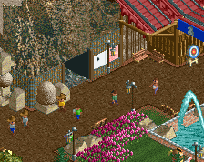
-Ducks in the shooting gallery. Totally gonna steal that at some point.
-The coke machine in the water park
-Water wheel next to the splashdown on Buzz Saw Mountain. Awesome to not see yet another ferris wheel.
-The Native American-looking path work in front of Kingsnake’s entrance
-Water play area is just great. Looks like the real thing.
Great job Terry, and good luck with the accolade vote!
Congratulations on an excellent park. There's tons of details and careful thought put into everything. Very, very impressive work.
+the little ducks at the carnival game is such a good detail
+California Cycle has a great layout and flow
+Rapids ride is beautiful. Could've benefited from a larger layout and more interaction with the surrounding area, but what was there was great
+the arrow looper came out great. Love the colors, station, layout. Only complaint was the path in front of the double loops
+Excellent use of the maze for hedges everywhere
+Love the little volcano building
+Rio Grande Falls was one of my favorite looking rides. Nicely done
+I spy rock climbing wall
+The stars on the walls by the kiddie coaster are such a cool detail
+Splash play area was amazing. One of the best things I've seen in NCSO
+Entrance area was cute (perhaps underwhelming for the scale of the park?)
+Rock n Roadster's station and supports were great. That building along the side was one of the best I've seen (especially that slice sign). Layout could've had more interaction with guests, paths, etc. but I get that the coaster inspiration for it doesn't really have much of that.
+Fences and stairs everywhere
-Torque (spinning coaster) was a good idea, but not exceptionally well done. The layout is kinda wonky (even for a spinning coaster) and it's too tight of a space for it. I would've had it go out over the lake a bit more.
-The bridges by Torque are kinda weird and boring. Why not build one bridge that was wider and prettier?
-I'm still not a fan of the rockwork around the log flume, but I'm in the minority there
-The whole Mexican area seemed like a mess. Without reading anything, it wasn't clear what the theme was (more on this later).
-The small water park area did not really do much for me (other than the splash play area and lazy river). There was a lot of concrete and not quite enough foliage. Seems like an an area worth exploring more in NCSO.
-Overall, the themes and transitions weren't quite clear.
-Lots of concrete. Would be good to break it up (which you tried but it's hard in NCSO).
75% or 80% from me. Really gonna have to think about which to go with.
Not a bad park.
Ideally I would like some more interaction and immersion going on, and I did not really agree with the amount of trackitecture, but a good park for sure.
Technically outstanding park, very clean, prim and proper. Perhaps too much so. Outside of the western area and maybe the water park, it didn't feel like there was much life in the park. I agree with Faas in that there's a lot of trackitecture where it may not have been necessary.
I think the scale of most of the buildings is a little off as well. You put a level of detail in them that is pretty near that of custom object parks, but as a result, all of the buildings got really big. As a result some of the shopfronts and rooves really distract.
I don't know. My love for good, creative NCSO and the fact that you spent 296 in-game years wants me to give a high score, but the park doesn't look like it was fun to build or fun for the peeps to be visiting. And that's something I value a lot when looking at a park.
Be proud of this park, because it is definitely in the top 5 NCSO releases of all time I think. It's too textbook good to not be. I know I'll never build something this good in RCT2.
What a great release! This park is definitely up to my favorite NCSO creations on this site, although it doesn't manages to give me the feeling that it is the first spotlight worthy NCSO park i see over here, but i will explain that later... Let me first dive into the water park, cause that very well shows your skill and the high technical level of your rct, while it also had flaws: I think that over here one can see very well, that in parts of this park you used trackitecture in places where it wasn't really necessary. I think all in all that made parts of this a bit unclean for me, which is kind of weird, since as a whole this feels very clean. The rides in the water park area, the foliage and the rocks worked very well for me though, which made this area stand out as a whole.
Steel Diablo is a good classical B&M invert with a solid theming, although the queue felt a bit short and forced for me. I also think that the support work over here was pretty amazing. We don't often see such good supporting in NCSO projects, also the railroad and the oldtimers made this scene perfect and this area looked conceptually pretty damn hot. The water ride on the other side is well done and also has amazing supports.
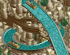
Buzz Saw Mountain is a standard flume with some good composition and interesting rockwork going on. It fits very well into the area and interacts nicely with the nearby railroad station. Same goes for the shuttle loop, all in all this area felt a little bit too straight and linear for me, especially due to the architcture. Also this area really suffered from the path feeling a bit empty, which is a feeling i had also going on in some other parts of this park.
The corkscrew coaster was my favorite one of this park layout-wise. It fits very well into the surroundings and the corner of the park, i also am a huge fan of the colors and foliage going on over here. The cave of knowledge on the other side felt a bit like a gap filler to me and compared to Kingsnake it was kind of underwhelming. Mammoth Rapids is a standard solid rapids ride with an amazing queue entrance!
The lake area left me kind of with confused feelings: On one hand it was very well made on a technical level and had a lot of cool things to explore. Also the woodie and totque are both solid coasters and that bridge was kind of cool. On the other hand the amount of greyness and concrete made me kind of sad. Also my useless trackitecture sense detected some interesting stuff over here. The hot launched coaster next to the lake made me forget that kind of though, it really completes the good coaster lineup this park has!
All in all this really is a park to be proud of! I think there are a bit too much "but"s and a bit too much doubt for me to call this a spotlight, but this still is an awesome release and a great christmas present and it really shows off the huge talent i'm seeing in you, Terry! Looking forward to your next creations!
Great NCSO park Terry. Especially the park composition is fantastic. I also love the colours. I would say that the biggest drawback is the architecture, which is great in some parts, but rather plain or underdetailed in others. I'm not a sucker for water parks attached to a normal theme park, but you integrated the water park well here. Oh, and the log flume rock structure is probably the best I've seen so far in game.
I much miss an aesthetic value in this though. While a lot looks impressive, it rarely looks pleasant. The Arrow is a positive exception here.
Congratulations Terry! Well deserved imo! I'll post a full review later!
This is really fantastic, superb job. The amount of detail in a NCSO park is unseen, you made it look like it is built with CO. The Rock'n Roadster, Rapids, GoKarts, log flume and Waterpark are my fav areas.
Steel Diablo however... can't feel it. That cobra roll should be closer to each other! Also the bit from the cobra roll to the zero g roll seems off to me. That is my only point of critique though.
This was amazing to look at. I'd give you 80 or 85%... Congrats with the gold, well deserved! I'm looking forward for your next project
Loving the wild west area with the rapids and the log flume. Those two were my favorite rides in the park. Very well done, great overall composition, and some cool details all over! Awesome park.
This is pretty f*ing impressive.
Congrats on the accolade Terry!
Really wonderful park Terry. I'd never think to use track this extensively but it's all so crips, clean and vibrant. Great job.
I promised to write a review for this, so here goes. I think you can be very proud of what you made here. On a technical level this is an amazing well thought out park full of innovative and great ideas. The park itself has a great selection of rides.
That said, on an aesthetical level, I'm not sure if I'm that big a fan of this. And I found the main culprit. It's the amount of trackitecture. I know I'm sounding like a stuck record here, but this is too much IMO. Some rooves could've easily been made with the standard NCSO pieces, and would've made for a more pleasant viewing experience. The thing with track is that it's very textured. Sometimes too much. Sometimes I found it even quite hard to distinguish rides from buildings. When you're putting rides under path you knowyou've gone too far.
Nonetheless the buidlings themselves were all well thought out and served a purpose; That Schwrzkopf loop looks amazing, and the rockwork on Buzz Saw Mountain looks as good as NCSO rockwork can get.
So overall a very good park, but I just hope that in your next project you tone down the wooden coaster roofs a bit.