Park / Villa De La Cascada
-
 07-December 18
- Views 1,890
- Downloads 522
- Fans 0
- Comments 8
-

-
 51.50%(required: 65%)
 Design Submission

posix 65% Cocoa 60% Ling 60% Scoop 60% bigshootergill 55% Liampie 55% RWE 50% saxman1089 50% csw 45% CoasterCreator9 40% G Force 40% Sulakke 35% 51.50% -
 Description
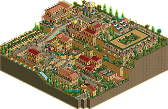
Relax and enjoy your visit to Villa De La Cascada, a beautiful Spanish themed getaway. Take a tour through the city canals and experience a meal at Los Hermanos Restaurant & Grill or a drink at Maria's Cantina. Even the streets are alive with street vendors supplying souvenirs, jamaica and even agua frescas. 🍹
View original video showcase here:
https://www.youtube.com/watch?v=7JNapNkZwO4
🏆RC&F Discord November 2018 Challenge Entry🏆
📕Rules📕
-You MUST build one main flat ride, that means every type of ride is allowed, except roller coasters. Other rides such as car rides or small water rides and using hacked custom flat rides are allowed.
-You are not allowed to build any roller coaster, even not as a supporting ride.
-Additional rides are okay, but the main focus point of your entry should be the main flat ride.
-All cheats, including zero clearance and use of the tile inspector, are permitted, however the main attraction should be rideable and peep friendly.
-Your entry should be as realistic as possible, but you can choose any theme.
-Your entry can be any shape, but NOT BIGGER THAN 900 USED -----TILES (30x30), be aware that empty space tends to be voted low; your entry should look as finished as possible, so use black tiles to your benefit.
You MUST use the workbench provided. You are allowed to change up right up to 10 objects though. -
 No fans of this park
-
 Full-Size Map
-
 Download Park
522
-
 Objects
136
-
 Tags
Tags
![park_3108 [MM2014 R1] Canali di Venezia](https://www.nedesigns.com/uploads/parks/3108/aerialt2718.png)
![park_4122 [H2H8 R4] Park Guell](https://www.nedesigns.com/uploads/parks/4122/aerialt3861.png)

Lovely little village, it's full of details and the buildings look really good! I also really like the boat ride going through the canals. One downside is that some of the walls are a bit glitchy for the people who don't use OpenGL.
Allright, nice park! And in a decent old style. Very small and a bit focussed on only two angles though. The walls are too glitcy indeed, but easy to fix by using land blocks instead of raising the land.
I really love the atmosphere here. Having one side of the park have the massive height difference and the other be much more uniform works really well. The garden area on the upper 3/4 area is such a nice contrast. The fountains might have worked better if they were emptying into the canal rather than hovering next to it. The path bridging over itself is very nice though. The only complaints I really have are that the canal would have looked better if the areas where the boats turned were smoothed out some more (like more diagonal blocks instead of two full grids) and the flower colors are very dull. Another scheme might have brightened up the open areas without totally going against the red/tan/peach color palette of all of the buildings.
The water down the canal was nice, I liked the buildings
hey this is neat work. Archy is pleasant, its lively and warm, and theres a very cool tiered structure going on to complement the atmosphere.
I think it terms of the entry being focused around a flat ride/ water ride though, you could have taken a slightly more focused route. If the point was to highlight a particular ride, you could possibly have integrated that swinger and water ride in a more significant way that shows me that they are the centerpieces of the park. After making such a cool tiered landscape, its a shame that the water ride doesn't have more cool drops and aquaducts and covered tunnels with arches peeking through the side! and the swinger could have been placed prominently on an outcropping with a queue around it or something to really highlight it and make it exciting. just a thought for composure next time.
It's a lovely arrangement of buildings overall. Even though it's all small structures and there's no symmetry to it, it has something monumental. The splash boats were tucked away a little too good in places, but I really like the way you executed it otherwise. The only thing I really don't like about this piece is how you for some reason built all the brick walls underground. It's super glitchy! Don't do that again next time. There's going to be a next time, right? I hope there'll be a next time!
Thank you for all of the feedback and sorry it took so long to reply, life has been hectic. I am sorry I did not notice the glitching walls. I learned after using GL graphics eliminates that and I did not realize this until I had already submitted it and others started to inform me of the glitching.