Park / Seaquarium Curaçao
-
 30-November 18
-
 Seaquarium Curaçao
- Views 8,328
- Downloads 1,103
- Fans 10
- Comments 26
-

-
 85.00%(required: 80%)
 Spotlight

RWE 95% yes Xeccah 90% yes bigshootergill 85% yes chorkiel 85% no Coasterbill 85% yes Cocoa 85% yes Poke 85% yes posix 85% no robbie92 85% yes saxman1089 85% yes G Force 80% no Scoop 80% yes 85.00% 75.00% -
 Description
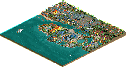
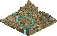
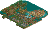
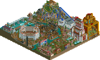
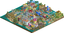
Welcome to Seaquarium Curaçao, one of the most unique aquaria in the world! Aside from hosting some of the most rare and beautiful creatures found in the Caribbean in a natural habitat, we also offer entertaining shows involving sea lions and dolphins, exhilarating roller coaster rides, and a look into the history of the Dutch Antilles. Enjoy your stay at Seaquarium Curaçao!
-
10 fans
 Fans of this park
-
 Full-Size Map
-
 Download Park
1,103
-
 Objects
553
-
 Tags
Tags
![park_3341 [H2H7 R2] Carreira da Índia](https://www.nedesigns.com/uploads/parks/3341/aerialt2950.png)
Great work, I do not even need to comment, everyone here commented very well
Liam does it again! I'll download this and post my thoughts eventually, but for now, congrats you overachiever.
I think this thing is pretty damn brilliant. And I feel this one brings all the best aspects of what I imagine a Liam park to be, and then is all done in this park concept that feels so lighthearted and fun. For me it this is my favorite thing you've released..
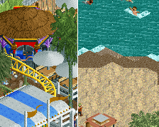
I've been struggling to formalize what bothers me so much about this park. I think the crux of the question is "Can enough little details add up to a macroscopic level of substance?" Or, to be less awkward, Can something be more than the sum of its parts? I think here the answer is only... kind of. There's no disputing the technical detail on display - the rock work alone is something that will likely be aped quite a long time from now - but I find it hard to really get into the park.
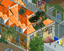
I find the town a really unnecessary addition. It has so much detail that it's fighting the park for visual interest in every way - detail, vibrancy of colors, motion, complexity of layout - and I just have to wonder why there is a tiny seaside fair thing taking up space on undoubtedly extremely spendy oceanfront property, right next to... a tiny seaside park, taking up space on undoubtedly etcetera etcetera.
Beachview is cool but the Seaquarium Resort structure is better in every way, so while "realistically" the two might exist right next to each other, I still just don't see the incentive to include them both. The trend of "realistic" parks moving towards including more and more surroundings of higher and higher detail is really bizarre to me. It's no longer simply providing context, it's becoming actively distracting. This map is the logical conclusion of that - literally less than 25% of this park is your park. The remainder is shops, parking lots, glitchy cars, villas, and weirdly another, smaller park, that isn't part of your park.
Tula and Passaat are both just okay. Tula has a really weird pacing structure where guests are loaded, wait 35 seconds doing nothing, then move forward 20ft and wait another 35 seconds to start the 45-second ride. The main thing I really love about Passaat is the cute pre-lift pretzel it does. Its problems have been voiced more thoroughly elsewhere so I won't go into them, but neither of these carry the park, yet they're practically all it has for attractions aside from an admittedly really cool, if a bit small and awkwardly-placed, dolphin stadium. The main shopping area with the huge glass dome is another highlight for me, but there isn't really anything else here.
I think what bothers me here is not the park, which is perhaps the most fully-realized version of itself that at least I can imagine (minus maybe some more interesting coaster designs, but who's to say where that falls on this park's dedication to realism), but the instant cries for Spotlight when it hit. I think the score is about right but this totally goes against what a Spotlight is - not just in scale, but in the things that it seems to value and focus on.
Unfortunately I do not have a good conclusion here. Liam, obviously you should be proud of this because it's lovely, but I can't say I understand the community falling all over itself to award another Spotlight (hopefully not just) because it's the latest in a line of releases with ever-bloating "realistic" surroundings.
What's wrong with realistic surroundings? If anything it helps realism in general find new ground.
Oops, didn't realise I haven't review this yet... Never too late, so leggo.
I know I once spoke out against heavy outskirts. I'm starting to take that back. The outskirts you did here are amazing and do lift up the whole park. The park would still be good but the outskirts that sketch the environment it's located in, is a real plus here.
The skill of sculpting a specific geographic place in its full details, making it very atmospheric and very believeable is an unseen skill at NE. I don't think anyone else is so good at it like you. Never been to Curucao but I immediately believe this is Curucao.
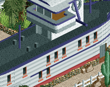
The park itself is great. You did an amazing job with the rockwork, if you use that many it's dangerous not to overdo it but you succeeded in using it a lot and still make it look interesting. Foliage and landscaping is also great. The coasters are cool. Tula seems like a fun coaster, just like the woodie. And the mouse... well, it looks believeable a park like this has a mouse
Congrats with the spotlight. Hope to so meer Liam solos in the near future! Always a delight to watch your parks.