Park / Seaquarium Curaçao
-
 30-November 18
-
 Seaquarium Curaçao
- Views 7,619
- Downloads 967
- Fans 10
- Comments 26
-

-
 85.00%(required: 80%)
 Spotlight

RWE 95% yes Xeccah 90% yes bigshootergill 85% yes chorkiel 85% no Coasterbill 85% yes Cocoa 85% yes Poke 85% yes posix 85% no robbie92 85% yes saxman1089 85% yes G Force 80% no Scoop 80% yes 85.00% 75.00% -
 Description
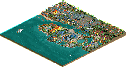
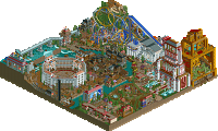
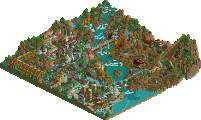
Welcome to Seaquarium Curaçao, one of the most unique aquaria in the world! Aside from hosting some of the most rare and beautiful creatures found in the Caribbean in a natural habitat, we also offer entertaining shows involving sea lions and dolphins, exhilarating roller coaster rides, and a look into the history of the Dutch Antilles. Enjoy your stay at Seaquarium Curaçao!
-
10 fans
 Fans of this park
-
 Full-Size Map
-
 Download Park
967
-
 Objects
553
-
 Tags
Tags
![park_3341 [H2H7 R2] Carreira da Índia](https://www.nedesigns.com/uploads/parks/3341/aerialt2950.png)
Wow, surprised to see this here now but excited nonetheless. Congrats on another ~full scale park! You've really cemented yourself as one of the all-time most important rct'ers.
Firstly, the park is lovely. Great vibes and atmosphere and all layed our with great eye for realism and form/composition of the layout. The way the main park is situated on an island is great and adds to the expanded-park scenario with the bigger coasters on the outskirt. I love aquariums and tropical stuff and I think you did a great job with it here- very convincing.
The outskirts are lovely and feel like a real mature homage to the place. I've never been, but the representation here feels both nostalgic and real. Lots to see and along the beach especially its quite lively. Maybe the corner with white and pink roofed cabins are a bit lifeless. Also I wish you had worked out that hack that removes chain noises from traffic! I like good rct music and vibes but its overwhelming.
Anyway, a few little bits I liked:
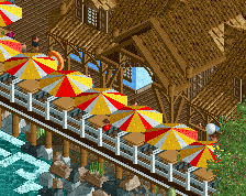
-in the park theres this bit with raised path and a ferris wheel. Great layering and awesome atmosphere here. A highlight of your eye for where to use verticality and where to use flowing flat spaces of path, and how water and foliage highlights features.
-woodie on a rectractable bridge. thats a funny idea
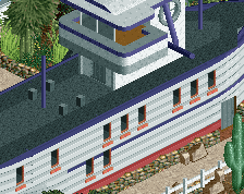
-shark walk/ boat is very cool
-near the log flume you highlight something done well throughout, which is using deep brown shades highlighted with light blue or purple. Its incredibly atmospheric, pops well and is a testament to your general use of color and atmosphere which obviously I appreciate.
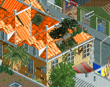
-similarly, the shack near the main yellow hotel is brilliant for the light blue/ brown color combo. so vibey. you've parked some cars in inaccessible spots though!
-my single favorite spot is the woodie station and queue. Love how the lift is directly adjacent to the station building and the way the ride twists around with the queue. The bright blue walls for the path are just lovely and really novel.
Is it a spotlight? I'm usually known for going easy on parks and saying yes. The park itself is quite small, and the extended map feels less full than, say, grona lund. But I'd still consider it. Its not some magical, overhyped incredible release but I would never expect or want that from you. Its mature, well made and atmospheric realism. Now watch me give it a community score and have it automatically vote no for me, which seems to keep happening...
This is a significant milestone of your career. I just hope panelists spend enough time to score it.
Between viewings last night and this morning, I'm really enjoying this park. All around great stuff. I think my favorite part of this entire park is the atmosphere it exudes. It's just dripping with it everywhere you look. The archy/landscaping/foliage are just awesome, and really hammers home the theme. I'm not great at long reviews, but here are some little things I enjoyed:
- I spent literally 5 minutes trying to "catch" one of the iguanas in the woods to figure out what they were. A wonderful little touch there.
- The bascule bridge for the wooden coaster. Before people start bitching about realism here, I think it would totally be possible to build this in real life if necessary. I'd love to work on something like that at work! I don't think the straight track ruins the layout at all as others have said.
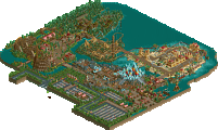
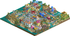
- Not so little, but the overview. It's just effing sexy, and the fact that you made the sea floor and its relationship to the coast actually look like it would from a plane over the Caribbean is really impressive.
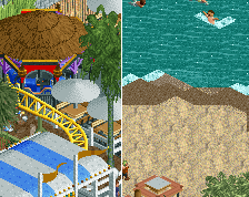
- The beach areas are just loaded with details, and having a peepable swimming area was a great addition.
- Tula and its interaction with path/landscape and also the arrangement of the queue. Sg.
The biggest issue I have with this submission is the almost total absence of activity in the gated community. I love the archy here, but the total lack of anything going on (asides from a few slow moving cars) stands in stark contrast to the rest of the map. Maybe this was intentional and I'm missing something, but it just makes me want to not explore the area more and go back to where all the action is. Some rich peeps going about their days in their nice cottages would have been helpful here. My other nitpick is something cocoa mentioned: the chain lift noises for the urban cars. It's just deafening.
All in all, this was an impressive submission, filled with character and your love for the real life place. That always makes for better work in my opinion, and you certainly proved that here.
As for score, I've been ranging anywhere between 80 and 90 for this over my various viewings, not sure where I'll end up.
I do not even know what words to use to describe this work amazing, excellent realism.
I loved the stones/reef, it became animal. (Fantastic)
This park reminded me of a beach on the coast of Santos/SP that just had an amusement park with these stones.
Well, I need to enjoy this park more
A beautiful mixture of Dutch parkmaking rules influenced by contemporary modellist NE. Good to see more concept driven parks again. I'm much impressed by your colour choices. They definitely added a +5% for me. Well done.
I will start at a point that is probably weird to talk about firstly reviewing this park: Legacies Themepark Europe, the last RCT2 spotlight Liampie brought to us, which was 8 years ago and feels like it have been ages ago. Since then, this park defined allowed of what we call European Realism these days, defining it as a vibrant playful style that relies very much on beautiful architecture and stunning atmosphere. Legacies partially defined a whole generation of parkmaking and was an inspiration for many builders and stayed one until today....
You may ask why i'm talking about Legacies now. I think it's a good point to see where Liampie went and what changes his style have made. Seaquarium shows how much mature his style have got and how European Realism as a whole has changed through the years. The story of what the submission brings to the community as a whole also has changed: While Legacies felt like a whole new level, a release with such incredible architecture at that time that some people completely overlooked the flaws it had, Seaquarium doesn't change the formula we know much: It's more a perfection of the more technical and more nature European Realism we know these days, a masterpiece of Lagomism, showing who really still is the king of Euprean Parkmaking, a definite spotlight.
But what is this park doing better than other perfect examples of that style we know? To be clear, i think it's mainly two points: The first one is Liampie being able to deal better with the flaws of the style than many other builders. The entrance area of this park is a great example: Liampie manages to create such a technical and realistic structure without any kind of uglyness to it. He is able to do this because he is having a great feeling to see when enough is enough. Just look at that Albert Heijn store and how less objects he is using, but he is still able to make it look much better than almost any other builder of that style. The second thing Liam does better are his color choices. While on almost every other park, one would always find at least one color to nag about, when looking at Seaquarium it is even difficult for me to find one color that doesn't look perfect. Liampie is an artist, always knowing exactly what color fits a certain situation, which differentiate him from other builders, because he has that talent above also knowing how to do great composition, architecture, foliage and making the right object choices. Tula and the area around it are a great example of this. I looked at that area for about ten minutes trying to find an object that i find wrong colored, badly placed or unfitting from all angles. One can easily guess, i didn't successed.
I generally took a long journey looking for flaws in this. The outskirts are amazing as everyone said but i also think that the actual park is keeping up to this. Size never really mattered for me, so that also isn't a point that holds me back. If i must say one thing, i would probably say that rockwork got a bit out of hand in some places, also the wooden coaster layout - except for that awesome bridge element - wasn't my cup of tea, but that's not the fault of the builder who have built it. Also i think the map wouldn't have been bothered if you would have cut down the amount of water a bit, a tad too much for me, but i'm getting really nitpicky now...
All in all, as said, a great milestone, and i'm amazed to see another full scale release coming to this site this year. I'm very interested to hear and see what your next plans are going to be, Liam! This thing isn't released for a day, and i already can't wait to see your next stuff!
the biggest thing that comes out at me is that you let your own personal style shine through here without any influence from the successes of others. in this era of people using funky textures to add depth, youve kept to your largely plainly textured walls. things that feel like no one but you would do then are all over the place here. that bridge is the easiest example. the scoring if this park is as much of a validation of your style and you, personally as it is about the park itself. you do take risks emotionally investing so much into something that isnt guaranteed to win, and i'd like to think you wouldnt care either way.
An amazing amount of details paralyzes. They are not lacking in any of the very large number of buildings, attractions and other works, also in all corners of the map.
The buildings are cute - both in the urban zone and the park, they are full of cheerful colors. I would pay attention to many well-made decorations and ornaments - for example in the station building: RCT Tula, or RCT Passaat.
I really liked the dark blue house as an entry into the Passaat attraction - and RCT itself (also for the most compact size).
Tula is also cool (the track passing over the section with brakes accentuates and adds excitement).
As for the urban part, everyone would probably find something for themselves. A nice surprise is a small amusement park next to the church. A small celadon house with pink accessories and a green one (?!) Would deserve my attention.
Summer zone refined.
A lot of ideas + commitment is a recipe for such a creation.
Greetings. (95%)
Wow, such nice reviews so far! Thanks for taking the time to talk about the park in depth, it's really making my day.
About the cars: I fucked up. I added them not so long ago and I usually don't play with sound. The real fuck-up is that I forgot to put music in the park. If I did that, I would've noticed and I could've done something about it...Maybe I'll update the savegame in the coming weeks. There appear to be a few objects missing on the screenshot I posted, so I'd like to fix that as well.
You are missing something! That 'gated community' is just another resort, and it happens to be inspired by the resort I stayed at in 2009. The quiet atmosphere is actually quite accurate. Not much happens there, especially during the day when most people are away and exploring. I guess I could've added some life to the porches. Shoulda coulda woulda
Instant fan. Among the best stuff on this website. You excel in every single aspect of this game. Congratulations !
The incredible dedication to setting and geography really pushes this park way over the top for me.
all the details you've implemented even in the far off ocean such as the subtle landscaping, and the boats really add so much to the overall product. tbh, the way water interacts with this park as a whole is just masterclass.
there were many aesthetic risks you took with this park and I think none of them are a hindrance at all, such as the triple coloured rocks, the peach pathways, the archy colours. they all work in creating the atmosphere intended in my opinion.
the architecture of this park is also incredibly convincing. the hotel is one of the best I've seen. you didn't force feed any of them mega amounts of details, instead you focused on really capturing their structures which to me makes them far more visually appealing.
I also think how this park is segmented was done well. Having the very loud park sandwiched by the quietness of the sea and the resort really added to the whole experience.
Overall, i think this park was completely successful. you've really nailed atmosphere and immersion here and created quite a wild and chaotic theme without it becoming too visually overbearing. such a brilliant release!
Well there you have it! Congrats on the Spot Liam! Hopefully I'll write up a review in the coming week, but this was fantastic! It gave my a Grona Lund kind of feel, with the surroundings being more of a focal point than the park, executed brilliantly!
Very close vote! Congrats Liam on the spotlight.
Congratulations on another spotlight. Usually takes me a few views before really getting into a park so I held off voting, but looks like it's too late now. I think spotlight is fair and deserved though.
I could imagine walking in the streets and soaking in the colorful atmosphere, great colors I think. Very bright and fun. "Ugly" buildings even looked good imo. But the actual park was the highlight for me. Loved the concept and rides. Buildings too. My favorite was the castle like building with the diagonals. Theming was very nice everywhere. Super cool and unique entrance area. Pretty paths. Great ships and boats. Even loved the water in the overview. The rocks all around fit very well. I could go on, but it's all good and I don't really have anything negative to say. Just thought the park was great and extremely fun. One of those maps that will become timeless for me for sure. So I'm looking forward to endless views.
Congrats on the spotlight Liam! I've been to Curaçao 8 years ago and I always wanted to recreate it in RCT2. It's a shame you did it before me lol. Some of the parts brought me back to that place, while others didn't. Here's my view on the park:
- Great foliage! That's really supporting the atmosphere and it really reminds me of a warm tropical country. The rocks and wild water also really worked.
- The yellow buildings in combination with blue buildings give me the real vibe of Curaçao (that church! <3). That was great in the outskirts, the park missed this combo.
-The park itself might be a bit small, but I don't care. The outskirts are fun anyways.
- I love the woody. Quite a short layout, but it's placed great in its surroundings and that turnaround is so nice. Also a fun queue.
- The sailing boat close to it is less good. Doesn't really look like a boat to me. Maybe a bit too forced to be modern.
- The big yellow hotel is a bit meh. The shape is a bit boring and nothing really special.
- The wooden restaurants next to that were awesome. Some of the best archy of the park.
In conclusion, this is a great park. Very nice to finally see this park finished after years of work. A 80% for me, but still a well-deserved spotlight.
Wow Liam, didn't see this one coming. After all this time! Congratulations !
Come on people, not even two pages of reviews for a Spotlight? Where is everyone?
It was also awarded Spotlight within two days of going live. I will write a long review, but that takes time as well. It's only been out a week.
If you build it, the reviews will come