Park / Izumi
-
 07-December 18
- Views 2,303
- Downloads 551
- Fans 0
- Comments 9
-
 59.50%(required: 50%)
 Bronze

CoasterCreator9 65% Cocoa 65% csw 65% G Force 65% Scoop 65% Liampie 60% CedarPoint6 55% Poke 55% RWE 55% saxman1089 55% Sulakke 55% posix 50% 59.50% -
 Description
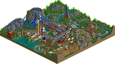
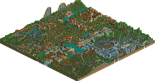
Use OpenRCT2 with OpenGL rendering for the best experience. This very small park started as a technical exercise to get familiar with the process of making a merged ride run properly in block section mode. Lots of Tile Inspector practice also.
The blue HyperSonic XLC-inspired coaster, Sky, was the first and only thing on the map for a while, and once it was done and working I wanted to test the peepability of it as I messed with various things, so I started adding more rides. Brought over a Superman Krypton Coaster-inspired floorless design I had toyed with forever ago but never used. When I realized I was filling out the space and might as well take it seriously, I resolved to add a third coaster in the bottom corner. Daemon is a Hades360-inspired timberliner with a high-speed corkscrew over the path in a small village setting.
The name Izumi refers to a fountain or water source, specifically a spring. It can also (sort of?) mean waterfall. The ride names are not references to anything.
Thanks to Xtreme97 for testing. -
 No fans of this park
-
 Full-Size Map
-
 Download Park
551
-
 Objects
224
-
 Tags
Tags
![park_4087 [H2H8 R1] All Coasters Go To Heaven](https://www.nedesigns.com/uploads/parks/4087/aerialt3818.png)
The impression of a super roller coaster with super structure, was very cool.
I liked the roofs imitating Japanese roof.
Attached Thumbnails
The RCT 'The Storm' attraction is surprising.
I like the design of the station and very much a combination of colors. Both red with blue and green. The waterfall is good, the RCT track is approaching well in many moments. Cool climate at the 'Trinity' towers.
I liked the entrance to the park,
- very pleasant association of objects.
The park is saturated with original objects and buildings, a somewhat controversial style does not bother - it is orderly. The white color of the walls accentuates the scenery.
Plants cool - without being overloaded.
The other two RCTs are good, awesome objects (supports and other technical details), but 'The Storm' pleases me the most.
Wooden is a classic.
You can easily recommend sightseeing to anyone.
Hey. Greetings. (75%)
This was enjoyable and a healthy effort in NCSO. I too could watch "Storm" for hours as the way it was set up had it shooting trains non-stop which was pretty entertaining.
Thanks guys. I wasn't trying to take any of it too seriously but was pretty proud of the coasters so I'm glad you liked them.
wow, some really lovely work here. Your use of the white-blue-brown-magenta color scheme is really atmospheric. I also applaud your use of blank grass/ empty space- it really highlights the flows of the rides and park and does wonders for the atmosphere. Most of the archy was good, relatively Japanese-y I'd say- but I do lament that the park sort of falls into that classic "NE/rct vague asian theme" without much real substance or reference to a real place/story/idea- just pagodas with sloping rooves.
The two steel coasters were excellent, sort of a weird mix of realistic but not, but still good aesthetics. the woodie and its green-pathed square area didn't cut it for me, I think it was a weird layout and it sucked atmosphere out of that corner.
overall a pleasant park showcasing some real solid skill- a focused theme and a bigger park next will do wonders for you
The word that comes to mind when looking at this is "fresh". This is fresh in every sense of the word. I love the unique forms and colors in the architecture, the unusual layouts, varied path types, contrasts between open and tight spaces. Great stuff Ling.
Daemon had some very nice interactions, but maybe too much tunnel, and I didn't like the barrel roll, and the flat green roofs did not look good either.
The Storm was beautiful I think. Fine layout, with again, fine interactions (this time with the landscape). Not sure what to think of the theming now, the blue roofs contrast with the surroundings so much, while also rhyming with some other elements that it shouldn't rhyme with. These buildings are cool but out of tune.
While not the best coaster, Izumi was the most refined I think. Everything about it works without being too special. Just a fine creation.
Overall: good coasters, hit or miss theming. This should be a little silver in my opinion!
I thought the landscaping was very good, and I always enjoy having lots of big rides in quite a small area. Some of your colour choices were a bold move, and I appreciate that.
Although, I do think some of your archy choices bordered on being like typical ncso texture / fence layered clusterfucks, which I struggled to enjoy. I do think your trackitecture was better than most ncso I've seen however.
That mix of open and cramped space was something I really tried for, so I'm glad it came through. Totally justified criticism of the architecture though.
It's coming
<3
Yeah, that was an experiment that didn't work out. That corner was already so cramped and had no opportunity to open the space up with blank grass like on the other side of the map, so I tried to use blank roofs in places to keep it from looking too cluttered. Didn't really turn out though.
Guilty.
Thanks for the comments guys.