Park / Glasshouse Gardens
-
 31-August 02
- Views 1,792
- Downloads 509
- Fans 1
- Comments 3
-

-
 Description
Original release date 8/31/02
-
1 fan
 Fans of this park
-
 Full-Size Map
-
 Download Park
509
-
 Tags
Tags

![park_4103 [H2H8 R3] E.V.I.L.](https://www.nedesigns.com/uploads/parks/4103/aerialt3847.png)
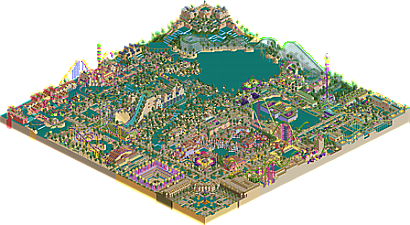
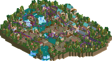
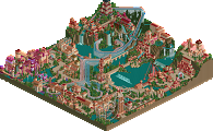
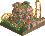
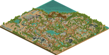
An NE1 classic and forum favourite. Correct me if I'm wrong Kai, but this was perhaps the first park around at the time where someone really went for all the objects that were considered ugly, and thus shunned upon: all the glass sculptures, toadstools, the jungle flowers, etc. Kai then of course combined everything in super bright glaring colours, to make a bit of an "anti" statement. Sadly there wasn't the attitude back then we sometimes have today to appreciate boldness. The majority thought the park was ugly, and there was "I need sunglasses to view your screens" mockery. Looking at it today, you can clearly see the single-wide paths era inspired broken up multi-wides paths and an early quite undefined NE style influence of ruthless jagged rocks mixed with tropical scenery. But thanks to Kai's love for outrageousness, it's still a park that was very different to what NE was used to.
Man this is fantastic! Absolutely love some of the views in this park. The palm trees lining the side of the wooden coaster on the shoreline is such a cool visual.
In:C - thanks. It's not the best woodie ever, but as biased as I am, I really think I'd love walking thru this park and riding the rides. I build all my parks this way - from the POV of if I'd like it and enjoy walking/riding thru the park. At this point in time, GG probably is my last and best full sized solo park.
Posix - Thanks for the kind words and fairly accurate synopsis. For those that weren't around here back then, at this time period (2002), we were in our last months of LL before the release of RCT2. Many were working to complete their LL projects and I was in a place where the other projects I was working on were dark and gloomy. Some were just traditional woods (like Mike Robbins) others were like a park with Mantis for RCTM called Toxic Terra (dark tiles/rocks/alien theming). Basically sludge and aliens and dark colors.
So I needed a change, and had done enough woodsy parks with some normal colors, so I went tropical, pastel, glass and other objects that as you said were not popular. I'm not sure if it is really a bright park compared to modern standards, but it was regarded then as hard to look at and mocked accordingly. I did try a few new skills or approaches in this, including some mild scenery hacks, non-traditional lift hills, and what I'd call the NE jagged rocks. ...and you caught me - the single paths that were really double lane "avenues" from the entrance plaza were definitely a push against the growing 2x/3x wide pathing movement, which I'm still not a huge fan of even though I've tried it myself.
Thanks again to both of you for revisiting my classic, even if it is only a classic cos it is almost 17 yrs old.