Park / Me, Myself & Hyde
-
 03-November 18
- Views 1,481
- Downloads 549
- Fans 0
- Comments 2

-
 Description
Fall apart in the falling rain on this Intamin Multi-Launch.
Inspired by the graphics in a lyric video for a song inspired by the story of Jekyll & Hyde. -
 No fans of this park
-
 Download Park
549
-
 Objects
118
-
 Tags
Tags
![park_4097 [H2H8 R2] Mzima Springs](https://www.nedesigns.com/uploads/parks/4097/aerialt3837.png)


![park_4120 [H2H8 R4] Ruigrijk](https://www.nedesigns.com/uploads/parks/4120/aerialt3860.png)
![park_4090 [H2H8 R2] Feira do Flamengo](https://www.nedesigns.com/uploads/parks/4090/aerialt3829.png)
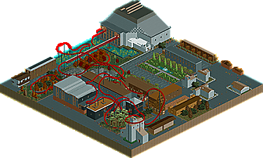
Buildings are really blocky, hard to get a sense or theme from them. The path mixtures are a mess, 2~3 would be plenty but you have 6 (not counting the queue path). Way too much grey with nothing to break it up. The landscaping just needed a lot more effort. The entire park is flat except for the (rock?) mounds and the water, but the water was just one-tile-lowered squares, which looks super lazy. Presumably this is supposed to be London, or at least some other urban area? Make a waterfront, or some recognizable set pieces. This just feels like a lot of "stuff". Not shops or homes or city structures, just boxes with no facades or styles.
The coaster layout is very meandering and had lots of quirks I noticed - the first launch is way longer than it needs to be, the train reaches its max speed at about the half-way point. The block section immediately before the first launch isn't actually far forward enough for the train to clear the station, which is poor planning. The only other block brake on the entire layout is right at the very end of the ride, so the train has to sit in front of the launch for quite a while which is bizarre pacing. I would either add an MCBR with a block section or remove the block functionality entirely.
ling has some good advice. welcome though, I assume you're new? I appreciate the attempt at fall foliage stuff, which is a bit rare. honestly reminds me of something i made way back when i first picked up rct2 well before I found NE