Park / Playcenter
-
 01-November 18
- Views 3,803
- Downloads 715
- Fans 3
- Comments 15
-

-
 50.00%(required: 50%)
 Bronze

Cocoa 60% Coasterbill 55% bigshootergill 50% CoasterCreator9 50% G Force 50% posix 50% RWE 50% saxman1089 50% Scoop 50% Xeccah 50% Ling 45% robbie92 45% 50.00% -
 Description
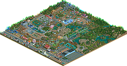
Playcenter created by me and inspired by other parks here in the NE.
Maybe someone will see something similar done in your park.
I followed the best possible all the advice received.
Of course there is still a lot to practice, because after it is ready, it is possible to perceive what was good and not very good.
There are things I did not plan well but in the end until it was fun.
I hope this park has gotten better than the others I've done.
Please comments, you are always welcome. -
3 fans
 Fans of this park
-
 Full-Size Map
-
 Download Park
715
-
 Objects
635
-
 Tags
Tags


The bright, colorful atmosphere is let down somewhat by having so many custom flat rides that are not peep-accessible. You have 5500 guests but only four really major rides for them to ride. The coaster layouts are fine - nothing remarkable. Judge Roy is probably your best yet (but you couldn't have found a way to make that coexist with the Giga Coaster without using zero clearance on the lift hill?). The supports for Giga Coaster are a mess - no reason to use that many flanges.
The areas outside the park seem odd to me. The foliage is a mess, try working on coming up with a natural-looking palette and then sticking to it. You have SO many different objects you are trying to cram in that it doesn't look like a real forest. The cityscape also seems unnecessary - a parking lot or fleshing out the park entrance with guest relations/lockers/strollers/maps/more shops would go further towards making me believe this feels like a real park than some buildings and a street outside.
The space museum is... out of place. I'm not saying that because I don't appreciate you taking direct inspiration from my work, but rather that leads me into another point - I think your next major improvement will come from having themes. Commit to an area all having some unifying theme and color palette. Something like this would just never exist in a normal, large theme park like you have here. Many rides have generic names and seemingly random one-off styles and color palettes. The three shops near the entrance are honestly the most cohesive-looking in the entire park, and they do look good. The brown spiky castle-y structures for the junior coaster and swinging ride look totally out of place next to the huge sparky/digital theme of Magnet, and the frozen area makes no sense surrounded by all of these temperate gardens. If you can pair your park down to just 4~5 themed areas, and build all of the rides in that space with that theme in mind, it will give you more direction and make your ideas clearer. It will also be easier to look through the park and get a sense of what it might be like to walk around in it. This extremely scattered method of theming is something you would expect from a small carnival or fairground, not a massively obviously permanent amusement park with a number of large, E-Ticket rides.
You are obviously improving and I suspect this will be just nudging Bronze. I wonder if it would help your building to take a break from trying to push out these enormous parks and focus on Designs with single, concrete themes for practice? Then bring those lessons to your larger parks in sections.
Your recent progress has been a blast to observe, and though this wouldn't be considered a Gold park from a technical standpoint, it's easily your best work so far, and it shows that you're improving rapidly with each new park you show us.
Some of the highlights for me include, but were not limited to...
This truck parked behind Walmart
This cleverly enclosed swinger
The little water towers scattered around the outskirts
This curvaceous building topper
Possibly my favorite detail, this simple yet visually striking modern sculpture
I also really enjoyed looking through the cityscape. You clearly spent a considerable amount of time with each store, restaurant, and hotel, and your attention to detail was really what pushed this park ahead of your past work and allowed this park to be one of the most enjoyable viewing experiences within recent releases.
You have a fresh way of looking at objects that's different from the way most builders see them; rather than thinking "I'm going to need this object for so-and-so", you're able to ask "How can I use this object?" and then find a fun way to incorporate it into your park. The next step for you, as Ling mentioned above, would be to organize your ideas on a larger scale. If you can do that without losing your unique and clever approach to building, you will go very far in this community!
I might be one of the high votes giving this 65%, which is a mid-level Silver score, but I was thoroughly impressed with your commitment to the various details throughout this park even if it wasn't always quite up to technical standards.
Wow, I´m impressed with the sheer size of this map and the way you´ve filled it up to the brim with all these funny, quirky and enjoyable rides and details. It´s colourfull and chaotic which is both it´s strenght and also it´s weakness. I really enjoy your different approach and it´s great to see you improve with every new screenshot and park that you upload. I think the key to further improve lies in finding a little more restraint and coherence in your park. Less is more.
boy you sure build quickly!
I see you're improving on the realistic aspects- the outskirts definitely show that. there's some admirable themeing throughout the park- the entrances are lovely, as is the observatory, the little covered bridge on the go-karts, and many of the buildings throughout. You still jump around in theme a lot, placing random buildings and rides wherever you feel like, but your paths and flow are significantly improved. I also quite liked the surrounding foliage and landscape. I was going to compliment you on your coasters but it seems like you've just taken two stock ones and very slightly modified them (the name "judge roy" really gave it away ). the original coasters, the bobsled and junior, are still super weird, although i like the landscape the junior coaster sits in. You gotta get yourself to a real theme park one day! your general use of objects and knowledge of how to build things is rapidly improving though.
BTW the signs in the town don't seem to correlate very much with what the buildings actually are, and I laughed quite a bit at some of them
I really enjoyed the fun vibe of this. Sure it's very macro and a bit unrefined but it's a lot of fun and it's a breath of fresh air on this site.
Thanks to all here for the sincere comments, spoking well.
Expressed situations in your comments that was exactly what I experienced, this is incredible.
<3
Congratulations MrTycoonCoaster !
Congrats on your first accolade, MrTycoonCoaster!
great job sir. keep up the hard work
Congrats on the bronze, MrTycoonCoaster! I may have been inactive on NE for a while, but it's great to see your progress.